
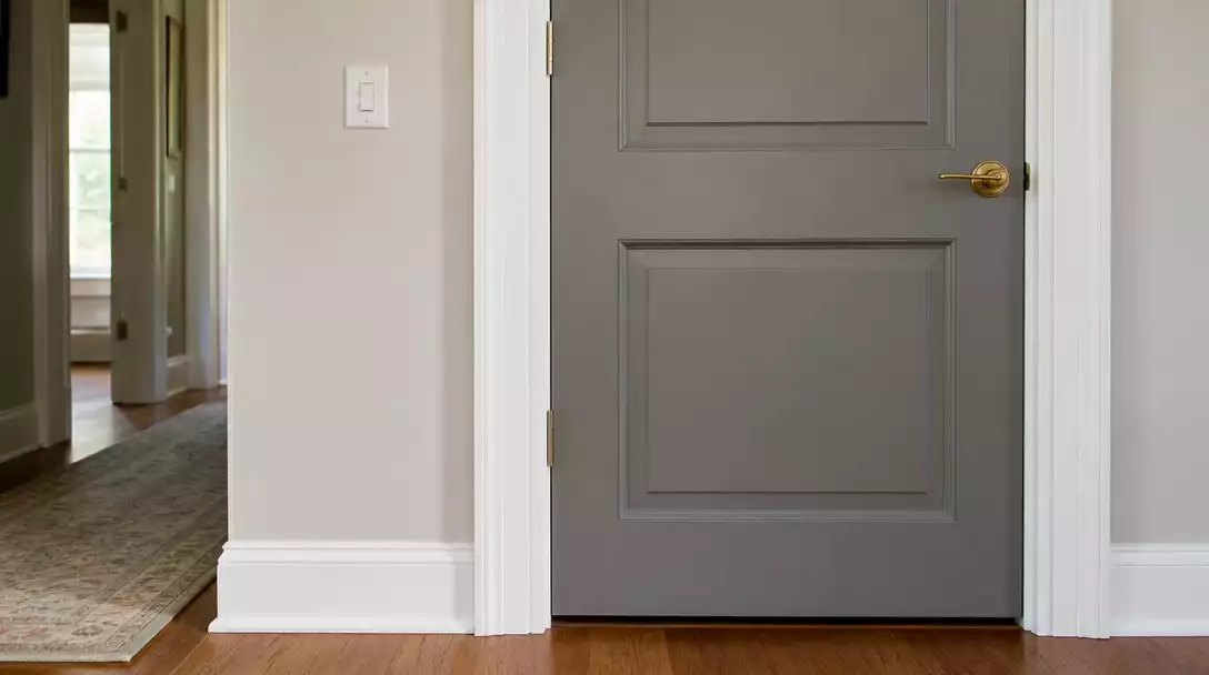
You have finished painting your trim, but now the door color looks muddy or flat. This guide narrows down 9 common mistakes that cause this visual clash so you can finalize your choice with complete confidence. Here is how to ensure your finishes actually work together.
1. Ignoring new undertones
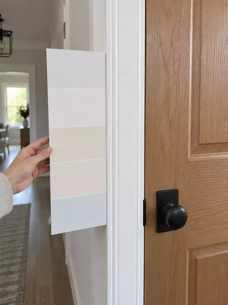
Aligning your trim and door undertones creates a cohesive, professional-grade finish for your home.
As an Amazon Associate I earn from qualifying purchases. Affiliate links may earn me a commission at no extra cost to you.
Most homeowners treat trim white as a blank slate, but in practice, white paint is rarely neutral. Every trim color carries a subtle bias—leaning blue, green, pink, yellow, or sandy—that dictates how every other surface in the room behaves.
When you repaint your trim, you aren’t just applying a fresh coat; you are establishing a new finish family. If you ignore the bias of that new trim, your door color will almost certainly clash, leading to a result that feels amateurish or off-balance.
The Undertone Collision Warning
Mixing temperature families is the fastest way to ruin a professional paint job. A classic “muddy” or “bruised” look happens when you pair a warm door with cool trim, while “chalky” or “dingy” results occur when a cool door meets warm trim.
To avoid this, evaluate your trim, cabinets, and flooring as a single, interdependent unit. Before you commit to a gallon of paint, create large samples on white foam board—never rely on tiny store chips that fail to capture how color shifts across a vertical surface.
Follow these steps to ensure your door color shares the same temperature family as your trim:
- Identify the bias: Look closely at your new trim. Does it lean toward a soft, golden yellow or a crisp, icy blue?
- Test in context: Place your foam board samples directly against the new trim to see how the edges interact.
- Check the family: If your trim is warm (yellow, peach, or beige base), keep your door color within the warm family to maintain consistency.
- Verify the cool side: If your trim is cool (blue, violet, or gray base), ensure your door color follows suit to prevent a “bruised” appearance.
⭐ Top Paint Kits for Door Projects
✨ Editor’s Pick
Fast Drying White Wood Paint Kit
Wood Look Garage Door Paint Kit
Satin Finish Interior Paint and Primer
💡 Designer Note: The “Finish Stack” Strategy
Think of your trim, cabinetry, and flooring as a single, interdependent family rather than isolated surfaces. When you view these elements as a unified “finish stack,” the door becomes a bridge that connects them. Choosing a color that ignores this harmony creates a visual interruption that makes even the most expensive paint job feel like an afterthought.
Matching the trim exactly
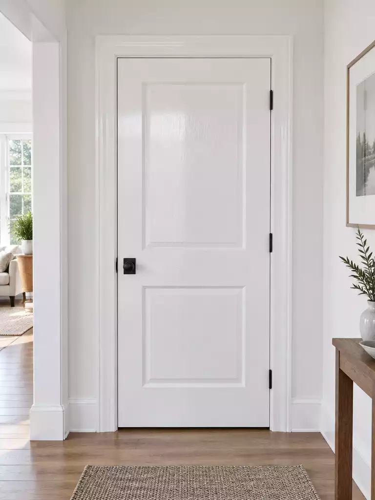
Using subtle sheen shifts creates professional depth that a flat, uniform match often misses.
There is a persistent myth in home improvement that painting your door the exact same color as your trim is the safest, most professional choice. While this creates a clean, uniform look, it frequently backfires by leaving the room feeling flat or institutional. When the door, casing, and baseboards are all identical in both color and sheen, the architectural features lose their definition, causing the doorway to disappear into a featureless void.
Unless you are specifically aiming for a “color-drenched” or “recessive” architectural style where the goal is to make the room feel larger by blending all surfaces into one, you should treat the door as a distinct element. Instead of relying on a different color identity, use sheen as your primary tool for creating visual depth.
Professional Strategy: The Sheen Tiering Method
To avoid the institutional look, keep your wall finish distinct from your woodwork. A common, effective strategy is to use a satin finish on walls paired with a semi-gloss finish on trim and doors. This slight difference in light reflection provides the necessary contrast to make the door feel like a deliberate, high-quality architectural choice rather than an afterthought.
If you do prefer a monochromatic color scheme, you can still achieve a sophisticated result by keeping the paint code identical but varying the sheen levels slightly. A semi-gloss on the door will catch the light differently than a satin or eggshell trim, providing just enough separation to highlight the craftsmanship of the door frame.
⭐ Best Entrance Mats for Your Porch
Heavy Duty Funny Welcome Entrance Mat
✨ Editor’s Pick
Striped Cotton Woven Porch Entrance Mat
Waterproof Non Slip Outdoor Entrance Mat
💡 How This Works in a Real Home:
- Define visual boundaries: Use a semi-gloss door finish to help the entry point stand out from matte or satin walls.
- Daily maintenance: Higher sheen levels on doors resist scuffs better, making high-traffic areas easier to wipe down and clean.
- Keep it lived-in: Avoid perfectly uniform color-sheen combinations that can accidentally highlight every minor dent or drywall imperfection.
3. Keeping a clashing undertone
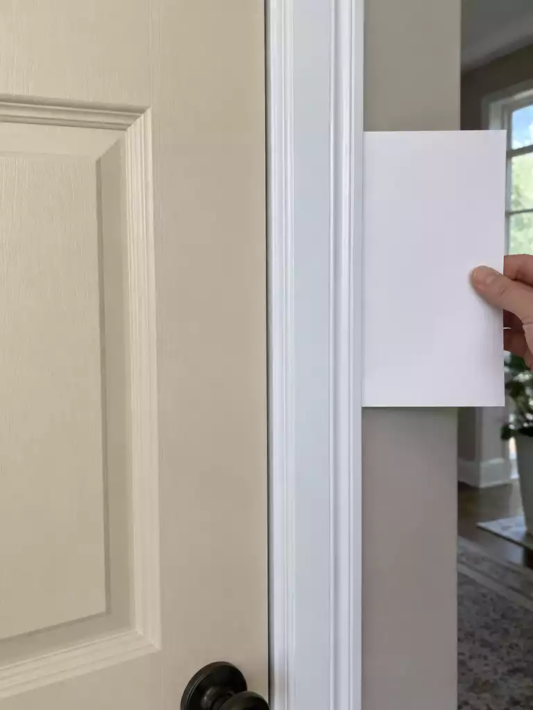
Aligning your undertones prevents the muddy look that ruins a professional finish.
The most common reason a door looks “off” after a trim update is a fundamental conflict in undertones. While we often think of paint colors as simple shades, they are actually complex mixtures that lean toward specific temperature families.
When you place a door color from one family against trim from the opposite, the human eye immediately registers a visual discord. This clash creates a “muddy” or “bruised” aesthetic that makes the entire doorway feel like an afterthought rather than a deliberate design choice.
To diagnose your current situation, use the “True White Paper Test.” Hold a standard piece of bright printer paper directly against your newly painted trim.
The paper acts as a neutral reference point, forcing the hidden bias of your trim color to reveal itself. If your trim looks yellow, pink, or sandy compared to the paper, it belongs to the warm family; if it looks bluish or icy, it is cool.
The Fix: Don’t Compromise
If your door color sits in the opposite category of your trim, no amount of lighting adjustment will resolve the clash. The only reliable solution is to repaint the door to align with the trim’s temperature family. Attempting to bridge the gap with décor or lighting often draws more attention to the mismatch.
⭐ Standout Door Mats for Every Entry
Washable Non Slip Indoor Entry Mat
Striped Cotton Layering Front Porch Rug
✨ Editor’s Pick
Funny Black Cat Themed Welcome Mat
⚖️ Quick Decision Guide: When to Repaint
- Choose this if: You see a distinct “bruised” or “muddy” quality when comparing your door sample directly against the new trim.
- Skip this if: The colors look harmonious in daylight but only clash under specific, non-representative store or low-quality bulbs.
- Pair it with: A high-quality satin or semi-gloss finish to ensure the new, correct color has the depth to stand out against your trim.
Achieving a home that looks intentional is rarely about fixing every single surface at once. By focusing on how your interior doors relate to the surrounding trim, you create a cohesive architectural system that stands the test of time.
True visual harmony comes from making just a few precise decisions that bridge your trim and wall colors to create a lasting, high-end feel.
Testing Without the New Trim
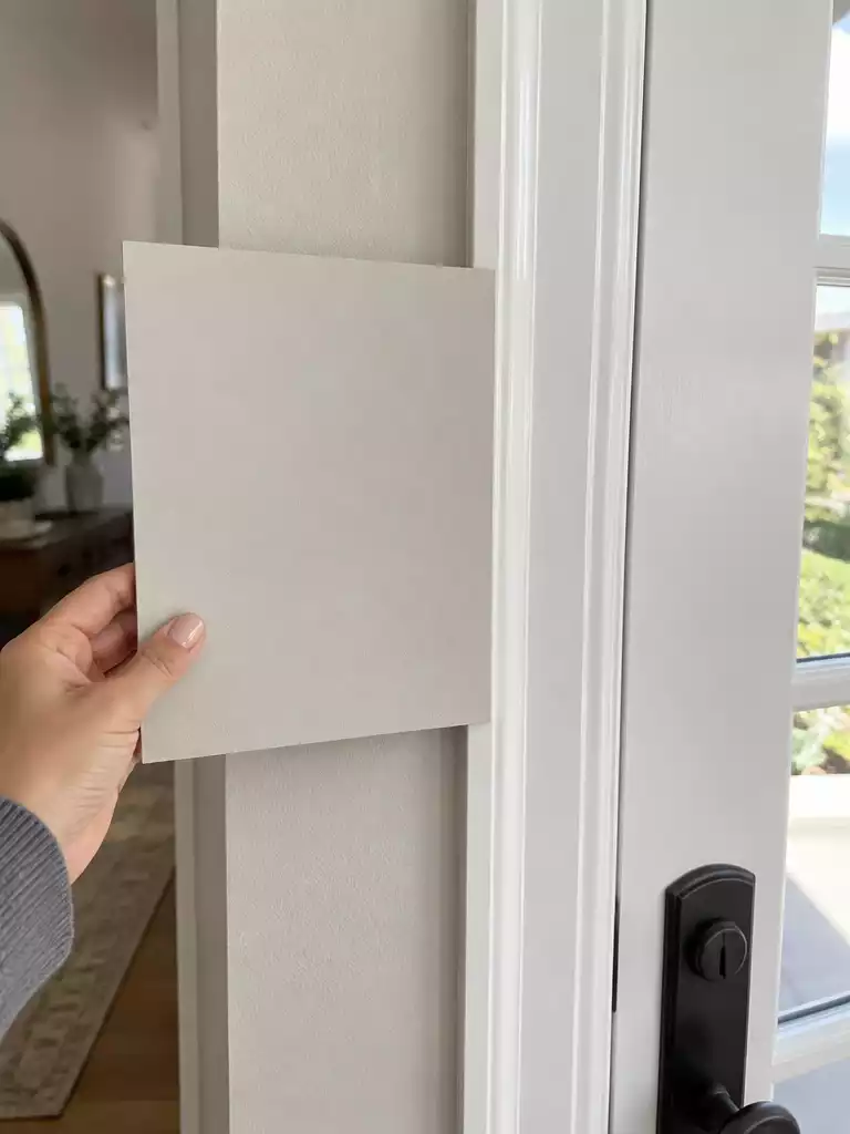
See the color in its final home to avoid costly rework and visual disappointment.
The single most frequent reason for post-renovation regret is choosing a door color based on a tiny sample chip viewed in isolation. Colors are not static entities; they are chameleons that shift based on the surfaces directly touching them. When you paint a door without holding your sample against the newly painted trim, you are effectively flying blind.
Your trim acts as a frame for the door, and its specific undertone will either harmonize with or fight against the door color you select. If the trim isn’t finished yet, it is far better to wait to finalize your door color than to guess and risk a color clash that forces you to repaint the entire door later.
The Foam Board Rule: Never rely on the tiny paper chips from the paint store. They lack the surface area and the reflective qualities of a true paint film.
- Paint two full coats of your chosen color onto a 12×12 inch piece of white foam board.
- Tape this board flush against your newly painted trim to see the actual interaction.
- Observe the sample at 8 AM, 12 PM, and 8 PM to watch how the light change impacts the undertones.
- Check the sample against your flooring and cabinets to ensure the entire finish stack stays in the same family.
This process is the best insurance policy you have against the “muddy” or “bruised” look that happens when cool and warm tones fight each other. By testing in the exact environment where the paint will live—surrounded by the specific white of your trim and the actual light of your home—you remove the guesswork. If the color looks “off” when placed against the trim, you have saved yourself a weekend of labor and the cost of a wasted gallon of paint.
⭐ Shop Stylish Mats for Your Home
✨ Editor’s Pick
Striped Cotton Woven Front Door Mat
Washable Striped Cotton Front Door Mat
Black White Striped Porch Throw Carpet
The Right Sequence to Avoid Rework
Color perception is entirely relative; failing to finalize your trim before testing door samples is the most common cause of costly, mid-project repainting.
- Finish the trim: Ensure the trim paint is fully cured and dry before testing any door samples.
- Sample in place: Tape your foam board samples directly against the new trim to view the interaction.
- Observe transitions: Compare the door sample against adjacent floors and walls throughout the entire day.
5. Choosing color under indoor light
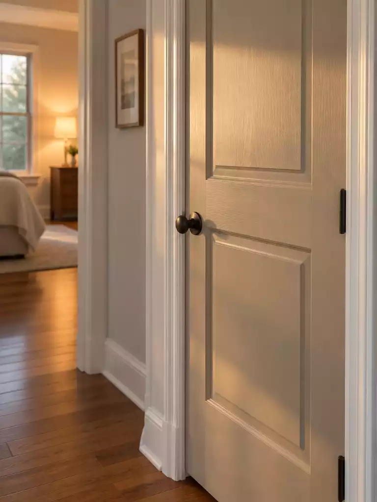
Evaluating your door color in the room’s actual light prevents costly repainting regrets.
The biggest mistake homeowners make is selecting a door color based on how it looks under the harsh, artificial glare of a hardware store. Your home’s lighting environment is entirely different and dictates exactly how those color undertones will behave once the paint is dry.
Light temperature, measured in Kelvin (K), acts like a filter over your paint. Warm light, typically found in 2700K–3000K bulbs, emphasizes yellow and red undertones, which can make a warm-toned door look cozy and intentional. However, if you switch to 4000K or higher—the cooler, bluer light often found in modern LED fixtures—those same warm tones can suddenly look muddy or bruised.
The Lighting Reality Check: If your room currently uses a mix of warm and cool bulbs, your door color will appear to shift throughout the day. Standardize your lighting to high CRI (Color Rendering Index) bulbs before finalizing your paint choice to ensure you are seeing the true character of the color.
You cannot rely on store lighting to tell you the truth. To avoid a finish that looks “off,” you must evaluate your samples in the room where the door will live.
- Morning (8 AM): Check how the cool north-facing or early morning light affects the color’s depth.
- Midday (12 PM): Observe the color at its most neutral point when natural light is strongest.
- Evening (8 PM): See how your artificial lighting—whether it is warm recessed cans or cool lamp light—interacts with the paint.
If the color looks dingy or chalky at any point during this cycle, it is a sign that the undertones are clashing with the light source or the trim bias. Never commit to a full gallon until you have viewed your sample at all three of these intervals.
⭐ Reader-Favorite Mats for Your Entry
Striped Hand Woven Front Porch Rug
✨ Editor’s Pick
Brown Striped Cotton Front Door Mat
Jumbo Size Waterproof Front Door Mat
🏡 Real-Home Application: Testing in Your Space
- Sample placement: Tape your painted foam boards directly against the new trim, not the wall, to capture the true color transition.
- Daily movement: Carry your sample board from the hallway to the door to see how light shifts across the surfaces throughout the day.
- Lived-in look: Evaluate the color during your typical evening routine when warm interior lamps are on, as this is when you’ll spend most of your time.
6. Forgetting the exterior view
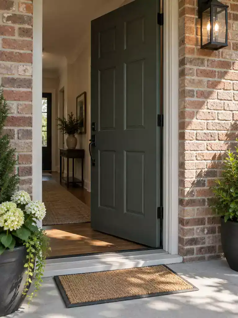
Align your door color with the home’s exterior light and architecture for a cohesive transition.
It is easy to get so caught up in making your door look perfect against your interior trim that you completely overlook how it presents from the street. An exterior door is a bridge between two entirely different lighting environments, and failing to account for that shift is a common path to regret.
The light hitting your front door from the outside is rarely the same as the light inside your hallway. Direct sun can bleach out subtle undertones, while deep shade can make a color appear murky or significantly darker than you intended.
The Golden Rule of Exterior Testing: Always evaluate your samples in both direct sunlight and deep shade. If your door sits on a covered porch, the color will consistently read darker and cooler than it would in full sun, which can make a warm-toned paint look unexpectedly dingy.
You do not necessarily need to match your door color to the exterior trim, but you do need to make sure it exists in the same architectural family. If the exterior side of your door clashes with your home’s facade, brick color, or landscaping, the entire entryway will feel disjointed.
If you find that your interior trim dictates a color that simply looks wrong against your home’s exterior, consider these options:
- The Double-Sided Solution: If your door style allows, consider painting the interior and exterior sides different colors. This is a common and effective way to maintain interior consistency while honoring the exterior design.
- Coordinating, Not Matching: Choose a color that shares the same undertone bias as your exterior materials. If you have warm-toned brick, look for a door color that leans into those warm, earthy undertones rather than fighting them with a stark, icy white.
- Test the Light, Not Just the Color: Take your foam board samples outside at different times of the day. A color that looks sophisticated in your living room might turn into a flat, unappealing shade once it is exposed to the harshness of outdoor light.
Avoid This Mistake: Do not rely on internal color charts alone. Lighter colors reflect significantly more light when placed outdoors, which can make a paint choice look much brighter than the swatch suggested. Always verify the color in the exact light conditions where the door will live.
⭐ Tried-and-Tested Mats for Every Door
Sturdy Natural Rubber Front Door Mat
Striped Cotton Indoor Outdoor Welcome Mat
✨ Editor’s Pick
Waterproof Plastic Straw Outdoor Camping Rug
📈 The Long-Term Payoff:
Coordinating your door with the home’s exterior facade prevents the “unintentionally highlighted” look that often signals a DIY project to potential buyers. While interior trim updates are personal, a cohesive exterior transition maintains your home’s architectural integrity and curb appeal. Investing extra time to test light transitions prevents the need for expensive, labor-intensive exterior repainting later.
Resale Advantage: A well-integrated entryway creates a professional, high-quality first impression that resonates with prospective homeowners.
7. Ignoring the sheen shift
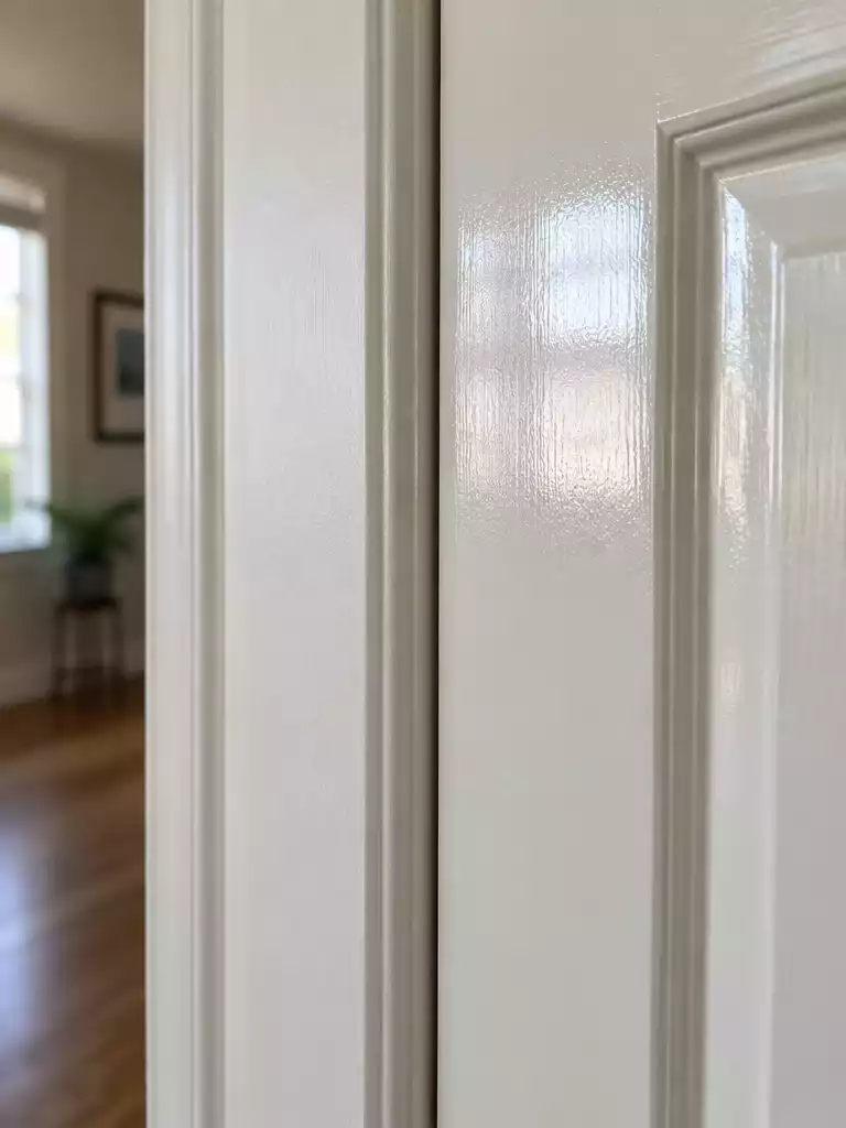
Control how light bounces off your surfaces to achieve a cohesive, professional look.
Many homeowners make the mistake of assuming that if they use the exact same paint color code for their trim and their door, the two will look identical. In practice, this often leads to a jarring visual disconnect because of specular reflection—the way light physically bounces off a surface based on its sheen.
Even when the pigment is a perfect match, a door painted in a higher sheen will almost always appear richer, deeper, or even slightly darker than trim painted in a lower sheen. This happens because the smoother, glossier surface catches more light, which changes how your eye perceives the color’s depth and saturation.
The Industry Standard: Semi-gloss is the professional choice for both doors and trim because it balances durability with a clean, reflective quality. If you are aiming for a cohesive, intentional look throughout your home, keeping the sheen consistent across these elements is the most reliable way to avoid an accidental “patchwork” appearance.
If you find that your chosen color looks too intense or dark on the door compared to the trim, it is usually a sign that the sheen difference is creating an unintentional contrast. Before you commit to a full gallon, test your color in the specific sheen you intend to use for the final project.
Sheen Check:
- Paint one sample board in semi-gloss and one in your trim’s finish (likely satin or eggshell).
- Hold them together in the actual light of the doorway to see how the light shift changes the color.
- Remember that higher sheens will highlight surface imperfections, so prep your door accordingly.
If your goal is a specific architectural style—such as a “color-drenched” or “recessive” look—you might intentionally choose to match the sheen exactly. However, for most standard residential updates, embracing the subtle shift that comes with a high-quality semi-gloss on the door is what provides that crisp, finished result you see in professional design projects.
⭐ Our Picks for Durable Door Mats
✨ Editor’s Pick
Funny Indoor Welcome Mat for Entryway
Heavy Duty Waterproof Front Door Mat
Blank Artificial Coir Crafting Door Mats
💡 Why Sheen Consistency Matters:
- Visual Depth: Higher sheen levels pull more light into the surface, which can make colors appear significantly more saturated or deeper than they do on flat trim.
- Surface Awareness: Because glossier finishes catch more light, they act like a spotlight on any minor dents or sanding scratches left on your door during prep work.
- Cohesive Flow: Matching your door sheen to your trim creates a unified architectural “frame” for your rooms, preventing the door from feeling like an afterthought or a mismatched addition.
8. Overlooking adjacent walls
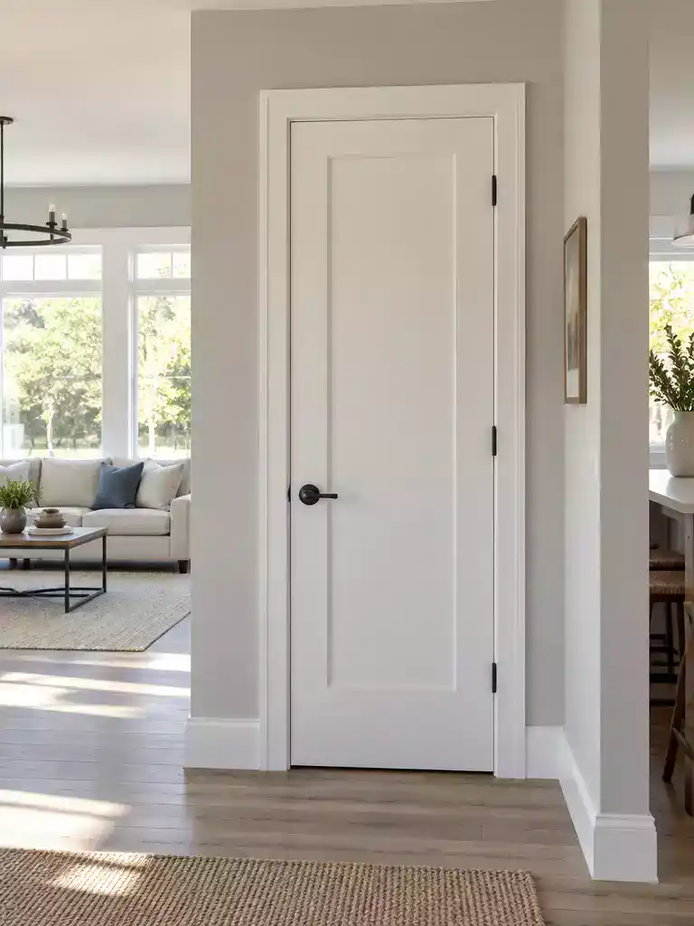
Create a cohesive flow by treating the wall, trim, and door as one unit.
When you focus exclusively on your new trim, it is easy to forget that the door exists within a three-surface relationship: the wall, the trim, and the door. If your wall color doesn’t actively support the new trim, the doorway can quickly become a jarring visual interruption rather than a smooth architectural transition.
The wall is almost always the largest surface in your field of vision. If you paint your trim a crisp, cool white but leave your walls in a warm, buttery beige, that door frame is going to look like it belongs in a different house entirely.
Pro Tip: Bridging the Gap
In open-concept spaces with long sightlines, treat your door color as the bridge between your wall and trim. If your wall is a dark or saturated tone, a mid-tone door color often feels more intentional and less like a floating white rectangle.
To avoid this, evaluate your samples while standing back far enough to see the wall, the trim, and the door all at once. If the doorway feels like a “hole” in the wall rather than a part of the room’s design, your color choices are likely fighting each other.
The Transition Checklist
- Does the wall color make the trim look dirty or discolored?
- Is the door color fighting the wall for dominance in the room?
- Does the transition feel intentional, or does it look like the paint was chosen separately for each surface?
If you find that the wall color is the primary culprit, it is often better to adjust the wall paint than to force a door color to match a trim that feels “off.” Remember, your goal is to create a seamless architectural unit, not a collection of individual paint samples.
⭐ Best Mats for High Traffic Areas
Extra Durable Waterproof Front Door Mat
✨ Editor’s Pick
Hand Painted Coconut Fiber Welcome Mat
⚖️ Quick Decision Guide: Managing Sightlines
- Choose a bridge tone if: Your walls are bold or dark and you want the door to feel grounded and intentional.
- Skip the high contrast if: You are working in a small, narrow hallway where multiple white shades will create visual clutter.
- Pair it with: A consistent sheen across all trim and doors to help the eye glide past the transition effortlessly.
9. Treating white as neutral
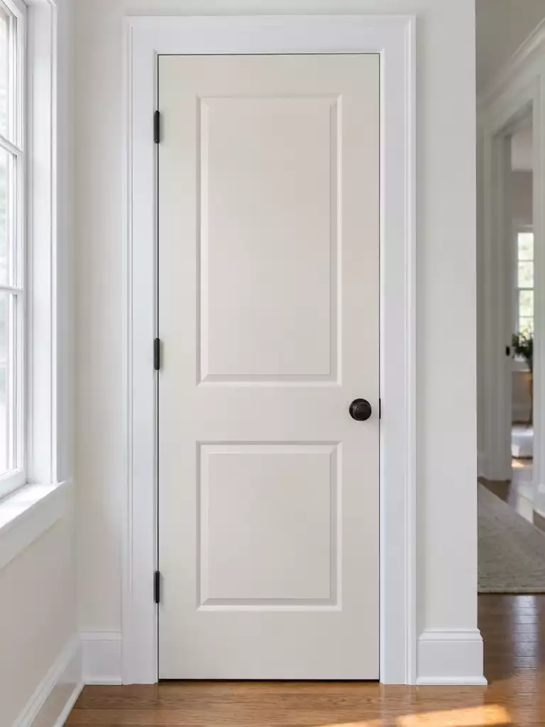
Avoid the common mistake of assuming all whites are universal and interchangeable.
One of the most persistent myths in home renovation is the idea that white is a universal neutral that automatically goes with everything. In practice, white is one of the most complex colors to manage because it is heavily influenced by its undertones.
When you place two different whites together, such as a door and its surrounding trim, any temperature mismatch becomes immediately visible. If the trim leans cool and the door leans warm, the result often looks like a mistake rather than a deliberate design choice.
Temperature Matching: The secret to a professional finish is treating your whites as a coordinated family. You must match the temperature—warm-to-warm or cool-to-cool—to ensure the transition between the trim and the door feels intentional.
To avoid a clashing look, look at the specific characteristics of popular white paints. Benjamin Moore White Dove or Sherwin-Williams Alabaster, for example, carry distinct warm, creamy undertones. Conversely, Benjamin Moore Chantilly Lace or Sherwin-Williams Extra White lean toward a cooler, sharper aesthetic.
If you attempt a white-on-white pairing without checking the bias, you are far more likely to end up with a “dirty” or “dingy” look. Never assume that a paint chip labeled “white” will work with the trim you just installed. Always test your door color directly against the new trim in multiple lighting conditions before committing to a full gallon.
⭐ Great Mats for Your Home Entrance
✨ Editor’s Pick
Buffalo Plaid Washable Front Door Mat
Black White Buffalo Plaid Decorative Mat
🧰 Ask Before You Hire:
- Undertone verification: Can you confirm the specific undertone bias of this white against my existing trim samples?
- Finish coordination: Will you apply a test patch in both morning light and evening artificial light before painting?
- Sheen consistency: How will we ensure the door sheen complements the trim without creating an accidental color shift?
With all nine variables now in front of you, the path to a cohesive look is far more manageable than a simple trial-and-error approach. You don’t need to address every single point to achieve a professional result; instead, focusing on the relationship between your trim undertones and your light sources will provide the most significant impact on how your home presents.
Start by performing a True White Paper Test to confirm your trim’s bias, as this one decision dictates every other color choice you make. When you align your door color with the temperature of your trim, you eliminate the muddy or dingy appearance that often forces a second round of painting. A few deliberate, informed choices are what separate a space that feels like a mistake from one that looks intentionally designed. Once you have that foundation set, the rest of your home’s transitions will naturally fall into place with far less effort.
Related posts
 8 Stylish Ways to Repaint Interior Doors
 Gray Walls White Trim Black Doors: 12 Rooms That Get It Right
 12 Oak Doors With White Trim That Actually Look Designed
 Should Interior Doors Match the Walls or the Trim?
 17 Creative Door Design Color Combinations
 What Color Door Works With a Black Stair Railing?
 Choosing a Door Color When the Rooms on Each Side Are Different Colors
 10 Black Front Door Trim Ideas