
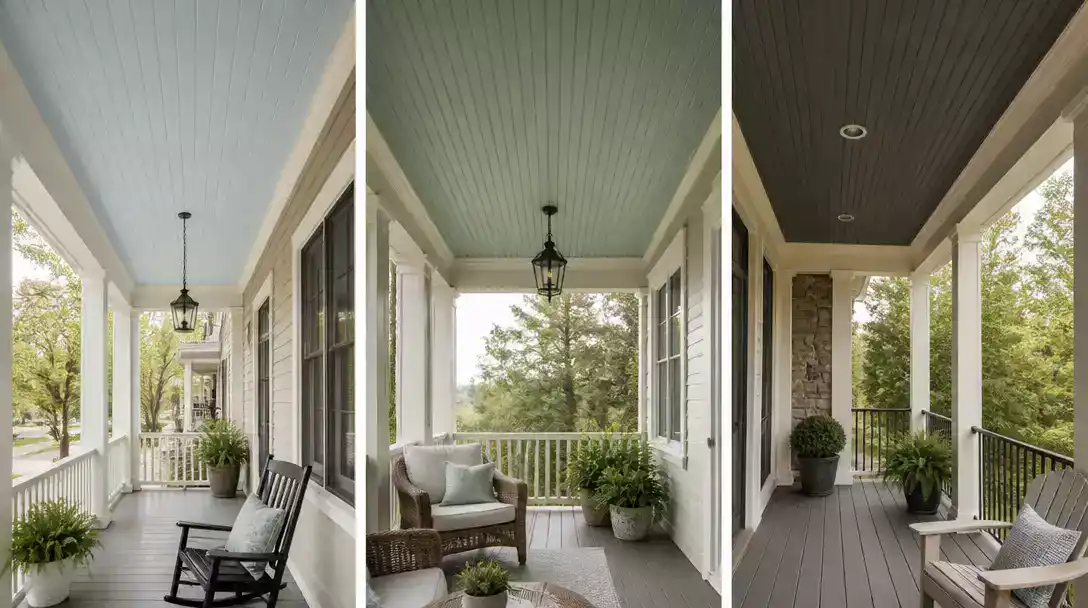
10 Sherwin-Williams porch ceiling color ideas can help you find a shade that works with your siding, trim, and changing daylight. This roundup brings together 10 door-worthy color ideas to save, from airy blues and soft green-blues to warm neutrals and deeper contrast. Start with the first light-blue option.
Topsail
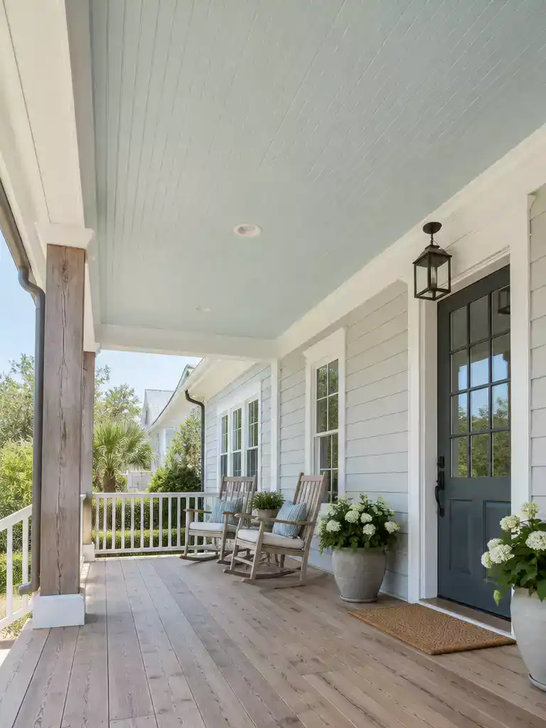
A light blue-green ceiling that stays calm and airy in every kind of daylight.
As an Amazon Associate I earn from qualifying purchases. Affiliate links may earn me a commission at no extra cost to you.
Picture a paint chip that’s almost white but not quite, with a little gray and a little green sitting underneath the blue. That’s Sherwin-Williams Topsail SW 6217. It’s a restrained choice for anyone who wants a soft blue-green overhead without the ceiling becoming the loudest thing on the porch.
The number on the chip is only half the story. In bright natural light, Topsail reads as an airy blue, and that’s the look most people are picturing. Under warmer or artificial light, the green in it can come forward and turn the ceiling into a greener aqua.
Because of that shift, judge your sample on the porch itself. A color that looks perfect under a showroom bulb can look different above your front door at four in the afternoon.
How to test it on your porch:
- Get a large sample rather than a small chip, and put it up on the actual ceiling plane.
- Hold it beside your siding and trim, then beside any visible natural wood like a porch floor or door.
- Check it in bright midday light and again in warmer evening light.
- Look from under the porch, then from the yard, so you see the ceiling with the whole façade.
Good fit if
Your siding is cool-toned or coastal, your trim is white or soft off-white, and you want a light blue-green that doesn’t shout. Natural wood on the porch floor or door will also sit comfortably beside it.
Skip it if
You want a vivid or saturated blue that reads as a bold statement. Topsail is quiet by design.
The LRV is a reported figure from listings, so treat it as a rough reference rather than a guarantee of how the ceiling will look. The sample on your own porch is the more reliable check.
💡 The Detail That Keeps Topsail Calm:
Because Topsail sits so close to white, it adds a cool hint rather than a strong color, which means the nearby details do much of the visual work. A warm metal or dark lantern hung from the ceiling gives the eye a clear focal point, while the blue-green stays in the background. Without one contrasting element, a very light overhead plane can start to blend into pale trim and make the porch feel a little flat.
Tradewind
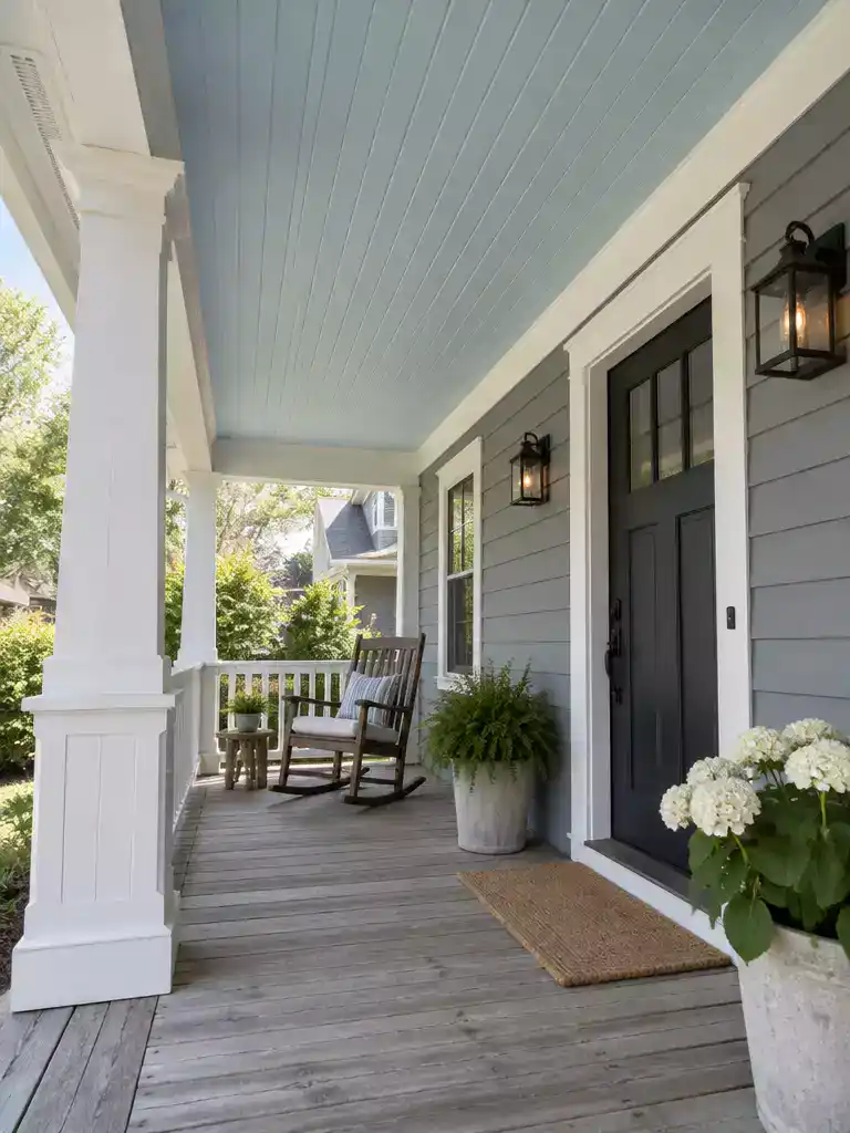
A soft blue overhead that lets your porch feel open without stealing the show.
Tradewind sits in the airy-blue part of this lineup, and it makes the most sense on a porch where the house already leans cool. Think gray or blue-toned siding, crisp white trim, and a ceiling you want to echo those tones without competing with a bold siding color.
Run a side-by-side test with Topsail
Hold a Tradewind sample against your trim and siding, then place a Topsail sample beside it in the same spot. Note which one reads bluer, which one reads greener, and which looks lighter or more muted against the same materials.
Don’t assume the difference you expect is the one you actually see. Write down what the two samples show in your own light.
What to check on each sample
- Hold it overhead, not only against a wall or a phone screen, because the ceiling plane and the surrounding surfaces change how the color reads.
- Compare it to the siding first, then the trim, to see whether it connects with the cool exterior tones or pulls against them.
- Look at it in the light the porch gets most often, both bright midday sun and the warmer late-afternoon hours.
- Check it beside fixed materials like porch flooring or a wood door, and note whether the blue settles into the scene or looks like a separate statement.
Good fit: a cool-toned exterior that needs a blue ceiling to stay in the background. Skip it if your siding is a strong, saturated color, since a pale blue overhead may end up feeling like a second color fighting for attention.
Whether Tradewind works comes down to the sample in your own light, not the name on the label. If it holds its place against the cool exterior colors, it’s a strong candidate, and if it blends into everything or clashes with the siding, the next color on the list may suit you better.
💡 Why This Side-by-Side Works:
Color is judged against its neighbors, not in isolation. A pale blue can look clearly blue on a chip, then drift grayer once it sits under cool siding. Holding two samples in the same spot shows which one keeps its character and which one gets absorbed by the surroundings.
Keep the one that holds: The sample that stays recognizable as blue beside your siding is the one to keep.
Set the blue samples beside your actual siding, trim, and porch materials, then view them overhead; that comparison says more than a chip on its own. A confident ceiling doesn’t depend on getting every color in this lineup right – one shade that sits well with the fixed exterior can carry the decision.
🎯 Where to Focus:
- Compare against siding and trim, using an exterior color guide.
- View both overhead beside porch flooring, brick, or exposed wood.
- Check changing daylight; note if a shade feels too strong, cool, warm, or trim-close.
Upward
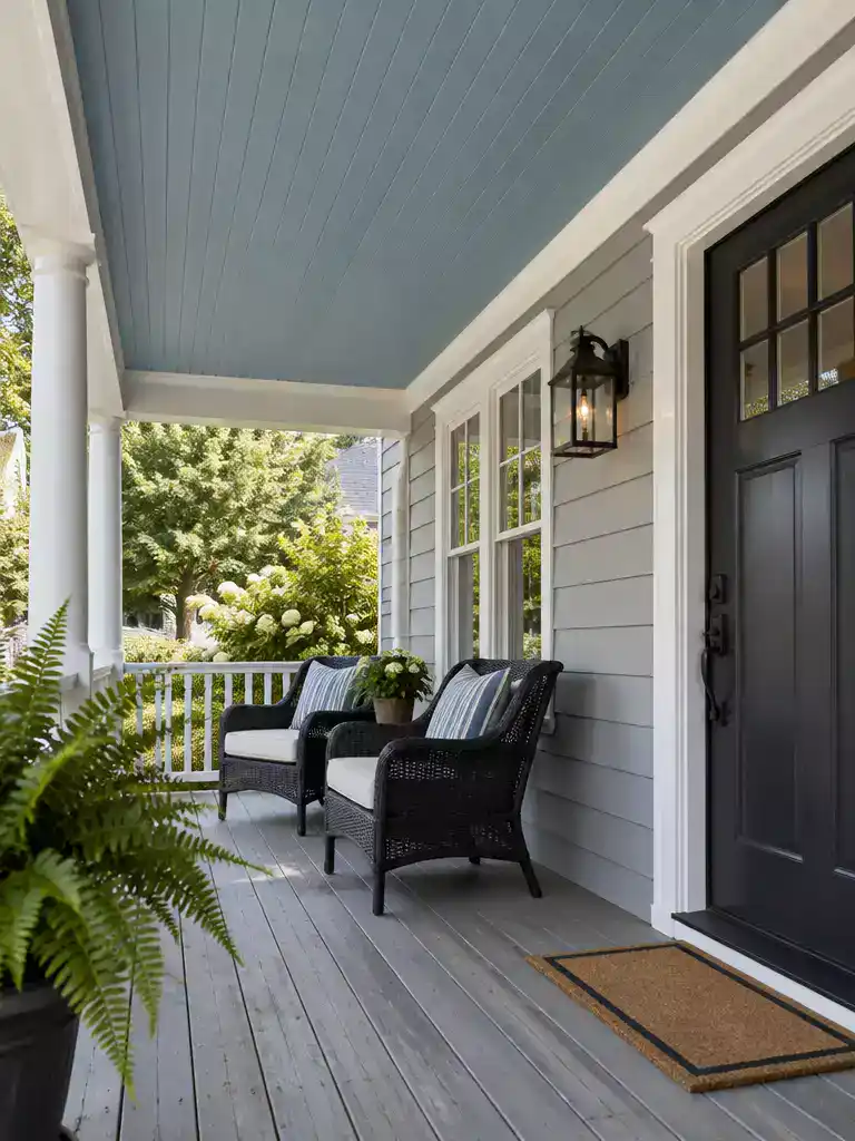
A blue ceiling that either stands out clearly or settles quietly into the house.
Upward is the blue to consider when you want the ceiling to read as a real blue, not a whisper of one. It sits alongside the lighter blues earlier in this list, but it asks a different question.
The question is whether you want the overhead plane to announce itself, or to sit calmly beside the siding and trim. That answer matters more than the color name.
Run the side-by-side test
- Get large samples of Upward, Topsail, and Tradewind so you can compare them with each other and with your trim.
- Apply or tape each sample to the actual porch ceiling, not a wall or a wall chart.
- Stand beneath the porch and check each one against the trim in the light you usually get.
Phone screens and vertical chips tell you little here. The ceiling plane changes how a blue reads, so judge it overhead.
The one question to ask each sample: does it stay legible as blue in this light, or does it blend into the nearby surfaces?
Good fit if
Your siding and trim are cool-toned, and you want the blue to be the visible point of the porch.
Probably skip if
Your exterior runs warm and you wanted the ceiling to disappear into it.
If the sample holds its blue beside your trim, it’s a serious contender for your porch. If it fades into the siding, a quieter color will likely suit the house better.
💡 Give the Blue a Job:
Think of the ceiling as a fifth wall and decide what job the blue should do. If your door, shutters, or railings already carry a strong accent, a blue overhead can tie them together, or it can split attention. With a quiet exterior, a clear blue ceiling becomes the one deliberate color note. Settle that role first, then let the sample show whether Upward plays it.
Sea Salt
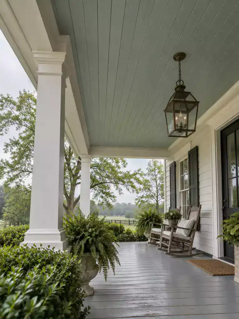
A soft green-blue ceiling tying pale trim and garden greenery together overhead.
Sea Salt sits in the soft green-blue group, and it’s the one to test when you can’t decide between a ceiling that just hints at color and one that clearly reads as green-blue. Picture a porch with crisp white trim, a row of boxwood along the rail, and siding in a quiet neutral. That’s the kind of porch where this shade is worth a real test.
The question you’re really answering is whether the ceiling should whisper color or stand out as its own green-blue surface. The sample should answer that, not the name on the chip.
Test it in this order
Compare the sample against the white trim first, then the siding, then any greenery nearby. Doing it in that order keeps the trim from being judged in isolation.
- Hold a large sample beside the white trim. Note whether the ceiling looks like a continuation of the trim or a separate color.
- Move it next to the siding. Look for whether it links the upper porch to the exterior or fights with the siding tone.
- Place it near the boxwood or ferns. Foliage can pull the ceiling greener or cooler depending on the light.
- Check it in the morning, at midday, and in the evening. Nearby walls and leaves bounce color onto the ceiling, so one look is never enough.
- Lean toward a hint of color if the sample sits quietly against the trim and the greenery picks up a little of its tone.
- Lean toward a distinct green-blue if you want the ceiling to read clearly as a color, and it still holds its own against the siding.
This is a test case, not a guaranteed match. Your siding, trim, and daylight decide how the sample actually looks, so treat any color name as a starting point only.
Sea Salt suits a porch with pale trim and planted landscaping, where the ceiling is seen alongside both. If your siding is a strong, saturated color and you have little greenery, judge this one harder before committing.
💡 Why a Green-Blue Ceiling Feels Calm Overhead:
People usually see a porch ceiling from below, at an angle, often while sitting in a chair. In that position, the color becomes a broad wash overhead rather than the small chip you held up earlier. A soft green-blue tends to read like a quiet extension of the sky or tree canopy, so it feels fresh without pulling attention from the door or the view.
Judge it from a seat: Check the sample from a seated spot, not only while standing beneath it up close.
Rainwashed
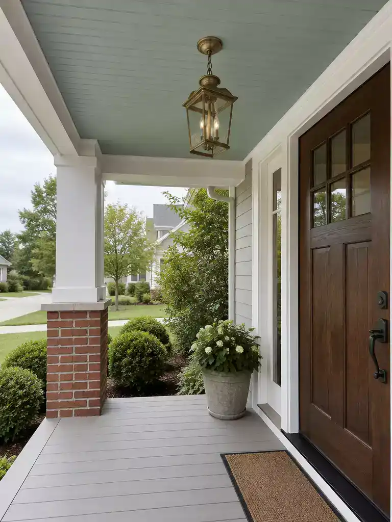
A porch ceiling that sits calmly against real wood and brick.
Picture a green-blue ceiling over pale gray decking, a dark wood front door, and a brick column at the top step. Done well, it reads as part of the house; done badly, it looks like a separate paint decision nobody checked outside.
Rainwashed is a soft green-blue candidate for homeowners who want the ceiling to relate to the porch’s natural materials rather than the trim. Its final character depends on your sample, so let the paint show you whether it leans bluer or greener in your light.
Start with the surfaces the ceiling will sit above. Hold a large sample beside each one separately so you can see which material pulls the color one way or the other.
- Porch decking, whether stained wood, composite, or painted concrete
- The front door, which often sets the darkest tone on the porch
- Brick or stone on columns, piers, or a half wall
Check it from the yard, not only from under the porch. Stand at the walkway or the bottom step and look up with the full front of the house in view. A green-blue that feels calm overhead can read as a separate color once the façade is behind it.
As you test, jot down a few specifics while the samples are still in place.
- Does the ceiling read bluer or greener beside the decking?
- Does the dark door make the ceiling look lighter or cooler than it does alone?
- From the yard, does the ceiling feel like part of the front of the house?
Rainwashed suits a home with natural wood or masonry you want to keep in the foreground, and a porch you see from the walkway as often as from the chairs. Skip it if your siding and door are both bold colors, since a green-blue ceiling will then have to compete with them.
💡 The Detail Your Floor Adds to the Ceiling:
Here’s something easy to miss under a porch roof. Light bouncing off the floor and nearby walls travels upward, so the ceiling picks up some of whatever those surfaces reflect. Pale gray decking can cool a green-blue, while a warm wood floor may nudge it softer and greener. Compare your sample near the steps and near the wall before you decide.
Retreat
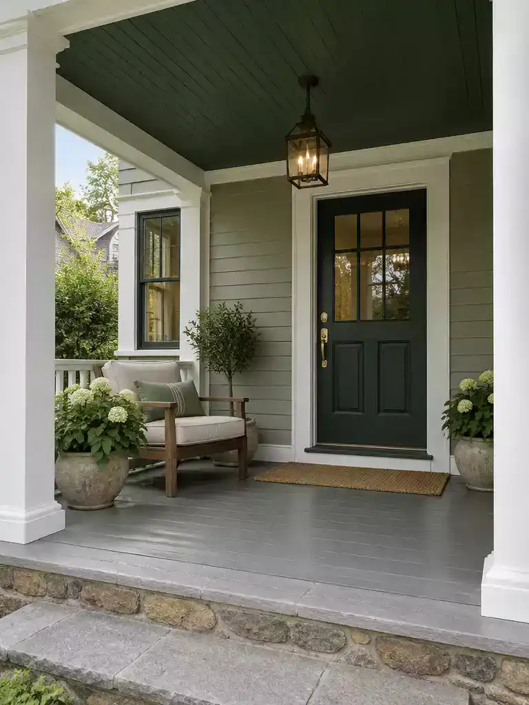
A deep green porch ceiling that makes the covered entry feel like a sheltered retreat.
Picture a covered porch on the shady side of the house, low enough that the ceiling feels close when you stand under it. That’s where Retreat earns a serious look, because it’s the deeper green direction in this lineup and it changes the feel of a porch more than the pale blues or neutrals do.
The real question is contrast. A darker green overhead can make the porch feel like an intentionally enclosed room, tucked into the house. On a porch that already sits low or gets little light, the same color can also press down on the space.
Ask this on-site: Does the darker ceiling make the porch feel like a cozy outdoor room, or does it make a low space feel heavier? Your answer to that question matters more than the color name.
A small chip won’t show you much here. Use a generous painted sample, since a large dark plane looks very different from a few inches of color.
- Hold the sample overhead against the ceiling plane, not on a vertical wall or a phone screen.
- Stand beneath the porch and note whether the ceiling feels enclosing, cozy, or heavy.
- Walk out to the yard or front approach and look at the ceiling together with the full façade.
- Compare the sample beside the siding and trim, then beside any green or earthy materials nearby, like shrubs, stone, or a wood door.
- Check it at more than one time of day, since shade on a porch shifts quickly.
Green or earthy exterior finishes can look like an obvious partner on paper. The sample decides whether they harmonize or compete with the ceiling.
If the sample makes the porch feel like a room you’d actually want to sit in, Retreat is a strong candidate. If it makes you want to duck, go lighter and choose one of the earlier options instead.
💡 Why a Dark Ceiling Changes the Feel of a Porch:
Darker colors absorb more light than pale ones, so a deep green ceiling tends to read as a heavy, quiet plane instead of a surface that bounces brightness back down. That’s why it can make a porch feel wrapped and private, and also why it can flatten a dim space. Your eye reads the ceiling as the frame over your head, so its visual weight matters as much as its green hue.
Takeaway: Judge how heavy the overhead plane feels, not only how green it looks.
Alabaster
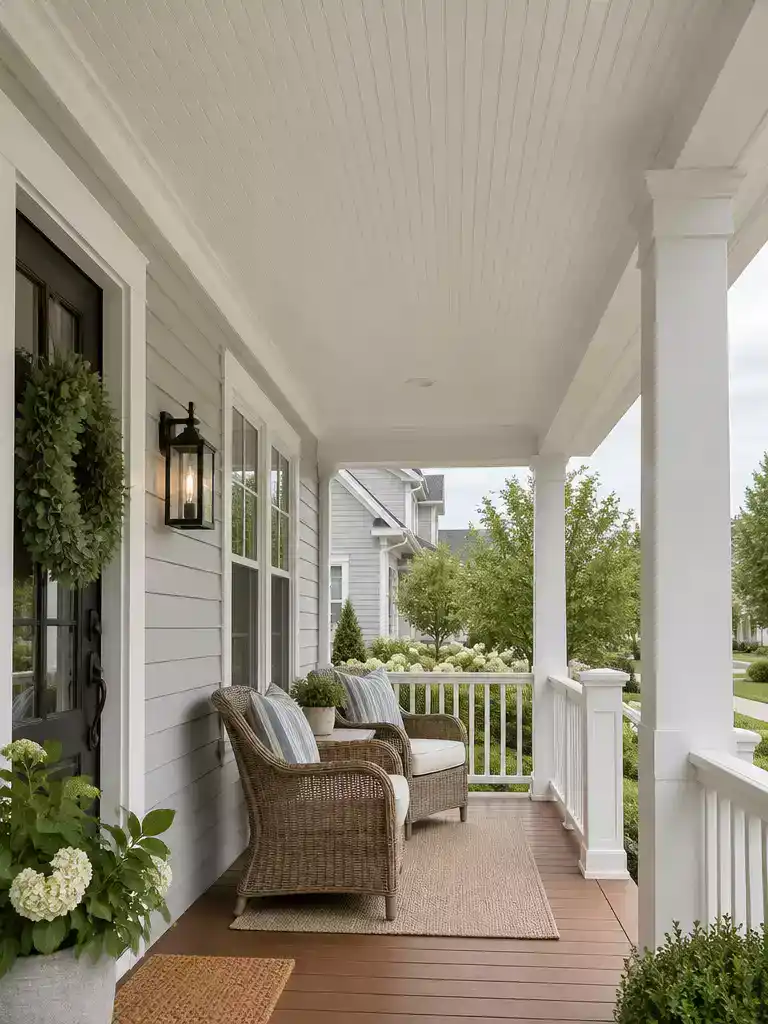
A light ceiling that ties your porch together instead of fighting the trim above it.
Alabaster is the light, low-contrast option in this lineup. If you want the porch ceiling to feel like a quiet, pale plane that belongs to the rest of the house, this is the shade to put on your short list. It is not a blue or a green-blue, so it works when you want lightness without a color statement overhead.
The question to answer on your porch is simple: do you want the ceiling to blend into your trim, or stand apart from it? Those two outcomes look very different, so test before you commit.
The trim check: Hold a large Alabaster sample against your actual trim, not a white card. Look at it in the porch’s light at the time you usually sit out there.
If the sample and trim look nearly alike, the ceiling will likely read as a continuation of the trim. That can feel calm and seamless, especially on a small porch.
If they look different in your light, the ceiling will likely stay visibly separate. Some people like that definition, and others find it distracting.
Then check the siding. A light ceiling can tie the upper porch area to pale exterior details, or it can make the difference between your siding and trim more obvious. Pay attention to which one happens on your house.
Good fit if you:
- Want a light ceiling without adding blue or green
- Have white or pale trim you’d like to echo overhead
- Prefer a calm, low-contrast porch
Skip it if you:
- Want the ceiling to be a clear color feature
- Find that your siding looks grayer or darker next to a light ceiling
⭐ Alabaster White Paint to Compare
✨ Editor’s Pick
Alabaster White Paint With Primer
💡 Why a Light Ceiling Changes the Whole Porch:
Easy to overlook: when you’re sitting under the porch, the ceiling is one of the brightest surfaces you see, especially in shade. A light shade like Alabaster can reflect daylight back toward the seating area, so the porch may feel more open than it would under a darker overhead. Check the sample beside any soffit or beadboard you can see, since those edges show mismatches fastest.
Natural Linen
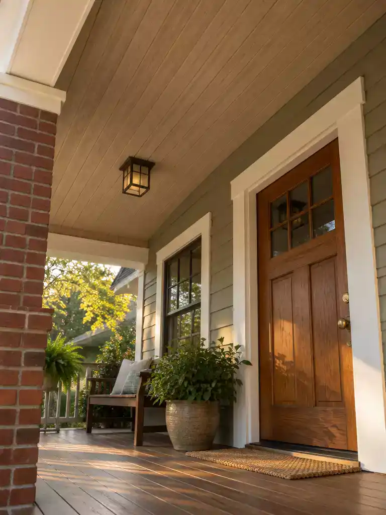
A warm ceiling that settles into the wood, brick, and earthy tones on your porch.
Natural Linen is the warm-neutral pick in this list, so it fits porches where the exterior already leans toward wood, brick, and earthy finishes. If your house reads cool blue or gray, it will feel like a deliberate shift rather than an easy match.
The first test is the floor and the door. Hold a large sample overhead beside your wood flooring, a stained wood door, or exposed brick, then check whether the ceiling seems to belong with those materials or looks like a separate color.
Here is what to look for during that test:
- Porch deck or flooring: does the ceiling warm up the boards, or does it make them look flatter?
- Wood door: does the stain sit comfortably under the sample, or does the door look redder or darker beside it?
- Brick or stone: does the ceiling calm the masonry, or does it push the brick toward orange?
- Trim: does the ceiling make the trim look whiter or grayer than it did before?
Light is the second test, and it matters more on porches with a mix of sun and shade. Look at the sample in the direct afternoon sun, then in the shaded corner where people actually sit, because a warm neutral can read differently from one end of the porch to the other.
Pro tip: Judge the sample against your siding and trim, not the name on the chip.
The name only tells you the family of color. Your house tells you whether it works.
Good fit if:
- Your exterior already has wood, brick, or tan and brown finishes.
- You want the ceiling to sit inside the palette, not add an accent.
Probably skip if:
- Your siding and trim are cool blue, gray, or green-leaning.
- You specifically want a blue or green-blue ceiling.
Choose it when you want the ceiling to belong to the house. Pass on it when a blue ceiling is what you have in mind.
🔢 Do It in This Order, So the Warm Tones Don’t Fool You:
Warm colors can quietly change what you see around them, so the order you judge things in matters for Natural Linen.
- Note how the floor, door, and brick look now, before any sample goes up overhead.
- Hold the sample overhead beside those materials, then check it again in the shaded seating spot.
- Step into the yard and judge the ceiling with siding, trim, and door in view.
Accessible Beige
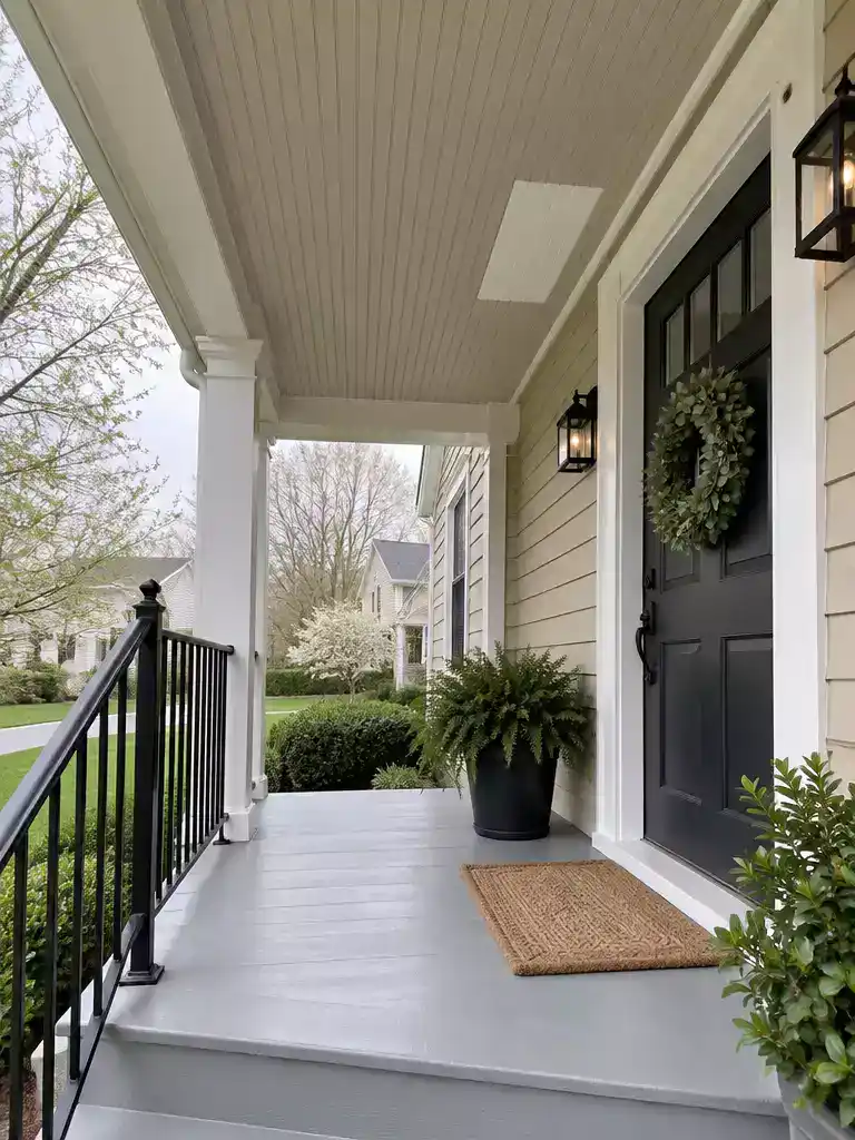
Pick a ceiling that settles into your exterior’s neutrals instead of fighting them for attention.
Accessible Beige suits a porch on a house that already runs on beige, tan, or mixed neutral finishes. The name tells you the color family, but it doesn’t tell you how the shade will sit against your house, so you’ll need to test it there.
Start with the siding. It covers the most area you’ll see from the yard, so a mismatch there is the first thing you’ll notice.
- Siding first. Does the ceiling blend into the larger neutral field, or read as a separate tan?
- Trim second. Check whether the ceiling looks like a continuation of the trim or stands apart from it.
- Every neutral, not just the closest one. If you have light trim and darker beige siding, hold the sample beside both.
The name alone won’t tell you whether this shade coordinates with your house. Daylight and the colors next to it change the result, so a chip held under store lights isn’t enough.
Paint a large swatch directly on the porch ceiling, or use a sample board big enough to read as a full plane. Look at it in morning and afternoon light, since the same beige can shift as the sun moves across the porch.
- Good fit: your exterior already runs on beige, tan, or mixed neutrals, and you want the ceiling to stay inside that family.
- Skip it: your house has a strong blue, green, or dark accent you want the ceiling to echo or contrast with.
💡 Why Beige Overhead Reads Differently:
Overhead is the one surface you see mostly in shadow, so beige there can shift toward warmer or grayer than it looked on a chip. Light bouncing up from decking, columns, and siding tints the ceiling too. That’s why a neutral reads as the calm base of the porch, not a color you notice.
Bottom line: Test beside the siding, but judge it overhead in real light.
Iron Ore
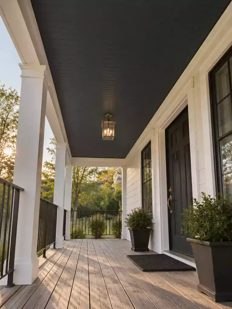
A deep overhead plane that turns your porch into a deliberate, confident feature.
Iron Ore is the darkest shade on this list, and it’s meant for one goal: making the porch ceiling something people actually notice. If you want the overhead plane to fade into a pale exterior, this is the wrong direction.
Dark colors overhead behave differently than they do on a paint chip. A small square can look moody, but a full porch ceiling covers far more of your view, so a small sample tells you very little.
Test a generous sample overhead. Tape up a piece large enough to cover a real section of ceiling, then check it in the light you actually get. Look from directly underneath the porch, then from the yard or walkway where the whole façade shows together.
Check the shaded spots first. A dark ceiling on a shaded or low porch can feel heavier than you expect. Give that exact spot the closest look before you commit.
Next, compare the sample with the dark details already on the house. Iron Ore either echoes those finishes or adds a second dark note, and you want to see which one happens.
- Window frames and entry door: Does the ceiling line up with them, or does it compete?
- Railings and posts: Dark bronze or black metal can tie in, or it can make the ceiling look like a separate color.
- Light trim: Hold the sample beside white trim so the contrast shows clearly.
- Porch floor and steps: Check whether the ceiling sits within the same dark family or stands apart.
If your exterior has no dark details at all, the ceiling becomes a brand-new contrast point. That can look intentional on a crisp white or pale gray house, or it can look like it came from a different home.
Skip this one if the porch is deeply shaded or you want the ceiling to disappear. A deep shade is a strong choice, and it works best when you want the ceiling to be part of the design.
🔢 Do It in This Order:
With a deep ceiling color, the order you decide and paint in can save you from touch-ups later.
- Decide on any dark trim, railing, or door color changes before you commit to the ceiling.
- Tape a generous sample overhead beside those colors and live with it for a few days.
- Paint the ceiling first, so drips land on trim you’re about to repaint anyway.
These 10 Sherwin-Williams porch ceiling color ideas span airy blues, softer green-blues, a deeper green, warm neutrals, a light neutral, and a high-contrast dark. The right choice is the one that relates well to your siding, trim, and visible materials in your porch’s own light. Topsail has a reported LRV around 75 and may shift from airy blue toward greener aqua in warmer or artificial light, a reminder that color names and screens can’t settle the decision. You don’t need to use every direction; one or two well-matched choices can define the whole ceiling.
Narrow the options to two or three, then compare generous samples overhead beside the siding and trim. Check them both from beneath the porch and from outside, where the ceiling meets the full façade. Start with the two color directions that suit your exterior best – perhaps blue against warm neutral – and let those real-life comparisons point to a clear choice.
Related posts
 10 Light Blue Front Porch Ceiling Ideas
 10 Rustic Multi Color Barn Door Ideas for Farmhouse Interiors
 11 Elegant French Door Color Ideas for Family Homes
 12 Wood Front Door Color Ideas for Timeless American Homes
 Front Door Color Ideas That Suit Red Brick Not Fight It
 11 Back Porch Door Ideas
 17 Creative Door Design Color Combinations
 The Door Color Mistakes That Show Up After You Repaint the Trim