
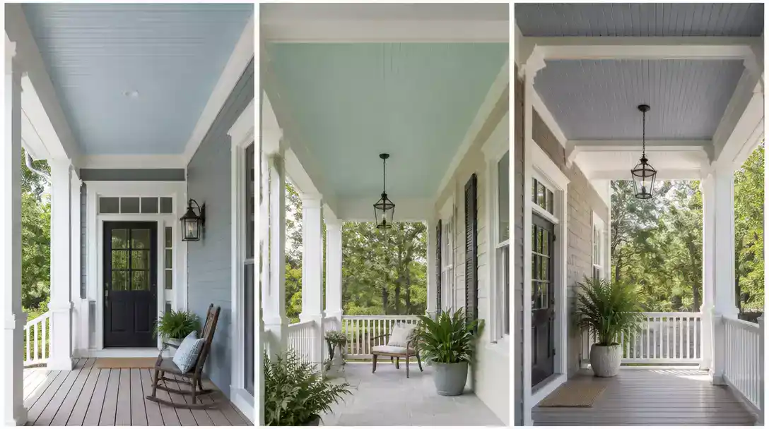
10 Light Blue Front Porch Ceiling Ideas help you compare pale blues that can look nearly white in sun or grayer in shade. This roundup covers 10 shades worth saving, from powdery blue to muted blue-gray and aqua, so you can find a fit for your exterior. Start with Powder Blue.
Powder Blue
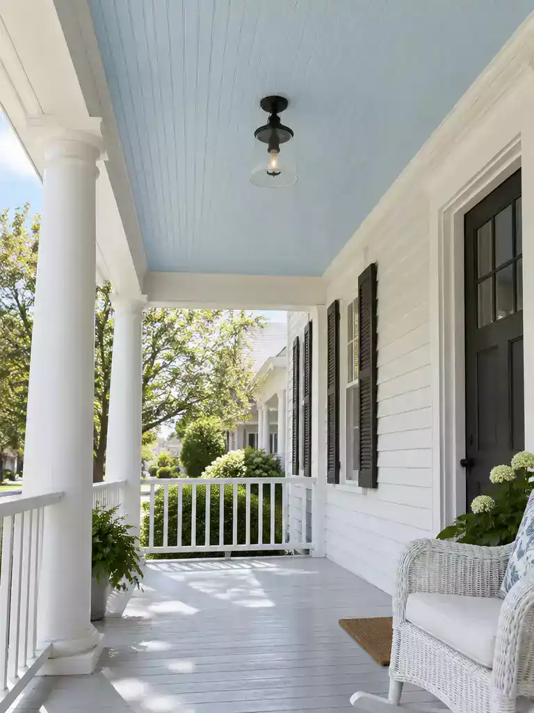
A soft sky overhead that makes a covered porch feel lighter and wider.
As an Amazon Associate I earn from qualifying purchases. Affiliate links may earn me a commission at no extra cost to you.
Powder blue is the cleanest, quietest blue on this list. It reads as a near-sky color rather than a statement, which makes it the right pick for a homeowner who wants blue overhead without anything that calls attention to itself.
Against white or off-white siding and trim, it keeps the crisp palette going. Overhead, the pale tone softens the heaviness a covered ceiling can have, so the porch feels a little higher and more open.
It suits a traditional white-trim porch best, or anyone who wants the most restrained blue in this set. Skip it if you want a clearly green, gray, or vivid blue, because this one will not give you that.
Powder blue is a style label, not a standardized paint formula. Each manufacturer’s version can run a little differently, so compare the actual sample on your ceiling before buying the full quantity.
If you find powder blue a touch too neutral, a small shift toward green makes the blue feel fresher and more playful. That is the direction the next shade takes.
💡 Designer Note: Why the Quiet Blue Depends on Its Trim:
Powder blue rarely succeeds or fails on its own. Because you look up at the ceiling, your eye reads its edges first: the beadboard seams, the crisp trim lines, and the finish on the porch light. Bright white trim makes the blue look like a deliberate sky band. If the trim runs cream or yellowed, the same blue can look dingy, so judge it against the trim you actually have.
Robin’s Egg Blue
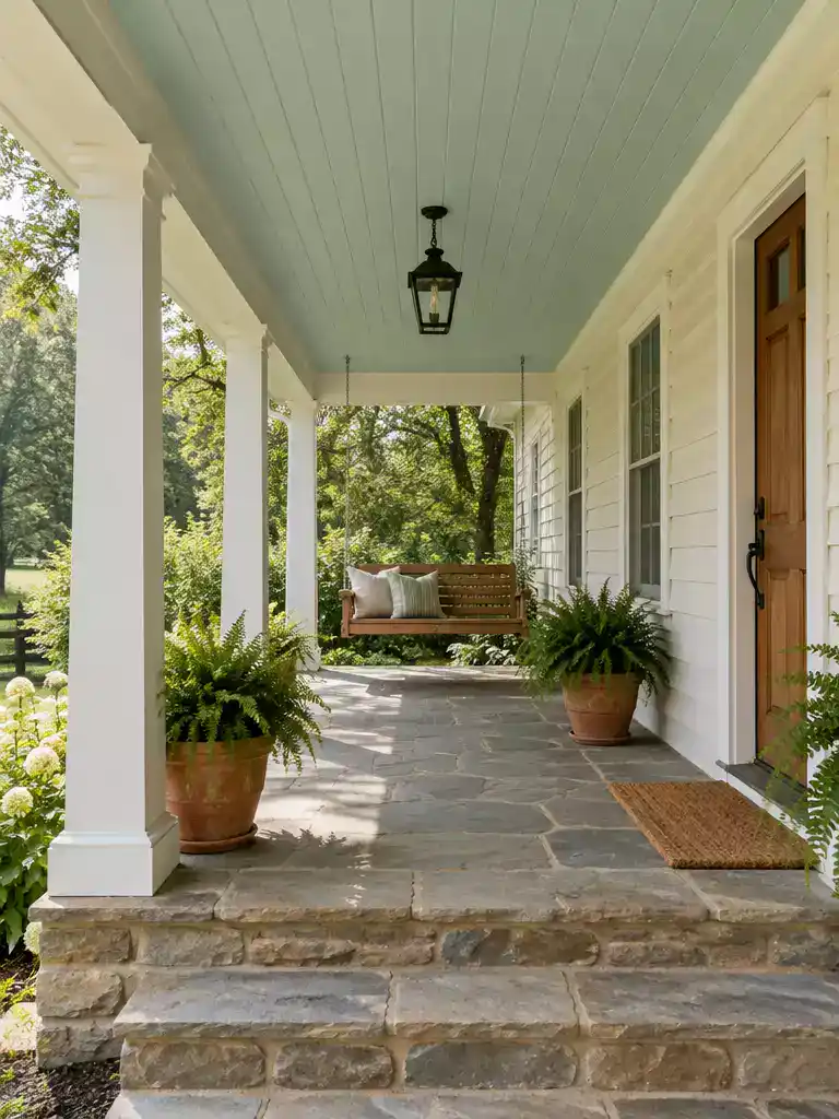
A fresher overhead blue that warms up cream and stone and makes your porch feel lighter.
Robin’s egg blue is the powder blue’s livelier cousin. Same pale, airy starting point, but a touch of green sneaks in, so it reads more aqua and less like a plain sky. If your porch needs a light ceiling with a little personality, this is the one that does it without going loud.
The green is what makes it work on a warm exterior. Cream, beige, and warm stone siding tend to look a little flat next to a clean cool blue, which can read as a sharp contrast. A hint of green softens that edge and ties in with warm tones, so the ceiling feels like part of the house instead of a separate color decision.
Who it suits: A porch with warm siding or stone that wants a light ceiling with a fresher, slightly playful note.
Who should skip it: Anyone who wants a restrained, nearly neutral ceiling, or who dislikes a coastal, beachy feel.
Before you commit, hold the paint beside your fixed exterior finishes and look for the green. In a pale tone it can stay quiet, but on some siding or next to a bright floor it can grow noticeable fast. If it starts pulling toward a seafoam or mint, it may be stronger than you wanted overhead.
Keep in mind that this name is a style label, not a standard formula. Two brands can sell a robin’s egg blue that look nothing alike, so test the actual can you plan to buy.
🏡 How This Works on a Real Porch:
- Seated sightline: Check the sample from the porch swing or chair, since that’s where the ceiling is actually seen.
- Evening light: Look at it under your fixture after dark, since warm bulbs can change how the green reads.
- Lived-in finish: Let the ceiling stay the calm backdrop, and balance it with warm-toned rugs, cushions, or pots.
Pale blue can shift sharply once overhead: direct sun may wash out the blue, while shade can deepen its gray or green undertone, and nearby finishes can change the effect. Paint a generous sample on the ceiling or a board held flat overhead, then view it in morning, midday, and evening light beside siding, trim, flooring, and roof materials; this exterior color guide offers another way to think through how colors relate. Names are only rough cues, so confirm the actual formula; testing two close contenders in place can reveal which undertone suits your home.
The shade that works in your light and with your finishes is the decision worth getting right.
Icy Blue
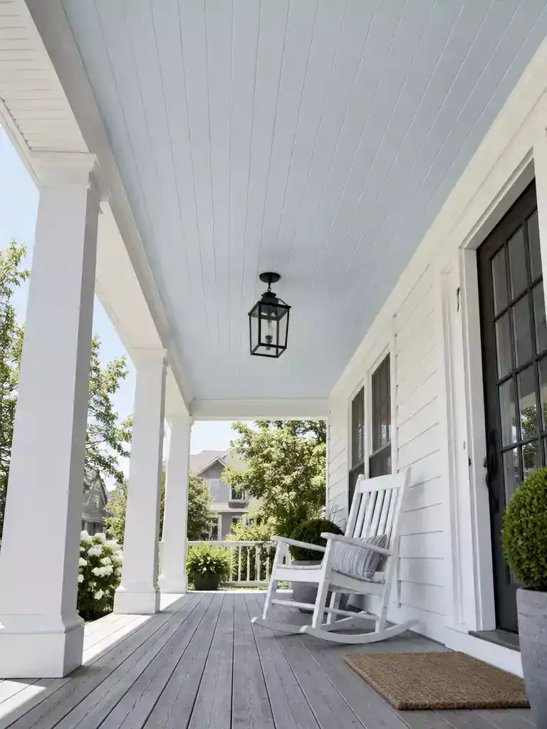
A cool, airy ceiling that makes a bright white porch feel lighter overhead.
Icy Blue sits at the cool, very light end of this group. Hold a chip of it next to a fresh coat of white trim and you’ll see a faint silvery crispness that Powder Blue doesn’t have. It’s the choice for a bright porch with white siding and trim, where an open, cool ceiling is exactly the point.
The catch is what direct sun does to it. On a clear afternoon this blue can look almost white overhead, so the color you chose in the store may barely register on the ceiling. That’s the tradeoff: maximum lightness, with less visible color in strong light.
- Good fit: a white-trimmed porch with cool or neutral finishes, where you want the ceiling to feel like an extension of the sky.
- Skip it: a porch with warm cream, beige, or stone materials, where the cool cast can look stark next to them.
- Skip it: anyone who wants the blue to stay clearly visible in full sun.
Check it at noon. Judge this one at the brightest time of day as well as in shade, because a sample that looks lovely at 8 a.m. may vanish by 1 p.m.
Before you buy, look at the sample on the ceiling at its brightest and its darkest, then decide whether you can live with it reading almost white. If you can, this is one of the airiest overhead colors you can pick. If you need a blue you can point to from the driveway, move on to the next shade.
📈 Does This Blue Pay Off Over Time?
Icy Blue is a finish you’ll mostly enjoy for its look, not for a resale bump. Sources don’t tie pale blue ceiling color to a reliable premium, so the payoff is an airier porch. Longevity depends more on prep and exposure than on the blue itself, and a sound, well-primed coat can hold up longer.
Takeaway: Spend on prep and an exterior-grade coat, not on chasing a shade for resale.
Silver Blue
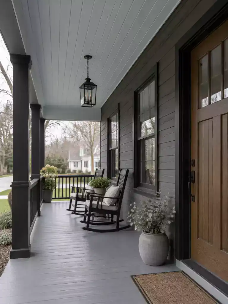
A quiet silver-blue ceiling that lets a gray or black-trimmed facade feel calm and deliberate.
Picture a covered porch with charcoal fiber-cement siding and black window frames. A blue overhead there needs to be quiet enough not to compete with the house, and that is the job Silver Blue does well.
This is the grayest blue in the set. Its gray content makes it read muted and slightly reflective, closer to brushed metal than to open sky, so it sits easily beside cool finishes.
It suits gray siding, cool trim, black trim, or a contemporary exterior. The gray connects with those materials without adding a bright color pop, so the ceiling feels intentional rather than decorative.
Pick Silver Blue if you want a blue ceiling that stays understated inside a cool-toned palette.
- Your siding is gray, your trim is cool white or black, and the look is contemporary or modern farmhouse.
- You like the ceiling to be felt more than noticed from the street.
Skip it if the ceiling needs to stand out clearly as blue. It will look more like a soft neutral than a color.
The risk of too much gray: the ceiling can drift toward a gray-white and lose its sky-like quality entirely.
If the sample looks like a cool neutral next to your trim, it has moved past Silver Blue’s intended range.
Manufacturer formulas for silver blues vary, so the name alone won’t tell you how the color will behave. Hold the chip or a painted board against your siding, trim, and porch floor, then check it at morning and evening light.
Silver Blue is the most restrained option in the blue-gray zone. If you want the ceiling to bring a little freshness instead, Pale Aqua moves in the opposite direction, toward green.
💡 Why This Works With Cool Exteriors:
Gray does something a clearer blue can’t: it lowers the ceiling’s visual volume. Instead of pulling the eye upward toward open sky, the surface becomes a calm plane that catches light softly. Your attention stays on the siding, the door, and the railings, which is exactly what a charcoal or black-trimmed facade needs from the space overhead.
Why it works: the ceiling supports the house rather than competing with it.
Pale Aqua
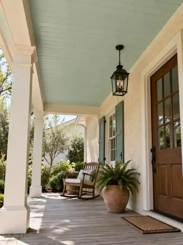
A cool, fresh ceiling that brightens a warm cream porch and makes it feel lighter overhead.
Pale aqua is the greenest blue on this list, and it’s the one to pick when your house is already warm. Think cream siding, beige trim, or a stone porch wall. Against those, a cool aqua ceiling reads as a deliberate, refreshing contrast rather than a blue that gets lost.
The trade-off is personality. This is the shade that brings a coastal, cabana feel to a porch, so it’s a poor match for a homeowner who wants a quiet, nearly neutral overhead. If that’s you, look at the gray-leaning blues instead.
Be careful with the word “aqua” on a paint label. Manufacturers balance the green and blue differently, so two cans with the same name can read quite differently on a ceiling. Put the actual sample up beside your warm materials before you commit.
Skip pale aqua if:
- Your roof is a strong blue, since vivid aqua can fight with it.
- You want a low-key, blue-gray ceiling that stays out of the way.
- Your siding is cool gray or black, where it can look like an accent that doesn’t belong.
If the porch is cream, beige, or stone and you want a fresh overhead note, pale aqua earns its spot. Test it at morning and evening, because strong sun can wash it out while shade brings out more of the green.
Faded Denim
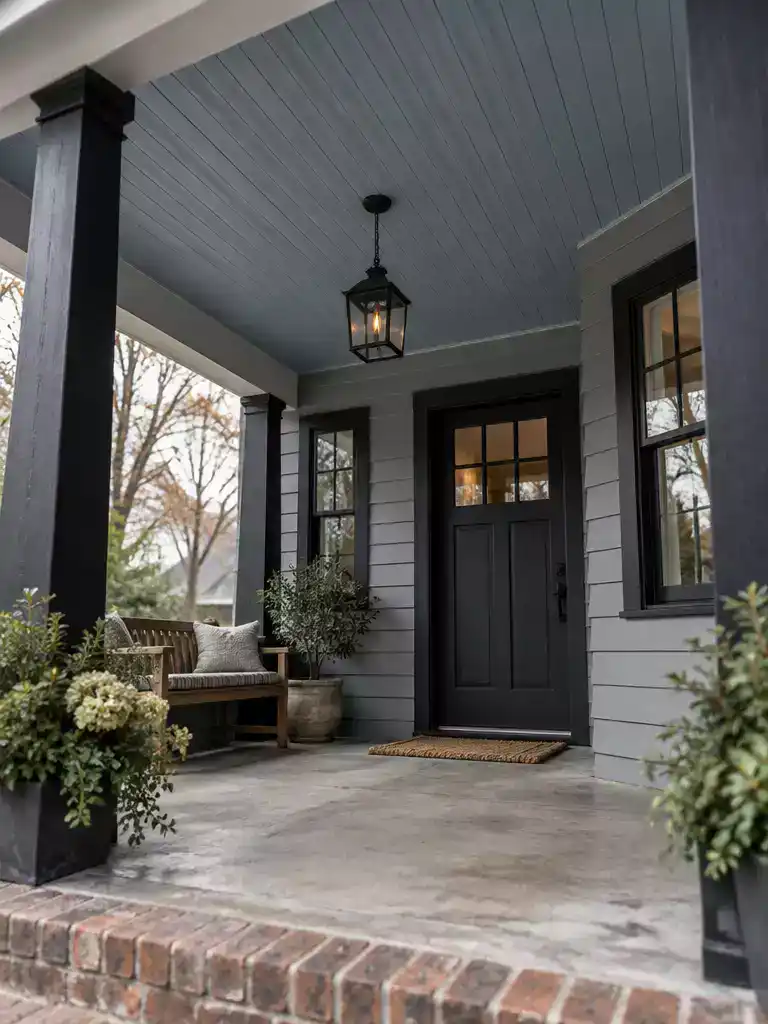
A calm, grounded blue overhead that sits quietly against modern gray and black finishes.
Faded Denim is the deeper, quieter end of this list. Think less open sky and more worn work-shirt blue, with enough gray in it that it reads as a color you notice only after a second look. It suits a porch with gray siding, black trim, or a clean contemporary facade, where a bright blue would feel like an add-on.
Its character comes from the gray. Where Powder Blue or Icy Blue lift the ceiling and make it feel like a window to the sky, Faded Denim pulls the eye down and holds it. The result is a ceiling that feels settled and intentional rather than airy.
Choose Faded Denim if:
- Your siding is gray, charcoal, or cool-toned.
- Your trim is black or a deep neutral.
- You want a muted blue presence overhead and can give up some of the open-sky effect.
Skip it if your main goal is the lightest, most expansive-looking ceiling. The added depth and gray make it less airy than Powder Blue, Icy Blue, or Cloud Blue, and it will not brighten a dim porch the way a pale sky tone does.
On a house with a blue or otherwise strongly colored roof, this family is the safer bet. A very pale, gray-leaning blue sits calmly under a bold roof, while a vivid aqua can start to fight with it.
Before you buy the paint
- Hold a large sample flat against the ceiling, not a chip on the wall.
- Check it beside the fixed siding, trim, and column color in both sun and shade.
- Confirm the exact manufacturer shade, since “faded denim” is a style name and not a standard formula.
🔢 Do It in This Order:
Muted blues tend to show patchiness and uneven coverage, so the order of prep and coating decides how clean the final ceiling looks.
- Clear the ceiling of dust, loose paint, and insect residue, then repair any damage.
- Address moisture sources and failing coatings first, since new paint over either is unlikely to hold up.
- Prime for the substrate type, then topcoat with exterior-grade paint once primer is fully dry.
Cloud Blue
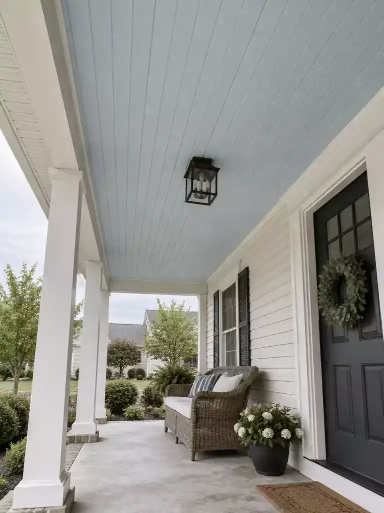
A calm, barely-there blue overhead that lets your porch ceiling melt into the sky.
Cloud Blue is the softest, most diffuse blue in this set. Think of the color you see at the edge of a summer sky where the blue thins out into white haze. It suits a homeowner who wants a calm blue overhead without anything that reads as a statement.
Against white or off-white siding and trim, it sits quietly. The ceiling softens the line between the porch and the sky above it, so the covered space feels a little less boxed in. Brick and warm wood are the other common backdrops, and this is one of the gentler blues there, since it is less likely to clash with those warm tones than a brighter or greener shade.
Heads up on bright days: the low-contrast quality that makes this blue calm can also make it hard to see in strong sun. Some people find the ceiling looks almost white at noon.
Skip Cloud Blue if you want a ceiling color that remains clearly visible in full sunshine. It is the wrong pick for a porch that gets hours of direct light and needs a noticeable blue to justify painting it at all.
Test it in full shade as well as bright light. Shade tends to pull pale blues darker, grayer, and more saturated, so a sample that looks faint on a sunny afternoon can read as a real blue in the evening. Check it against your siding and trim before you commit, and watch how it holds up as the light shifts across the day.
✓ Practical Ways to Test Cloud Blue Overhead:
- Tape a test patch: Tape a large sample directly to the ceiling for a few days instead of judging a store chip.
- Compare beside trim: Hold the sample next to your actual trim and siding, since bright white can make Cloud Blue read grayer.
- Choose lower sheen: Pick a flat, matte, or satin exterior finish, since lower sheen hides small imperfections better on ceilings.
Pale Wedgwood Blue
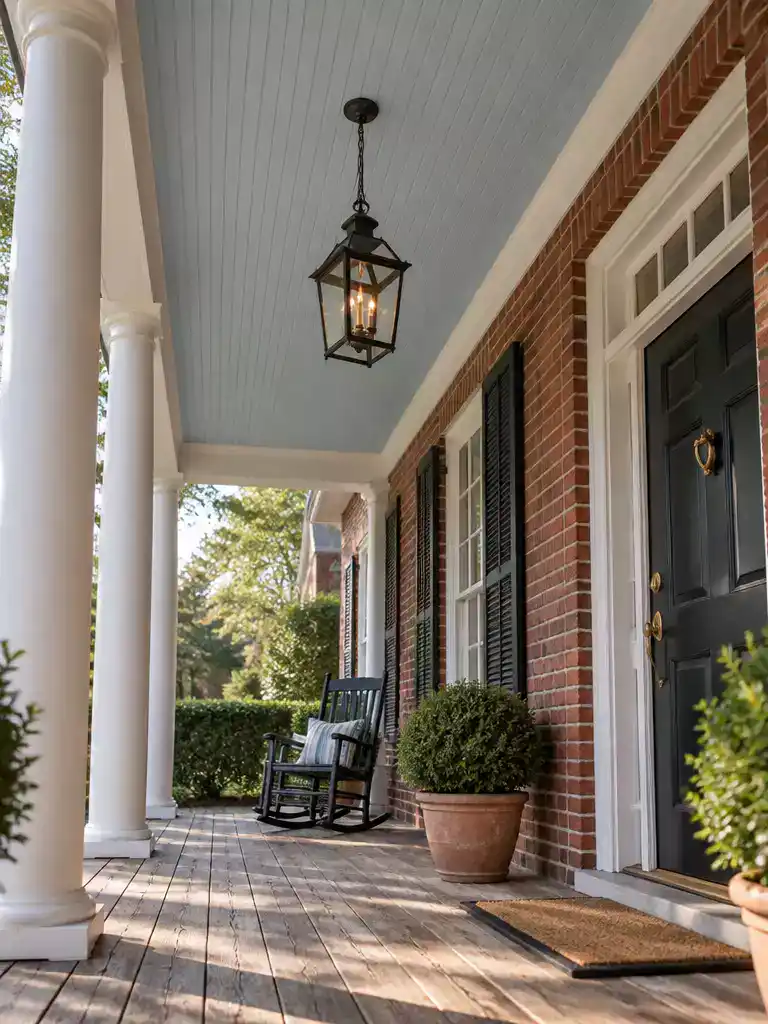
A calm blue overhead that lets your brick and wood stay the stars of the porch.
Pale Wedgwood blue has the feel of old porcelain: soft, a little dusty, and quietly formal. It carries more gray than Robin’s Egg Blue, so it reads as a considered color rather than a playful one.
That softness is what makes it work on porches with warm materials. A brighter or greener blue can sit beside red brick or stained cedar and start to compete with it. This one tends to step back and let the masonry do the talking.
Good fit
- A porch with brick columns, a brick knee wall, or warm wood trim
- Someone who wants blue overhead without an aqua note
- A house with a formal or traditional feel
Skip it if
- You want a fresher, greener ceiling
- Your siding is cool gray and you want a crisper blue
Watch the name. Wedgwood is a historical reference, not a formula that every paint brand follows. Two cans labeled Pale Wedgwood can differ in how blue or gray they run, so judge the sample itself.
Before you buy, check the sample against your porch in real conditions. Hold a board flat overhead and compare it with the masonry or wood next to it.
- Look at the mortar lines and brick tones at midday, when the sun is strongest.
- Check the sample in the deepest shade of the porch to see how much gray it picks up.
- Make sure the blue stays slightly cool beside warm wood, not muddy or brown.
Push the gray content higher and the ceiling stops reading as blue and starts reading as a neutral. That’s the direction the next shade takes you.
📈 Does It Add Value at Resale?
Pale Wedgwood blue won’t add a measurable resale bump by itself, and the sources don’t support one for pale blue ceilings. Its real value is durability. Repainting an existing porch ceiling is usually cheaper than replacing it. A well-prepared coat can outlast the roughly 5 to 7 year cycle cited for some lower-cost systems, while moisture shortens it.
Takeaway: Pick the color for how it looks now, then protect it with prep and moisture control.
Misty Blue-Gray
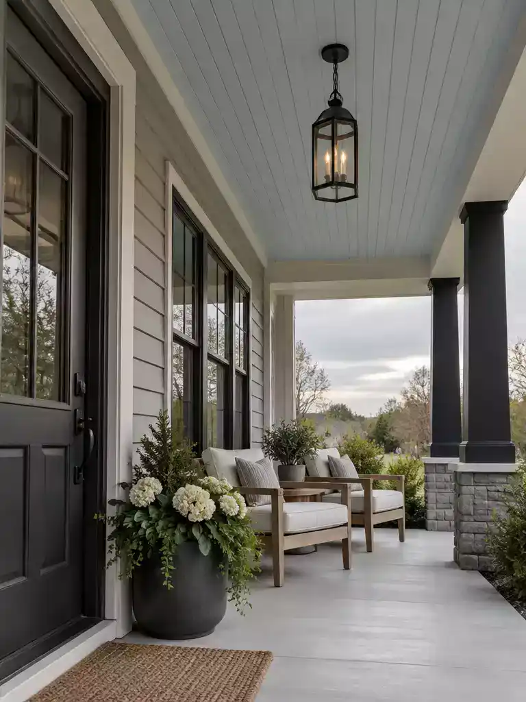
A calm, quiet ceiling that sits easily beside cool gray and black details.
Misty Blue-Gray is the most neutral ceiling on this list. Hang it over a gray fiber cement house with black window frames, and the porch overhead reads as a soft extension of the cool palette rather than a color statement.
Gray is doing most of the work here, so the blue shows up mainly as a hint. That makes it a strong match for gray siding, black trim, and contemporary exteriors, where a bright blue would look out of place.
Quick pick
- Right for you if: your siding and trim are cool-toned and you want a quiet blue-gray overhead.
- Skip it if: you want a fresh aqua note or a ceiling that clearly reads as blue.
If your roof is blue or another strong color, a very pale gray-leaning blue is generally the safer direction. Vivid aqua tends to fight a roof for attention, while this one stays in the background.
The tradeoff
Strong gray content can make the ceiling feel neutral rather than sky-like. If you want the overhead to suggest open air, this shade may look flatter than you expect.
Test the sample on the actual ceiling, not just a chip, and check it in full shade as well as bright midday light. Paint labeled with this kind of name varies between manufacturers, so compare the real sample against your fixed siding, trim, and floor before buying the full quantity.
When you want the blue to show more clearly, the next shade on this list, Pale Cornflower, takes that step.
💡 Designer Note: Let the Ceiling Step Back:
Because Misty Blue-Gray leans on gray rather than blue, it works best as a quiet backdrop. Let the color show up in what sits below it: a warm-toned rug, cushions, or a planter. Those pieces give the eye something to land on, while the ceiling does its job of softening the overhead plane. Dark trim then frames the edges crisply, so the gray-blue reads as a deliberate choice rather than a leftover shade.
Pale Cornflower
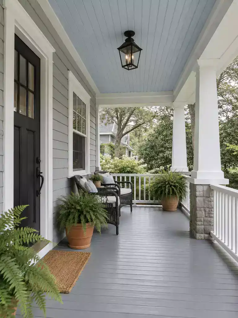
A clearer blue overhead that still keeps the porch light and open.
Pale Cornflower is the last stop on this spectrum, and it’s the one where the blue finally announces itself. It’s still light enough for a ceiling, but it reads more clearly as blue than Cloud Blue or Misty Blue-Gray, especially once you step into shade. If you’ve worked through the softer, grayer options and still want a blue you can identify from the driveway, this is the one to test.
The clearer read is a relative difference inside the pale-blue family, not a guarantee. Paints sold under the cornflower name don’t all match, so the sample on your ceiling is what counts.
Best fit: A porch with fixed colors that can support a clearer blue, and a homeowner who wants more color definition than Cloud Blue or Misty Blue-Gray.
Skip it if: You want near-white subtlety, or the sample starts competing with the facade, furnishings, or a strong roof color.
Shade is where this one earns its place. Under a full-shade porch roof, a pale cornflower often reads as a distinct, honest blue, while strong midday sun can wash it toward something lighter and quieter. Hold your sample overhead at morning, midday, and evening before you decide.
- Check the sample beside your siding, trim, and porch posts, since a clearer blue can pull attention away from the facade.
- Compare it against your roof color, because a vivid blue sample next to a strong roof can look like a clash.
- Look at it under the actual overhang depth, not just on a chip in the store.
📈 Does a Cornflower Ceiling Add Value at Resale?
A pale cornflower ceiling is mostly a personal choice rather than a resale move. The research doesn’t support a reliable resale premium from ceiling color alone. The payoff is how the porch feels day to day. Over time, the surface underneath matters more than the blue. A sound, well-prepped, properly coated ceiling protects the investment, while peeling or moisture damage works against it.
Bottom line: Pick the blue you’ll enjoy seeing overhead, and protect the surface underneath it.
With all 10 Light Blue Front Porch Ceiling Ideas in view, the choice comes down to undertone and how much blue you want overhead: cleaner, brighter shades; greener aqua-leaning blues; or quieter gray-muted options, with misty, porcelain-soft, and clearer-blue impressions between them. A pale ceiling can soften the overhead boundary and help a covered porch feel more open, though sun, shade, and exterior finishes affect how light it appears. You don’t need a universal “right” shade – or every idea; the best fit is the one that works with your home.
Start with the two undertones that seem closest to your siding, trim, floor, railings, and roof, then test both overhead in morning, midday, and evening light. Choose the sample that stays in step with the exterior in both sun and shade. Before painting, confirm the coating suits the ceiling surface and address any moisture or peeling. That gives you a clear, practical basis for settling on a light blue that makes the porch feel airy without fighting the rest of the house.
Related posts
 Do Plantation Shutters Block Out Light? A Homeowner’s Guide to Elegant Light Control
 12 Spooky Door Decorations for a Dim Porch Light
 15 Best Blue Front Door Inspiration Ideas That Say ‘Welcome Home’
 12 Neutral Door Design Ideas With Light Ash Wood
 15 French Door Privacy Ideas That Still Let the Light In
 17 Gorgeous Light-Filled Patio French Door Ideas
 15 Glass Framed Door Ideas That Pull Light Into Dark Rooms
 11 French Door Ideas For Home Offices With Natural Light