White interior doors disappear into a home easily, which is exactly why they can start feeling forgettable. Once the walls, trim, flooring, furniture, and lighting have some character, a plain white slab can read like the one decision nobody made.
Painting the doors a deeper neutral, earthy green, blue, or clay tone changes that without requiring a new door style. For a smooth result, follow our step-by-step interior door painting guide. The color creates enough contrast to make panel details, hardware, and casing more noticeable, and even an inexpensive molded door can feel more deliberate once the white is gone.
The safest color is not automatically the lightest one. Interior doors occupy relatively little surface area compared with walls, so they can carry considerably more depth without making the whole room dark. The bigger concern is undertone. A charcoal with a strong blue cast, a green that turns nearly black away from the windows, or a greige that goes pink beside the flooring can look very different on a full-height door than it did on a phone screen.
Quick Pick Guide
Choose soft black or charcoal for strong architectural contrast, navy or blue-black when you want darkness without a purely neutral result, forest green for drama, sage for a quieter earthy shift, greige or mushroom taupe for softer contrast, and muted terracotta when the house already leans warm and natural.
Soft Black

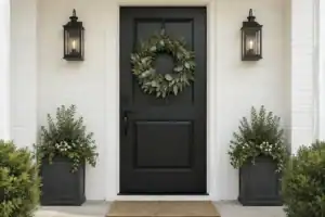
Soft black is the place to start if white feels too plain but true jet black feels harsh. It gives a door a defined outline and makes simple panel molding easier to read, yet a softened black usually carries enough gray or another undertone to keep the contrast from feeling stark.
Benjamin Moore describes Wrought Iron 2124-10 as a black with a relatively soft character and lists its LRV at 8.17. That low reflectance explains why it still reads as a dark door even though it does not behave like a pure, hard black.
Soft black works especially well on paneled doors, French-door frames without trying to compete with the glass, and ordinary molded six-panel doors that need more definition. Against warm white walls, medium oak floors, or natural stone, the contrast can make inexpensive door construction feel more intentional. Brass and bronze hardware move the result warmer; polished nickel or chrome pushes it cooler.
Pay attention to repetition in a hallway. One soft-black office or pantry door creates a focal point. Six dark doors facing each other across a narrow corridor create much more visual weight. In that situation, either commit to the dark rhythm deliberately or use one of the softer middle-value options farther down this list.
Best fit
Light or medium walls, visible panel detail, warm or mixed wood flooring, and spaces where you want the door itself to become part of the architecture rather than disappear into the trim.
Charcoal

Charcoal gives you much of the depth of black with a little more breathing room. The gray component makes it easier to place beside stone, veined tile, concrete-look flooring, cool beige, and mixed neutral finishes that may feel disconnected next to a harder black.
Sherwin-Williams Iron Ore SW 7069 is described by the manufacturer as a cool, deep charcoal. That cool direction matters on doors because a full-height vertical surface shows undertone more clearly than a tiny paint chip.
Charcoal is particularly useful when the room already has black accents but you do not want the doors to match them exactly. A softer charcoal door beside dark window frames, dark cabinet hardware, or a charcoal fireplace can connect those elements without making every dark finish identical.
The risk is blue or violet. Some charcoals look neutral in store lighting and noticeably cooler beside creamy walls or honey-toned flooring. If your fixed finishes are warm, look at the sample against the floor as well as the wall. The floor often exposes an undertone conflict faster than the paint next to another paint.
Watch the hallway light
A charcoal that reads clearly gray near a window may read nearly black on a door at the end of a hall. Test it on the actual door location rather than judging it only in the brightest room.
Deep Navy

Deep navy is a useful choice when you want a dark door but do not want another gray or black surface. It has enough color to feel intentional, yet the depth keeps it from reading like a bright accent door.
Sherwin-Williams describes Naval SW 6244 as a deep blue with a cool gray-green undertone. That slight gray-green influence is what keeps a navy in this family from looking like a clean primary blue.
Navy has an easy relationship with warm wood. Walnut, medium oak, and darker brown flooring stop the blue from feeling cold, while the blue makes the wood grain more noticeable by contrast. Brass hardware pushes navy toward a traditional or collected look; nickel keeps it quieter and cooler.
Use deep navy where the color can repeat naturally across several doors, or give one important door the color and let the remaining doors stay restrained. A home office, library, primary bedroom, pantry, or hall leading into a deeper-toned room can carry navy without the color feeling random.
Very bright daylight can expose more blue than you expected, while weak interior light can make the same door look almost charcoal. That shift is part of navy’s appeal, but it is also why a sample needs to spend time on the actual vertical surface.
Choose navy over black when
The house already contains warm wood, brass, blue-gray stone, denim-like textiles, or other subtle blue notes and you want the doors to feel dark without looking strictly neutral.
Forest Green

Forest green looks particularly convincing beside warm oak, dark walnut, cream walls, limestone-like flooring, aged brass, and bronze. It also gives painted doors some of the weight you normally associate with stained wood, which can be useful in a house where white doors feel too light against substantial flooring or furniture.
There is a large difference between a deep green and a dark green that disappears entirely. If the door sits in an interior hallway with little daylight, move one or two steps lighter than the sample that looked right beside a window. The color should still read green often enough that choosing green had a reason.
For several adjacent doors, forest green works better when the wall color is restrained. The repeated green slabs already provide the color statement; they do not need a competing wall treatment to make them noticeable.
Sage

Sage is the easier green if forest feels too dramatic. It brings color to a door while staying close enough to gray and neutral territory that it can repeat through bedrooms, baths, closets, and hallways without every doorway demanding attention.
Sherwin-Williams describes Evergreen Fog SW 9130 as green meeting gray with a small amount of blue. That combination is a good reference for the kind of sage that works well on doors: muted enough to live beside neutral finishes, but still recognizably green.
Sage doors are especially useful with natural oak floors because both materials sit comfortably in an earthy palette without becoming an exact match. Warm off-white casing creates a clean frame around the green; painting the casing the same sage makes the opening feel larger and more architectural, though it also increases the amount of color considerably.
Gray-heavy sage can lose its green identity in dim rooms. On the other side, yellow-heavy sage can turn olive beside warm bulbs and beige flooring. Check both daylight and evening light before choosing between two close samples.
Where sage earns its place
Use it when white feels unfinished but black feels too heavy. Sage creates visible separation from pale walls without turning every doorway into a dark rectangle.
Warm Greige

Warm greige is for the homeowner who is tired of white doors but does not necessarily want people to notice the door color first. The shift can be subtle: enough beige and gray to separate the slab from the wall and trim, without the weight of charcoal or the obvious color identity of green or navy.
Benjamin Moore Revere Pewter HC-172 is described as a neutral that bridges warm and cool tones, with an LRV of 55.05. It is a much lighter reference than the dark colors above, which makes it useful for homeowners who want the door to register as different without becoming a strong focal point.
Warm greige tends to work well beside cream, beige stone, medium oak, pale wood, and quieter patterned flooring. It can also make white casing look cleaner because there is enough contrast to define the edge without creating a hard dark outline.
The main failure is choosing a greige too close to the wall color. A difference that is obvious on two paint chips can almost disappear once one color covers the wall and the other covers a vertical door several feet away. If the goal is visible separation, compare samples from across the room rather than standing six inches from the door.
Greige can also swing pink, green, or violet beside fixed materials. Flooring is often the deciding factor. A greige that looks neutral next to a white wall may reveal a strong pink cast beside gray-brown planks or a green cast beside warm beige tile.
Mushroom Taupe

Mushroom taupe sits deeper and earthier than many greiges. Think warm stone, putty, dried clay, and taupe rather than beige. On interior doors, that extra depth is useful because it gives the slab enough presence to look intentional without pushing all the way into a dark accent color.
Sherwin-Williams calls Shiitake SW 9173 a warm stone gray. That description captures the direction to look for: gray that has enough brown warmth to feel earthy rather than cool.
Mushroom works particularly well with oak, travertine, limestone colors, cream upholstery, aged metals, and homes with warm neutral finishes that make cool gray look disconnected. It is also forgiving on ordinary molded doors because the moderate contrast lets the panel shadows do some work without making every seam or surface wave obvious.
Do not choose mushroom by name alone. One brand’s mushroom may lean beige, another violet, and another almost brown. Hold the sample beside the floor, baseboard, and casing together. If it suddenly turns pink next to one of those fixed materials, it will keep doing that after you paint the whole slab.
A strong choice for busy family spaces
Mushroom gives hall, pantry, mudroom, and bedroom doors more definition than white without creating the visual weight of several black doors lined up together. Matching choices are in should bedroom doors match walls.
Inky Blue Black

Blue-black is for the moment when navy feels too obviously blue and soft black feels too neutral. In one part of the day the door can read almost black; in stronger light the blue becomes visible. That movement gives a simple slab more depth without requiring decorative trim or another design device.
Benjamin Moore Mysterious AF-565 is described as a denim blue that can read as black or rich navy. Benjamin Moore lists its LRV at 8.76, placing it firmly in the dark range while still leaving room for the blue character to appear.
This color family works well on doors near white plaster, warm white paint, walnut furniture, medium and dark wood floors, brass, bronze, or nickel. The door stays dark enough to provide structure, but the blue stops the result from feeling like a generic black-and-white contrast.
Blue-black is especially convincing on paneled doors because light catches the raised profiles differently than the recessed sections. Even without changing the door construction, the changing reflections can make the color appear deeper around the panel edges.
Low-light locations need a deliberate sample test. If you can never see the blue at the darkest end of the hall, you may as well choose soft black. If the sample turns bright navy every afternoon, move toward a smokier or grayer blue-black.
Do not judge blue-black from a phone screen
Very dark blues are especially difficult to read digitally because screens and surrounding light change how much blue you perceive. Use the digital view to narrow the field, then move to a physical sample.
Muted Terracotta

Muted terracotta takes interior doors in a completely different direction. Rather than making the door darker with gray, blue, or black, it introduces warmth. The right version looks like fired clay, canyon earth, or softened brick rather than bright orange.
Sherwin-Williams describes Cavern Clay SW 7701 as a reddish-orange midtone, and the company’s material for the color identifies it as a warm terracotta with earthy roots.
Terracotta doors make the most sense in a house that already contains warm materials: cream walls, oak, walnut, tan stone, handmade tile, brown leather, aged brass, or bronze. Against icy gray finishes, the same clay color can feel detached from everything around it.
This is also one of the colors where restraint matters. A single terracotta pantry, office, powder-room, or bedroom door can feel purposeful. A long hallway of saturated orange-red doors is a much stronger commitment. For repeated doors, choose a muddier version with enough brown, gray, or clay character to quiet the orange.
Muted terracotta is particularly good at making plain doors feel less builder-grade because the color itself carries personality. It does not need ornate hardware or aggressive contrast to be noticed. Warm wood and simple metal hardware are often enough.
Best way to narrow the nine choices
Start with the fixed material directly below the door. Warm oak, brown stone, and cream usually point toward mushroom, sage, forest green, navy, or terracotta. Cooler gray flooring often makes charcoal, blue-black, navy, and cooler soft blacks easier to place. Then compare the remaining two or three candidates against the casing and hardware.
Before committing to every door, put a real sample on one representative slab. Benjamin Moore’s current sample guidance specifically recommends testing color because it changes under different light and in different spaces, and Sherwin-Williams likewise warns that on-screen color can differ from the physical result. Benjamin Moore paint color samples are intended for this kind of evaluation.
Judge the sample from the places where you actually see the door: down the hallway, from the adjoining room, beside the flooring, and with the door both open and closed. A color that works in all four views is far less likely to become the expensive gallon you wish you had reconsidered.
Related posts
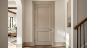 Transform Interior Doors From Builder Basic to Designer Looking
 15 Front Door Decor Arrangements Beyond the Basic Wreath
 Closet Door Makeover for a Custom-Built Look on a Basic Door
 Bifold Door Makeover From Builder-Basic to Built-In Looking
 A Complete Guide to Choosing Your Front Door Paint Color
 How to Paint Interior Doors Black Without Making the Trim Feel Disconnected
 10 Interior Door Paint Finishes for Homes With Kids
 Flat Closet Doors Reworked to Read Like Paneled Cabinetry