
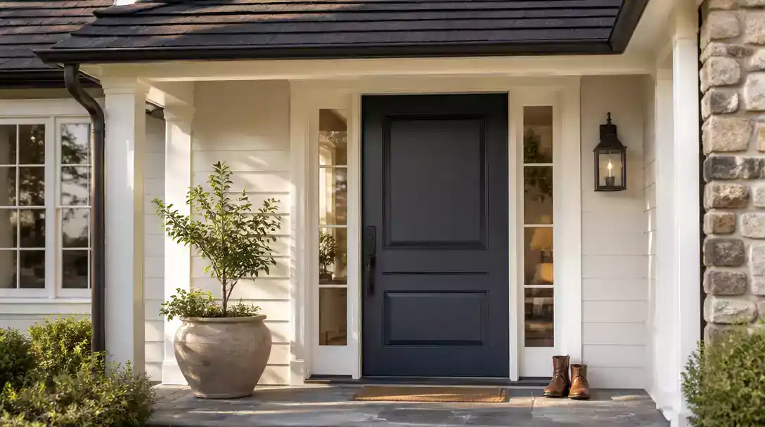
A dark roofline often makes a home feel top-heavy, but front door colors for houses with a dark roof can balance your entire facade. This guide covers 11 color strategies – all ideas worth saving – to help you find the precise tone that connects your entrance to your roof.
Soft black
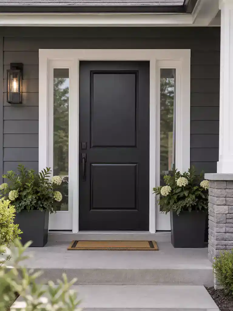
Create a seamless, high-end architectural edge that connects your dark roof to the facade.
As an Amazon Associate I earn from qualifying purchases. Affiliate links may earn me a commission at no extra cost to you.
Soft black is the go-to choice for charcoal or slate roofs when you want to achieve a seamless, architectural transition from the roofline down to the ground. It avoids the harshness of a pure, flat black by centering on a deep, neutral pigment that grounds the entire facade.
To pull this off, you must use a satin or semi-gloss exterior enamel. These finishes provide just enough reflectance to define the door against a dark roof while effectively masking minor surface imperfections in the door material.
The Mismatch Rule: Avoid brown-blacks on roofs with cool gray or blue tones to prevent a muddy, jarring appearance.
Similarly, stay away from blue-black pigments if your roof has warm, brownish undertones. The goal is to keep the undertone temperature of your door consistent with the temperature of your roof shingles.
If you are DIYing this project, prioritize using a high-quality leveling enamel to ensure the dark pigment doesn’t show roller streaks. A professional sprayed finish is always the gold standard for achieving that smooth, factory-look density required for a dark door.
⭐ Soft Black Mats for Dark Roofs
✨ Editor’s Pick
Heavy Duty Indoor Outdoor Welcome Mat
Waterproof Non Slip Front Door Mat
Jumbo Size Waterproof Entrance Floor Mat
Why This Looks Better: The Architectural Edge
Using a soft black creates a deliberate, grounded focal point that prevents your front entrance from feeling like a visual afterthought. By mirroring the depth of your dark roof, the door acts as a sophisticated anchor, drawing the eye downward and balancing the home’s facade rather than letting the roofline dominate the exterior’s silhouette.
Graphite gray
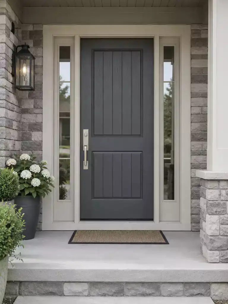
Create a sophisticated, balanced entrance that prevents your dark roof from feeling top-heavy.
Graphite gray functions as the essential bridge color for homes with charcoal or slate roofs. It sits perfectly in the middle ground, offering enough depth to connect with the roofline while staying light enough to avoid the intensity of pure black.
This is an ideal choice if your home features cool-toned trim and you want a clean, monochromatic aesthetic. It provides a polished, high-end look without the visual heaviness that can sometimes make an entrance feel like a dark void.
The Value Trap
Avoid choosing a shade that matches your roof’s darkness level exactly. If the door and roof share the same value, the entrance will lose its definition and seem to recede into the facade.
When selecting your specific shade, focus on the contrast against your siding. Use this quick guide to determine if this color is the right fit for your home:
⭐ Graphite Gray Rugs We Love
Striped Cotton Woven Indoor Outdoor Rug
✨ Editor’s Pick
Six Tier Over The Door Organizer
Thickened Buffalo Plaid Outdoor Area Rug
💡 The Visual Benefit of Graphite
Graphite works by providing just enough visual weight to anchor a home without the stark, sometimes harsh contrast of pure black. It creates a seamless flow from a charcoal roof down to the entryway, preventing the home from looking like it has two separate, disconnected pieces at the top and bottom.
Design Takeaway: Use graphite to create a sophisticated, monochromatic look that feels intentional rather than just safe.
Midnight navy
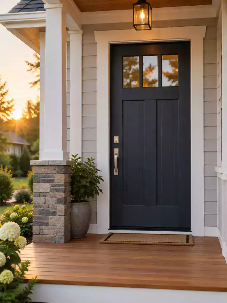
Anchor your neutral siding with a grounded, deep blue that complements any cool-toned roofline.
Midnight navy serves as a sophisticated, grounded contrast for homes with neutral siding like gray, beige, or white. Because of its inherent blue undertones, this color acts as a natural partner for black, charcoal, and cool-gray roofs.
Strategic Placement: This shade works best when it can pull from other cool-toned elements on your property. If your home features blue-gray shutters or cool-toned stone accents, midnight navy will feel perfectly at home.
You should approach this color with caution if your roof has strong warm-brown or reddish-orange undertones. Without other cool-toned elements to act as a bridge, the navy can feel disconnected or isolated from the rest of the facade.
If you choose to use midnight navy, ensure the finish is high quality to prevent it from fading into a dull, flat blue over time. A satin or semi-gloss finish will catch the light and help define the door against the weight of your dark roof.
⭐ Midnight Navy Mats to Consider
Extra Durable All Season Welcome Mat
Dirt Trapper Non Slip Entrance Mat
✨ Editor’s Pick
Hand Painted Coconut Fiber Welcome Mat
💡 Why This Works:
Midnight navy functions as a sophisticated visual anchor because it bridges the gap between deep roof tones and lighter siding. Its cool blue undertones pull the eye toward the entrance without the harshness of true black, creating professional color harmony that feels intentional rather than accidental in a residential setting.
Design takeaway: Use navy to unify a facade that features mixed neutral materials like stone and siding.
The difference between a designer-led home and one that feels mismatched often comes down to just a few deliberate choices rather than an entire overhaul. Exploring impactful front door makeovers can help you see which specific adjustments actually move the needle for your facade.
A cohesive entrance relies on balancing your roof tone with one intentional color shift, which is far more manageable than trying to make every exterior element match perfectly.
Slate blue
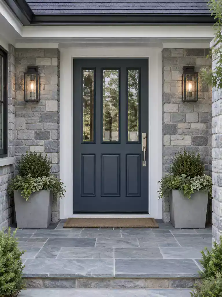
Create a sophisticated, atmospheric entrance that anchors your home against a dark roofline.
Slate blue functions as an atmospheric bridge, pulling together the cool tones of a dark roof without the heavy, finality of black. It is the ideal move for homes where the roof already reads as stony or charcoal, providing enough contrast to be seen without feeling like a sudden, jarring shift.
Authority Check: Avoid opting for pale, powdery versions of this color. A light blue often looks washed out or “nursery-like” when forced to compete with a heavy, dark roofline.
Choose this color if your exterior palette includes cool greys, natural stone, or modern metal accents. It creates a cohesive, intentional look that feels grounded rather than decorative.
If your home features warm brick or rustic wood siding, you might find slate blue fights the architecture. In those instances, shift toward a warmer, earth-based tone to keep the entrance connected to your siding materials.
⭐ Slate Blue Mats Worth Buying
✨ Editor’s Pick
Gold Star Hanging Bunting Banner Backdrop
🏡 Real-Home Application: Making Slate Blue Feel Natural
- Porch styling: Pair this door color with matte black planters or charcoal doormats to bridge the gap between the blue and your dark roof.
- Hardware choice: Choose brushed nickel or satin chrome hardware; these cool-toned metals feel much more intentional against slate blue than warm brass options.
- Lighting check: Test your swatch in the specific light of your porch; deep blue tones can shift toward purple in certain late-afternoon sun conditions.
Pine Green
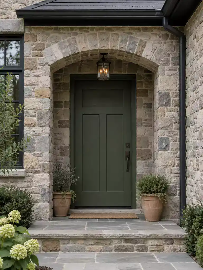
Connect your entrance to the landscape with a deep, earthy tone that anchors stone facades.
Pine green excels on homes that feature natural stone or rugged brick components. It acts as a bridge between the organic textures of your siding and the weight of a dark charcoal or black roof.
By choosing a deep, desaturated shade, you create a connection to the surrounding environment without turning your home into a distraction. This color choice works best when the green feels grounded rather than bright or lively.
Avoid the Saturated Trap
Steer clear of bright, yellow-leaning greens that fight for attention against your roofline. These vibrant shades create an unnecessary clash, making the door look disjointed from the rest of the exterior materials.
If you are aiming for a cohesive look, pair this color with dark bronze or oil-rubbed bronze hardware. These finishes reinforce the earthy, natural palette that pine green establishes on a stone or brick facade.
⭐ Pine Green Mats for Entryways
✨ Editor’s Pick
Absorbent Dirt Resistant Indoor Entry Mat
Pumpkin Themed Halloween Outdoor Door Mat
Designer Note: The Importance of Sheen
When working with deep, moody tones like pine green, your choice of sheen is just as vital as the pigment itself. Aim for a satin or semi-gloss finish; these reflect just enough light to prevent the door from looking like a flat, dark void, while effectively smoothing over any minor imperfections in the door’s surface.
Muted Olive
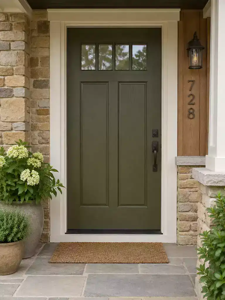
Bring warmth to your entryway by bridging earthy siding tones with a dark roofline.
Muted olive is the most effective green option when you have a dark roof with warm undertones, such as bronze-black or deep brown-black. It pulls the exterior together by echoing the natural colors often found in surrounding landscaping or masonry.
This color works best on homes featuring tan, cedar wood, or warm-toned brick siding. It acts as a grounding element that prevents the entrance from feeling disconnected from a heavy, dark roof above.
Choose your shade carefully to avoid a lifeless look. A muted olive should lean toward a rich, organic green rather than a flat, muddy khaki or a pale, yellowish tan.
If your roof is a crisp, cool charcoal or blue-black, be cautious with olive tones. A shade that is too light or contains too much yellow will look dull and out of place against a cool-toned roofline.
⚖️ Quick Decision Guide: Choosing Your Olive Shade
- Choose this if: Your exterior features warm-toned stone, natural cedar siding, or bronze hardware that needs an earthy, organic anchor.
- Skip this if: Your roof is a crisp, cool charcoal or blue-black; a warm olive will likely clash and appear out of place.
- Pair it with: Matte black hardware to sharpen the look and keep the door from appearing too “soft” or washed out.
Deep Burgundy
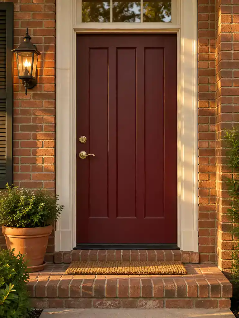
Add a stately, traditional anchor to your entrance with this warm, deep-toned red.
Deep burgundy acts as a refined, stately alternative to standard primary red. It provides the visual heat necessary to counteract the cooling effect of a dark slate or charcoal roofline.
This color performs best on homes that lean into traditional or historic palettes. If your exterior features warm-toned brick or creamy off-white trim, this shade will feel intentional rather than jarring.
Steer clear of bright, fire-engine reds. These high-intensity shades create a festive appearance that fights the natural weight and restraint of a dark, heavy roof.
Use the following guide to ensure your burgundy selection maintains the right level of sophistication:
- The Undertone Test: Choose a burgundy with brown or purple base notes to ensure it stays grounded against a dark roof.
- Finish Matters: Opt for a high-quality satin or semi-gloss exterior enamel to add depth to the color.
- Hardware Pairing: Pair this door color with brushed brass or oil-rubbed bronze hardware to highlight the warm, classic character of the paint.
⭐ Deep Burgundy Mats to Consider
✨ Editor’s Pick
Black White Checkered Front Door Rug
Embossed Welcome Mat for High Traffic
🏡 How This Works in a Real Home:
- Brick coordination: Use burgundy if your home has warm-toned brick; it bridges the gap between the dark roof and red masonry.
- Daily maintenance: Deep red tones show dust and pollen less than black or navy, keeping your entryway looking fresher longer.
- Natural finish: Keep the door hardware consistent with existing exterior metal finishes to avoid a cluttered, mismatched appearance.
Warm Cream
Brighten your entry and transform a heavy, dark facade into an inviting focal point.
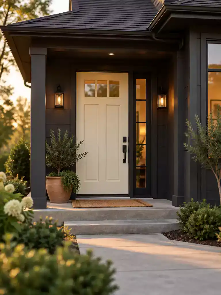
When both your roof and siding lean toward dark, heavy tones, the front entrance often disappears into a visual “black hole.” Using a warm cream finish provides the necessary lift to pull the eye toward the door rather than letting it recede into the shadows.
The success of this color rests entirely on its undertones. You must select a shade with enough yellow or red warmth to stand out, but you need to be careful with the specific intensity.
Avoid the Mismatch: Never pair a stark, cool white with a warm-toned house, as it will look disconnected and sterile. Conversely, avoid overly yellow, “butter” creams that will clash aggressively with any cool-toned or blue-gray roof shingles.
This color strategy works best for homeowners who want to soften the severity of a dark home exterior. It acts as a bridge, bringing a touch of natural light to the porch area without requiring a full exterior repaint.
If you are testing swatches, look at how the cream interacts with your home’s trim during both the morning and late afternoon. If the color looks too much like a standard primer, it is likely too thin or lacks the pigment density required to hold its own against a dark roofline.
⚖️ Quick Decision Guide: Finding Your Perfect Cream
- Choose this if: Your porch is perpetually shaded by a deep roof overhang, making the entry feel cavernous and dark.
- Skip this if: Your home features a high-contrast, modern architectural style where a lighter door would look out of place.
- Pair it with: Matte black hardware to ground the creamy tone and prevent the door from feeling too light or airy.
Stone Taupe
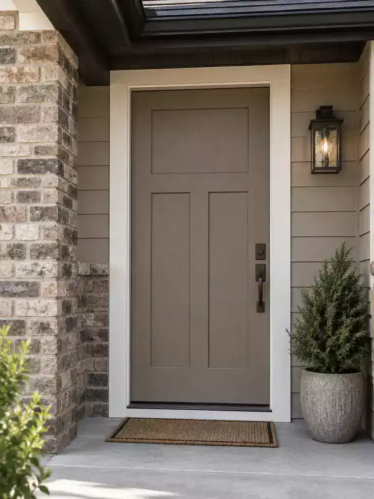
Create a grounded, cohesive entrance that bridges the gap between dark rooflines and neutral siding.
Stone taupe acts as the ultimate bridge neutral for homes struggling to connect a visually heavy dark roof with lighter exterior walls. If your siding leans into beige, putty, or greige tones, this shade pulls those warm and cool signals together into one cohesive look.
The Power Check: Avoid selecting a taupe that leans too light or too gray. An underpowered, washed-out shade will look weak and disappear against the dominance of a dark roofline.
This color choice is best for homeowners who want their entrance to feel established without the sharp intensity of black or navy. It thrives in environments where the facade materials already contain earthy or stony undertones.
If you prefer a monochromatic exterior, this shade provides enough depth to stand out from the trim while remaining soft enough to blend with the natural surroundings. It is a reliable, low-risk path to a balanced facade that respects the weight of your roof.
⚖️ Quick Decision Guide: Is Taupe Your Best Fit?
- Choose this if: You want a sophisticated, monochromatic look that links your dark roof to lighter, neutral siding without stark contrast.
- Skip this if: Your home lacks existing earthy or stone-toned elements, which might cause the taupe to look disconnected rather than intentional.
- Pair it with: Matte black or oil-rubbed bronze hardware to add a crisp, modern edge that keeps the taupe from feeling too muted.
Smoky Terracotta

Bring earthy warmth to your entrance by balancing a dark roof with muted clay tones.
Smoky terracotta acts as a strategic warming agent for homes featuring clay brick, warm stucco, or natural stone facades. Because dark roofs often pull the visual weight of a house toward the top, this color helps ground the entrance by extending the warmth of your primary building materials to the door itself.
The Smoky Factor: You must prioritize a muted, desaturated shade to maintain balance. A raw, high-chroma orange or bright red will look disconnected and festive against a heavy, dark roofline.
This color is an ideal choice for homeowners who want to highlight the natural textures of their siding. It bridges the gap between dark roofing and lighter masonry by introducing a middle-ground saturation that feels intentional rather than accidental.
If your roof has distinct cool-toned charcoal or blue-black shingles, proceed with caution. Ensure your trim or porch accents include warm wood or stone elements to help the terracotta door feel supported by the rest of the exterior.
⭐ Smoky Terracotta Mats to Consider
✨ Editor’s Pick
Handmade Terracotta Pumpkin Tea Light Holder
Striped Front Door Welcome Outdoor Mat
Hand Woven Farmhouse Porch Area Rug
💡 Why This Works
Smoky terracotta succeeds because it embraces the “bridge” strategy, using a muted, earthy pigment to harmonize the temperature gap between a cold, dark roof and warm masonry. By lowering the color’s chroma, you prevent the entrance from competing with the roofline, instead allowing the door to anchor the entire facade with natural, organic warmth.
Visual payoff: A muted tone creates an intentional transition that feels sophisticated rather than distracting or purely decorative.
Bronze brown
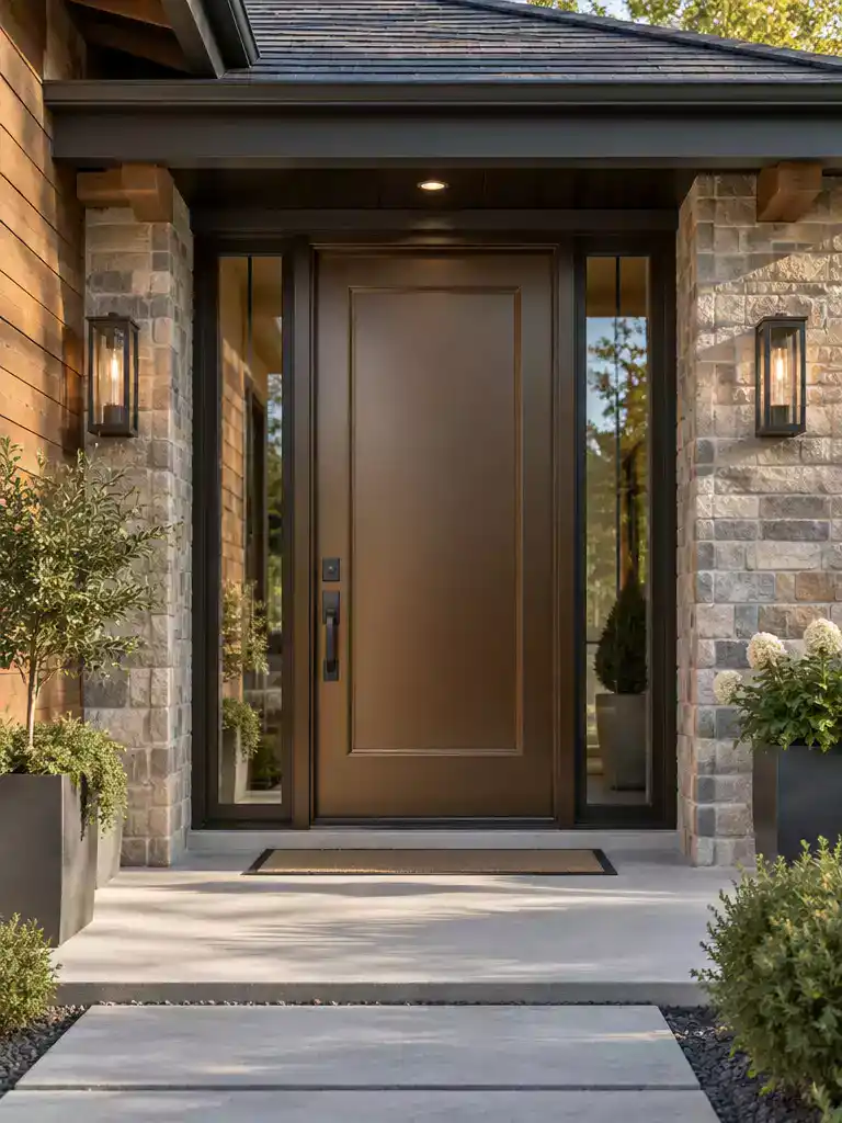
Create a grounded, earthy entrance that bridges your dark roof and natural exterior materials.
Bronze brown works best when you want to lean into a grounded, metallic-earth palette that feels intentional rather than accidental. This color excels on homes where the facade features natural stone, cedar shingles, or warm-toned masonry, as the bronze undertones pull those textures together.
When choosing this shade, the biggest risk is picking a brown that is too similar to the depth of your dark roof. If the values are too close, the door will simply vanish into the shadows of your porch, losing all visual impact.
Professional Tip: Pair your bronze brown door with dark bronze or oil-rubbed bronze hardware to create a cohesive, monochromatic look.
If your home has wood textures in the siding or columns, ensure the door paint has enough metallic depth to stand apart from the natural wood grain.
Use this color if you want an entrance that feels high-end and heritage-inspired without the sharpness of black. Avoid this choice if your home’s exterior is already dominated by brown tones, as the lack of contrast will make the entrance feel heavy and light-starved.
⭐ Bronze Brown Mats We Love
Heavy Duty Sturdy Entrance Door Mat
✨ Editor’s Pick
Funny Indoor Welcome Mat for Entryway
Blank Scalloped Artificial Coir Door Mats
🧰 Questions to Ask Your Pro
- Hardware coordination: Can you confirm the bronze finish on the door matches the existing exterior light fixtures?
- Finish durability: Will you be using a high-quality leveling enamel to ensure the dark pigment resists sun fading?
- Surface preparation: How do you plan to prep the door surface to prevent brush marks from appearing in bright sunlight?
With eleven specific color strategies now in front of you, the path to a balanced facade becomes much clearer. You do not need to implement every suggestion to achieve a cohesive look; the one or two options that align with your home’s specific undertones will carry the entire entrance.
Focus your energy on testing your top favorites in changing light conditions, as the right paint finish often makes the biggest difference in curb appeal. Once you settle on the door color that bridges your roof and siding, the rest of your home’s exterior will naturally feel more intentional. If you are still weighing the overall design impact, exploring these transformation results can help you visualize how a single choice fundamentally shifts your home’s presence.
Related posts:
 14 Front Door Colors Designers Love for Dark Blue Houses
 Front Door Colors for Red Brick Houses Beyond Black
 15 Front Door Colors for Gray Houses That Need More Warmth
 What Changing Only the Front Door Did to These Houses
 21 Dark Front Door Colors That Create Stunning Visual Contrast
 14 Front Door Glass Options for Dark Foyers
 15 Front Door Colors Designers Pick for Brick & Black Shutter Homes
 14 Best Front Door Colors for Log Cabin