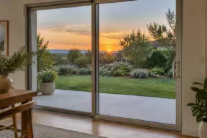
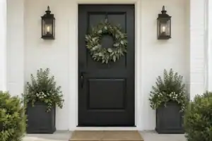
A cool gray exterior often feels sterile, but the right accent can instantly add the cozy richness your entry is missing. This guide covers 15 front door colors designed to warm up your home, helping you quickly identify the shade that finally feels right.
Warm White

Transform a sterile gray entrance into a soft, welcoming passage with creamy, light-filled tones.
As an Amazon Associate I earn from qualifying purchases. Affiliate links may earn me a commission at no extra cost to you.
Many homeowners avoid white paint because they fear it will look like a sterile hospital exterior against their gray siding. Light gray homes have their own list in colors for light gray houses. If you choose a warm-tinted white, you actually create a soft-focus filter that makes the entire entry feel intentional and refined.
The secret is identifying whites with yellow or cream undertones that bridge the gap between cool siding and your home’s interior. You want to steer clear of blue-based or “icy” whites, which will only highlight the coldness of your gray paint and create a harsh, disjointed look.
Pro Tip: The Sunset Test
Always hold your paint sample against the siding during the late afternoon. Cool grays often shift into a blue-toned cast as the sun sets, which can cause a poorly matched white to clash aggressively with your exterior.
This color is the ideal choice for homeowners who want to brighten their entry without relying on high-contrast black or navy. It provides a clean, inviting transition that feels soft rather than demanding.
⭐ Warm White Mats for Inviting Entryways
✨ Editor’s Pick
Buffalo Plaid Checkered Outdoor Welcome Mat
Natural Coco Coir Welcome Door Mat
📋 Quick Reality Check: Before You Buy
- Check the trim: Ensure your door frame color complements the warm white, as a starkly different white trim can make the door look yellow or dirty by comparison.
- Observe the finish: High-gloss warm white reflects more light, which may wash out the creamy undertones you are aiming for; consider a satin or semi-gloss for better depth.
- Verify light exposure: North-facing entries get less direct sun, meaning your “warm” sample might look cooler than expected; test it on a cloudy day to be certain.
Cream

Soften your gray facade with a gentle, lived-in hue that feels welcoming and sophisticated.
Cream acts as the gentle neighbor to gray siding, offering a more substantive presence than stark white. If your home currently feels too flat or industrial, this shade provides enough body and saturation to bridge that gap without demanding aggressive attention.
Unlike stark whites that can sometimes read as clinical or cold against a gray backdrop, cream brings an inherent, quiet comfort. It creates a seamless, sophisticated transition that makes a gray exterior feel undeniably more “lived-in” and approachable.
Pro-Tip for Hardware Pairing: To truly amplify those golden undertones, swap your standard silver hardware for solid brass. The warmth of the metal pulls the cream forward, making the entire entryway feel cohesive rather than disjointed.
This color is an ideal choice for homeowners with neutral gray siding who want to avoid high-contrast, harsh pairings. If you prefer a home that feels established and calm, cream is your most reliable path to achieving that finish.
⭐ Cream Colored Mats for Soft Entryways
Soft Cotton Woven Checkered Entry Rug
✨ Editor’s Pick
Natural Rattan Vine Ball Decorative Set
Funny Welcome Mat for Home Entrance
📋 Quick Reality Check Before You Paint:
- Check the undertones: Verify your gray siding doesn’t lean toward violet or blue, which can make cream look muddy instead of intentional.
- Test in daylight: Paint a sample on a large board and lean it against your door; check how it shifts during sunset.
- Coordinate your hardware: Ensure your existing door handle finish complements the cream’s warm base, as cool-toned chrome or nickel often creates a clash.
Butter Yellow

Add a sunny disposition to your entryway that feels approachable and warm against gray siding.
Butter yellow acts as the ultimate welcoming color for gray homes, turning a sterile exterior into an inviting cottage-style facade. The trick is hitting the Goldilocks zone: the shade must be soft and buttery to effectively bridge the gap between your gray siding and the bright, outdoor light.
The Lemon Trap
Avoid icy or lemony yellows at all costs. These cool, sharp tones will highlight the underlying blue or violet in your gray siding rather than warming it up.
This color is most successful on homes with bungalow or cottage architecture, where a touch of whimsy is expected. It provides a cheerful, optimistic greeting that makes a gray house feel less like a fortress and more like a home.
Before committing, always test your sample on the door itself rather than the siding. Watch how the color shifts in the afternoon light to ensure it retains its buttery richness instead of turning neon when the sun hits it directly.
⭐ Butter Yellow Mats for Sunny Porches
Striped Cotton Woven Indoor Outdoor Rug
Funny Opossum Delight Welcome Door Mat
✨ Editor’s Pick
Extra Durable Heavy Duty Entrance Mat
⚠️ Watch Out for These Pitfalls:
- Undertone Clashes: Avoid colors with a cool, green-based yellow tint, as these directly fight against the inherent neutrality of gray siding.
- Finish Gloss: Steer clear of high-gloss sheens, which reflect cool ambient light and make even a warm color feel clinical.
- Hardware Mismatch: Using cool-toned silver or chrome hardware effectively cancels out the cozy “sunny” effect you are working so hard to achieve.
Mustard Yellow

Ground your gray exterior with a sophisticated, earthy ochre that feels architectural and intentional.
Mustard yellow serves as the grown-up alternative to bright, sunny yellows. While lighter shades can sometimes feel sugary or temporary, mustard brings a high-density, ochre-adjacent warmth that holds its own against charcoal or medium-gray siding.
This color is particularly effective for homes with Craftsman or mid-century architectural details. It provides a punch of personality that feels rooted and established rather than playful.
Why it works for darker grays: Because mustard contains deep brown undertones, it creates a grounded transition when placed against dark charcoal. It prevents the door from disappearing into a dark facade while avoiding the harshness of a high-contrast white.
If you are worried that your gray exterior leans too industrial, an earthy mustard yellow acts as the perfect stabilizer. It turns a sterile entry into a focal point that feels welcoming throughout the changing seasons.
Choose this if your house has strong structural lines that benefit from an earthy anchor. You should skip this if your siding is a light, blue-toned gray, as the mustard may pull out unwanted green or muddy undertones in the surrounding paint.
⭐ Mustard Yellow Mats We Love
✨ Editor’s Pick
Black and White Striped Porch Rug
Rustic Funny Kitchen and Entry Mat
Funny Guest Welcome Entrance Door Mat
🧰 Ask Before You Hire:
- Color matching: Ask if they can tint the primer to match the mustard tone for better coverage.
- Finish durability: Check if they recommend a semi-gloss or satin finish to resist the inevitable porch-front scuffs.
- Preparation scope: Confirm the quote includes thorough sanding of the existing door to ensure the new color adheres properly.
Distinguishing between a fleeting color fad and a choice that defines your home’s character for years is the most effective way to cut through the noise. Evaluating your entryway palette through a lens of longevity allows you to sidestep the pressure of finding the single perfect shade.
True home identity isn’t about following every trend, but anchoring your space in a color that remains timeless after the neighbors’ fads have already faded away.
Antique Gold

Bring a sense of historical richness and established warmth to your gray exterior.
Antique gold acts as a deep, ochre-toned bridge between a cool-toned gray exterior and a high-end interior. Unlike brighter, candy-colored yellows, this shade provides a grounded, historical richness that makes a modern gray house feel instantly more established.
It is an ideal choice for homeowners who want their entry to feel expensive and substantial. If your home features stone or brick accents in the foundation, this color will pull those natural textures together into a cohesive look.
Expert Tip: Avoid pairing this with cool-toned silver or chrome hardware, which can make the gold look muddy. Instead, choose oil-rubbed bronze or matte black to anchor the depth of the ochre.
This color is best for medium-to-dark gray siding where a lighter yellow would look too sugary or neon. It is a sophisticated, mature statement that moves your house away from the industrial gray trend and toward something more organic.
⭐ Antique Gold Mats to Consider
Heavy Duty Indoor Outdoor Welcome Mat
✨ Editor’s Pick
Coir Welcome Mat and Plaid Rug
Modern Absorbent Non-Slip Floor Mat
🔢 The Right Sequence for Success:
Achieving an authentic antique gold finish requires a careful layering process to ensure the color depth doesn’t look like flat yellow paint.
- Prep the surface: Clean thoroughly and sand lightly to ensure your gold pigment adheres smoothly without streaks.
- Apply base coat: Use a high-quality primer to prevent the gray siding from bleeding through the gold.
- Add protective topcoat: Seal the finish with a UV-resistant clear coat so the richness doesn’t dull over time.
Warm Terracotta

Bring organic earth tones to your gray exterior for a deeply grounded, welcoming entrance.
Terracotta introduces raw, clay-like energy that immediately neutralizes the sterile feel of cool gray siding. It is arguably the most organic choice on this list, making your home feel as though it is naturally anchored to the surrounding landscape.
This color works best on doors with visible textures, such as wood grain or shaker panels, rather than ultra-smooth metal surfaces. The depth of the pigment allows the door to stand out without feeling like a jarring accent against a neutral gray house.
Pro-Tip for Texture: If you are painting a metal door, look for a low-sheen or matte finish to mimic the porous look of actual fired clay.
High-gloss paints can reflect too much cool light, which can inadvertently make the terracotta look synthetic.
Why Terracotta Wins for Gray Homes
- Neutralizes Coolness: The strong red-orange earth tones effectively pull the eye away from “blue-gray” casts in your siding.
- Landscape Integration: It bridges the gap between structured man-made architecture and natural elements like greenery, stone paths, or wood mulch.
- Lived-In Aesthetic: Unlike bright accent colors, terracotta provides a sophisticated warmth that feels settled and established.
If you have an abundance of greenery or a home with stone foundation accents, this is your strongest candidate. It is a high-reward choice for homeowners who want their entryway to feel like a warm invitation rather than a crisp, modernist statement.
⭐ Terracotta Mats That Warm Up Entryways
✨ Editor’s Pick
Green Leaf Home Decor Entrance Mat
Designer Note: Mastering the Terracotta Sheen
Because terracotta is inherently matte and porous, selecting a high-gloss paint finish can create a jarring visual conflict. Opt for a flat, matte, or eggshell finish to better replicate the organic, fired-clay aesthetic. This choice anchors the door to your gray siding without the synthetic sheen that often makes bold, earth-toned front doors feel out of place on a modern gray facade.
Burnt Orange

Infuse your gray exterior with high-energy warmth that feels like a permanent summer sunset.
Burnt orange is the go-to choice for homeowners who want to transform a cold, gray facade into a high-energy statement. It acts as a bridge between the sterile nature of gray siding and the cozy, organic warmth of a lived-in home.
Pro Tip: To keep this shade from feeling like a seasonal holiday decoration, pair it strictly with matte black hardware. The dark metal grounds the brightness of the orange and gives the entry a modern, architectural finish.
This color works particularly well for mid-century modern homes where a bold, saturated accent is expected. If your gray siding leans toward the cooler side, the fire-toned quality of burnt orange effectively “heats up” the exterior, making the threshold feel instantly approachable.
Is Burnt Orange Right for Your Home?
- Choose it if: You have a mid-century or contemporary home and want to break away from neutral complacency.
- Skip it if: Your gray siding has strong blue or violet undertones, as these can create a jarring, circus-like effect rather than a cozy one.
- Design Pairing: This color thrives when surrounded by natural materials like wood decking or stone planters.
Don’t be afraid of the saturation, but do test your sample in both direct afternoon sun and heavy shade. You want a deep, earthy orange that stays grounded even as the daylight shifts throughout the day.
⭐ Burnt Orange Mats Worth Buying
✨ Editor’s Pick
Funny Non-Slip Floor Entrance Mat
✨ Finishing Touches for Burnt Orange
Since this color is so vibrant, your secondary elements should act as a supporting cast rather than competing for attention.
- Natural Textiles: Use a neutral, textured coir doormat to ground the door’s intensity with organic, earthy tones.
- Strategic Lighting: Opt for warm-toned LED bulbs in porch fixtures to amplify the glow of the orange finish.
Warm Red

Transform your cool gray exterior into a cozy, inviting space with deep, earthy red tones.
The secret to using red on a gray house is all in the undertones. A bright, fire-engine red carries blue undertones that will clash with your gray siding, making both colors feel cold and harsh.
Instead, look for brick-toned reds that lean heavily into orange or brown. These earthy pigments provide the necessary warmth to soften the facade and create an immediate sense of comfort.
Avoid the “Cool Red” Trap
Stay away from cherry or blue-based reds, as these highlight the coolness of your gray siding rather than neutralizing it. If the sample looks like a bright berry or neon, it will likely fight with your gray exterior.
This color is an ideal choice if you want your home to feel established and traditional. It creates a bold focal point that feels grounded and substantial, rather than purely decorative.
If you have stone or brick accents on your foundation, a warm red will often pick up those existing colors to create a cohesive look. It is a high-reward project that injects personality into an otherwise neutral exterior.
⭐ Warm Red Mats for Cozy Homes
✨ Editor’s Pick
Personalized Funny Kitchen and Entry Mat
⚖️ Quick Decision Guide
- Choose this if: Your gray siding has warm or neutral undertones that can handle a bold, earthy red statement.
- Skip this if: Your home has cool, blue-gray siding, as the rust-spectrum reds will look muddy and clash significantly.
- Pair it with: Matte black hardware to ground the intensity and prevent the entry from feeling too flashy or dated.
Burgundy

Add sophisticated, muted warmth that grounds a gray facade with deep, classic richness.
Burgundy serves as a quiet, substantial alternative to the high-energy impact of bright red or orange. It provides the deep, maroon-leaning saturation needed to counterbalance the sterile feel of a cool gray home without demanding immediate attention.
This color works best for traditional or colonial-style architecture where you want the entryway to feel established and serious. Because it avoids the punchy, neon-adjacent tones of lighter reds, it integrates seamlessly into mature neighborhoods.
Pro Tip: When selecting your paint, choose a shade that leans toward deep maroon or wine rather than a blue-based berry.
Blue-based undertones will clash with cool gray siding and undo your efforts to build warmth.
If you are struggling to choose between a “serious” look and a “cozy” one, burgundy hits the middle ground. It is heavy, classic, and provides a sense of permanent comfort that lighter, more playful colors simply cannot match.
⭐ Burgundy Mats We Love
✨ Editor’s Pick
Decorative Non-Slip Porch Welcome Mat
🔢 The Right Sequence
Getting the depth of a deep wine color right requires a thoughtful, staged approach to avoid streaks or uneven coverage.
- Prime for pigment: Use a tinted gray primer to help the deep burgundy reach full opacity faster.
- Apply thin coats: Build the color gradually with multiple light layers to prevent heavy drip marks.
- Seal the finish: Finish with a high-quality UV-resistant topcoat to keep the rich tone from fading.
Dusty Rose

Soften your home’s facade with a romantic, earthy pink that feels instantly welcoming.
If you suspect pink is too bold for a front door, dusty rose is the corrective you need. It is a muted, earthy shade that leans heavily into mauve territory rather than bubblegum.
This color works by lowering the intensity of a severe gray facade. Instead of creating a high-contrast clash, it introduces a soft, approachable layer that pulls the home away from an industrial or fortress-like aesthetic.
Pro Tip: Dusty rose is an ideal choice for cottage or romantic-style homes where you want to emphasize charm. It pairs exceptionally well with light-to-medium gray siding that feels a bit too cold in the morning light.
Because it is a complex, desaturated tone, it behaves like a neutral in your landscape. It avoids the “look at me” quality of bright red or orange while still providing enough personality to make your home stand out on the block.
We recommend this choice for homeowners who want to prioritize a “lived-in” feel. If your gray siding has cool or blue undertones, the subtle brown or gray base of a true dusty rose will act as a perfect bridge to harmonize the entry.
⭐ Dusty Rose Mats to Consider
✨ Editor’s Pick
Machine Washable Striped Porch Rug
💡 Why This Works:
Dusty rose succeeds because it acts as a “bridge” color. By introducing a desaturated, mauve-leaning pink, you effectively break up the monotony of gray siding without the harshness of a primary color. It creates a psychological sense of warmth that signals comfort and invitation before guests even step inside.
Design takeaway: Use this shade to ground cool-toned exteriors, making the entryway feel like an organic extension of a garden.
Cocoa Brown

Ground your gray exterior with a rich, chocolatey hue for an instant cozy upgrade.
Cocoa brown functions as the ultimate grounding force for cool-toned gray siding. It offers a wood-adjacent richness that feels substantial without introducing the harshness of a primary color.
If you are hesitant about using bold paint but want to move away from standard black or white entryways, this is your best path forward. It creates deep, monochromatic warmth that complements gray rather than competing with it.
Why it works: Cocoa brown adds a layer of depth that makes a home feel like a warm, inviting shelter. It is particularly effective for modern or minimalist homes where you want to maintain a clean aesthetic while adding a touch of natural-feeling pigment.
When selecting your shade, look for formulas that lean toward deep espresso or milk chocolate. Avoid anything with a gray tint, as that will simply disappear against your siding and create a muddy, flat appearance.
⭐ Cocoa Brown Mats for Entryways
✨ Editor’s Pick
Shalom Entrance Floor Door Mat
📈 Does It Add Value?
Choosing a classic, earthy tone like cocoa brown is a smart move for long-term curb appeal. Because it avoids trendy, high-contrast aesthetics, it feels established and permanent rather than like a passing fad. This choice is particularly effective for resale, as it presents a neutral, sophisticated facade that appeals to a wide range of future buyers.
Timeless Appeal: Grounding your entry in brown ensures your home’s exterior remains stylish and cohesive for years.
Olive Green

Bring your home into the landscape with this grounded, earthy, and natural choice.
Olive green acts as a bridge between your home’s architecture and the surrounding environment. By pulling the gray siding toward an earthier, natural palette, it creates a cohesive look that feels less like a standalone structure and more like it belongs in the landscape.
Pro Tip: This shade is a tonal pairing, not a high-contrast accent. It is most effective on homes with neutral or warm gray siding, where the green can pick up the hidden warmth in the paint.
Avoid using this color if your siding leans heavily toward blue or cool, icy gray. On those surfaces, the green can clash and look muddy rather than intentional.
This is the ideal pick for homeowners who want an understated, sophisticated entry that doesn’t demand immediate attention. It works best on homes with mature landscaping or lots of trees, where the door color can reflect the natural greens of the yard.
⭐ Olive Green Mats We Love
✨ Editor’s Pick
Departure Arrival Entrance Floor Mat
🧰 Ask Before You Hire
- Confirm Undertone Compatibility: Ask your painter to test the olive shade against your specific gray siding to ensure the undertones harmonize rather than clash.
- Assess Surface Preparation: Inquire if they will perform the necessary sanding and cleaning to ensure the green finish adheres correctly to your door’s existing material.
- Review Long-term Durability: Request a product recommendation that offers high UV resistance to prevent the olive pigment from fading or shifting in tone over several seasons.
Warm Greige

Create a sophisticated, designer-approved transition by pulling the hidden warmth from your gray siding.
If you want your home to feel cohesive rather than fragmented, warm greige is your best move. This color naturally bridges the gap between your gray siding and any beige or taupe undertones already present in the stone, brick, or mortar of your exterior. For taupe siding, see best door colors for taupe.
Instead of acting as a sharp contrast, greige functions as a seamless extension of the house. It creates a monochromatic, architectural look that feels intentional and high-end without the drama of a bold accent color.
Pro Tip: To keep this look from appearing flat, choose a finish with a slightly higher sheen than your siding.
A satin or semi-gloss finish on a matte or eggshell siding background adds just enough dimension to make the door pop while remaining perfectly tonal.
This entry is the ideal choice for homeowners who prefer a minimalist or modern aesthetic. If you are tired of sterile, clinical white or harsh black entries, greige provides the grounded, cozy depth you need to make the front of your home feel truly inviting.
⭐ Warm Greige Mats Worth Buying
✨ Editor’s Pick
Beige Striped Cotton Woven Rug
⚖️ Quick Decision Guide
- Choose this if: You want a high-end, gallery-like exterior that feels cohesive rather than fragmented or “decorated.”
- Skip this if: Your gray siding has strong blue undertones, which can make greige look muddy or unintentionally dirty.
- Pair it with: Matte black hardware for a sharp, modern edge, or polished brass to lean into the warmth.
Honey Oak Stain

Bring organic radiance to your entry with the deep, glowing warmth of natural wood.
Nothing softens a cool gray exterior quite like the raw, amber richness of real wood. While paint creates a flat color, a honey oak stain allows the natural grain to show through, adding a layer of texture that feels inherently grounded and welcoming.
This is the ideal choice for homeowners who want to break up a monochromatic gray facade with a high-end organic element. If you prefer a polished, uniform color, however, you may find the natural variation of wood grain too unpredictable for your aesthetic.
The Real Maintenance Reality: Natural wood is a living finish that requires proactive care to prevent the amber tones from weathering into a dull gray. You should plan on a yearly maintenance check including light sanding and a fresh coat of UV-resistant topcoat to seal in that honey glow.
Budgeting for Your Stain Project
Choose the DIY route only if your door is currently in sound condition with minimal peeling or heavy damage. If your wood has deep cracks or significant finish breakdown, calling in a professional ensures the wood is properly prepped and sealed against the elements.
⭐ Honey Oak Mats to Consider
✨ Editor’s Pick
Striped Cotton Hand Woven Rug Runner
🏡 How This Works in a Real Home:
- Natural landscape pairing: Use honey oak on wood doors to soften gray siding that feels too industrial or cold.
- Daily maintenance routine: Keep an eye on grain exposure; a simple yearly wipe-down and re-sealing prevents UV-related color breakdown.
- Genuine wood character: Embrace the subtle knots and variations that make a real wood door feel authentic rather than factory-finished.
Copper

Add a living metallic glow that evolves beautifully against your cool gray exterior.
Copper is a living finish that acts like jewelry for your home’s entrance. It catches the light differently throughout the day, providing an active, reflective warmth that paint simply cannot replicate.
This is the perfect choice for homeowners who want a high-end, architectural statement that feels organic rather than manufactured. If you prefer a static, unchanging look, you should skip this material, as it will naturally shift over time.
The Patina Process
Expect your door to transition from a bright, penny-like orange to a muted, sophisticated teal-toned brown. This evolution is part of the material’s character and adds significant depth to a gray-sided facade.
Because copper is a bold accent, it works best when the surrounding exterior is kept relatively neutral. It effectively pulls the cool tones out of grey siding, making the entire entryway feel richer and more welcoming.
⭐ Copper Mats for Inviting Entryways
✨ Editor’s Pick
Black and White Cotton Woven Rug
📈 The Long-Term Payoff
Copper is a high-impact investment that typically adds more character than traditional paint. While it requires an upfront financial commitment and patience for the patina process, its timelessness ensures it won’t look dated in a few years. It transforms a standard entry into a sophisticated, high-end feature that buyers often perceive as a premium home upgrade.
Resale Appeal: A high-quality copper element signals craftsmanship and durability, making your home stand out during resale.
You now have fifteen potential directions for warming up a cool-toned exterior, but you only need one to get the result right. Focusing on the one or two shades that best match your gray siding will simplify the process and remove the guesswork entirely.
A successful front door upgrade hinges on how well the color balances the existing architecture, not on using every option provided. Once you test a few samples directly on the door to see how they handle your local light, the best choice will become obvious. Secure that one firm decision, and you will have a finished entryway that feels intentional and complete.
Related posts
 Front Door Colors for Red Brick Houses Beyond Black
 11 Front Door Colors for Houses With a Dark Roof
 14 Front Door Colors Designers Love for Dark Blue Houses
 12 Best Front Door Colors for Light Gray House
 What Changing Only the Front Door Did to These Houses
 10 Front Door Makeovers for Red Brick Houses
 14 Best Front Door Colors for Log Cabin
 11 Front Door Colors for Homes With Stone Around the Entrance