
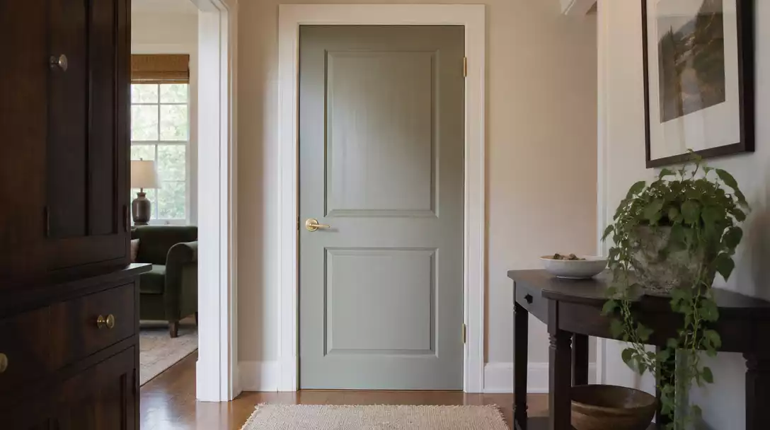
When dark furniture dominates a room, heavy doors can make the space feel cramped, while stark white paint often looks disconnected. This guide covers 10 interior door color ideas worth saving to balance your room’s undertones. Here are the best strategies to anchor your space without shrinking it.
Soft Ivory
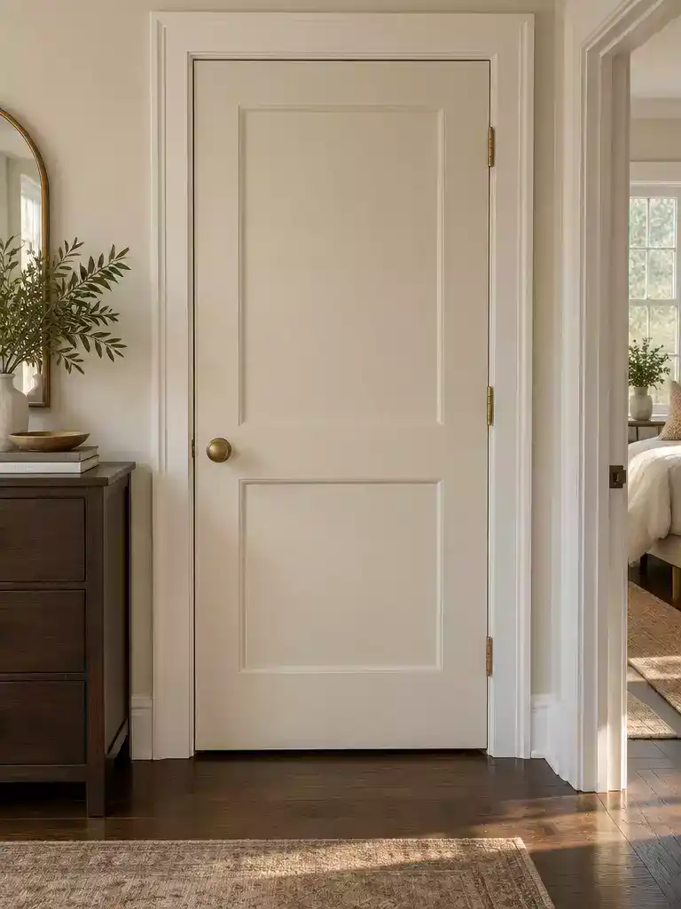
Refresh your space with a warm, creamy finish that grounds heavy furniture without appearing harsh.
As an Amazon Associate I earn from qualifying purchases. Affiliate links may earn me a commission at no extra cost to you.
Soft ivory serves as the ultimate balancing partner in rooms where dark mahogany or espresso furniture threatens to overpower the visual landscape. Unlike stark, clinical white – which often looks like a jarring sticker against deep wood tones – ivory introduces a creamier, warmer depth that bridges the gap between your furniture and your walls.
The Dingy Factor
Avoid ivories with heavy yellow undertones at all costs. In dim lighting, these hues can quickly shift from welcoming to aged or dingy, clashing with the crisp finish of modern dark furniture.
This color is an ideal choice for homeowners who want their room to feel airy and welcoming rather than bright and sterile. It works best when you want to soften the edges of heavy, oversized upholstery or dark cabinets, making the furniture feel like a deliberate part of the architecture.
If you are deciding whether this is the right move for your home, consider these quick checks before picking up a brush:
- Test the Undertone: Always compare your ivory sample directly against the wood finish of your furniture under both morning and evening light.
- Limit the Yellow: Look for “clean” ivories that lean toward cream or soft white, rather than those with visible golden or honey undertones.
- Check the Contrast: If your furniture is a cool-toned dark charcoal, opt for an ivory with a drop of gray to keep the palette from feeling disconnected.
⭐ Soft Ivory Doors for Your Home
✨ Editor’s Pick
Solid Core White Primed Shaker Slab Door
Raised Six Panel Textured Primed Door Slab
Large Indoor Cat Door for Interior Doors
💡 Why This Works:
Ivory acts as an architectural bridge, gently diffusing the intensity of dark furniture without creating the “cut-out” effect common with pure white. By selecting a creamy, warm-toned neutral, you soften the room’s hard edges, allowing heavy mahogany or espresso pieces to feel intentionally grounded rather than visually cluttered or confined.
Linen Beige
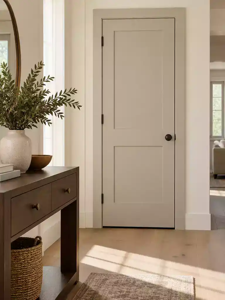
A balanced, grounding choice that bridges the gap between deep wood tones and lighter walls.
Linen beige is your best move if your room features walnut or oak furniture that feels too heavy for the surrounding space. It acts as a bridge, pulling the warmth out of the wood without making the door feel like a dark, imposing object.
The Grounding Effect: Unlike stark white, which can create a jarring cutout against dark mahogany or espresso, linen beige softens the transition.
It makes the furniture feel like a deliberate part of the design rather than a collection of heavy, disconnected pieces.
Before you commit to a gallon of paint, you have to watch for undertone shifts. Linen beige is a chameleon that can quickly turn against your furniture if the lighting isn’t right.
If your furniture leans toward cool, dark finishes, skip the linen beige and look for a cooler neutral instead. This color works best when you want to emphasize a cozy, warm, and cohesive atmosphere in rooms with significant natural light.
⭐ Linen Beige Accents We Love
Matte Black Entry Door Knob With Lock
✨ Editor’s Pick
Linen Blackout Curtain for Glass Doors
Clear Rubber Glass Retainer for Doors
💡 Why This Works:
Linen beige succeeds because it shares the same warm, earthy DNA as walnut and oak furniture. By echoing the furniture’s natural undertones, the door stops competing with the wood and instead creates a unified, layered look that feels intentional and calm rather than starkly contrasted.
The Visual Benefit: It softens the room’s overall visual weight, making heavy furniture feel like a natural design choice.
Paint is a significant commitment, but the fear of a permanent mistake often looms larger than reality. Most homes find their balance through a few strategic choices that unify the space, and you can explore color strategies to see how these selections actually perform in practice.
The most successful rooms aren’t built on one perfect choice, but on testing a few options against your existing furniture to ensure the undertones genuinely harmonize.
Pale mushroom
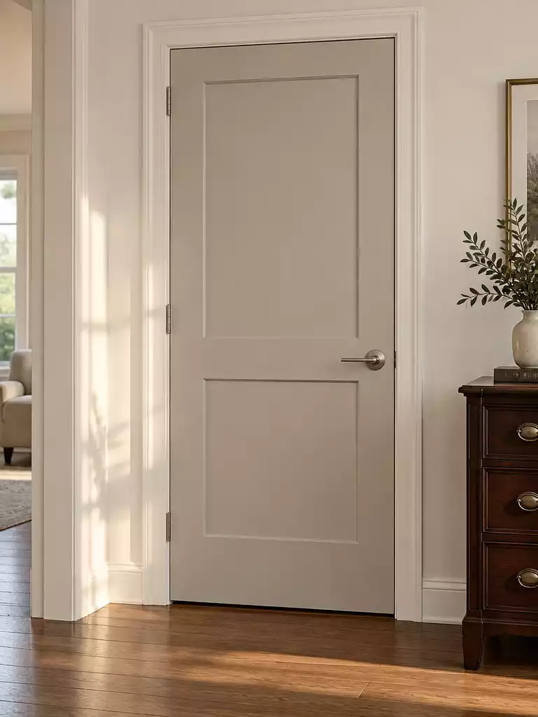
Create a deliberate, balanced connection between your dark furniture and lighter room architecture.
Pale mushroom acts as the ultimate middle ground when you want visual contrast without the clinical starkness of pure white. It bridges the gap between deep, heavy furniture finishes and lighter wall colors, making your layout look intentional rather than accidental.
The Disappearing Act Warning: Because this color is inherently muted, it can sometimes lose its distinction if it leans too brown.
If your dark furniture is a deep espresso or walnut, avoid mushroom tones with heavy brown undertones as they will simply blend into the furniture rather than framing it.
This color works best for homeowners who find white doors too glaring but fear that darker shades will swallow the room’s light. It creates a soft, contemporary silhouette that allows dark pieces to sit comfortably in the space.
Always test your sample against the actual furniture finish at different times of the day. A swatch that looks perfect in the morning sun might shift significantly under evening artificial light, potentially clashing with your wood tones.
⭐ Pale Mushroom Doors to Consider
Sliding Barn Wood Door with Hardware Kit
Five Lite French Interior Glass Slab Door
✨ Editor’s Pick
Sliding Barn Wood Door for Interior Rooms
💡 Why This Works:
Pale mushroom succeeds because it functions as an architectural bridge rather than just a wall color. By echoing the mid-tones found in natural wood grain, it softens the heavy presence of dark furniture without turning the door into a competing focal point, ultimately creating a cohesive, professionally curated room feel.
Design takeaway: Use this color to unify rooms where high-contrast white doors feel like jarring, disconnected stickers.
Dusty Sage
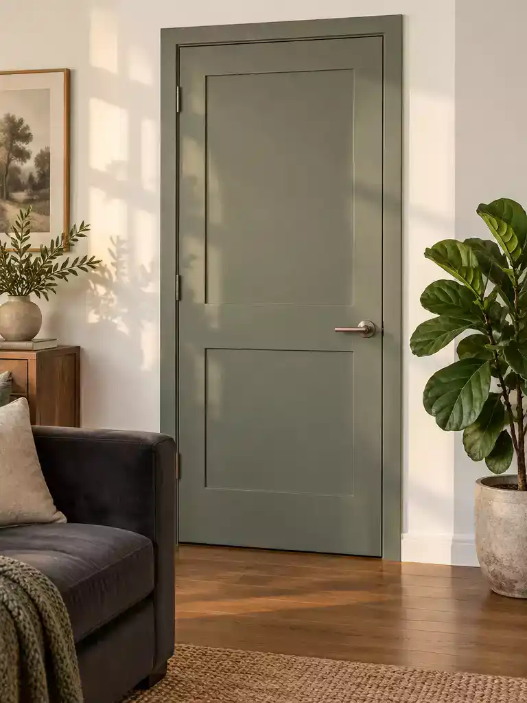
Bring a calm, restorative feel to rooms heavy with dark furniture by using organic, muted tones.
Dusty sage acts as a quiet, botanical shift for spaces weighed down by dark upholstery or heavy wood pieces. It introduces color without overwhelming the room, effectively softening the sharp edges of dark, solid furniture.
The Undertone Requirement: To keep this look from feeling disjointed, your sage must be strictly muted and gray-leaning. Avoid any versions with strong yellow or neon-green bases, which will clash aggressively with dark mahogany or espresso finishes.
This color is a smart move for you if your home already leans into natural textures like linen, jute, or indoor greenery. It bridges the gap between those natural elements and the gravity of your dark furniture, making the entire space feel intentional.
Skip this color if your room is dominated by warm, honey-toned woods or gold-heavy decor. In those specific settings, a green-based sage can look accidentally muddy rather than curated.
⭐ Dusty Sage Doors Worth Buying
✨ Editor’s Pick
Five Grid Primed Barn Door Slab Kit
Matte Black Passage Door Knob No Lock
🏡 Make It Feel Natural:
- Layered textiles: Pair your sage door with linen curtains or jute rugs to repeat the organic, earthy theme.
- Botanical accents: Incorporate live greenery or wood-toned frames nearby to pull the door’s color into the room.
- Matte finish: Choose a flat or matte paint sheen to keep the sage looking soft, velvety, and approachable.
Muted Blue-Gray
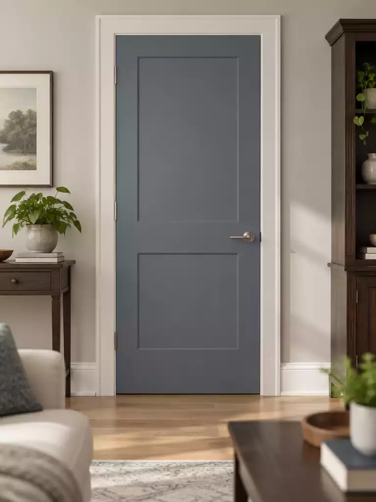
Create a polished, modern counterpoint to heavy dark furniture with cool, architectural color.
This color provides a crisp, modern counterpoint to the warmth of chocolate or espresso finishes. By introducing a cooler undertone, you prevent the room from feeling like a one-note “wood-on-wood” environment.
A muted blue-gray pulls the entire space into a more professional and composed aesthetic. It acts as a bridge, grounding the floor and wall colors while highlighting the structure of the doorway itself.
Avoid the “Flatness” Trap
In rooms with minimal natural light, this color can quickly turn somber or appear ink-like. Always test a large sample on the door before painting to ensure the light levels maintain the intended blue-gray depth rather than a flat, heavy gray.
Use this option if you want your space to feel highly designed and intentional. If your home has a traditional layout with low window exposure, you should skip this shade to avoid a cold or moody atmosphere that might shrink the room.
⭐ Muted Blue Gray Doors We Love
✨ Editor’s Pick
Five Panel Prehung Interior Door With Jamb
🧰 Questions for Your Painter
- Light-level adjustment: Ask if they recommend a higher-sheen finish to help the color reflect more light in dim hallways.
- Undertone matching: Request a side-by-side swatch comparison of three blue-gray variations against your specific furniture finish at noon.
- Long-term performance: Inquire about high-durability, scuff-resistant paint formulas that maintain color integrity without losing their crisp, cool depth.
Warm Pewter
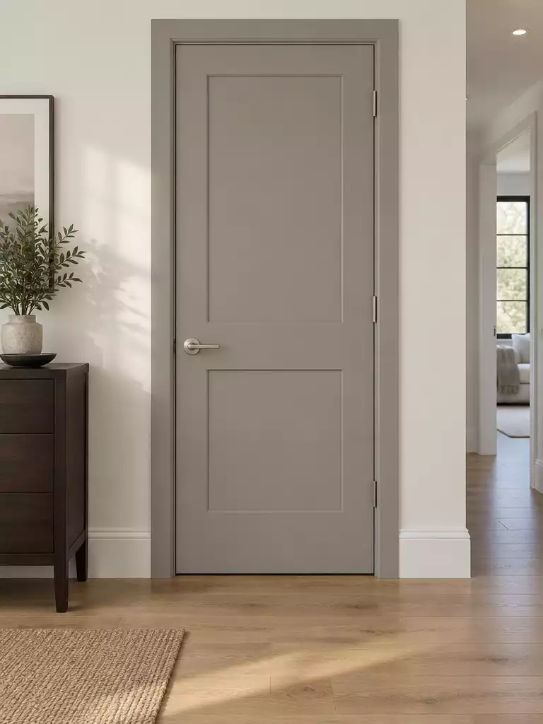
Achieve a sophisticated balance that anchors your space without the heaviness of black.
Warm pewter serves as the ideal tailored neutral for rooms where you need to soften dark furniture without defaulting to white. It provides the necessary depth to stand against heavy pieces like mahogany or walnut while avoiding the shrinking, cave-like effect often associated with charcoal or black doors.
The Chameleon Effect Alert: Warm pewter is notorious for shifting its personality based on the available light. It can pull toward cool lavender, soft green, or earthy brown depending on the time of day.
This color is best suited for homeowners who want a polished, professional aesthetic that feels intentional rather than accidental. If you are struggling with a room that feels “muddy” or disconnected, this mid-tone bridge helps pull your dark furniture into the wider color scheme.
Crucial Step: Never commit to a full gallon without painting a large swatch and observing it against your furniture at both 9:00 AM and 7:00 PM. Seeing how the color behaves under artificial versus natural light is the only way to avoid an undertone clash.
⭐ Warm Pewter Doors to Consider
✨ Editor’s Pick
Wood Door Lock Installation Drilling Kit
Cocoa Brown
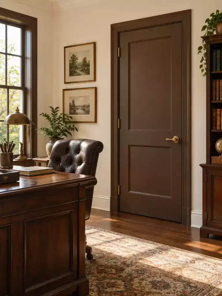
Create a grounded, library-like atmosphere by embracing deep, warm tonal layers in your home.
Cocoa brown is a sophisticated choice for rooms that feel too sparse or clinical. It works best in spaces filled with traditional wood furniture, as the shared warmth creates a seamless, library-inspired aesthetic.
Warning: The Value Trap
Avoid choosing a shade that mimics your furniture’s darkness too closely. If the door and the furniture share the exact same depth, the room will lose its definition and begin to feel claustrophobic.
Use this color only in rooms with abundant natural light or strong artificial layering. In dim, windowless hallways, cocoa brown can quickly turn a space into a dark, uncomfortable cave.
If you want to pull off this look successfully, follow these placement rules:
- Pair with lighter wall colors to prevent the room from feeling like a solid block of color.
- Ensure your furniture has a slightly different undertone or texture to provide visual separation.
- Add metallic accents or glass elements to bounce light around and break up the heavy brown tones.
💰 What This Really Costs
- The material reality: High-quality dark pigments often require multiple coats for full coverage, increasing your paint volume and project time.
- Hidden prep cost: Darker doors highlight every surface scratch or dent, so budget extra for high-quality primer and filler to ensure a smooth finish.
- Worth the investment: Investing in premium, high-opacity paint is essential here; cheaper formulas will streak, requiring even more labor to fix.
Deep Moss
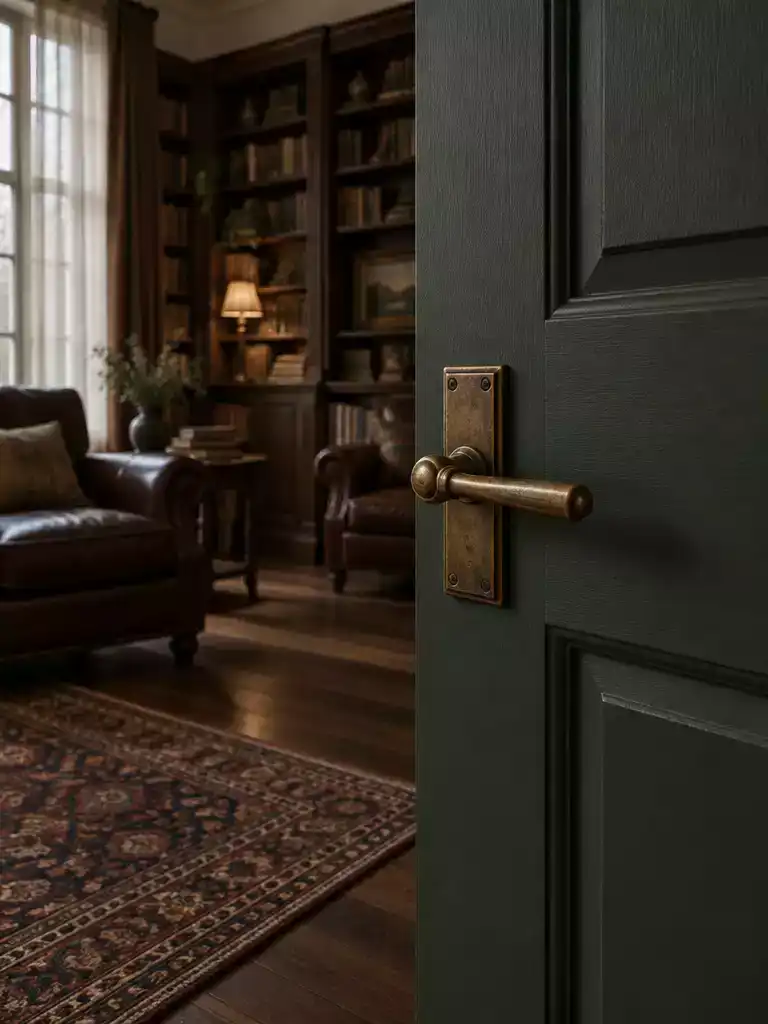
Anchor your room with this grounded, moody green that brings an organic, library-like atmosphere.
Deep moss serves as a grounded, natural alternative to the standard black or brown doors often paired with heavy furnishings. It works best in dens or private studies where you have a collection of dark, leather-heavy furniture that needs a unifying element.
This color choice creates a distinct, library-like atmosphere that feels intentional and curated. It pulls the room together without the visual weight of a solid black or dark charcoal surface.
The Muddy Undertone Warning: Avoid moss shades with a heavy yellow-green base, as these often look sickly or “off” against dark wood finishes. Stick strictly to blue-green or gray-green moss tones to ensure the color remains sophisticated under artificial light.
Before you commit, observe how the paint behaves at different hours of the day. A deep, blue-leaning moss can shift dramatically between morning sun and evening lamp light.
This color is an excellent match for homeowners who want to lean into a moody, retreat-like design. It is not recommended for small, windowless hallways where the saturation might cause the space to feel constricted rather than cozy.
⭐ Deep Moss Doors to Consider
✨ Editor’s Pick
Interior Slab Door With Five Frosted Glass
Thirty Inch Interior Slab With Frosted Glass
⚖️ Quick Decision Guide:
- Choose this if: Your space features heavy, dark leather upholstery or walnut pieces that need a softening, nature-inspired anchor.
- Skip this if: Your room lacks significant natural light, as a deep moss can easily turn somber and cave-like.
- Pair it with: Brushed brass or matte black hardware to heighten the “library” aesthetic and add a refined, metallic finish.
Smoky Mauve
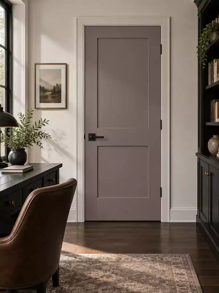
Break the wood-on-wood monotony with a sophisticated, moody undertone that elevates your dark furniture.
Smoky mauve is a high-risk, experimental choice designed specifically for the designer looking to shatter the monotony of brown-on-brown wood palettes. This color sits at the intersection of gray, brown, and soft violet, making it a complex chameleon that requires a careful eye.
The Undertone Test
Because mauve can swing wildly toward pink, flat gray, or dirty brown, you must test your sample against the exact finish of your furniture. If the undertone fights with the wood grain, the results will feel like a mistake rather than a curated design decision.
This color performs best when paired with cool-dark furniture finishes, such as black, charcoal, or deep espresso. It creates a bridge between those dark, heavy pieces and lighter wall colors, preventing the room from feeling like a static, dark box.
If you aren’t ready to commit to the entire room, try this on a secondary door first, like a linen closet or a guest suite. This allows you to observe how the color shifts from morning’s crisp light to evening’s artificial glow before you transform your main living area.
⭐ Smoky Mauve Doors Worth Buying
✨ Editor’s Pick
Composite Front Entry Door With Ironwork
💡 Why This Works
Smoky mauve acts as a bridge between high-contrast elements, softening the presence of black or deep charcoal furniture without losing the grounded, moody aesthetic. By picking up the subtle violet or gray notes in your furniture finish, this color makes the room feel intentional and layered rather than simply dark.
Design takeaway: Use this color to harmonize cooler, darker furniture palettes while preventing a clinical, sterile room atmosphere.
Soft Ebony
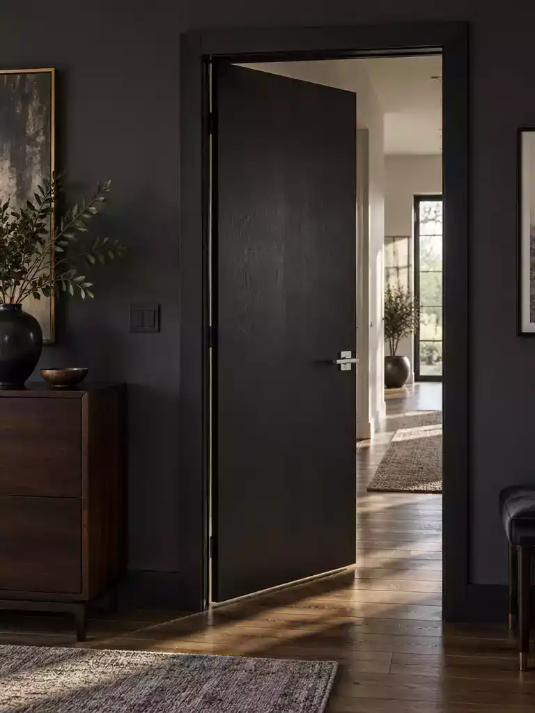
Create a sophisticated, high-contrast architectural envelope that unifies your dark furniture and walls.
Soft ebony functions as a bold architectural anchor, perfect for rooms where you want to lean into a moody, high-contrast aesthetic. By painting the door, trim, and surrounding wall the same deep shade, you create a tonal envelope that allows your dark furniture to feel like an intentional part of the room’s architecture rather than a collection of heavy, disconnected objects.
Warning: The Shrinking Effect
Because this is the darkest option on the list, it carries the highest risk of making a room feel smaller or claustrophobic. Avoid this choice in low-light bedrooms or narrow hallways that lack natural windows or high-output artificial lighting.
This color choice works exceptionally well when you need to hide visual clutter or mask door hardware that has become dated. If your space is already filled with dark wood, choosing soft ebony ensures the door doesn’t become a jarring, light-colored focal point that breaks up the room’s flow.
Designers’ Strategy:
- Use a matte or eggshell finish to prevent glare, which can make dark paint look cheap or washed out.
- Ensure your room has at least three sources of secondary lighting, such as lamps or sconces, to keep the dark walls from consuming all the light.
- Pair this with metallic hardware in gold or brushed brass to provide a necessary, reflective pop against the deep, dark surface.
⭐ Soft Ebony Doors We Love
✨ Editor’s Pick
Six Pack Privacy Door Knob Matte Black
Ten Pack Privacy Door Knob Matte Black
Six Pack Matte Black Interior Door Hinges
📈 The Long-Term Payoff
While soft ebony creates a striking, modern atmosphere, its permanence is significant. Because deep, saturated pigments bond differently to wood grain, changing this look later often requires multiple coats of high-quality primer. Treat this as a long-term design commitment rather than a quick seasonal refresh, ensuring it aligns with your home’s enduring style.
Resale Insight: A bold, cohesive dark envelope can signal high-end design to buyers, provided the execution is flawless.
With all ten color strategies now in front of you, the path to a balanced interior becomes much clearer. You do not need to implement every suggestion to achieve a cohesive result; the doors that best align with your furniture’s specific undertones will carry the design. Choosing one or two shades that bridge the gap between your dark finishes and the room’s architecture is far more effective than forcing a complete overhaul all at once.
The most effective approach is to test your top picks against your furniture during different times of the day, as this ensures your final selection remains grounded. For more guidance on refining your space, exploring different paint approaches can help you move from planning to execution with confidence. Once you settle on the door color that fits, the heavy weight of the room will finally feel purposeful and intentional.
Related posts:
 15 Glass Framed Door Ideas That Pull Light Into Dark Rooms
 Choosing a Door Color When the Rooms on Each Side Are Different Colors
 21 Dark Front Door Colors That Create Stunning Visual Contrast
 14 Front Door Colors Designers Love for Dark Blue Houses
 11 Front Door Colors for Houses With a Dark Roof
 17 Interior French Door Ideas That Instantly Open Up Small Rooms
 16 Glass Door Designs For Bright Interior Rooms
 10 Door Stops for Rooms With No Wall Behind the Door