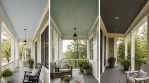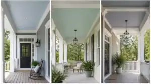
Choosing front door colors for homes with stone requires a careful balance so the entrance stands out instead of vanishing into the masonry. This guide rounds up 11 door ideas worth saving that coordinate with mineral undertones, helping you find the perfect match for your home.
Iron Black
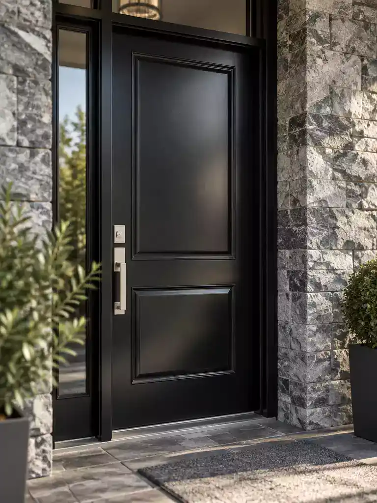
Create a bold, grounded entryway that frames your home with crisp, modern architectural definition.
As an Amazon Associate I earn from qualifying purchases. Affiliate links may earn me a commission at no extra cost to you.
Iron black functions as a dark anchor for stone entrances featuring charcoal, blue-gray, or cool mineral flecks. By providing a sharp, high-contrast frame, it highlights the natural geometry of the masonry rather than letting the door blend into the wall.
The Receding Risk: If your stone facade is already composed of deep charcoal or near-black slate, avoid this color.
In these cases, the door will likely disappear into the surround, losing its presence as a welcoming focal point.
To keep the entryway from looking like a flat hole in the wall, always opt for a high-sheen finish. A satin or semi-gloss paint reflects subtle light, ensuring the door maintains its depth and dimension against the rugged, matte texture of the surrounding stone.
⭐ Top Iron Black Mats for Entrances
✨ Editor’s Pick
Waterproof Non Slip Front Door Mat
Sturdy Natural Rubber Front Door Mat
Heavy Duty Funny Welcome Door Mat
💡 How to Test Iron Black Properly:
- Morning observation: Check the sample in early light to see if the black turns too blue or gray.
- Midday intensity: View the door under direct sun to ensure the sheen doesn’t look overly plastic or cheap.
- Late-day depth: Observe how the color holds up at dusk when the stone’s texture naturally begins to shadow.
Quarry Blue
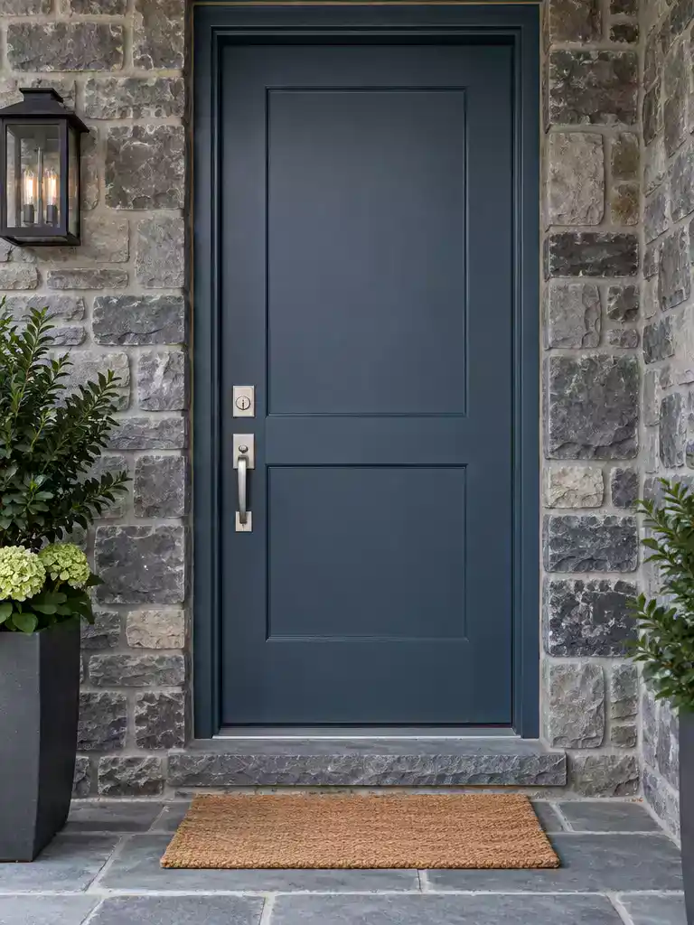
Connect your entryway to cool masonry with a color that bridges slate and gray tones.
Quarry blue acts as a strategic mineral echo for homes featuring slate, cool gray, or greenish stone veneers. Unlike a standard neutral that might fade into the masonry, this hue introduces a deliberate pop of color that separates your door from surrounding tan or taupe stone surroundings.
If your stone feels inherently “cold” or stark, this blue provides the necessary warmth to keep the entryway inviting. It works best as a bridge for homes that need a more vibrant, non-neutral presence without clashing with the natural stone pattern.
Best Application: Use quarry blue when your masonry is predominantly slate or cool-toned gray. It is particularly effective for homeowners who want their entrance to feel distinct from the house’s exterior stone cladding.
Avoid this color if your home features significant rust, terracotta, or warm iron-stained mineral deposits in the stone. In those instances, the blue will likely create an unintended, jarring color collision that fights the natural warmth of the masonry.
⭐ Quarry Blue Mats We Love
Jumbo Size Waterproof Entrance Door Mat
✨ Editor’s Pick
Hand Painted Coconut Fiber Door Mat
Black and White Striped Welcome Mat
💡 Why This Works:
Quarry blue succeeds by mimicking the natural shadow play found in slate and cool-toned granite. By mirroring these subtle mineral undertones, the color creates a harmonious bridge between the rugged texture of your stone and the artificial surface of the door, making the entryway feel like an intentional, curated extension of the home’s architecture.
Visual Connection: This shade reinforces the stone’s color story rather than competing with it, providing a professional, cohesive look.
Moss Green
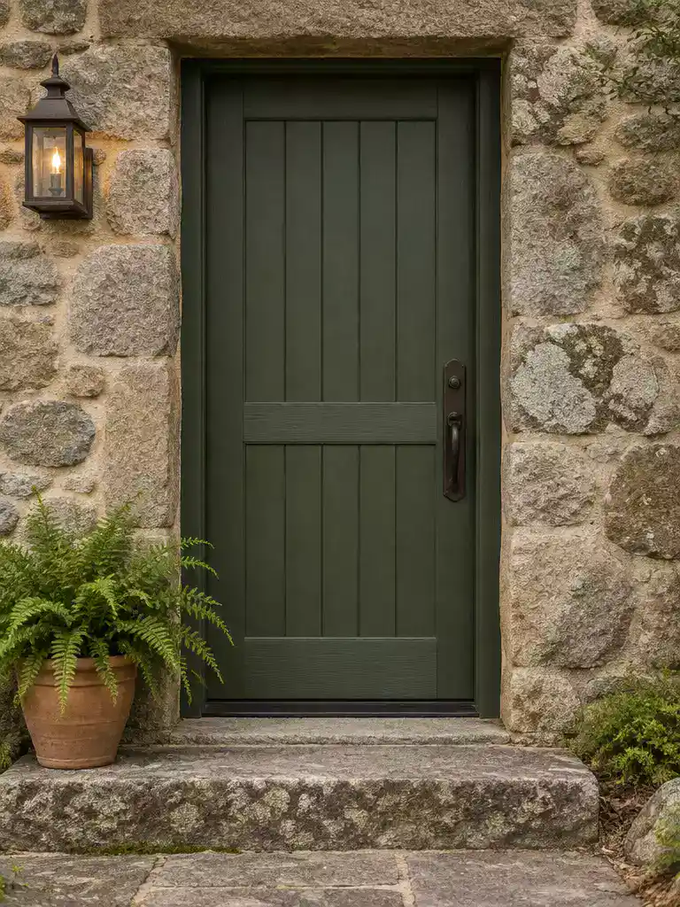
Ground your entryway with organic tones that bridge the gap between stone and nature.
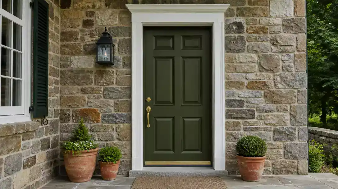
Moss green is the go-to selection for fieldstone or weathered limestone featuring olive, brown, or lichen-like mineral variations. This shade acts as a natural bridge, softening the harsh transition between rugged masonry and your surrounding landscape.
If your home leans toward rustic or cottage-style architecture, this color is your best bet for avoiding a clinical or man-made appearance. It works because it pulls directly from the earthy pigments already present in the stone’s surface, making the entrance feel like an extension of the garden rather than a separate structure.
Why it works: Unlike synthetic brights, moss green maintains a muted, low-saturation profile that allows the stone’s inherent texture to remain the star of the show.
Consider this color if you want to emphasize a cozy, established look. You should skip this option if your stone is primarily cool gray or blue-dominant, as the green undertones may create an unintended clash with those specific mineral profiles.
⭐ Moss Green Mats Worth Buying
Funny Indoor Entrance Welcome Door Mat
Personalized Blank Artificial Coir Mats
✨ Editor’s Pick
Heavy Duty Artificial Grass Door Mat
🏡 How This Works in a Real Home:
- Exterior lighting test: Check your porch lights at night; moss green tends to darken significantly under warm-toned bulbs.
- Hardware coordination: Pair this organic shade with matte black or oil-rubbed bronze hardware to avoid a jarring, modern contrast.
- Siding interaction: Ensure the green doesn’t compete with nearby wood trim; it looks best when allowed to anchor the stone exclusively.
Differentiating between a fleeting trend and a finish that actually lasts is the hardest part of any front door renovation. You do not need to curate an entire entrance based on a single passing fad to see a high-end result.
True curb appeal is built on selecting a shade that respects your home’s permanent masonry rather than trying to follow the latest design cycles.
Pewter Green
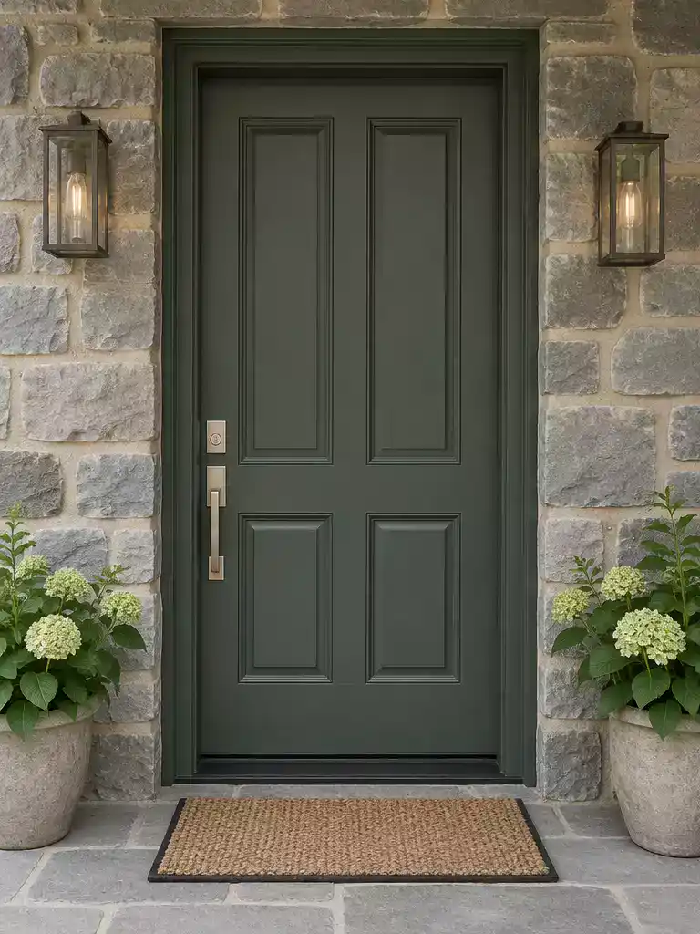
Connect cool gray stone with warm mortar undertones using this sophisticated, muted green bridge.
Pewter green is the ideal choice when your stone facade feels disconnected from your home’s trim or mortar. It works as a chromatic bridge because it balances cool, gray-leaning green pigments with just enough softness to harmonize with sandy or taupe mortar lines.
Why it works: Unlike a standard neutral gray that might look flat against stone, pewter green adds a layer of depth.
Its muted nature ensures the door maintains a presence without competing with the complex, busy patterns often found in natural masonry.
You should consider this shade if you want a door that feels substantial but not aggressive. It thrives in entrances where the stone’s primary personality is cool gray, yet the overall house palette includes warmer exterior elements like limestone steps or wood-toned eaves.
This color is perfect for homeowners who want to avoid the “receding” risk of charcoal or black doors. It provides enough visual weight to define the entry point clearly, even on cloudy days when natural light is limited.
⭐ Pewter Green Mats to Consider
✨ Editor’s Pick
Fall Decor Buffalo Plaid Outdoor Rug
Hand Woven Buffalo Check Outdoor Rug
Oxide Red
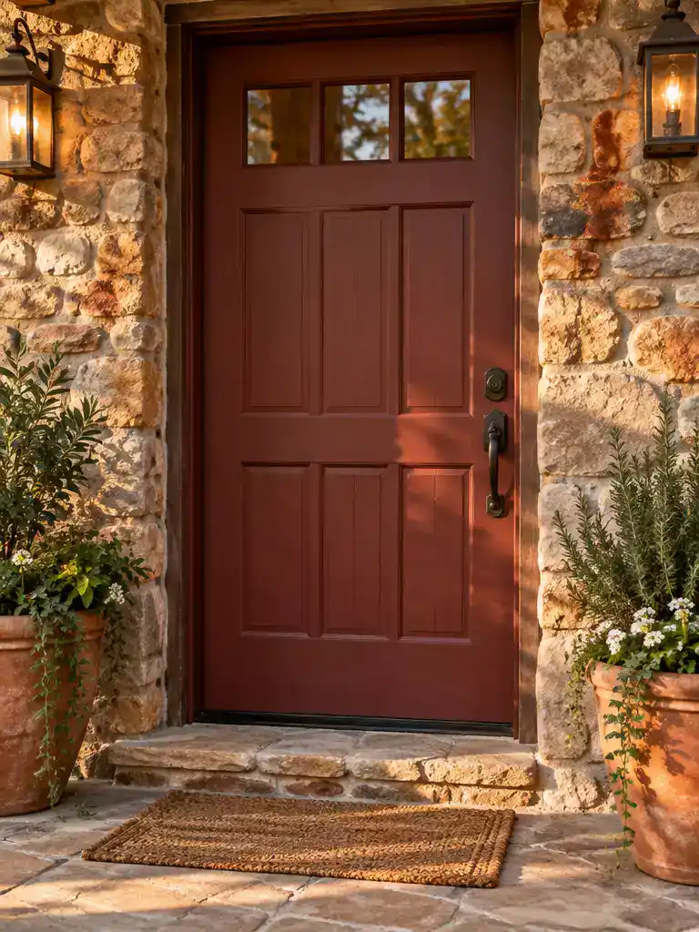
Bring out the hidden warmth in your masonry with this rich, historic earth tone.
Oxide red acts as the perfect bridge for stonework that leans heavily into rust, terracotta, or iron-stained mineral deposits. Because this shade shares the same earthy origins as the stone itself, it creates a cohesive, grounded focal point that feels like a natural part of the architecture.
Warning: Use caution if your stone is pale or lacks deep, warm mineral notes. On light-colored limestone or cool gray masonry, this shade can look disconnected and potentially dominate the entrance too aggressively.
For homes where the masonry has naturally occurring warm streaks, this color choice anchors the entryway without fighting the stone’s existing patterns. It provides a level of depth that makes the door feel substantial and intentional rather than like a painted afterthought.
Deciding if this is the right move for your home comes down to a quick check of your stone’s dominant mineral profile:
- Ideal for: Fieldstone or split-face masonry with clear brown, copper, or orange-toned inclusions.
- Skip if: Your stone is primarily cool gray, blue-gray, or stark white, as the contrast will lean toward clashing rather than harmonizing.
⭐ Oxide Red Mats We Love
✨ Editor’s Pick
Custom Size Waterproof Bench Cushion Mat
🧰 Questions for Your Installer:
- Color matching: Ask if they can tint the primer to minimize color bleed-through on porous, high-texture stone surfaces.
- Finish durability: Confirm if a high-grade satin finish is recommended to provide moisture resistance against the surrounding masonry.
- Maintenance plan: Request instructions on touch-up procedures, as oxide pigments can fade unevenly if exposed to intense sun.
Smoky Brown
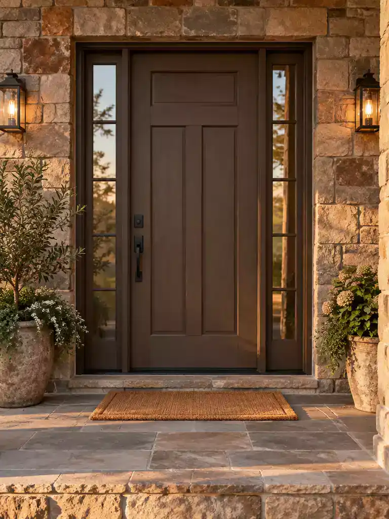
Anchor your entryway with a grounded, earthy hue that complements any stone variation.
If you are looking for a fail-safe choice that bridges the gap between conflicting mineral tones, smoky brown is your best bet. This shade works because it sits firmly within the neutral, earthy family found in most natural masonry.
Why it works: Unlike high-contrast black or vibrant colors, smoky brown provides enough depth to define the door frame without appearing artificial. It pulls the varied colors of your stone together into a single, cohesive look.
This color is an ideal pick for homes with mixed stone palettes where one specific color might clash with the masonry’s natural variation. If you want a sophisticated, low-risk update that feels like a natural part of the architecture, this is the solution.
Quick Planning Tip: To get the best result, ensure your paint finish is satin or semi-gloss rather than flat. A little sheen will help the smoky brown pop against the rough, porous surface of the stone surrounding your entrance.
⭐ Smoky Brown Mats for Entrances
✨ Editor’s Pick
Rustic Brown Hall Tree Bench Storage
Football Field Rug and Welcome Mat
💡 Why This Works:
Smoky brown acts as a visual anchor because it mimics the natural mineral shadows found within stone. By choosing an earthy tone, you avoid the “artificial” look that can occur when high-contrast colors clash with the rugged, variegated texture of your masonry, creating a seamless transition from the stone to the door.
Design Benefit: It provides essential framing without competing with the stone’s complex, natural color story.
Muted Ochre
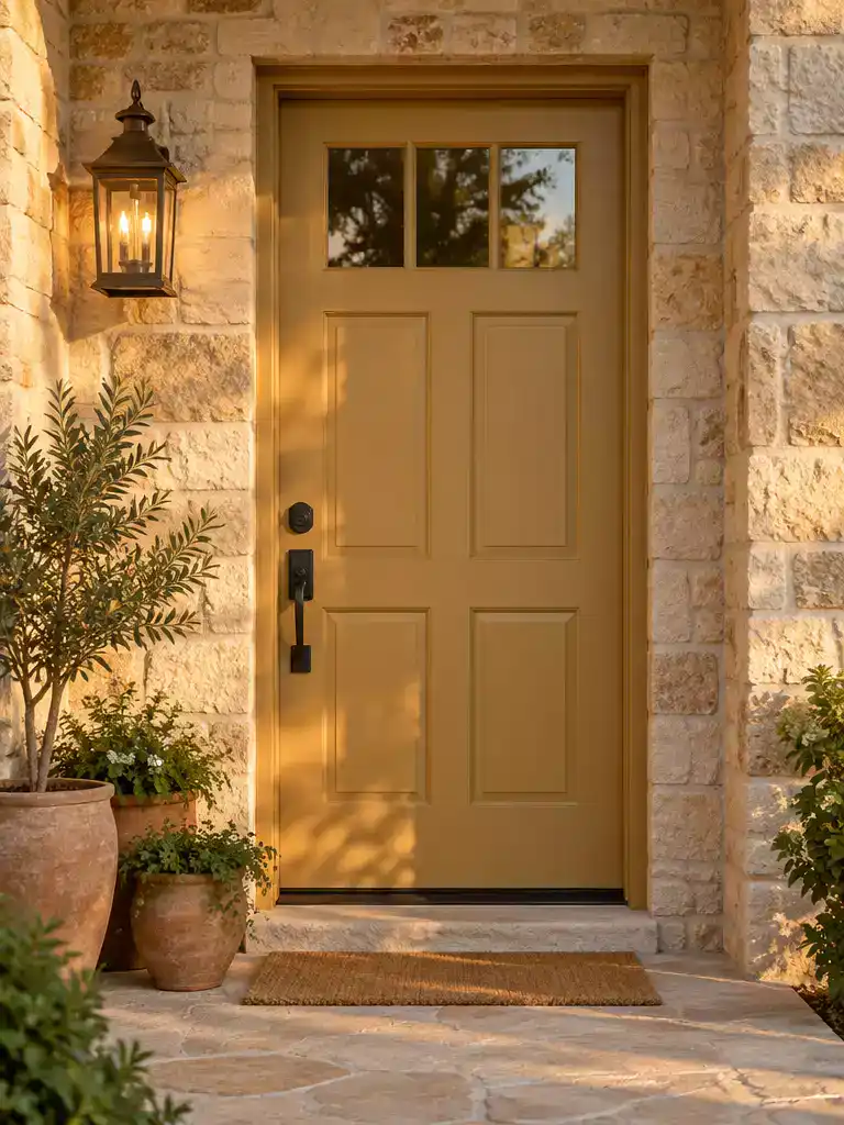
Bring sun-warmed light to your entryway by pairing earthy ochre with textured buff stone.
If your home features honey, buff, or tan stone, a muted ochre door acts like a natural light source. It draws the eye to the entrance by echoing the golden mineral notes already present in your masonry.
The key to success here is avoiding anything labeled “bright yellow” or “sunflower.” Those saturated shades will look like a painted accent rather than a design choice that belongs to the house.
Why Muted Ochre Works:
- It bridges the gap between cool-toned stone and the warm, welcoming feeling of a front door.
- The earthy base ensures it doesn’t fight the natural color variation of the stone.
- It adds a sense of brightness to shaded or north-facing entrances where the stone might otherwise look gray or dull.
This color is ideal for homeowners who want to lift the visual weight of a heavy stone facade. If your stone has cool gray or blue undertones, skip this color as it may create a jarring contrast that highlights the stone’s coldness rather than warming it up.
⚖️ Quick Decision Guide: Ochre vs. Yellow
- Choose this if: Your stone has sandy, buff, or honey notes that need a warm, organic color anchor.
- Skip this if: Your masonry is primarily cool-toned granite or blue-gray slate, which will clash with ochre’s warmth.
- Pair it with: Matte black or oil-rubbed bronze hardware to ground the golden tones and prevent a “citrus” look.
Blue-Gray
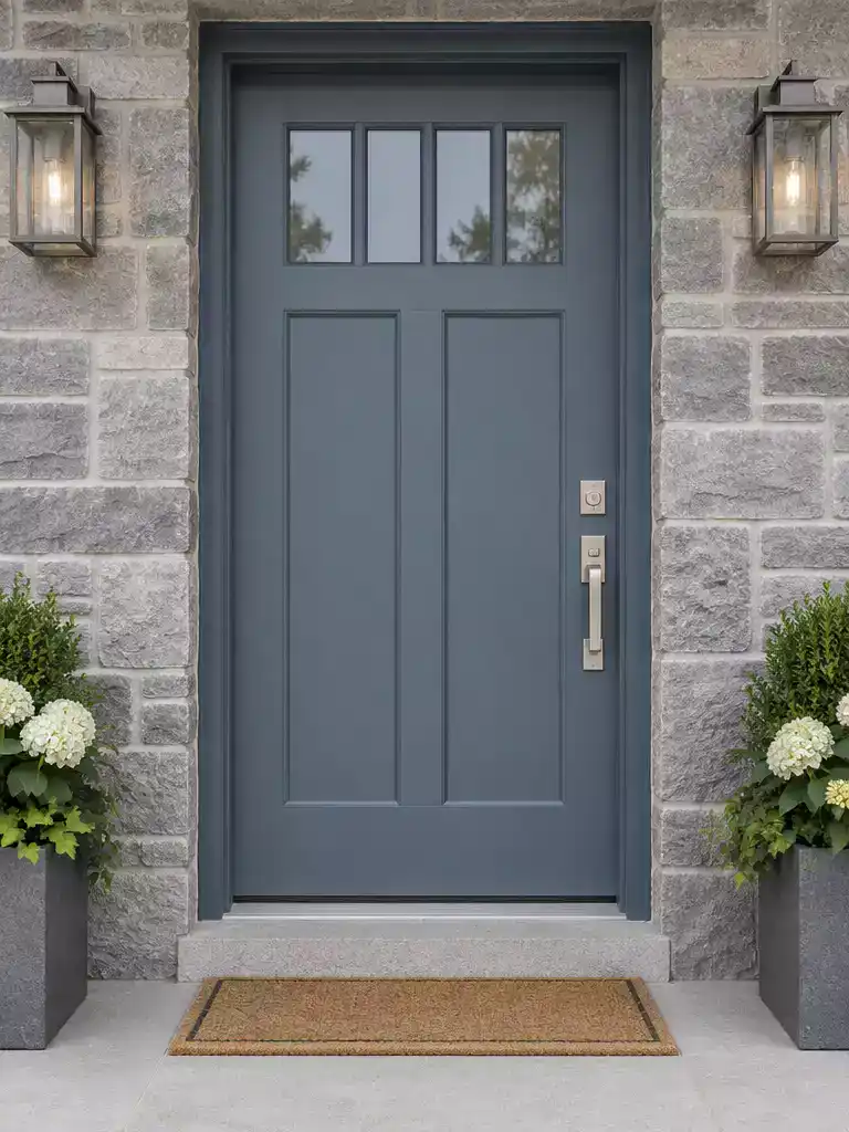
Reinforce the natural mineral character of your stone entrance with this crisp, balanced color choice.
Blue-gray is one of the most reliable selections for homes built with granite, slate, or gray limestone. These stones often contain subtle cool pigments that can look flat if paired with a standard neutral.
By choosing a blue-gray, you pull those hidden mineral undertones to the surface. This creates a cohesive look that feels intentional rather than accidental.
Why it works: Unlike deeper shades like iron black, blue-gray provides visible depth without the risk of the door receding into the masonry.
It maintains a sense of lightness while clearly defining the entryway as a distinct architectural element.
Consider this option if your stone has a high concentration of cool, gray-scale variety. It is particularly effective for homeowners who want to modernize the look of rough-hewn, traditional stone without clashing with the existing color story.
For the best result, opt for a satin finish. This sheen level captures just enough light to show the door’s texture without competing with the rugged, matte surface of the stone.
Plum Brown
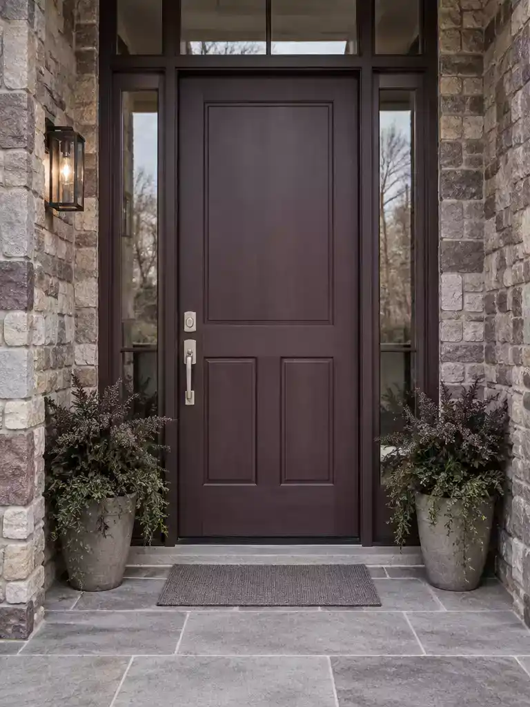
Connect mixed-mineral stone with a sophisticated, earthy shade that bridge warm and cool tones.
Plum brown is a strategic choice for stone that feels impossible to match because it contains both warm and cool mineral deposits. If your masonry features flecks of gray, tan, and shadowed purple, this color acts as a cohesive bridge that pulls those disparate tones together.
Warning: Watch the Saturation
This color must remain heavily muted to stay connected to your stone. Avoid high-chroma purple paints, which will look like an artificial plastic accent rather than a natural extension of the architecture.
This shade provides significant depth, making it ideal for entrances that lack strong architectural definition. It is a sophisticated alternative to standard browns or grays, offering a level of character that feels intentional and grounded.
Choose plum brown if your stone has a distinct “earthy” feel but you want to avoid the common fallback of black or navy. Skip this option if your stone is strictly monochromatic, as the complex undertones of the paint might clash with a simple, singular color profile.
💡 Why This Works
Plum brown succeeds because it creates a sophisticated visual bridge between contrasting mineral temperatures. By occupying the space between warm earth tones and cool gray shadows, it prevents the entryway from looking fragmented, instead creating a unified, intentional focal point that feels deeply rooted in your home’s existing stone palette.
Design takeaway: Use this color to harmonize mixed-mineral stone without resorting to standard black or gray.
Chestnut
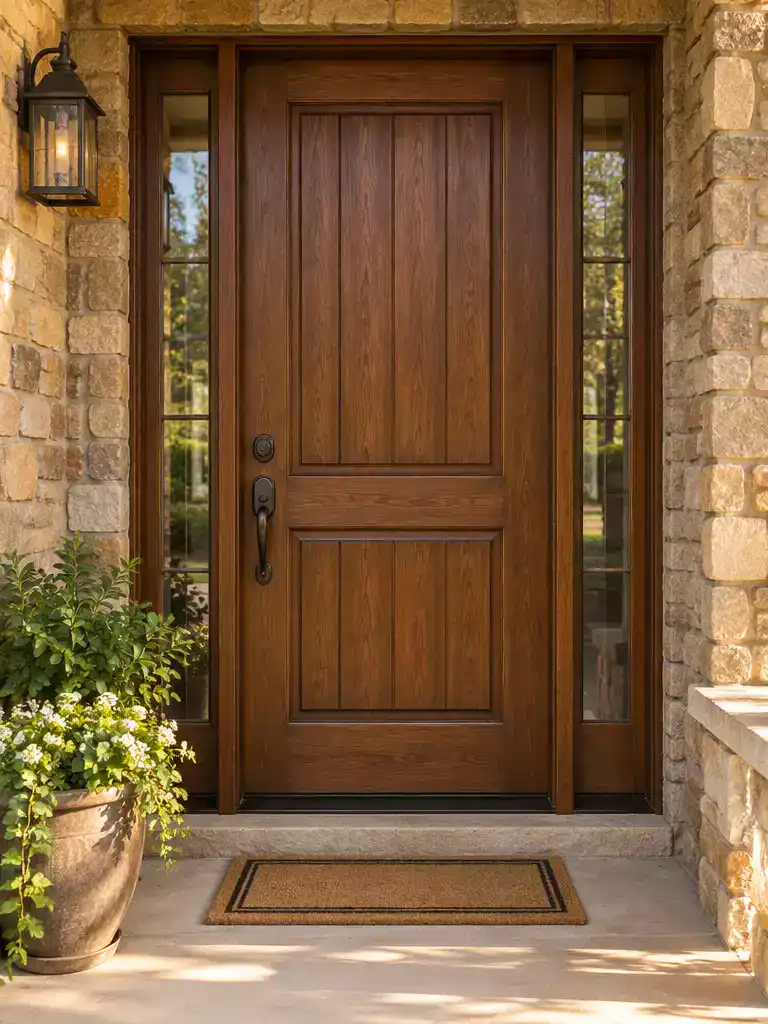
Warm, earth-inspired tones create a welcoming anchor for stone-clad homes with natural mineral variations.
Chestnut is a natural fit for homes featuring warm stone, as it effectively mimics the depth of bark and deep earth tones. This shade creates an entrance that feels substantial and inviting rather than clinical or cold.
The Definition Rule: Ensure your chosen chestnut paint is not the exact same hue as the main color of your stone.
If the values are too similar, the doorway will lose its visual definition and fade into the masonry. Always test your sample in both direct sunlight and deep shade to confirm there is enough contrast.
This color works best for homeowners aiming to highlight the natural warmth of their architecture. It connects the front door to the environment, making the transition from landscape to living space feel intentional.
Skip this option if your stone is primarily cool gray or slate-toned, as the warmth of chestnut may create an awkward color clash. For those cooler stone palettes, a blue-gray or pewter green will offer better harmony.
📈 The Long-Term Payoff:
Chestnut tones offer exceptional longevity for curb appeal because they harmonize with the natural, organic evolution of your stone masonry. Unlike high-contrast, trendy colors that can feel dated within a few seasons, this earthy choice maintains a timeless, substantial look that appeals to a wide range of future buyers.
Investment Insight: Choosing a natural palette ensures your entrance remains classic, maximizing the visual ROI of your paint job.
Limestone Beige
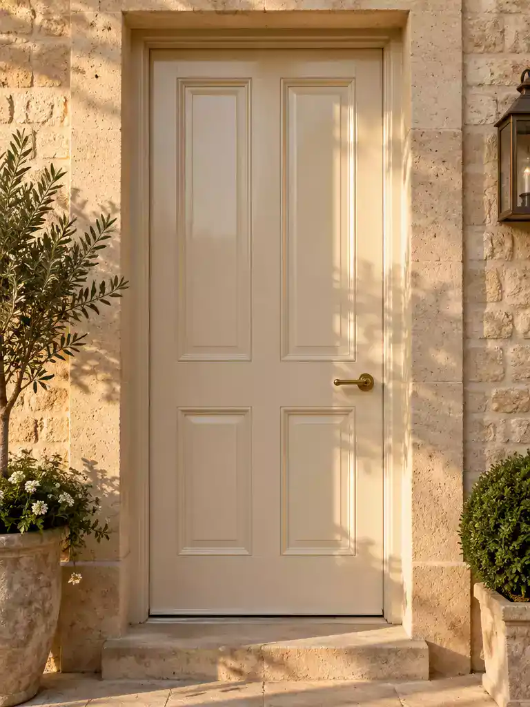
Create a soft, sophisticated entrance that harmonizes perfectly with creamy or buff-toned natural stone.
Limestone beige is the top choice for homeowners who want an understated, monochromatic look against creamy or buff-colored stone. It relies on subtle tonal shifts to provide interest rather than loud, eye-catching contrast.
The Disappearing Act Warning
This color carries the highest risk of the door visually disappearing into the masonry. If you choose this palette, you must use a high-gloss finish or a sharp trim contrast to maintain the necessary definition around your entrance.
To pull off this monochromatic style without the door getting lost, prioritize your finish and hardware selections. The goal is to separate the door plane from the wall plane through texture and depth.
- High-Gloss Sheen: Use a high-gloss paint to catch natural light and create a clear visual break from the matte, porous texture of the stone.
- Define the Trim: Paint your door casing a slightly lighter or darker shade than the door itself to create a crisp perimeter.
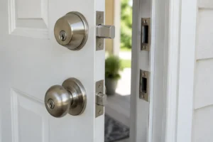
- Hardware Contrast: Use dark, oil-rubbed bronze or matte black hardware to anchor the door and provide a singular, sharp focal point.
This approach is right for anyone looking to highlight the architectural lines of the entrance without adding color complexity. If your stone has heavy dark veining or deep charcoal inclusions, skip this option as it will look washed out by comparison.
⭐ Limestone Beige Mats to Consider
Funny Indoor Outdoor Farmhouse Door Mat
✨ Editor’s Pick
Absorbent Dirt Resist Indoor Door Mat
Halloween Pumpkin Outdoor Welcome Door Mat
📋 Quick Reality Check: Testing Your Beige
- Morning shade: Observe how the beige looks when the stone is cool and shadowed to ensure it doesn’t appear sickly or gray.
- Midday sun: Confirm that the high-gloss finish reflects enough light to keep the door from washing out against the bright stone surface.
- Late-day light: Verify the color holds its warmth during sunset, preventing the door from looking flat or disconnected when the stone’s color deepens.
With eleven specific palettes now in front of you, the path to a balanced entryway becomes much easier to navigate. Focus on the one or two shades that truly complement your stone’s mineral profile, as you certainly do not need to experiment with every concept here to get the result you want.
The most successful front door projects rely on a clear connection between the masonry and the paint finish. Once you identify the dominant undertone of your stone, you can test your top two selections in varying daylight to confirm the fit. A high-contrast, professional-looking entrance is achieved through these few deliberate choices rather than exhaustive experimentation.
Related posts
 15 Front Door Colors Designers Pick for Brick & Black Shutter Homes
 12 Wood Front Door Color Ideas for Timeless American Homes
 12 Steel Front Door Designs That Look Clean In City Homes
 Why Some Homes Feel Welcoming Before You Reach the Front Door
 12 Front Door Privacy Options for Homes Near the Sidewalk
 Front Doors for Homes Without a Covered Porch
 10 Pet Door Ideas for Homes Where You Don’t Want to Ruin the Front Door
 14 Best Front Door Colors for Log Cabin