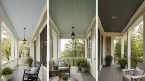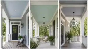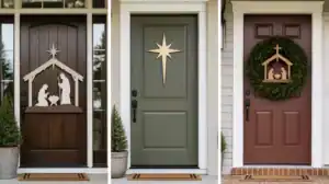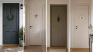
Painting your front door a different color on the interior and exterior is a high-impact way to balance curb appeal with your home’s unique style. This guide narrows the process down to 9 practical steps to ensure a professional finish and a result you can trust.
1. Exterior color role
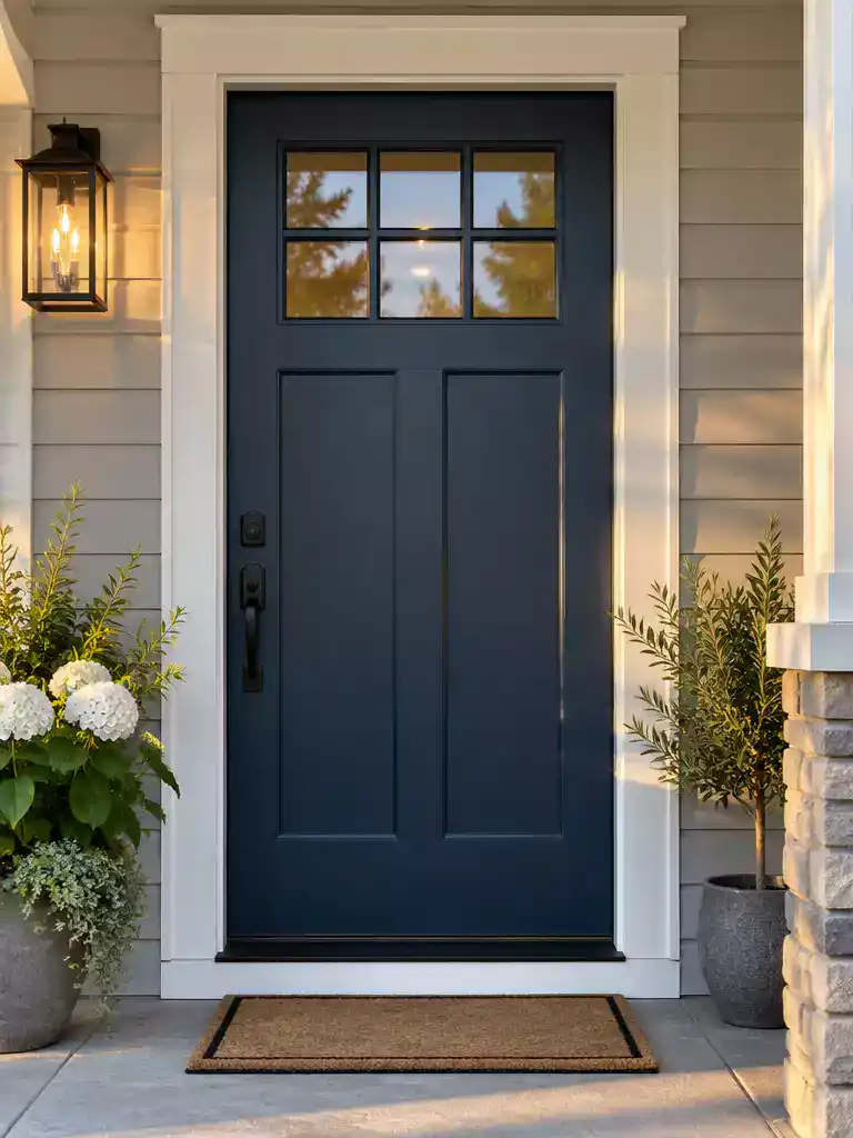
Anchoring your home’s facade with a bold, intentional color creates an immediate sense of curb appeal.
As an Amazon Associate I earn from qualifying purchases. Affiliate links may earn me a commission at no extra cost to you.
When you paint the exterior of your front door, you aren’t just applying pigment; you are creating controlled contrast. The exterior face needs to stand as a focal point that harmonizes with your home’s existing facade, roofline, and the overall neighborhood context rather than fighting against it.
For a high-impact look that signals intentionality, lean toward richer, deeper tones. Think navy, charcoal black, forest green, or a classic deep red.
Pro Tip: Performance Matters
Don’t use standard interior wall paint here. You need high-quality exterior acrylic latex or exterior acrylic enamel formulated specifically for high-touch, high-traffic areas. Brands like Behr offer formulations designed to resist moisture and UV fading, which is essential for a door exposed to the elements.
The biggest mistake homeowners make is selecting a color based on a tiny paint chip under fluorescent store lights. Exterior light shifts drastically throughout the day, and colors that look perfect at 10:00 AM can turn muddy or washed out by sunset.
The Sample Test Requirement
- Always paint large swatches on poster board rather than directly on the door.
- Observe your samples at three distinct times: high noon for the brightest exposure, late afternoon during the golden hour, and again in the evening under artificial porch lighting.
- Move the sample around the door to ensure it complements your permanent exterior materials like brick, stone, or siding.
By taking these steps, you ensure the color feels like a natural part of your home’s architecture. It’s about creating a finish that looks just as deliberate in the harsh afternoon sun as it does when your porch light clicks on at night.
⭐ Top Exterior Doors for Your Home
✨ Editor’s Pick
Solid Wood Core Double Exterior Doors
Pine Dutch Door Slab with Glass
Fiberglass Entry Door with Privacy Glass
🔢 The Right Sequence for Exterior Success:
Painting a front door requires a specific order of operations to ensure the finish survives harsh UV rays and moisture without premature peeling.
- Prep the surface: Thoroughly clean and lightly sand the door to remove any existing grime or loose coating.
- Apply exterior primer: Use a high-quality primer formulated for your specific door material to ensure maximum paint adhesion.
- Topcoat with enamel: Apply two thin, even layers of your chosen exterior acrylic latex or enamel for long-term weather resistance.
2. Interior color role
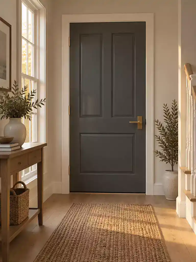
Ground your entryway by selecting a door color that harmonizes with your home’s interior temperature.
Your front door is a major architectural element, but inside the home, it shouldn’t feel like an isolated island. Instead, treat the interior face of your door as a foundational design piece that anchors your foyer to the rest of your house.
The most successful interior colors are those that respect the room’s existing temperature family. If your foyer is filled with warm wood tones or cream-colored walls, look toward earthy, grounding shades to keep the space feeling cohesive.
Color Strategy: Never choose a door color based on an online trend alone. The most effective approach is to repeat the door’s tone elsewhere in the room – such as in your textiles, a piece of art, or decorative accents – to ensure the color feels intentional rather than accidental.
When selecting your shade, consider the mood you want to set the moment you step inside. Here is how different palettes influence the feel of your entryway:
- Calming and Soft: Opt for soft greens, warm greiges, or muted blues. These tones are excellent for creating a serene, welcoming transition from the outside world.
- Dramatic and Elegant: A deep navy or charcoal can provide a sophisticated, high-contrast look that feels both modern and timeless.
- Bright and Airy: If your foyer is small or lacks natural light, creamy whites or pale, sun-drenched yellows can reflect light and make the space feel larger.
Avoid the pitfall of picking a color that fights with your foyer’s existing palette. If your foyer walls are already a strong color, a door in a tonal or monochromatic shade often works best to prevent visual clutter. By aligning the door with the room’s temperature, you create a seamless arrival experience that feels curated and well-planned.
⭐ Best Door Trim Kits to Buy
Peel and Stick Door Frame Trim
✨ Editor’s Pick
Custom Aluminum Door Casing Trim
Interior Door Jamb Repair Kit
💡 Why This Works:
By treating the interior door face as a deliberate extension of your foyer’s color story, you move away from the “isolated door” effect. This approach creates a sense of visual continuity that makes your entryway feel like a thoughtfully curated room rather than just a functional passageway, instantly elevating your home’s interior character.
Design takeaway: Echoing your door color in small decor pieces anchors the tone and bridges the gap between architecture and furniture.
3. Open-door view
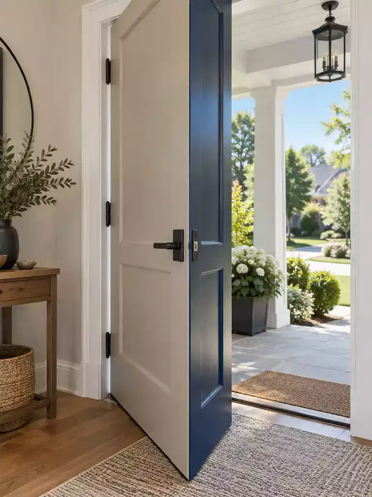
Create a seamless visual bridge that makes your two-toned door look like a professional design choice.
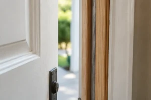
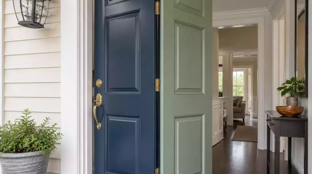
When you commit to painting the two sides of your front door differently, the way the door behaves when it is ajar becomes a critical design detail. You aren’t just painting two surfaces; you are creating a deliberate hinge that bridges the gap between your home’s exterior character and your interior sanctuary.
The secret to a high-end look lies in how you handle the exposed door edges. If you get this wrong, it looks like an afterthought; get it right, and it feels like a custom architectural feature.
The Hinge Logic: For an inward-swinging door, the hinge edge should match the exterior color, while the latch edge should match the interior color. If your door swings outward, simply reverse this logic. This ensures that when the door is standing open, the color you see on the edge “belongs” to the side of the door that is most visible from that perspective.
You might wonder about the door frame itself. To keep the transition from feeling chaotic, keep your jambs and interior trim aligned with the interior side of the door. By treating the trim as a neutral boundary that stays consistent with your foyer walls, you draw the eye to the door itself rather than the mechanics of the frame.
Avoid the common mistake of painting all four edges one color. A door that is visibly dark on the hinge side when standing open inside the house can create a jarring visual break. Taking the time to map out your edge colors before you pick up a brush ensures that your color shift feels intentional and clean from every angle.
⭐ Frosted Glass Grill Doors to Consider
Entry Door Frame Replacement Kit
Low-E Clear Glass Door Insert
✨ Editor’s Pick
Venting Entry Door Glass Replacement Kit
📋 Quick Reality Check: Before You Commit
- Check hinge swing: Confirm your door’s swing direction to ensure the correct edge color lands on the correct side.
- Assess jamb visibility: Check if your door frame is deep enough to hide the color transition when the door is closed.
- Verify edge clearance: Confirm there is enough gap between the door and frame to allow for the thickness of fresh paint.
Balancing curb appeal with interior comfort often feels like a high-stakes trade-off, yet the transition is rarely as complex as it looks. Focusing on how your door makeover impacts the overall flow of the home provides a much clearer path forward than trying to perfect every single detail.
Securing a cohesive home relies on nailing just a few structural elements rather than attempting to achieve a flawless, magazine-ready execution across every single surface.
4. Foyer palette
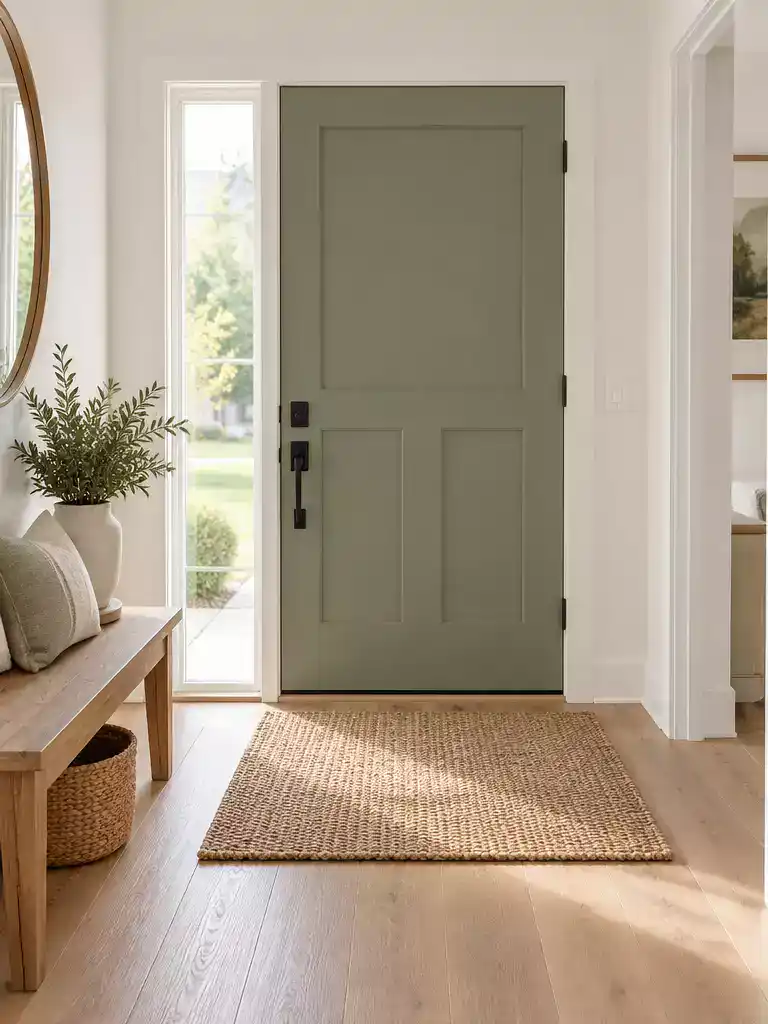
Ground your door’s color within the room’s temperature to create a cohesive, intentional entry space.
When you start thinking about the foyer, it helps to view the entire space through the 60/30/10 rule. In this design framework, your door acts as that final 10% accent, which is exactly why it needs to feel like a deliberate choice rather than an afterthought.
If you want a calm, monochromatic look, try matching your door color to the wall tone. This creates a soft, expanded feeling, especially in smaller entryways where you want to minimize visual clutter.
Pro Tip: For a more dramatic effect, opt for controlled contrast. Choose a door color that shares the same undertone as your foyer walls but sits at a different depth on the paint swatch. This creates a focal point that feels anchored to the room rather than floating in isolation.
One of the most common mistakes I see is a door color that feels disconnected from the floor. To avoid that “floating” effect, ensure the door and your flooring share a similar depth or undertone.
If you are working with a small, narrow foyer, keep the palette light and bright to prevent the space from feeling cramped. You can still use color, but lean toward muted, airy tones that reflect light rather than absorbing it.
Finally, remember that the door should never be an isolated island. If you pick a deep charcoal or a soft greige for your door, pull that same tone into your foyer through textiles, a piece of art, or a simple entryway rug.
⭐ Entry Mats That Welcome Guests
✨ Editor’s Pick
Striped Farmhouse Front Door Mat
Absorbent Indoor Dirt Trapper Mat
Non-Slip Indoor Entrance Door Mat
🏡 How This Works in a Real Home:
- Entryway flow: Use a runner rug that incorporates both your door’s accent color and your wall tone for instant visual cohesion.
- Daily utility: In high-traffic mudrooms, choose a darker door shade to better hide the inevitable scuffs and handprints from daily use.
- Living pieces: Place a ceramic vase or throw pillow near the entry that matches your door’s specific color to tie the look together.
Trim color relationship
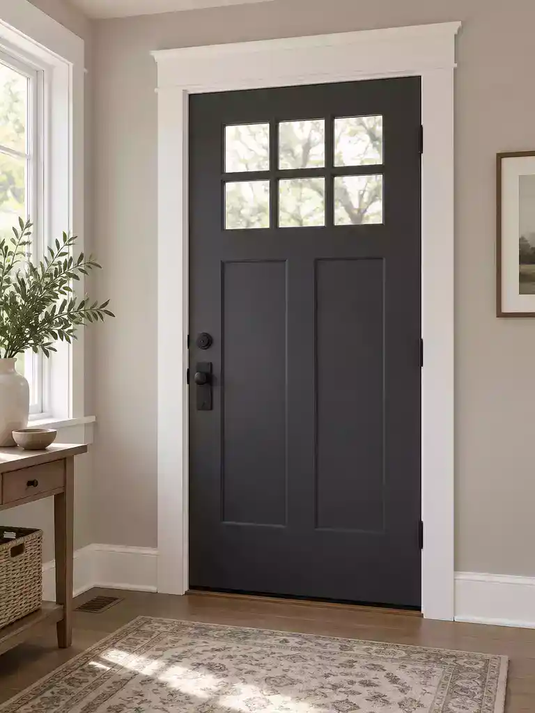
Use your trim as a clean architectural boundary to anchor two different door colors.
Think of your door trim as the neutral boundary that keeps your two-sided paint job from feeling chaotic. When you choose to paint the inside and outside of your door different colors, the trim acts as a vital buffer zone that prevents the two shades from clashing directly against each other.
Instead of treating the trim as a second accent piece, keep it grounded in a neutral tone that complements your wall color. This ensures the door itself remains the focal point of the entryway rather than the frame surrounding it.
The Warm-to-Warm, Cool-to-Cool Rule: To keep your design feeling intentional, align your trim’s undertone with your door’s color family. If you have chosen a warm, earthy tone for your door, pair it with a creamy, warm-white trim; if you have opted for a cool, crisp blue or charcoal door, stick with a cool, bright white trim.
Following this logic prevents the “wrong color” look that often happens when a cool-toned door is framed by yellow-based white trim. If your foyer walls are already a specific color, match your trim to the existing wall color or a classic neutral that bridges the gap between your door’s intensity and the room’s overall temperature.
By keeping the trim consistent and neutral, you allow the door to stand as a deliberate design choice rather than a color that just happened to be painted on both sides. This simple coordination strategy makes the entire transition feel purposeful and high-end.
⭐ Standout Door Frame Reinforcements
Permanent Stripped Door Hinge Repair
✨ Editor’s Pick
Heavy Duty Interior Door Jamb Repair
Magnetic Stainless Steel Door Stoppers
⚖️ Quick Decision Guide:
- Choose neutral trim if: Your foyer and exterior have vastly different color palettes; it creates a necessary visual bridge.
- Skip bold trim if: You are already using a high-contrast door color, as competing accents will quickly overwhelm the space.
- Pair it with: A consistent sheen across all trim throughout the foyer to ensure the door frame looks intentional and polished.
Door Edge Color
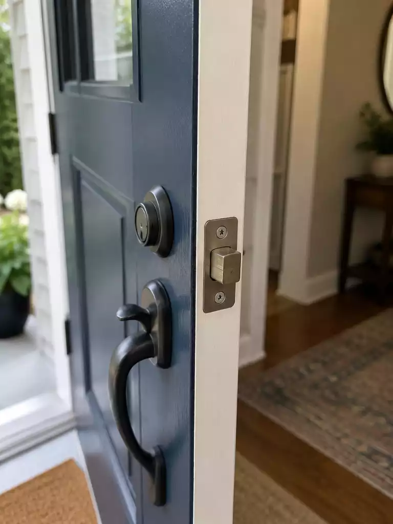
Crisp, intentional edge transitions turn a simple paint project into a professional-grade finish.
The most common mistake homeowners make when painting two sides of a door is ignoring the edges, or worse, painting all four edges one color. This creates a messy visual when the door is ajar, as the “wrong” color peeks into the foyer or onto the porch.
To achieve a high-end look, you need a deliberate edge strategy that defines where one world ends and the other begins. For an inward-swinging door, the hinge edge should match the exterior color, while the latch edge is painted to match the interior side. If your door swings outward, simply reverse this logic so the color transition remains hidden from the main view.
The “Edge Bleed” Warning
Jagged paint lines are the hallmark of an amateur job. Always use high-quality painter’s tape to mark your transition line on the edge of the door, and remove the tape while the paint is still tacky to ensure a sharp, clean break. If you wait for the paint to fully cure, you risk pulling up sections of the finish along with the tape.
As a general standard of high-quality workmanship, the top and bottom edges of the door should typically match the interior side. This provides a cleaner, more finished look when the door is viewed from inside your home. While there is no building code dictating these placement rules, following this standard ensures your two-sided treatment feels intentional rather than accidental.
Before you start, double-check your door’s swing direction. A quick way to visualize this is to stand in your foyer and imagine the door opening; the edge you see first as it moves should be the one that coordinates with your interior palette. By treating the edges as a bridge between two distinct design spaces, you prevent the “floating color” effect and keep your entryway looking cohesive.
⭐ Handlesets That Elevate Any Door
Entry Door Knob and Deadbolt Set
Matte Black Privacy Door Handles
✨ Editor’s Pick
Matte Black Privacy Door Levers
🔢 The Right Sequence for Sharp Edges
Painting edges requires a specific order of operations to prevent color overlap and ensure your transition lines remain crisp and professional.
- Prep the hinge side: Paint the hinge edge first using your exterior color before masking the interior face.
- Tape the transition: Apply tape exactly along the door’s bevel, creating a clean boundary between interior and exterior tones.
- Remove while tacky: Peel back your painter’s tape while the final coat is still wet to avoid jagged, peeling edges.
Hardware Finish
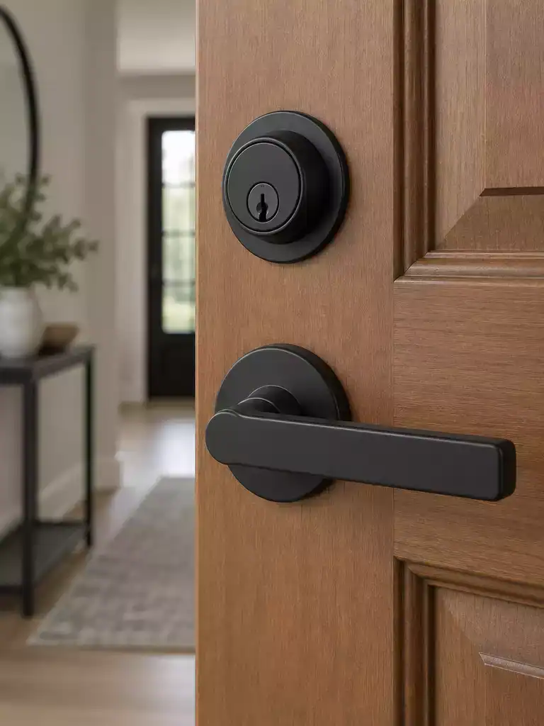
Selecting hardware that survives the elements while tying your interior and exterior styles together.
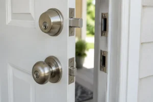
Choosing hardware for a two-sided door project requires balancing aesthetic goals with the harsh realities of exterior exposure. Because your front door faces two very different environments, the hardware must be rated for the more demanding side – the exterior – to prevent premature corrosion or mechanical failure.
When selecting your finish, consider both the climate and the frequency of use. While interior-only finishes like satin chrome might look fine in your foyer, they will struggle against moisture and UV rays once exposed to the elements.
Prioritize durability first. If you live in a coastal area or a region with severe weather, look specifically for 316 stainless steel hardware. It provides the highest level of corrosion resistance, ensuring your investment doesn’t pit or rust after a single season.
For high-traffic entryways where you want a finish that stays looking new, PVD or “Lifetime” brass is a smart choice. These finishes are engineered to resist tarnish and abrasion, making them ideal for busy households that don’t want to worry about constant maintenance.
If you find yourself stuck between a traditional exterior aesthetic and a modern interior, matte black serves as an excellent transitional bridge. It pairs equally well with deep navy or charcoal exterior doors as it does with warm greige or white interior schemes.
Avoid the temptation to use different finishes on each side of the door. Using one finish for the exterior and another for the interior can create a visual disconnect and often complicates the installation of the through-bolts and internal mechanisms. Stick to one high-quality finish that complements both sides of your home.
⭐ Best Door Hardware for Security
✨ Editor’s Pick
Matte Black Passage Door Handles
Keyed Entry Bronze Door Lever
Matte Black Entry Door Handleset
✨ Finishing Touches: Hardware Nuance
Beyond the metal’s durability, the visual weight of your chosen hardware finish is what truly anchors the door’s two-sided identity to your home’s architecture.
- Visual Continuity: Ensure the handle projection and backplate scale feel balanced against both the exterior facade and interior trim depth.
- Cohesive Details: Match your hinges to the lockset finish to prevent a cluttered appearance when the door is standing open.
8. Sheen Consistency
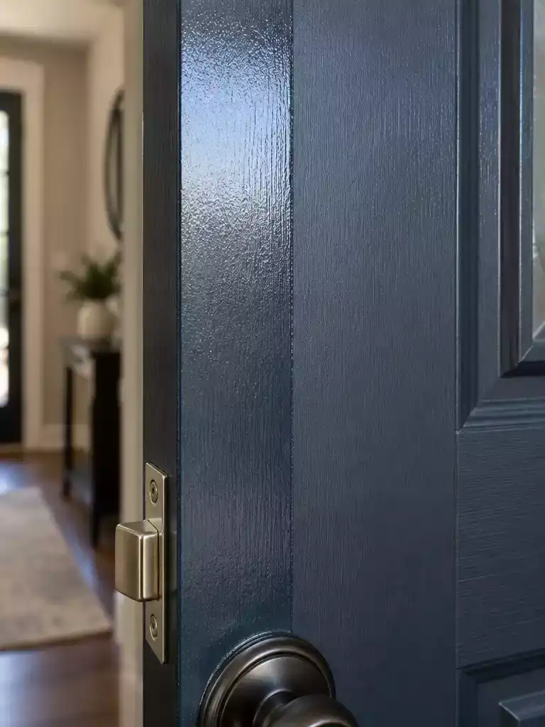
Selecting the right sheen balances everyday durability with a sophisticated, professional-grade finish.
When you are painting your front door two different colors, the temptation is often to focus solely on the hue. However, sheen consistency is the technical detail that separates a amateur paint job from a professional-looking finish. Because your front door faces vastly different environmental pressures on each side, choosing the right sheen is a decision about performance as much as it is about aesthetics.
For the exterior face, semi-gloss is almost always the correct move. It offers the best durability against the elements and makes the surface significantly easier to wipe down when dirt or pollen inevitably collects. If you prefer a more understated look, you might be tempted to move toward a flatter finish, but you should avoid matte or flat paint entirely on a door.
Flat or matte finishes are notoriously difficult to clean and prone to showing “burnishing” marks. Every time you touch the door to open it, you risk buffing the paint and leaving permanent shiny streaks that are impossible to repair without repainting the entire door.
On the interior side, you have more flexibility. If your foyer is prone to scuffs from bags, shoes, or children, stick with semi-gloss to ensure the door remains wipeable. If you prioritize a softer, more furniture-like aesthetic and your door surface is in excellent condition, satin can provide a more subtle, elegant appearance.
Remember that durability is the priority when your door sees heavy daily use. Regardless of the sheen you pick for the interior, ensure your exterior paint is a high-quality exterior acrylic latex or enamel designed for high-traffic zones. By matching your sheen to the specific demands of each side, you ensure that your door will look just as good a year from now as it does the day you finish painting.
⭐ Paints and Finishes We Love
Durable Black Front Door Paint
✨ Editor’s Pick
Safe Paint and Varnish Stripper
Sage Interior Satin Paint Primer
⚖️ Quick Decision Guide:
- Choose semi-gloss if: Your entryway sees heavy daily traffic, kids, or pets, as it stands up to constant cleaning.
- Skip semi-gloss if: Your door has visible dents or surface texture, as the higher sheen will highlight every imperfection.
- Pair it with: A high-quality exterior acrylic enamel, which provides the weather resistance needed for the outdoor-facing side.
9. Two-Sided Color Balance
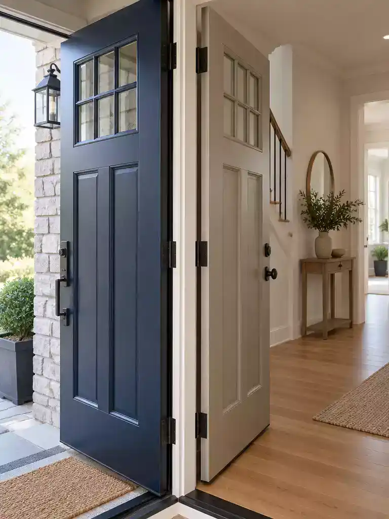
Create a unified narrative where your front door colors feel like one deliberate design story.
The secret to a successful two-sided door isn’t just picking two colors you like; it is ensuring they share a common undertone. Even if your exterior is a bold, deep charcoal and your interior is a soft, airy sage, they need to feel like they belong to the same home. When the door is open, the eye should naturally travel from one space to the other without feeling a jarring break in the home’s personality.
Aim for analogous or complementary color pairings that respect the temperature of your home. If your house has a cool grey stone facade, a cool-toned blue or deep slate on the interior will feel far more intentional than a jarring warm yellow or terracotta. This shared temperature acts as the glue that keeps the design feeling cohesive rather than accidental.
Professional Tip: If your door has previous coating issues or requires significant prep work, hiring a professional is the smartest move. A factory-quality finish is difficult to replicate with a brush, and a professional can ensure that both sides are properly primed to handle the different environmental stresses they face.
When you are planning your palette, remember that the door acts as a visual bridge. If you are struggling to find a balance, look to your existing foyer furniture or exterior landscaping for cues. Pulling a secondary tone from your rug or a deep green from your exterior bushes can help ground the door color, turning it into a deliberate accent rather than an isolated island.
There is no standard building code for how these colors must meet, but for a high-quality finish, treat the edge transition as a piece of fine workmanship. A clean, sharp line where the colors meet at the latch or hinge edge is what separates a DIY project from a custom design feature. If you are uncertain about your ability to achieve a crisp line, focus on using high-quality painter’s tape and removing it while the paint is still slightly tacky to avoid any jagged edges.
Project Prep Checklist
- • Verify Undertones: Do both your exterior and interior colors share a warm or cool base?
- • Hardware Check: Does your chosen hardware finish look consistent against both colors?
- • Prep Assessment: Does your door need stripping or heavy sanding to ensure a smooth, lasting finish?
- • Edge Strategy: Have you decided which edge (hinge or latch) will carry which color?
⭐ Shop Interior Door Paint Colors
Alabaster White Interior Paint Primer
Black Iron Semi-Gloss Interior Paint
✨ Editor’s Pick
Frosted Glass Pantry Door Slab
💡 Why This Works
Treating your door as a two-sided narrative creates a psychological bridge that makes your home feel custom-tailored rather than pieced together. By anchoring both faces with shared undertones, you eliminate the visual fatigue of a disjointed entryway, turning a simple transition point into a deliberate design statement that flows seamlessly from your foyer to the curb.
The Pro-Cohesion Secret: Use your foyer’s textiles or hardware finish to echo the door’s exterior tone, ensuring the two faces feel like one unified design story.
With all nine points now in front of you, the path to a balanced two-sided paint job is much more manageable. Focusing on the one or two choices that carry the most weight for your home is how you achieve a professional result without getting lost in the details.
Prioritize your exterior color and hardware finish first, as these decisions dictate the longevity and curb appeal of your project. When you anchor your plan in these core elements, the rest of the work becomes simple maintenance rather than guesswork. If you are still weighing your options, exploring front door makeover ideas can help you visualize how these choices translate into a finished, high-impact entrance. Once you have your palette and hardware, the rest of the process is simply a matter of careful execution to ensure the style stands the test of time.
Related posts
 17 Industrial Barn Door Ideas for Inside Your Home
 12 Wood Front Door Color Ideas for Timeless American Homes
 A Complete Guide to Choosing Your Front Door Paint Color
 Front Door Color Ideas That Suit Red Brick Not Fight It
 12 Autumn Wreaths for Front Door With Texture Color and Depth
 When New Window Frames Change What Color Your Front Door Should Be
 How to Build Steps Outside French Doors
 How to Paint French Doors: Prep, Primer and Glass