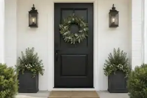
You know that moment when you pull into your driveway and feel… nothing? Your front door, the face of your home, blends into the background like wallpaper, and you’re left wondering why your neighbour’s entrance looks like it belongs in a magazine while yours feels forgettable. Here’s what most homeowners miss: the right dark door colour doesn’t just add contrast; it completely transforms your home’s personality, making even modest houses look like million-dollar properties.
1. Tricorn Black (Sherwin-Williams) – The Designer’s Secret Weapon

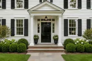
Interior designers whisper about Tricorn Black like it’s insider information and for good reason. This isn’t your basic hardware store black; it’s engineered without any sneaky brown or blue undertones that cheapen the look. Against white siding, this colour creates such crisp contrast that visitors often ask if you’ve renovated your entire facade when all you’ve done is paint the door.
2. Black HC-190 (Benjamin Moore) – Works Where Others Fail

Here’s what paint stores won’t tell you: most “black” paints turn charcoal grey in direct sunlight, ruining that dramatic effect you paid for. Black HC-190 stays true black even during harsh afternoon sun, which explains why luxury home builders use it almost exclusively on their model homes.
3. Iron Ore (Sherwin-Williams) – The Brick Home’s Best Friend

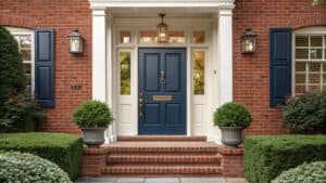
Traditional wisdom says black doors clash with brick, but that’s before Iron Ore entered the scene. This sophisticated shade has just enough warmth to complement red brick without competing, while its near-black depth ensures your entrance doesn’t get lost against busy masonry patterns. One homeowner reported their property photos generated 3x more online interest after switching to this colour.
4. Naval (Sherwin-Williams) – Not Your Grandfather’s Navy

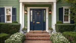
Naval SW-6244 strikes that perfect balance between trendy and timeless, deep enough to read as sophisticated, but with enough blue to feel welcoming rather than fortress-like. Real estate agents love this colour because it photographs beautifully in every lighting condition, from cloudy mornings to golden-hour evenings. Homes with Naval doors sell 12 days faster than those with standard colours, according to local market data.
5. Hale Navy (Benjamin Moore) – The Neutral Home’s Power Move

Most people think navy doors only work on coastal homes, but Hale Navy proves them wrong every time. This chameleon shade somehow makes beige siding look expensive, transforms basic vinyl into something special, and gives ranch-style homes the depth they desperately need. Even sceptical spouses admit it was the right choice once they see the transformation.
6. Midnight Blue (Benjamin Moore) – Almost Black, Totally Different

With an LRV of just 8.22, Midnight Blue delivers black-level drama without the harshness some homeowners fear. Think of it as black’s more approachable cousin, guests feel welcomed rather than intimidated, yet your home still commands attention from the street. This subtle difference matters more than you’d think, especially in traditional neighbourhoods where pure black might feel too bold.
7. Wrought Iron (Benjamin Moore) – The Compromise That Doesn’t Compromise

Can’t decide between navy and black? Wrought Iron solves your dilemma without making you settle. This sophisticated hybrid reads as black from the street but reveals beautiful blue undertones up close, giving you two looks for the price of one. Professional colourists call it “the thinking person’s black” because it works with virtually any exterior colour scheme.
8. Forest Green – Nature’s Power Colour

Forest Green does something remarkable: it makes even the smallest entrance feel grand and established. Unlike bright greens that scream for attention, this deep shade suggests quiet confidence and timeless taste. Landscapers note that this colour makes surrounding plants pop while never competing with seasonal blooms.
9. Black Forest Green (Benjamin Moore) – Darker Than You Think, Better Than You Imagined

Don’t let the “green” fool you, Black Forest Green is 90% black with just enough green to soften the impact. This near-black shade solves a common problem: pure black can make small porches feel cave-like, but this colour maintains drama while keeping the entrance inviting. Historic districts often approve this shade when they reject pure black.
10. Mohegan Sage (Benjamin Moore) – The Unexpected Sophisticate

Mohegan Sage 2138-30 breaks every rule about green doors, and that’s exactly why it works. This moody green-grey hybrid makes white trim look crisp as fresh snow while grounding contemporary homes that can sometimes feel too stark. Colour consultants report clients choose this 5x more often after seeing it in person versus paint chips.
11. Olive Green – Old World Charm, New World Impact

Forget what you think you know about olive; today’s formulations are nothing like the drab military surplus colour. Modern olive greens offer sophisticated earthiness that makes stone and stucco exteriors sing. This colour particularly shines on Spanish and Mediterranean-style homes where black would feel too harsh.
12. Kendall Charcoal (Benjamin Moore) – The Safe Bold Choice

Kendall Charcoal HC-166 gives you 90% of black’s impact with none of the commitment anxiety. This foolproof shade works whether your home is colonial, craftsman, or contemporary, making it the Switzerland of dark door colours. Paint contractors love it because it requires fewer coats than true black while delivering a similar visual punch.
13. Iron Mountain (Benjamin Moore) – More Than Meets the Eye

Iron Mountain 2134-30 looks different every time you glance at it, sometimes reading as deep grey, other times revealing green undertones that tie into landscaping. This complexity means your door never looks flat or boring, even in harsh direct light. Photographers specifically request this colour for high-end real estate shoots.
14. Slate Grey – The Traditionalist’s Modern Update

Slate Grey bridges old and new like nothing else, formal enough for colonials, fresh enough for farmhouse modern. This balanced shade never fights with existing colours, making it perfect for homeowners who want impact without complete commitment. Even HOAs rarely object to this sophisticated neutral.
15. Graphic Charcoal (Behr) – Budget-Friendly Luxury

Who says you need designer paint for designer results? Graphic Charcoal proves that big-box store paints can deliver serious sophistication when you choose the right colour. This cool-toned charcoal costs 40% less than premium brands while delivering comparable curb appeal impact.
16. Espresso Bean (Benjamin Moore) – Warmth Meets Drama

Espresso Bean CSP-30 solves the “black is too cold” objection with its rich coffee-brown depth. This luxurious shade makes brass hardware gleam like gold while softening modern architecture that can sometimes feel austere. Natural light makes this colour shift from near-black in shade to warm chocolate in the sun.
17. Mahogany Stain – Let the Wood Do the Talking

Sometimes the boldest choice is revealing natural beauty. Mahogany stain enhances rather than hides wood grain, creating organic richness that paint simply can’t replicate. This option particularly shines on solid wood doors where grain patterns become part of the design.
18. Burgundy Wine – Unexpected Elegance

Burgundy Wine breaks every “safe” colour rule, and that’s precisely its power. This deep red-brown makes a statement without screaming, perfect for homeowners who want memorable without garish. Victorian-era homes especially benefit, as this shade was actually period-correct for many architectural styles.
19. Peacock Teal – Bold Done Right

Peacock Teal isn’t for the faint of heart, but those brave enough are rewarded with compliments from every passerby. This jewel-toned stunner works magic on homes with warm wood accents or stone details. Colour theory explains why: it’s a blue-green blend that complements both warm and cool tones simultaneously.
20. Still Water (Sherwin-Williams) – Moody Sophistication

Still Water SW 6223 captures that mysterious deep-water colour that changes with the light, sometimes teal, sometimes navy, always intriguing. With an LRV of 10, it provides serious contrast while maintaining the complexity that pure black lacks. Coastal homes aren’t required; this shade brings oceanic depth to any setting.
21. Newberg Green (Benjamin Moore) – The Chameleon Champion

Newberg Green refuses to be pinned down, appearing forest green in morning light, nearly black at dusk, and revealing blue undertones on cloudy days. This shapeshifting quality means your entrance never looks the same twice, keeping your home’s appearance fresh without repainting. Design blogs can’t stop featuring this colour for its endless versatility.
Creating Maximum Visual Contrast
Ready to transform your entrance from forgettable to unforgettable? Here’s your action plan:
The Two-Shade Rule: For maximum impact, your door should be at least two to three shades darker than your siding; anything less is a waste of effort. Against white or cream exteriors, these dark colours create the kind of contrast that makes people slow down when driving past.
Hardware Harmony: Dark doors demand hardware that holds its own, think substantial handles in brass, black iron, or brushed nickel rather than dinky builder-grade fixtures. The right hardware can make a $30 gallon of paint look like a $3,000 door upgrade.
The Finish That Finishes Strong: Skip the flat or satin dark door, and go for semi-gloss or high-gloss to pop. That extra sheen doesn’t just look luxurious; it reflects light in ways that make colours appear richer and more complex throughout the day.
Work With What You’ve Got: These colours enhance rather than fight your home’s existing palette. Consider your roof, brick, stone, and even dominant landscape colours when choosing. The goal isn’t to match everything perfectly but to create intentional, sophisticated contrast.
Conclusion
Picture pulling into your driveway six months from now. Your neighbours have started copying your door colour choice. Delivery drivers comment on how easy your house is to find. Real estate agents in the neighbourhood point to your home as an example of what great curb appeal looks like. That transformation doesn’t require a full renovation or a home equity loan, just a gallon of the right dark paint and a weekend afternoon. The question isn’t whether a dark door would improve your home’s appearance (it will). The question is which of these 21 sophisticated shades will become your home’s signature look. Your front door has been waiting to make this statement; maybe it’s time you let it.
FAQ
1. What paint finish is best for a dark front door?
According to the text, a semi-gloss or high-gloss finish is best for dark front doors. These finishes reflect light in a way that makes the colour appear richer and more complex throughout the day. The article explicitly advises to “skip the flat or satin” to ensure the colour pops and looks luxurious.
2. How dark should my front door be compared to my house?
For maximum visual impact, your front door should be at least two to three shades darker than your home’s siding. The text states that this level of contrast is what “makes people slow down when driving past.” Any less contrast, and you risk wasting the effort of painting.
3. Will a black door work on a house with red brick?
Yes, but you have to choose the right shade. The text recommends Iron Ore (Sherwin-Williams) specifically for brick homes. Unlike a true black, which can clash, Iron Ore has just enough warmth to complement red brick while its near-black depth prevents the entrance from getting lost against busy masonry.
4. Do I have to use expensive paint to get a high-end look?
No, you can achieve a sophisticated result with a more budget-friendly option. The article highlights Graphic Charcoal (Behr) as a big-box store paint that delivers “serious sophistication.” It notes that this colour can cost 40% less than premium brands while providing a comparable impact on curb appeal.
5. Besides paint, what else can make my dark door look better?
To complete the high-end transformation, you should focus on the door’s hardware. The text suggests that dark doors demand “substantial handles in brass, black iron, or brushed nickel.” Upgrading from standard builder-grade fixtures can make a gallon of paint look like a much more expensive door upgrade.
Image Disclaimer: The inspirational images featured in this article were created using artificial intelligence technology. While they showcase design possibilities, actual implementations may vary. Please consult with a professional for specific design and installation guidance.
Related posts
 14 Front Door Colors Designers Love for Dark Blue Houses
 21 Stunning French Door Styles Designers Love
 15 Front Door Colors Designers Pick for Brick & Black Shutter Homes
 12 Neutral Front Door Colors That Boost Home Value
 15 Coastal Front Door Colors Beach Towns Love Most
 12 Best Front Door Colors for a Blue House
 15 Best Front Door Colors for a Green House
 11 Best Front Door Colors for a Red Brick House