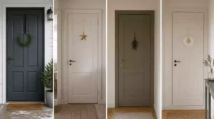
Front door colors for red brick houses beyond black offer practical alternatives, but the right choice depends on whether your masonry leans orange, brown, burgundy, or pink. This guide rounds up 10 door color ideas worth saving, judged by contrast and harmony, so you can find the right fit for your home – starting with a controlled dark contrast.
Deep Navy
 Create grounded contrast that gives warm red brick a clear, sophisticated entry focal point.
As an Amazon Associate I earn from qualifying purchases. Affiliate links may earn me a commission at no extra cost to you.
A warm red brick façade often needs a dark focal point, but the door does not have to go back to black. Deep navy gives the entry strong, grounded contrast: its cool blue note tones down warm masonry while its depth keeps the door connected to the façade.
Choose a muted navy that looks almost ink-like in shade, not cobalt, electric blue, or icy blue beside the brick. It is most dependable with balanced red brick containing brown and muted variations, rather than masonry dominated by orange or pink.
Deep navy is perfect for: a west-facing entry where afternoon light intensifies warm brick, or a homeowner who wants a defined dark door without returning to black.
Skip it when: the brick is strongly orange and the available navy looks icy or highly saturated. That combination can make the masonry appear even warmer.
Before painting, place a large sample beside the door and check it in morning, noon, late-afternoon light, and shade. From the street, it should remain visibly blue, avoid turning nearly black in shadow, and still read as a distinct entry rather than a disconnected color block.
A slightly glossy exterior-rated dark paint can increase perceived depth, but color comes first. Test the navy against both the brick and mortar, then choose the sample that stays balanced across the entire façade.
⭐ Top Navy Door Color Picks
✨ Editor’s Pick
Navy Blue Decorative Border Trim
✓ Practical Tips for Choosing Navy:
- Read the brick: Hold white paper beside the wall to identify balanced red, brown, orange, burgundy, or pink undertones.
- Compare variations: Move the sample beside both darker and lighter bricks so it works across the façade.
- Keep definition: Choose the navy that separates the doorway without overpowering the masonry’s natural color variation.
Charcoal

A warm charcoal door adds definition while letting red brick stay the focal point.
A low-drama charcoal rectangle against red masonry suits homeowners who want the weight of a dark door without an obvious blue or green cast. It frames the entry quietly, allowing the brick to remain the strongest color story.
Choose a charcoal softened with brown rather than a steel gray that turns blue in daylight. Against orange-red brick, a cool charcoal can look flat and disconnected; brick with brown, burgundy, or pink variation usually gives a balanced charcoal more to relate to.
Best fit: restrained contrast on a traditional red brick façade when you do not want a noticeable color statement.
Skip it: when the sample reads blue-gray beside warm orange brick or turns the doorway into a dull gray block.
Paint two large samples beside the entry – one warmer and one cooler – and compare them with both the brick and mortar. Pale mortar can sharpen the door contrast, while dark mortar may soften the separation.
- Check the samples in morning, noon, late-afternoon light, and shade.
- Reject any charcoal that makes the brick look unusually orange.
- Step back to the street to confirm the door still reads as an entry focal point.
Charcoal is safer than a strongly colored cool tone, but its warmth must hold up in natural light. From this neutral baseline, forest green adds an earthier connection to the masonry.
⭐ Charcoal Color Worth Considering
✨ Editor’s Pick
Charcoal Gray Upholstered Platform Bed
💡 The Detail That Pulls It Together:
Treat charcoal as a supporting neutral, not a second focal color. The most convincing choice usually relates to a darker brown or burgundy fleck within the brick, giving the door a visual connection without copying the masonry. That restrained relationship helps the entry feel intentional rather than simply painted dark.
A reliable checkpoint can narrow the field before a color choice becomes expensive: hold white paper beside the brick, then judge real samples in changing light. You do not need every option to work – just enough evidence to identify the direction that belongs at your entry.
🎯 Where to Focus:
- Call the brick’s direction orange, brown, burgundy, or pink with red-brick color ideas.
- Paint large samples beside the entry; compare mortar in morning, noon, afternoon, and shade.
- Step back to the street: the right shade stays visible, anchored, and distinct.
Forest Green

Create an earthy entry that feels rooted in warm brick and surrounding landscape.
Picture a deep green door against terracotta-like brick, with the entry picking up the earthy feeling of the masonry instead of fighting it. Forest green creates natural harmony while still giving the doorway enough contrast to read clearly from the street.
Choose a moody, muted green with some gray or brown influence. Bright hunter green can look harsh or holiday-like beside red brick, while a strongly blue-green sample may feel detached from warm masonry.
Best match: warm, terracotta-like brick with red, brown, and earthy variation – especially on an established home where you want color that feels connected to planting and shade.
Forest green is a strong pick for homeowners who want more personality than charcoal but less icy contrast than navy. It is also more grounded than blue, borrowing from the landscape while keeping the red brick’s warmth intact.
- Test in morning light: check that the green does not turn too blue.
- Check midday sun: make sure it stays deep rather than becoming overly bright.
- View late afternoon: confirm reflected warmth does not push it too yellow.
Skip forest green when the brick is pale pink or strongly orange and the sample looks vivid or blue beside it. Paint a large sample beside the actual door, then compare it with the brick’s darkest and most terracotta-colored sections before committing.</)>
⭐ Forest Green Accents We Love
✨ Editor’s Pick
Forest Green Camping Lantern Set
💡 Why This Works:
A muted forest green gives a multitone brick façade a steady visual anchor. Instead of competing with every orange, red, or brown variation, its deep earthy value creates one calm focal point, helping the entrance feel intentional even when the masonry changes noticeably across the wall.
Best visual benefit: It unifies varied brick without making the doorway feel overly formal or detached.
Sage Green

A softer green entry creates calm contrast while keeping warm brick grounded.
A muted terracotta brick wall and a light green door can feel quietly connected, especially when the brick carries brown or burgundy variation. Sage green is the softer, lighter alternative to forest green for homeowners who want natural color without a dark block at the entrance.
This color is more exacting than navy or charcoal. Strong orange brick can reflect warmth into sage, pushing it toward yellow, washed-out green, or a dull khaki appearance.
Best fit: muted red, terracotta-like, or slightly burgundy-leaning brick in a shaded or partially sheltered entry.
Choose another color when the doorway needs strong street-facing contrast or the sage sample turns yellow beside intensely orange masonry.
Compare sage with olive only after placing both large samples beside the actual door. Sage is gray-green and softened; olive moves further toward yellow-brown and may relate more closely to earthy brick.
- Check the sample in morning light, midday sun, late afternoon, and shade.
- View it against both the brick and the mortar; gray mortar can emphasize sage’s cool side, while warm cream mortar may pull it yellow.
- Step back to the street to confirm the lighter color still defines the entry.
If the wall has strong orange, brown, burgundy, and pink variation – or you are stuck between sage and olive – professional color advice is worthwhile. The useful expertise is undertone reading, not choosing a particular paint brand.
⭐ Standout Sage Green Trim
✨ Editor’s Pick
Sage Green Decorative Border Trim
💡 Designer Note:
Sage looks most intentional when it occupies a middle ground between the brick and the entry’s lightest fixed surface. If it blends into pale mortar, choose a slightly deeper gray-green; if it feels stark beside darker masonry, a warmer, dustier sage will create gentler separation without becoming yellow.
Olive

Ground warm brick with a smoky olive door that feels organic, distinct, and settled.
A warm brick wall with brown or terracotta flecks gives olive something specific to relate to. This muted green sits closest to the brown-yellow side of red brick, creating earthy harmony instead of the cooler separation you get from navy or slate blue.
Choose an olive that looks subdued and slightly smoky in daylight. Bright yellow-green and highly saturated military green will compete with the masonry rather than settle into its natural warmth.
Olive is right for: warm, terracotta-like brick with enough red variation to keep the door clearly visible. It is not the best pick when the facade is already dominated by brown-red tones.
That closeness is olive’s advantage and its risk. If the brick contains too much brown, the door can turn muddy or lose its identity, especially beside dark mortar.
- Test the olive beside the darkest brown bricks and the reddest bricks.
- Check whether it shifts too yellow or too green in changing light.
- Compare it with the mortar so the entry does not blend into a similar earthy neutral.
Sage is gray-green and softened; olive is more yellow-brown and grounded. If those two samples still seem interchangeable, paint both beside the door and consider professional color advice before committing.
⭐ Olive Door Accents to Consider
✨ Editor’s Pick
Olive Leaf Front Door Swag
Olive Green Blackout Curtain Panels
💡 Why Olive Works
Olive gives a red brick entry a nature-inspired focal point without forcing a sharp cool contrast. Its yellow-brown direction connects with earthy variation in the masonry, while the green keeps the doorway from reading like another brown surface. That balance makes the entrance feel intentional but comfortably settled.
Best visual payoff: Choose olive when you want organic harmony with enough green presence to identify the door clearly.
Slate Blue

A softened blue gives warm brick a cooler focal point without turning the entry icy.
A slate blue door suits the homeowner who wants blue contrast but finds deep navy too dark or formal. Its gray-softened color cools warm brick while staying quieter than clear sky blue or bright denim.
Choose a muted, weathered slate blue – not a sample that looks icy white-blue in sunlight. Cooler or grayer red brick handles this color best; strongly orange brick can make the blue look sharper and make the masonry appear even warmer by comparison.
Skip slate blue when: the brick is dominated by orange or cool mortar already pushes the entry toward blue-gray. It is less forgiving than deep navy because its lighter surface exposes undertone mismatches.
Paint a large sample beside the door and check it in direct sun and shade. Reject it if it turns overly blue or loses its blue identity and becomes a dull gray block.
- Compare the sample with both the brick and the mortar.
- View it in morning, noon, and late-afternoon light.
- Step back to the street; slate blue can look more neutral at curb distance.
Slate blue is the right call when the masonry includes gray, burgundy, or cooler shadow variation. If it passes those checks, it leads naturally into warm cream for a softer, lighter contrast.
⭐ Slate Blue Color Inspiration
✨ Editor’s Pick
Slate Blue Balloon Garland Kit
💡 Why This Looks Balanced:
Slate blue works as a visual bridge: its gray influence relates to cooler shadows and mortar, while its blue hue keeps the door distinct from the brick’s warmer body. That balance suits an entry where you want noticeable color without making the doorway feel like a separate, competing block.
Warm Cream

A softened light entry creates warmth without the harshness of pure white.
Against orange-red brick, a warm cream door gives the entry a lighter focal point without the sharp jump of bright white. Think softened ivory or warm off-white – not yellow paint, and not a sterile white that makes the masonry look even more intense.
This color suits homeowners who want a welcoming, traditional-looking entrance and whose brick includes cream, tan, or pale mortar notes for the door to echo. It creates softer contrast than charcoal or navy, so the cream must remain visibly separate from the brick at curb distance.
Choose warm cream when: the masonry has lighter variations that can connect with the door.
Skip it when pink-leaning brick makes the sample turn yellow, or when the wall offers no light variation for it to relate to.
Test the large sample beside both the lightest and darkest bricks. It should connect to the pale notes without disappearing against the red field, and it should not shift too white, pink, yellow, or disconnected as daylight changes.
- Check the sample in morning, noon, late-afternoon light, and shade.
- Compare it with the actual mortar, not only the brick faces.
- Step back to the street before committing; a cream that feels gentle up close can look stark from farther away.
⭐ Warm Cream Entryway Favorites
✨ Editor’s Pick
Cream Hydrangea Door Basket Wreath
Off White Ceramic Cabinet Knobs
💡 Why Warm Cream Works
Warm cream creates separation through lightness while staying visually connected to the brick’s earthy warmth. That makes the entry easier to notice without turning it into a cold, isolated rectangle. On a varied wall, it can quietly bridge pale mortar and darker red bricks, helping the doorway feel intentional rather than newly pasted on.
Best visual cue: Choose the cream that connects the entry to the façade’s lighter notes without losing definition.
Soft Greige

A calm neutral entry lets warm red brick remain the main color story.
Against warm red brick, soft greige settles between beige and gray, giving the doorway definition without adding another strong color. It suits homeowners who want the masonry to remain the most noticeable part of the entry.
Choose warmth, not blue-gray. A greige with a beige undertone can relate to warm brick, while a cool version may turn gray-green, drab, or disconnected beside the wall.
Best fit: warm red brick with a restrained, neutral entry. Skip it when you want a clearly colored focal point or the sample looks gray-green beside the masonry.
Mortar can shift the result more than expected: gray mortar pulls greige cooler, while tan or warm mortar makes it appear more beige. Compare a warmer and cooler sample directly beside the door opening rather than trusting a paint-card label.
- Check the sample in morning, noon, and late-afternoon light.
- Reject it if it looks too gray, green, dull, or disconnected.
- Match it to a lighter or darker neutral fleck within the brick for quiet cohesion.
⭐ Burgundy Door Decor We Love
✨ Editor’s Pick
Burgundy Velvet Holiday Door Bows
🏡 How This Works in a Real Home:
- Street view: Step back far enough to confirm the greige still defines the doorway instead of fading into brick.
- Fixed surfaces: Compare it with nearby steps, trim, and masonry so those surfaces do not shift it unexpectedly.
- Whole-wall balance: Judge the sample beside several brick variations, not just the most neutral-looking section.
Burgundy

Deepen burgundy-leaning brick with a layered entry color that stays visible from the street.
When the brick wall already carries wine, brown-red, or darker burgundy flecks, a muted burgundy door can deepen the same color family instead of introducing a competing contrast. The result is layered and formal, but it depends on the door being darker or different enough from the masonry to stay readable.
Burgundy is for tonal coordination, not camouflage. Choose a brown-influenced shade rather than saturated red-purple or bright crimson; overly pink or orange versions can make the brick look more intense.
Important curb-distance test: A burgundy sample may look distinct at arm’s length but merge into the wall from the street if its value and hue sit too close to the brick.
Burgundy suits warm brick with clear burgundy or wine variation, especially when you want the entry to feel connected to the masonry. Skip it when the façade is mostly orange, the doorway has little separation from the wall, or the sample reads nearly identical to the reddest bricks.
- Test beside the reddest, darkest, and most orange bricks in the wall.
- Check that the door does not turn too red, pink, or heavy in sunlight.
- View it in morning, noon, late-afternoon light, shade, and from the curb.
Burgundy is one of the least forgiving choices here. If you are deciding between burgundy and aubergine, or the brick has strong multitone variation, professional color advice can help identify whether a red-brown direction will coordinate or disappear.
Aubergine

Give warm brick a deep, individual entry color with carefully matched purple-brown depth.
Aubergine suits the homeowner who wants a front door outside the usual navy, green, gray, and red families. Its deep, muted purple creates a richer focal point than burgundy without needing a bright or overly saturated paint color.
The strongest match is warm red brick with brown, burgundy, or muted red variation and limited orange dominance. A smoky purple-brown aubergine can relate to those darker masonry notes, while saturated plum, magenta-purple, or blue-violet will look more like a separate color block.
Aubergine is a high-risk color match. Skip it when the brick is strongly orange, the sample turns vivid, or you want the safest low-commitment option.
Check the sample against the actual wall, not a screen or small paint chip. Reject it if it becomes:
- Too pink beside the red brick
- Too blue against warm masonry
- Overly purple in direct sunlight
- Disconnected from the brick in shade
Paint a large sample beside the door and view it in morning, noon, late-afternoon light, and shade. Then step back to the street; aubergine must remain a defined entry accent rather than merging with the brick.
Professional color advice is worthwhile when the wall has strong multitone variation or you are choosing between burgundy and aubergine. This is the least forgiving direction on the list, so let the brick determine whether its purple-brown depth feels intentional.
💡 Why This Works:
Aubergine gives the entrance personality by stepping outside the brick’s dominant red family, while its smoky depth keeps that contrast grounded. When the purple-brown tone relates to darker brick variation, the door feels deliberate and layered rather than trendy or detached from the façade.
Visual takeaway: Use aubergine when you want individuality without sacrificing a grounded connection to warm masonry.
With all ten ideas in front of you, choosing Front Door Colors for Red Brick Houses Beyond Black comes down to how your masonry actually reads. Deep navy, charcoal, forest green, soft greige, and warm cream are dependable starting points, while sage, olive, slate blue, burgundy, and aubergine need closer attention to orange, brown, burgundy, or pink undertones. You do not need to use every idea; the right color matters more than covering every direction.
Narrow your choice to one or two colors that create the effect you want, then paint large samples beside the entry. Check them in morning, noon, late-afternoon light, and shade, and step back to the street before deciding. Let the actual brick settle the question, and the front door color that fits will become clear.
Related posts
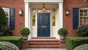 11 Best Front Door Colors for a Red Brick House
 14 Front Door Colors Designers Love for Dark Blue Houses
 Front Door Color Ideas That Suit Red Brick Not Fight It
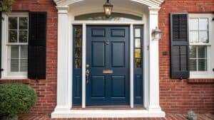 15 Front Door Colors Designers Pick for Brick & Black Shutter Homes
 15 Front Door Decor Arrangements Beyond the Basic Wreath
 What Changing Only the Front Door Did to These Houses
 11 Barn Door Designs Beyond The Farmhouse Look
 12 Best Black Front Door Paint Colors That Hide Everything