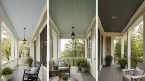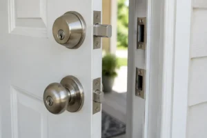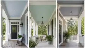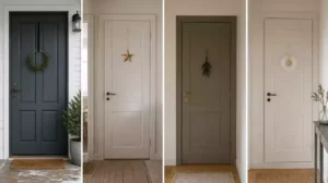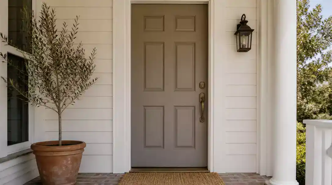
High-traffic entries quickly collect dust and scuffs, but choosing front door colors that hide dirt makes maintenance effortless. This guide rounds up 10 door ideas worth saving to keep your entry looking fresh with the right depth and undertones. Here is the first low-maintenance option.
Mid-Tone Greige
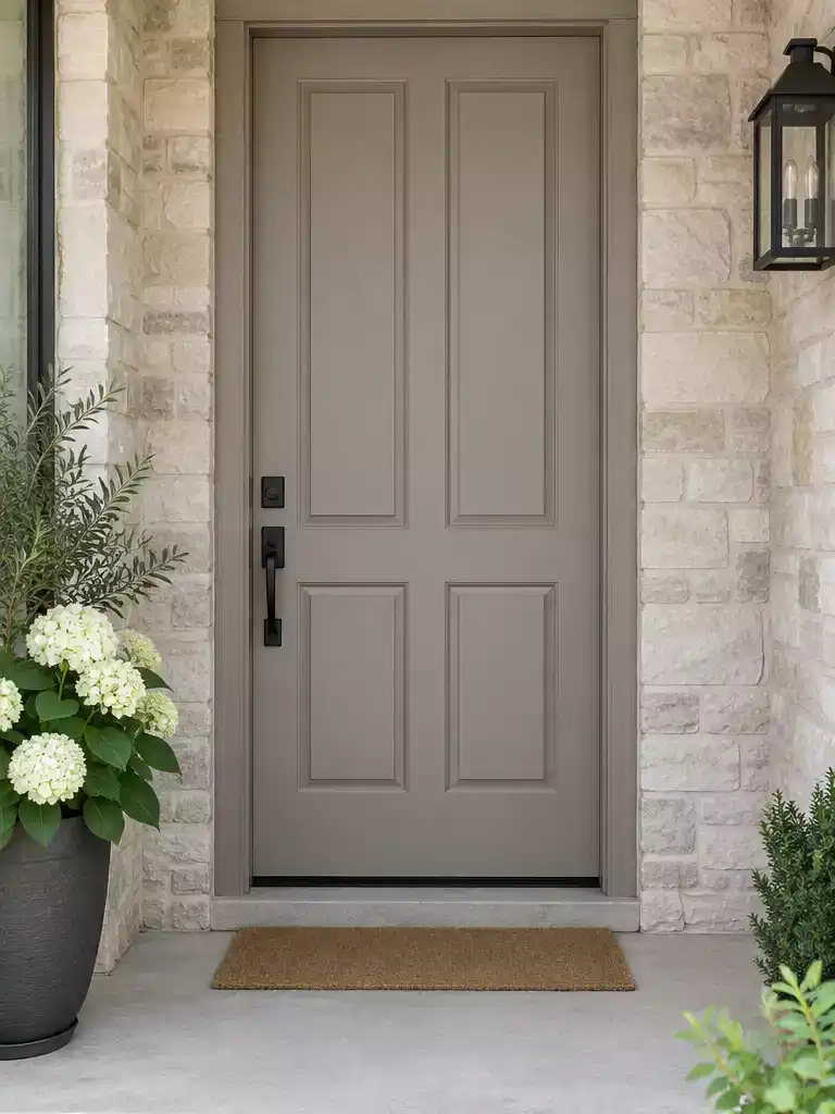
Achieve a clean, low-maintenance look that effortlessly hides dust and daily wear.
As an Amazon Associate I earn from qualifying purchases. Affiliate links may earn me a commission at no extra cost to you.
Mid-tone greige is the definitive “sweet spot” color for homeowners who want a door that stays looking fresh without constant wiping. By blending gray and beige, this tone sits exactly in the middle of the value scale, avoiding the extremes that highlight debris.
The beige component acts as a natural camouflage for light-colored dust and pollen that blows onto your porch. Meanwhile, the gray undertone prevents dark scuffs and shoe marks from jumping out against the surface.
Best For Your Home If:
- Your home features neutral stone or light brick siding.
- You want to avoid the high-contrast look that makes every speck of dirt visible.
- You prefer a color that transitions well from bright sunlight to evening shadows.
Avoid using a high-gloss finish with this color, as the reflection will negate the masking benefits of the greige tone. Opt for a satin or eggshell finish to keep the surface forgiving while maintaining enough durability to handle the occasional cleaning swipe.
⭐ Top Greige Mats for Your Entryway
✨ Editor’s Pick
Heavy Duty Indoor Outdoor Welcome Mat
Absorbent Low Profile Indoor Entry Mat
Waterproof Non Slip Outdoor Welcome Mat
Why This Works
Mid-tone greige succeeds because it strikes a delicate visual balance that neither reveals the stark white of dust nor the deep void of a scuff mark. By neutralizing the harsh contrast seen in high-saturation colors, this shade creates a cohesive, grounded look that allows your home’s architectural features to shine without competing for attention.
Charcoal Brown
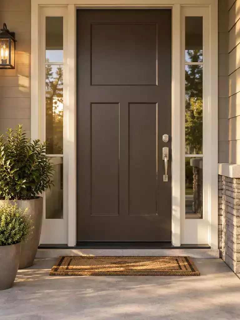
Warm undertones transform traditional dark charcoal into a hardworking, grime-masking exterior finish.
When you choose pure black or deep charcoal for a front door, you are often fighting a losing battle against chalky dust and light-colored debris. These dark, cool-toned paints create a high-contrast canvas that puts every speck of pollen or white dust on full display.
Charcoal brown solves this by introducing a warm, earthy base that breaks up the visual density of the pigment. By leaning into brown, the color becomes much more forgiving toward minor grime and surface abrasions, which simply blend into the depth of the hue rather than standing out against it.
Best for Sun-Drenched Entryways
If your home faces west or south, pure black paint can trap heat, leading to premature fading and peeling. A charcoal brown provides the same modern, grounded look while handling direct afternoon sun with much higher resilience.
This color is the right choice if you want the high-end appeal of a dark entry without the daily wipe-down routine. If your home has a natural wood trim or red-toned brick, the brown undertones in the paint will tie the door into your architecture far better than a standard, flat black ever could.
⭐ Best Charcoal and Brown Entry Mats
Non Slip Indoor Outdoor Checkered Rug
✨ Editor’s Pick
Heavy Duty Rubber Dirt Trapping Mat
Washable Brown Beige Diamond Entry Rug
💰 What This Really Costs
- Professional investment: Expect to spend $125–$225 for a standard repaint, though complex jobs can reach $550+.
- Hidden prep work: Budget extra if your door has deep gouges or peeling paint, which requires professional sanding.
- Sample strategy: Always paint a 2×2 foot test patch to observe performance in your specific afternoon light.
A long-lasting look relies more on your preparation than picking the perfect shade from the start. Taking the time to properly assess your entry will save you from future maintenance cycles that cost significantly more than a fresh coat of paint.
Prioritizing surface prep over a perfect color match ensures that your investment protects the door’s integrity for years, not just months.
Dusty Olive
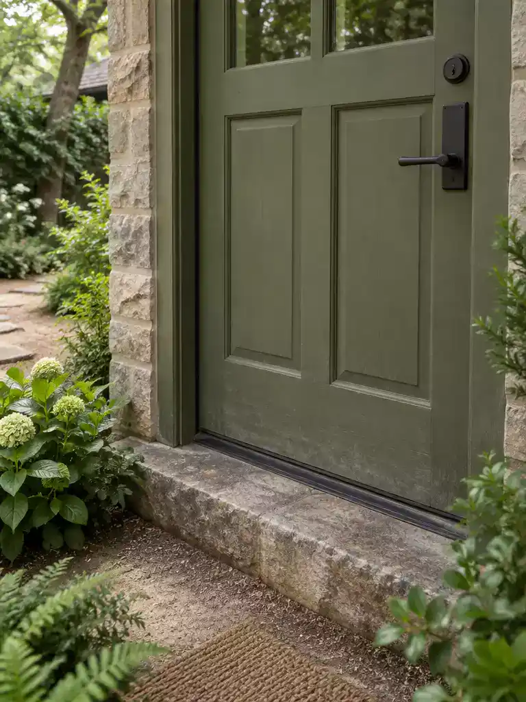
Low-saturation olive tones blend seamlessly with natural surroundings while effectively camouflaging debris and fingerprints.
The term “dusty” in this context refers specifically to a low-saturation pigment that lacks the intensity of bright, grassy greens. High-saturation colors often appear loud in exterior light, which ironically makes every single fingerprint or smudge pop against the surface.
This muted olive acts as a functional camouflage for high-traffic entryways. Because the color mimics the tones found in natural foliage and surrounding landscaping, it visually absorbs the dust and dirt particles that inevitably migrate from pathways to your door.
Why this masks marks: Unlike bright or dark colors, this specific olive shade sits in the perfect mid-value range. It avoids the high-contrast trap where light dust highlights dark paint or dark scuffs highlight light paint.
This color is the most effective choice for homes bordering dirt driveways, wooded lots, or dense gardens. If your entryway frequently collects mud or windblown debris, this muted green will hide those surface imperfections far longer than a traditional black or white finish.
If you prefer a high-gloss aesthetic, this might not be the right fit. The matte or low-sheen finish required to keep this color looking “dusty” will struggle to provide the reflective polish found in glossier paints.
⭐ Dusty Olive Mats We Love
Jumbo Size Waterproof Entryway Floor Mat
Extra Durable All Season Welcome Mat
✨ Editor’s Pick
Hand Painted Coconut Fiber Welcome Mat
💡 Why This Works:
Dusty olive succeeds because it leans into the concept of visual noise. By choosing a shade that mirrors the natural, imperfect tones of soil and plant life, you create a surface where stray debris simply camouflages into the paint. It effectively tricks the eye, making the door appear clean even when it hasn’t been wiped down recently.
Camouflage Logic: Choosing colors found in nature hides the contrast between your door and the surrounding environment.
Slate Gray
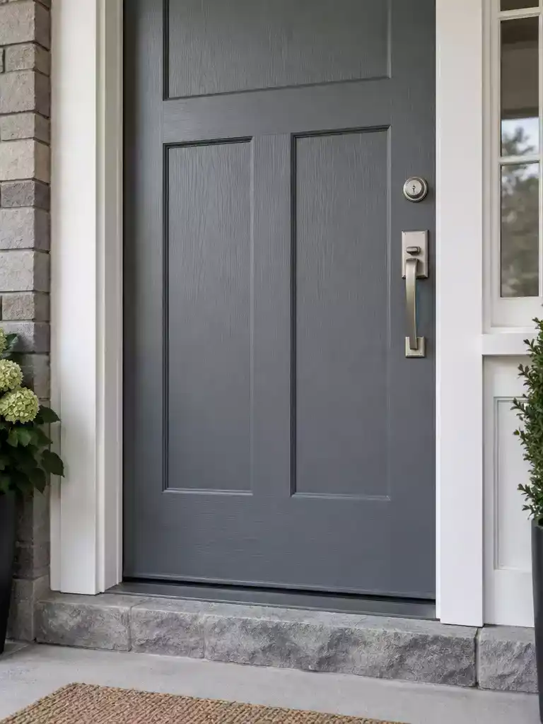
A sophisticated, cool-toned choice that masks surface imperfections and everyday wear with ease.
Slate gray relies on an absorptive, mid-depth quality that makes it one of the most forgiving neutrals for high-traffic entryways. Because the color sits firmly in the middle of the value scale, it avoids the high-contrast trap of both stark white and deep black doors.
The subtle blue-gray base is particularly effective at masking the harsh shadows created by minor surface dents or scratches. Where a glossy or light-colored paint would catch the light and highlight every imperfection, this matte or satin-finish gray helps those marks recede into the surface.
Pro-Tip: To get the most protection against scuffs, opt for a satin finish over a high-gloss one. The lower sheen prevents the door from reflecting light into the deep grooves of your panels, which keeps the surface looking uniform.
This color is an ideal pick for homes with modern or transitional architecture where you want a clean look that doesn’t demand constant wiping. It bridges the gap between industrial steel tones and warmer, organic grays, making it a reliable performer regardless of your siding color.
⭐ Slate Gray Mats for Entrances
✨ Editor’s Pick
Sturdy Natural Rubber Front Door Mat
Funny Farmhouse Style Indoor Welcome Mat
Black White Striped Farmhouse Porch Rug
Muted Navy
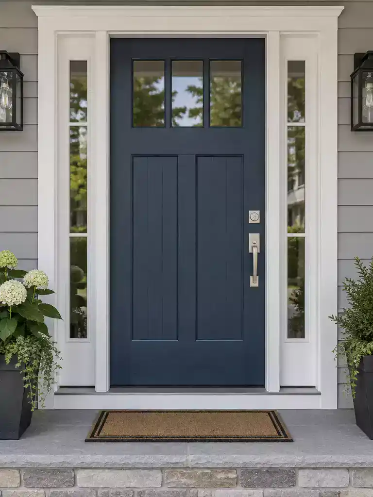
Control the depth of your entryway while masking everyday wear with this grounded, non-reflective blue.
When you choose a dark blue for a high-traffic entrance, the finish is just as important as the pigment. Avoid high-gloss navy at all costs, as it acts like a mirror for every smudge and fingerprint your household leaves behind.
Instead, opt for a matte or satin finish to ensure the blue depth conceals wear rather than highlighting it. This deep, muted tone effectively prevents the harsh contrast you see on lighter doors where dirt accumulates near the handle.
The Gloss Trap: High-gloss navy paint creates a spotlight effect for every single handprint and scuff.
This color choice is ideal for homeowners who want a bold, authoritative look without the constant need for touch-ups. If you live in an area with heavy dust or high humidity, a flat-finish muted navy will stay looking fresh significantly longer than any lighter alternative.
⭐ Muted Navy Mats Worth Buying
✨ Editor’s Pick
Non Slip Washable Dirt Trapper Mat
🏡 Real-Home Application:
- Entryway proximity: Use this deep navy near the floor line to naturally camouflage splashes from rain or mud.
- Daily upkeep: Wipe handles with a dry microfiber cloth weekly to prevent oils from creating a shiny patina.
- Lived-in look: Pair with brass or matte black hardware to ground the blue, making minor scuffs less visually obvious.
Weathered Green
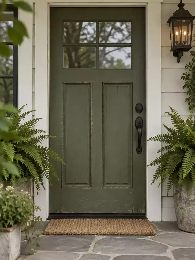
Embrace a low-maintenance, lived-in aesthetic that masks daily wear with earthy, muted tones.
Weathered green is designed to look intentional even when it shows the slight wear and tear of a busy household. This color relies on a patina-inspired finish that makes minor scuffs and surface abrasions feel like part of the home’s character rather than a maintenance failure.
Research consistently identifies the green color family as top-tier for masking shoe-adjacent grime and mud splashes. If you live in a farmhouse or cottage-style home, this shade integrates seamlessly with natural landscaping and dirt paths.
Styling Tip: Use this color for entryways where a “lived-in” aesthetic is the goal. Because the shade is already muted and earthy, it requires far less touch-up work than high-contrast alternatives like white or deep charcoal.
This is the ideal choice for homeowners who want a door that doesn’t demand perfection. Avoid this color only if you are aiming for a high-gloss, ultra-modern look, as the weathered aesthetic relies on a flatter, more organic finish to properly conceal surface imperfections.
⭐ Weathered Green Mats to Consider
Funny Indoor Welcome Mat for Cats
Blank Scalloped Artificial Coir Door Mats
✨ Editor’s Pick
Heavy Duty Sturdy Home Entrance Mat
🏡 Make It Feel Natural: Real-Home Application
- Landscaping match: Position potted ferns or dark foliage near the threshold to mirror the door’s muted tones.
- Matte finish: Choose a low-sheen paint to prevent high-noon glare from revealing dust on the door surface.
- Hardware pairing: Use oil-rubbed bronze or aged brass handles to complement the earthy, organic nature of the green.
Brick Brown
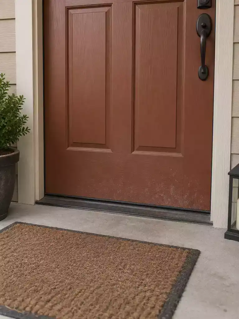
Earthy tones that make mud and outdoor debris disappear into your entryway’s aesthetic.
Brick brown works because it occupies the same color family as the dirt, clay, and dust that naturally collect at your doorstep. By choosing a mid-value brown with distinct reddish undertones, you effectively camouflage the splashes and scuffs that accumulate near the threshold.
Avoid the Mahogany Trap: While dark mahogany or deep cocoa browns might look rich, they often act like a magnet for light-colored dust and chalking. Stick to a mid-value brick tone to ensure the door stays looking clean between washes.
This color is an ideal choice for homes with natural landscaping, dirt paths, or heavy garden traffic. If your entryway sees a lot of muddy shoes or pets, the reddish-brown base acts as a visual break that prevents individual marks from standing out against the surface.
If you prefer a clean, sharp look, skip this option – it leans into a rugged, lived-in aesthetic. It is perfect for those who want their home to feel grounded and welcoming without the constant pressure of scrubbing the entryway every weekend.
⭐ Brick Brown Mats We Love
✨ Editor’s Pick
Washable Buffalo Plaid Front Door Rug
💡 Why This Works:
Brick brown succeeds because it leverages the psychological principle of camouflage. By mirroring the earthy, neutral tones found in the surrounding landscape, the paint effectively “breaks up” the visual impact of debris, making fine dust and mud splashes appear as intentional color variations rather than unsightly marks that need immediate cleaning.
Visual camouflage: This tone mimics natural soil, helping the entryway stay looking tidy with minimal effort.
Mushroom Taupe
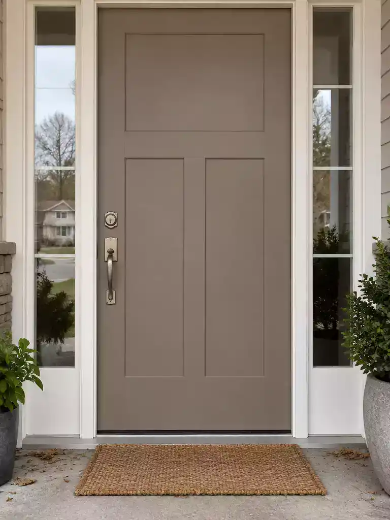
Achieve a low-maintenance, sophisticated look that effortlessly masks both dust and everyday fingerprints.
Mushroom taupe sits in the “Goldilocks” zone of exterior colors because it perfectly balances light and dark values. This makes it an ideal choice for households that want a neutral look without the constant upkeep of pure white or deep black.
The secret is the complex, earthy pigment base. While light colors immediately highlight dark scuffs and dark colors showcase every speck of dust, this mid-tone shade physically camouflages both types of debris.
Professional Tip: Use a satin or eggshell finish rather than high-gloss for this color. A lower sheen prevents light from reflecting off surface imperfections, which helps hide the texture of minor dings or scratches.
Because mushroom taupe is inherently “busy” with its mix of gray and beige undertones, it creates a visual texture that makes individual marks difficult for the human eye to track. You don’t need to worry about the door looking “dirty” after a light rain or a windy day.
This color is particularly effective for:
- Homes with frequent foot traffic where hand oils often collect near the handle.
- Entryways exposed to dusty environment conditions or unpaved driveways.
- Homeowners who prefer an earthy, organic aesthetic that complements stone or brick siding.
If your home features very high-contrast trim, such as bright white, ensure you test a swatch first. Mushroom taupe can sometimes lean too close to the color of your trim in direct sunlight, so viewing a 2×2 foot sample in both morning and afternoon light is essential before buying your gallon.
⚖️ Quick Decision Guide
- Choose this if: You want a versatile, forgiving neutral that bridges the gap between warm brick and cool stone.
- Skip this if: Your porch is perpetually shaded, as the taupe might lose its complexity and appear muddy.
- Pair it with: Matte black hardware to sharpen the profile and prevent the door from blending into the walls.
Bronze Gray
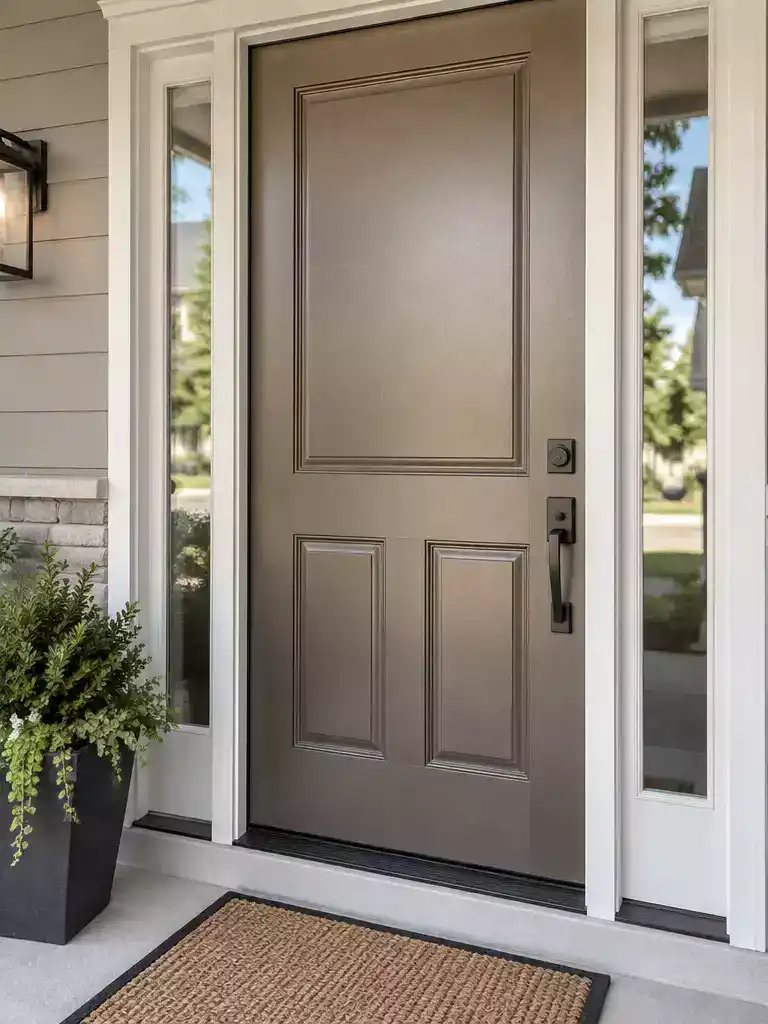
Disrupt the eye’s focus on surface imperfections with a sophisticated, metallic-leaning neutral finish.
When you want a door that feels intentional but refuses to show every scuff from a delivery box or a stray kick, bronze gray is a tactical choice. Unlike flat, uniform grays that immediately highlight smudges, this color relies on its complex, warm undertones to do the heavy lifting.
The subtle, metallic-adjacent quality acts as a visual filter. It creates a slight shimmer that disrupts the eye’s ability to lock onto fingerprints or surface abrasions, keeping the entryway looking fresh without constant wiping.
Why it works: Flat colors create a canvas where every speck of dirt stands out against the solid background. Bronze gray breaks up that solid plane, making it much harder for the eye to track individual marks.
This color is best for homeowners who prefer a modern, industrial-leaning aesthetic but need a practical solution for high-traffic entryways. If your door is constantly exposed to heavy use, you should skip lighter, high-contrast grays and lean into this deeper, warmer tone instead.
💰 What This Really Costs:
- The professional range: Expect to pay $125–$225 for a standard repaint, though complex prep can reach $550+.
- Hidden prep costs: Failing to sand deep gouges first makes even the best colors look worn immediately.
- Smart investment: Spending on professional surface repair ensures the bronze tone’s finish performs as designed instead of flaking.
Smoky Blue
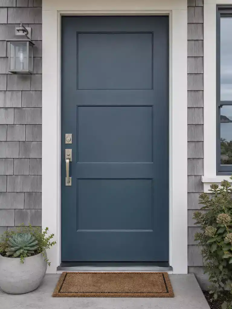
Control the grit of urban or coastal living with this moody, high-performance shade.
Smoky blue relies on its low-saturation profile to keep your entryway looking sharp without constant wiping. Unlike high-chroma primary blues that highlight every smudge, this muted tone absorbs visual noise.
The “smoky” quality acts as a built-in camouflage for the natural oils transferred from hands. It is an ideal choice for urban homes or beachside properties where fine dust and grit are part of the daily environment.
The Finish Matters: Avoid high-gloss formulas here, as they will turn your smoky blue into a mirror for every fingerprint. Stick to a satin or matte finish to maintain that soft, forgiving depth.
If you want a door that feels grounded and intentional rather than bright and flashy, this is your best bet. It conceals the inevitable wear of a high-traffic entrance while providing a distinct, moody aesthetic that holds up against the elements.
⭐ Smoky Blue Mats We Love
✨ Editor’s Pick
Hand Woven Cotton Buffalo Check Rug
Coffee White Plaid Front Porch Rug
Foldable Buffalo Plaid Front Door Rug
🧰 Questions for Your Professional Painter:
- Site-specific glare: Ask how the smoky blue will shift under direct coastal or high-noon urban sun exposure.
- Prep-to-paint ratio: Confirm if the $250–$550+ quote covers essential sanding to remove old, peeling surface layers.
- Finish durability: Request a high-quality, weather-resistant satin that resists chalking in humid, salt-heavy, or smoggy environments.
With ten practical color directions for your entryway now in view, the path to a cleaner-looking exterior becomes much clearer. You do not need to implement every suggestion to achieve a durable finish; selecting the one or two shades that best anchor your home’s architecture is all it takes to see an immediate difference.
The goal is to choose a mid-depth tone that masks daily wear while elevating your curb appeal. Once you tape a few swatches to your door to test the light, you can move forward with confidence, knowing the right color choice will save you significant maintenance effort. For a broader look at how to refine your entrance, you might also explore the complete guide to choosing your front door paint color to finalize your plan. Deciding on the color that fits your specific light and siding is the only step that truly matters for a polished result.
Related posts
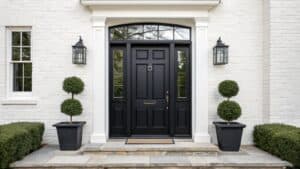 12 Best Black Front Door Paint Colors That Hide Everything
 14 Cupboard Door Designs That Hide Clutter Beautifully
 11 Door Design Modern Homes Use to Hide Storage
 10 Wardrobe Door Designs That Hide Visual Clutter
 Curtains for Closet Doors That Hide Clutter Without Looking Makeshift
 15 Front Door Colors Designers Pick for Brick & Black Shutter Homes
 12 Best Front Door Colors for a Blue House
 14 Best Front Door Colors for Log Cabin