
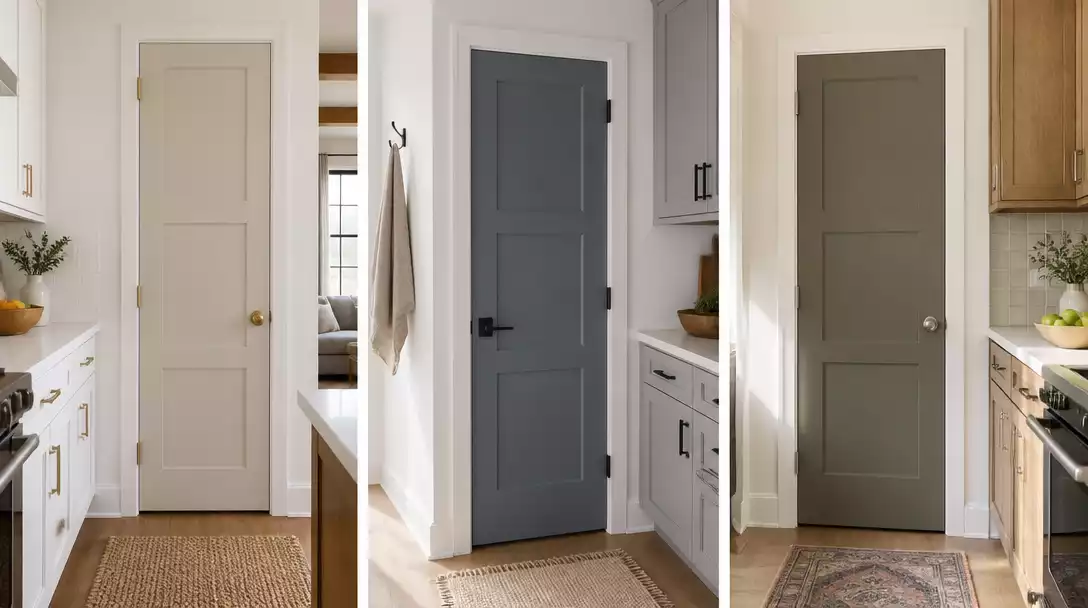
Choosing interior door colors that coordinate with painted kitchen cabinets is the best way to bridge your floor plan. This guide rounds up 10 door ideas worth saving to help you find a cohesive match for your home. Start with these reliable pairings for your next project.
Soft putty
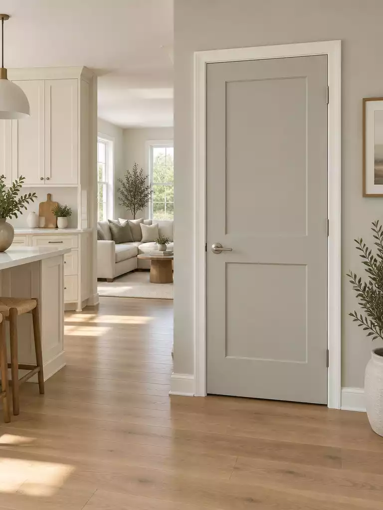
Create a seamless architectural bridge between your cream kitchen cabinets and the rest of your home.
As an Amazon Associate I earn from qualifying purchases. Affiliate links may earn me a commission at no extra cost to you.
Soft putty is the ultimate neutral anchor for kitchens featuring cream or off-white cabinetry. It effectively prevents the space from feeling like a stark, clinical laboratory by introducing a whisper of earthy warmth.
This color works best in open-concept homes where the kitchen flows directly into a living or dining area. By using putty on the interior doors, you create a cohesive visual thread that ties the kitchen’s warmth to the surrounding rooms.
Identifying the Right Putty
Not all putty shades are created equal, and the wrong undertone can make your doors look like they need a deep scrub. To avoid a dirty appearance, always check the base of your chosen paint sample:
- Green-based putty: Pairs beautifully with cabinets that have yellow or golden-cream undertones.
- Yellow-based putty: Works best against cabinets that lean toward a true, soft white.
Before you commit to a full gallon, paint a large sample board and hold it directly against your cabinet fronts. If the door color makes your cabinets look yellowed or dingy, the undertones are fighting rather than complementing one another.
⭐ Soft Putty Mats for Your Entryway
✨ Editor’s Pick
Woven Cotton Plaid Front Door Mat
Coir Welcome Mat with Striped Rug
Striped Farmhouse Porch Entryway Rug
💡 Why This Works
Using soft putty on interior doors acts as a visual “bridge” that softens the transition between high-contrast kitchen cabinetry and the rest of your home. By picking up the subtle, earthy temperature of your cream cabinets, this color creates a continuous, professional flow that feels intentional rather than fragmented.
Design Benefit: It provides a sophisticated neutral backdrop that makes your kitchen hardware and cabinet finishes pop.
Chalk white
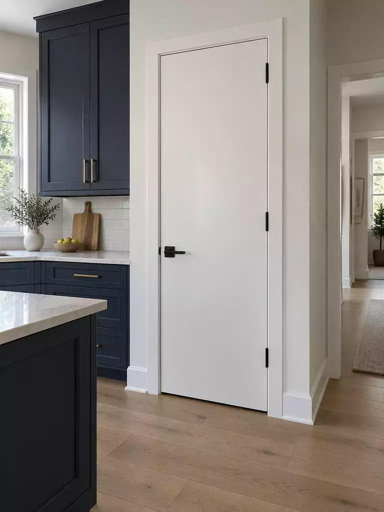
Create a crisp visual release to balance bold, saturated kitchen cabinet colors effectively.
Chalk white acts as a clean slate, making it the ideal choice for kitchens dominated by high-contrast finishes like navy, forest green, or charcoal cabinetry. When your kitchen cabinets carry significant visual weight, a stark, clean-toned door provides necessary relief instead of competing for attention.
To avoid a disjointed appearance, pay close attention to your finish selection. You should match the sheen of the door – typically satin or semi-gloss – to your existing kitchen baseboards and window casings for a cohesive, professional transition.
Who should choose this?
This color is perfect for smaller kitchens where you need to maximize light reflection. It effectively minimizes visual clutter in tight floor plans, helping the transition between rooms feel open and airy.
If your home features very warm, yellow-toned lighting, verify that your “chalk” white doesn’t lean too yellow on the door. You want a neutral, true white that stays crisp even when the afternoon sun hits the kitchen floor.
⭐ Chalk White Mats We Love
Coco Coir Doormat and Striped Rug
✨ Editor’s Pick
Scalloped Artificial Coir Crafting Mats
Cotton Woven Striped Porch Area Rug
📋 Quick Reality Check: Before You Paint
- Surface condition: Inspect for existing dents or deep scuffs, as high-gloss white paint highlights every minor imperfection.
- Hardware coordination: Check if your current kitchen cabinet pulls look dated against a crisp white finish before buying paint.
- Lighting shift: Test your chalk white sample during both morning and evening hours to ensure it avoids looking gray or blue.
Navigating the long-term upkeep of your painted doors matters far more than obsessing over every paint chip in the shop. A durable finish requires balancing your desired aesthetic with practical color choices that hold up under daily use, keeping your entryway looking intentional for years, not just months.
Select a single high-traffic door to test your finish, as a long-wearing, well-applied coat delivers more lasting value than a perfectly matched but high-maintenance color.
Muted denim
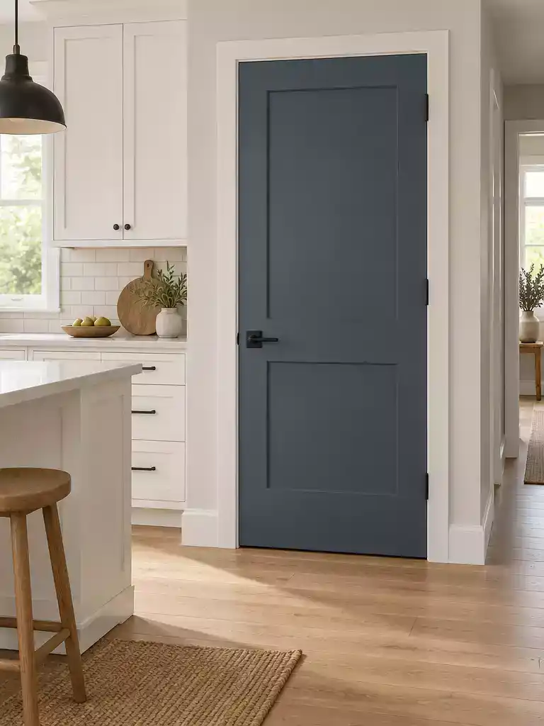
Create a sophisticated, grounded transition between your kitchen and living area with this deep blue.
Muted denim is your best choice when you want to introduce color without the intensity of a primary, nursery-style blue. The secret is the heavy gray base, which pulls the color into a sophisticated, lifestyle-friendly territory that pairs naturally with household architecture.
This color works effectively as a bridge between high-contrast kitchen cabinets and a more relaxed living space. If your kitchen features crisp white or light gray cabinetry, a muted denim door provides that necessary pop of color while remaining anchored to the neutral tones of the rest of your home.
Styling Pro-Tip: To keep this look from feeling too coastal, lean into industrial hardware. Brushed nickel or matte black hardware provides the perfect metallic weight to ground the blue-gray tone.
Avoid using muted denim if your kitchen is already saturated with warm, cream-based cabinetry or honey-toned wood. In those environments, the gray-blue undertone can fight against the warmth, causing the door to look muddy rather than intentional.
⭐ Muted Denim Mats to Consider
Waterproof All Season Gray Diamond Mat
Scalloped Coir Outdoor Welcome Door Mat
✨ Editor’s Pick
Custom Nautical Anchor Rubber Door Mat
✨ Small Details That Matter
Muted denim relies on careful accessory choices to bridge the gap between a casual kitchen and a more pulled-together living room transition.
- Hardware coordination: Pair with matte black lever handles to sharpen the blue’s edges and prevent a soft, blurry appearance.
- Sheen selection: Use an eggshell or satin finish to hide surface imperfections while giving the blue a smooth, clean-looking depth.
Olive gray
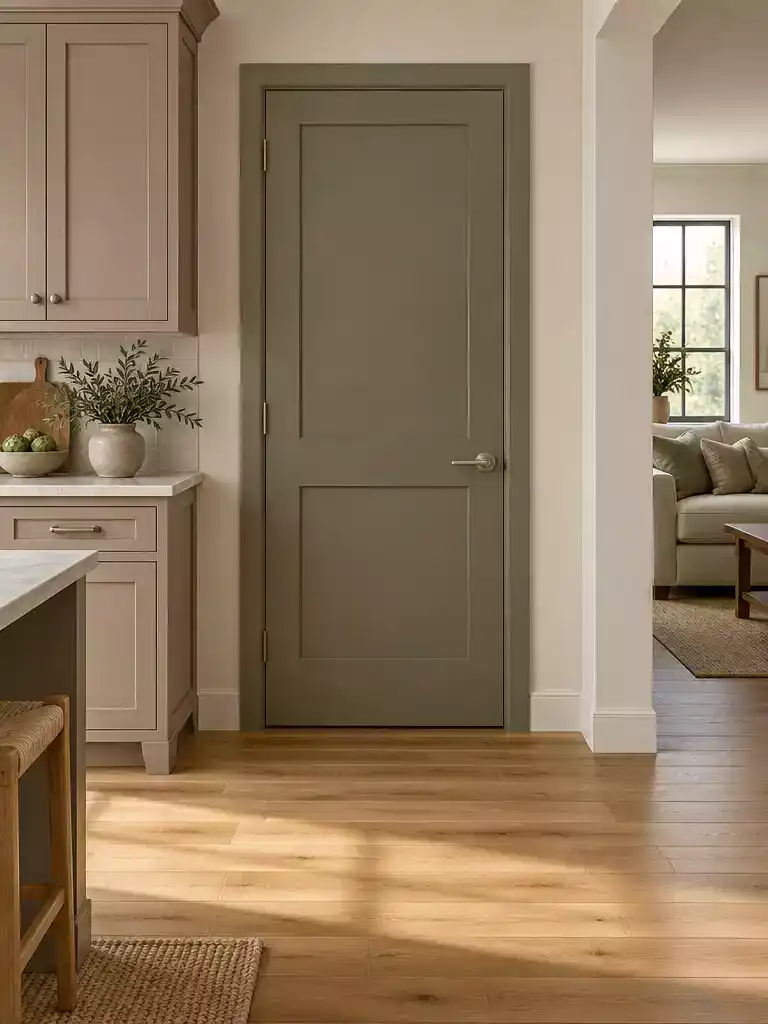
Ground your open-concept home with an earthy, organic tone that bridges warm and cool finishes.
Olive gray functions as a sophisticated, earthy anchor for kitchens that lean heavily into mushroom, greige, or natural wood cabinetry. By balancing green and gray pigments, this color avoids the sterile, clinical feel of standard factory-mixed grays.
Use this shade if your home features natural wood flooring, as the wood’s inherent warmth interacts with the green undertones to create a seamless visual connection. It is a particularly strong choice for bridging the gap between a busy kitchen and a more relaxed living space.
Pro-Tip for Coordination: Because olive gray is a complex mid-tone, it can look drastically different depending on your light exposure.
Always test a large paint swatch against both your kitchen cabinets and your flooring before committing. If your kitchen receives very little natural light, opt for a formula with a higher green saturation to prevent the color from appearing muddy.
You should skip this color if your cabinetry has strong blue or violet undertones, as the green base of the olive gray will clash and create a jarring transition. This color thrives when it is allowed to act as an organic neutral rather than a competing focal point.
⭐ Olive Gray Mats Worth Buying
✨ Editor’s Pick
Heavy Duty Rubber Boot Tray Mat
Black and Tan Striped Porch Rug
Heavy Duty Indoor Outdoor Welcome Mat
📋 Before You Try This: Integration Checks
- Flooring transition: Ensure the olive gray doesn’t clash with the specific grain patterns or warmth levels found in your kitchen flooring.
- Existing trim: Check if your baseboards and door casings are a stark white, which may highlight the gray undertone, making the door appear darker.
- Light consistency: Confirm how afternoon sunlight hits the door, as this will shift the olive tint significantly compared to your cabinet’s finish.
Clay Beige
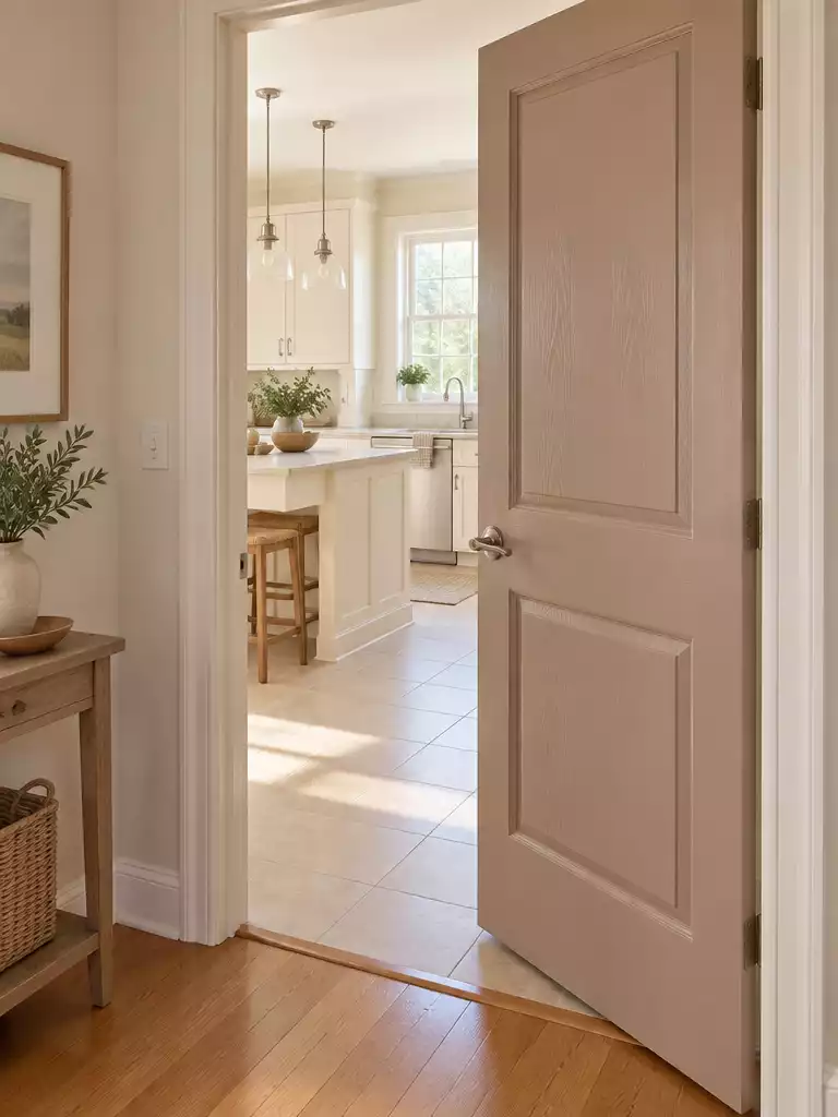
Bring warmth to your kitchen flow with this grounding, earth-inspired neutral tone.
Clay beige acts as a powerful bridge for kitchens featuring cream or honey-toned cabinetry. Its distinct pinkish-brown undertone warms up spaces that often feel too clinical, making the transition between the kitchen and adjacent living areas feel intentional and cozy.
The Coordination Rule: This color thrives when it echoes the warmth already present in your kitchen. If your cabinets lean toward cream, ivory, or warm wood, clay beige will anchor the entire room.
You should carefully avoid this shade if your kitchen relies on cool gray or stark blue-white cabinetry. In those environments, the inherent warmth of the beige will clash with the cool tones, resulting in a muddy, confusing look that feels like a mistake rather than a design choice.
⭐ Clay Beige Mats We Love
✨ Editor’s Pick
Brown Dirt Trapper Indoor Door Mat
💡 Why This Works
Clay beige succeeds as a transition color because it mimics the natural, softened light found in many kitchen finishes, effectively bridging the gap between high-contrast zones. By pulling the warmth out of your cabinetry, this shade creates a visual tether that makes shifting between rooms feel seamless rather than jarring.
Cohesive Flow: Use this color to unite warm-toned cabinet finishes with neutral living room wall palettes.
Tobacco brown
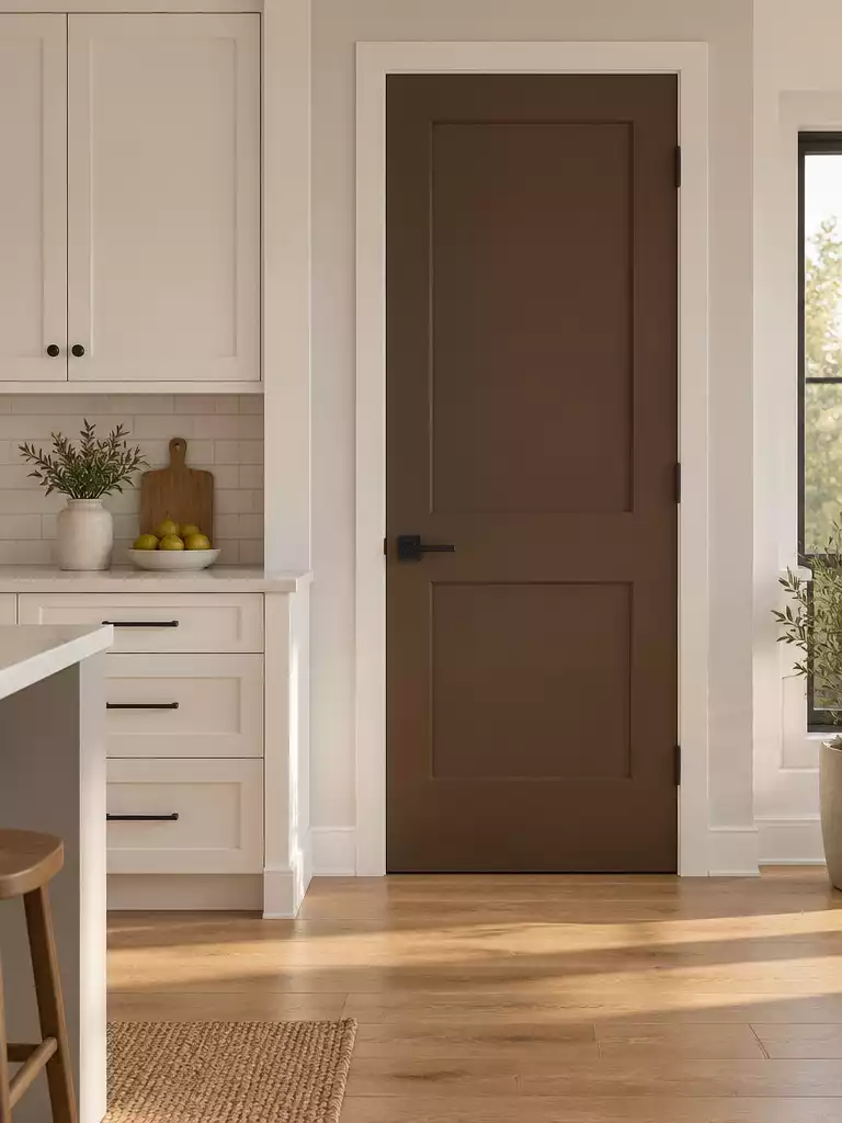
Create a high-end focal point that grounds your light kitchen cabinetry with rich, earthy depth.
Tobacco brown acts as a dramatic anchor, specifically designed to break up expansive runs of white or light-gray kitchen cabinetry. By introducing this deep, warmth-filled shade, you move away from monochromatic design and into a space that feels more like a custom, furniture-grade room.
To achieve the right look, opt for a matte or eggshell finish rather than a high-gloss paint. This lower sheen mimics the appearance of stained wood, providing a sophisticated texture that doesn’t demand the constant maintenance of actual wood grain.
Best for Modern Kitchens
This color is ideal if your home features clean, minimalist lines or contemporary hardware. It provides exactly enough contrast to make the transition between the kitchen and the living room feel like a deliberate design choice.
If you have an open-concept layout, use this color sparingly on doors that act as a gateway to the kitchen. It creates a bold, grounding effect that prevents a large kitchen from feeling too airy or sterile.
⭐ Tobacco Brown Mats for Your Home
✨ Editor’s Pick
Rustic Brown Hall Tree Shoe Storage
📈 The Long-Term Payoff
Deep, grounding colors like tobacco brown are exceptionally forgiving in high-traffic kitchens compared to lighter shades. While trendy bright colors can date a home quickly, a rich, wood-toned brown creates a timeless, furniture-like quality that appeals to a wide range of buyers during resale, keeping your kitchen’s aesthetic feeling intentional rather than fleeting.
Resale Advantage: Choosing a timeless, earthy neutral protects your home’s value better than passing, high-saturation color trends.
Dusty Eucalyptus
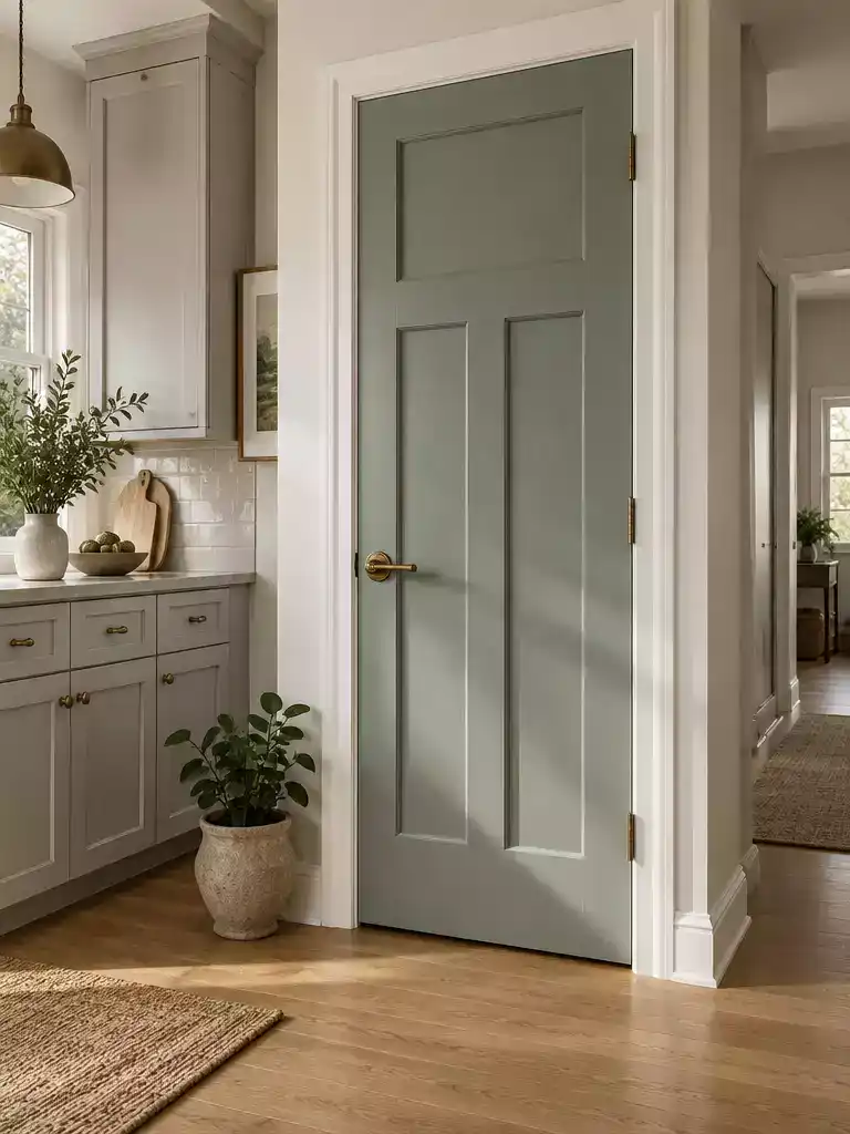
Soft, muted green tones create a sophisticated, organic bridge between cool kitchen cabinets and living spaces.
Dusty eucalyptus is a deliberate choice for kitchens featuring soft sage or light gray cabinetry. It functions as a bridge that brings the outdoors inside without overwhelming the visual flow of your home.
The “Dusty” Factor: The heavy gray base within this color is what keeps it from appearing minty or overly vibrant. It is the secret to getting a green that feels grounded and mature rather than playful or primary.
When styling a door in this shade, the right hardware selection is critical to prevent the color from feeling too cold. Aged brass or warm gold hardware will highlight the subtle yellow-leaning undertones within the green, making the entire entryway feel more welcoming.
Consider this color if you want an organic feel that isn’t as harsh as a pure, flat gray. It is best suited for:
- Kitchens with cooler cabinet finishes that need a touch of warmth.
- Open-concept layouts where you want a soft, non-intrusive transition.
- Homes incorporating natural wood accents or indoor botanical elements.
Pro Tip: Avoid pairing this with high-gloss finishes, which can make the muted green look like plastic. Stick to a satin or eggshell finish to allow the subtle gray undertones to show their depth in changing light.
⭐ Dusty Eucalyptus Mats to Consider
✨ Editor’s Pick
Charcoal Balcony Privacy Fence Screen Cover
💡 Designer Note: Why This Works
By pulling a dusty eucalyptus onto your doors, you create a visual “anchor” that prevents the kitchen from feeling like an island of color. This hue works because it mimics the natural, desaturated greens found in stone or foliage, effectively softening the transition between high-contrast kitchen cabinetry and the more relaxed, neutral living areas of your home.
Ink Charcoal
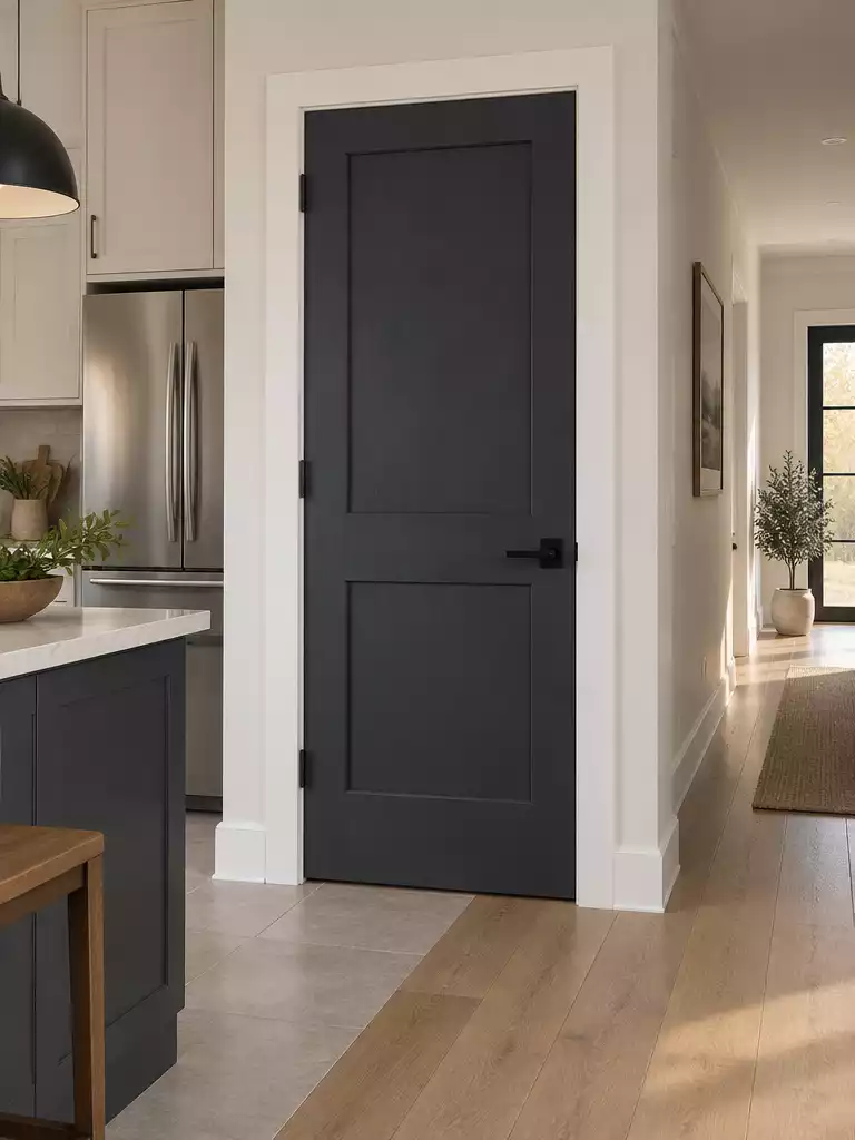
Anchor your space with a dramatic, high-contrast door that hides scuffs and defines transitions.
Ink charcoal serves as a heavy-hitting anchor for kitchens featuring bold, saturated cabinets or those needing a sharp, dark frame against white walls. Because this shade relies on a neutral or blue base, it avoids the muddy, purple cast that often plagues cheaper black paints in low-light conditions.
Avoid the purple shift. Always test your charcoal sample against your cabinet finish in both morning sunlight and evening artificial light to ensure the undertone remains true.
This color is a practical choice for high-traffic entryways where durability is a priority. Darker pigments naturally mask scuffs and fingerprints better than lighter tones, making it an ideal candidate for doors leading to garages, mudrooms, or busy pantries.
When selecting your finish, stick to an eggshell or satin sheen rather than high-gloss. A lower sheen mimics the look of premium furniture and prevents the door from looking overly reflective or “plastic” in bright kitchen lighting.
⭐ Ink Charcoal Mats for Entryways
✨ Editor’s Pick
Six Tier Over Door Hanging Organizer
⚖️ Quick Decision Guide
- Choose this if: You want a low-maintenance, sophisticated anchor that hides daily wear in high-traffic kitchen entryways.
- Skip this if: Your kitchen lacks natural light or feels cramped, as deep charcoal can unintentionally shrink small footprints.
- Pair it with: Warm metallic hardware like antique brass to soften the intensity and add a touch of luxury.
Warm Stone
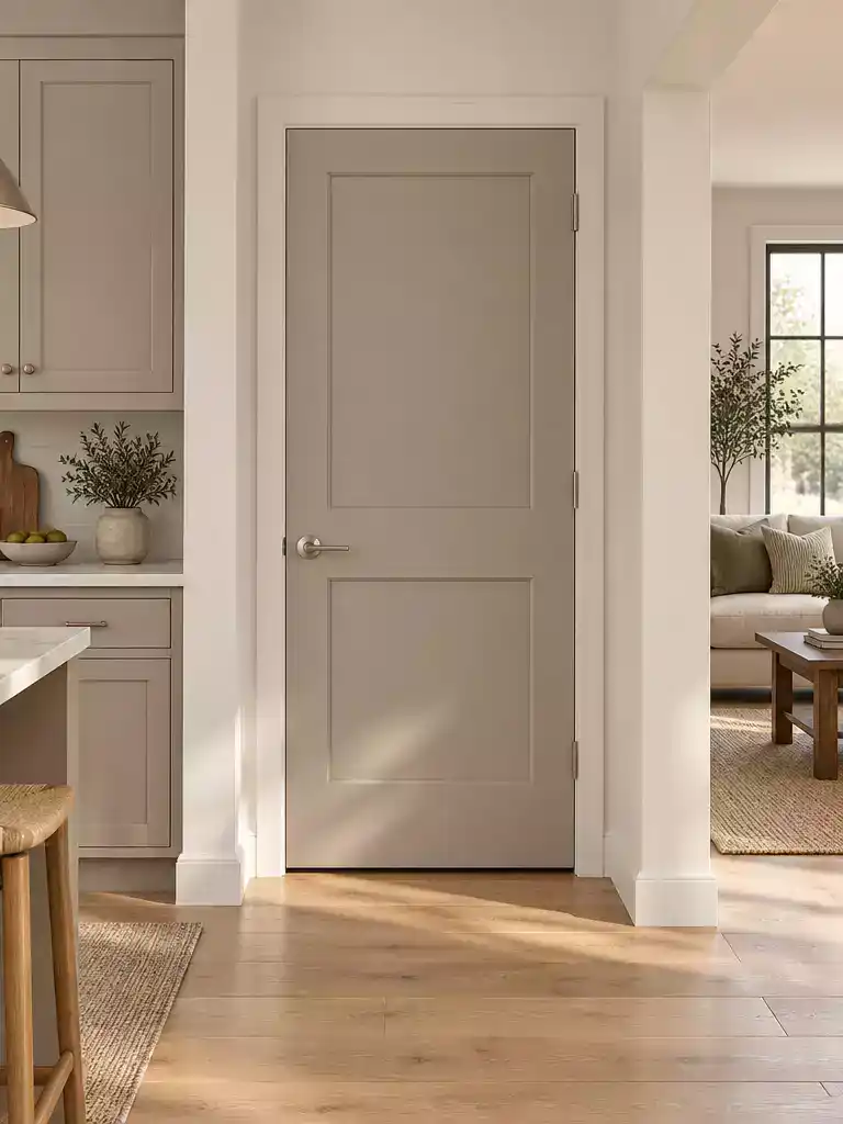
Create a professional, cohesive floor plan by using this neutral bridge between kitchen and living zones.
If your kitchen features greige or taupe cabinetry, this color acts as the ultimate neutral bridge for your home. It sits exactly between gray and beige, making it the most forgiving choice when you are trying to coordinate disparate undertones in an open-concept layout.
Why it works: Because this color lacks strong blue or yellow dominance, it won’t clash when the natural light shifts throughout the day. It provides a steady, grounded anchor that ties the kitchen to the rest of the house without calling unnecessary attention to the door itself.
This is the right choice for homeowners who prioritize a cohesive, flow-focused design over high-contrast drama. If you want your house to feel like a single, curated space rather than a collection of separate rooms, lean into this balanced neutral.
When applying this, ensure the finish matches your baseboards to keep the transition invisible. A satin or eggshell finish works best here, as it offers enough durability for high-traffic doorways while maintaining that soft, stone-like appearance.
💡 Why This Works
Because warm stone sits perfectly at the intersection of gray and beige, it naturally absorbs the surrounding hues of your kitchen. It creates a psychological “buffer” that prevents the eye from snagging on harsh color shifts, making smaller homes feel more expansive and thoughtfully connected rather than segmented.
Design Takeaway: Use this color to unify disparate flooring transitions, as its neutral base naturally complements both wood and tile.
Soft Terracotta
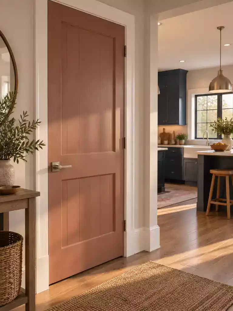
Inject warmth into your floor plan by using this glowing, earth-toned bridge between rooms.
Soft terracotta is the ideal choice if your kitchen relies on cool-toned gray or navy cabinets that currently make your cooking space feel isolated. By introducing this muted, brown-heavy shade to your interior door, you create an inviting transition that softens the crispness of those cooler cabinet colors.
Is this right for you? Use soft terracotta if your kitchen lacks natural light and feels clinical. Skip this shade if your home already features heavy red or orange wood accents, as the color may become too dominant and overwhelm your existing palette.
The “soft” version of this pigment is critical for a professional look. It relies on a significant brown base to ensure the result is an earthy, grounded hue rather than a bright, artificial orange.
For the best results, consider these coordination tips for your space:
- Hardware Pairing: Use matte black or oil-rubbed bronze to ground the warmth of the terracotta; avoid bright, shiny chrome.
- Finish Selection: Opt for an eggshell or satin finish to provide just enough light reflection without highlighting imperfections in the door panel.
- Lighting Check: Test your swatch in both the morning and evening, as this color will shift from a deep clay in low light to a vibrant glow in direct sunshine.
⭐ Soft Terracotta Mats for Fall
✨ Editor’s Pick
Terracotta Jack O Lantern Pumpkin Decor
Custom Size Indoor Outdoor Bench Cushion
Heavy Duty Blue Green Rubber Mat
🏡 How This Works in a Real Home:
- Strategic Placement: Use this color on the door entering the kitchen to signal a shift toward the “heart of the home.”
- Daily Usability: Because soft terracotta hides dust better than white, it is an excellent choice for high-traffic doorways near messy zones.
- Natural Finish: Pair with muted, earthy wall colors in the hallway to prevent the door from looking like a staged, singular pop of color.
You now have ten distinct color directions for bridging your kitchen cabinetry with the rest of your home. Selecting the one or two shades that naturally align with your existing undertones is all it takes to achieve a cohesive, professional result.
There is no need to overhaul every entry point; the look you want comes from choosing a finish that creates a seamless visual bridge. If you are unsure where to begin, learning what color to paint interior doors when basic white fails will give you the confidence to finalize your decision. Pick the shade that feels right for your home’s specific light, and you will have an entry that feels intentional and complete.
Related posts:
 I Painted the Inside of Our Front Door a Different Color Than the Outside
 12 Natural Wood Door Picks That Work With Grey Floors—Not Against Them
 12 Climate-Proof Main Door Design Ideas That Always Work
 Do Roller Blinds Work On French Doors
 Choosing a Door Color When the Rooms on Each Side Are Different Colors
 12 Door Handle Upgrades That Make Cabinets Feel Custom
 14 Front Door Colors Designers Love for Dark Blue Houses
 14 Best Front Door Colors for Log Cabin