
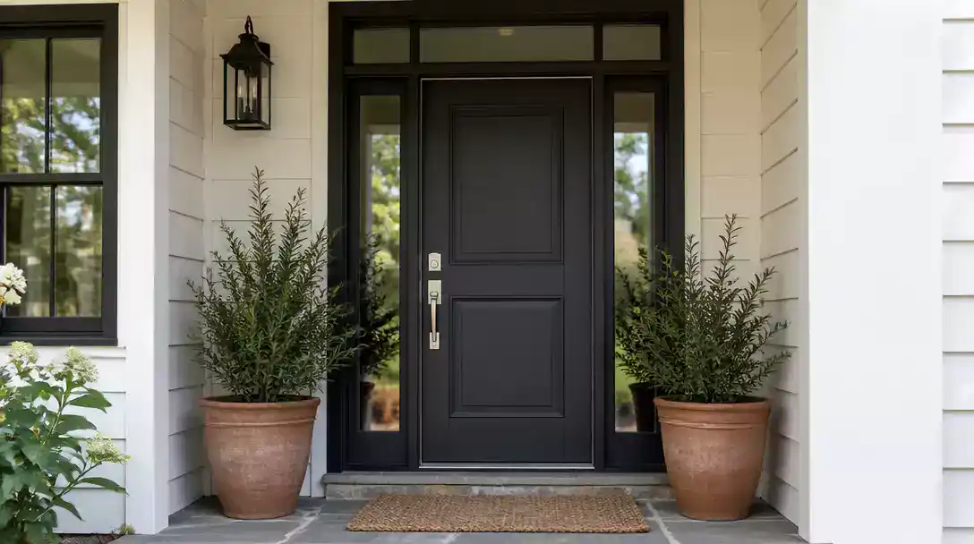
Replacing your window frames fundamentally alters your home’s exterior color palette, turning your front door into a high-stakes design puzzle. This guide narrows the search to 9 ideas worth your attention so you can finalize your color choice with absolute confidence and avoid costly repainting regrets.
Frame undertone
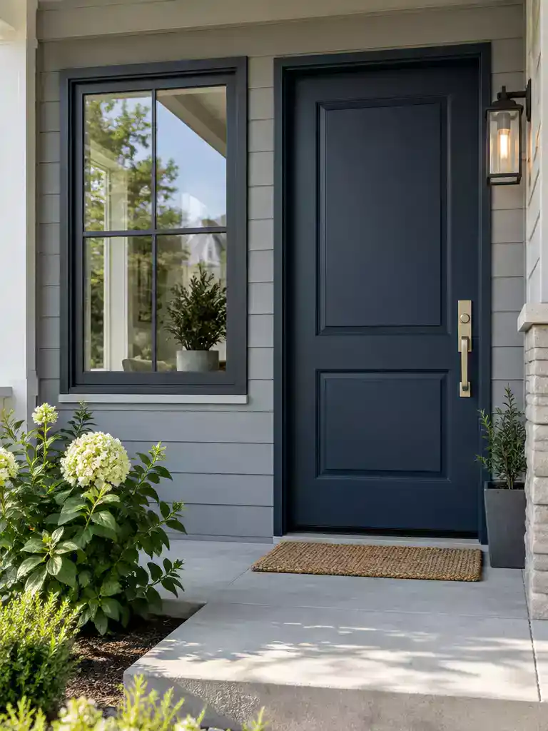
Aligning your window frame and door undertones creates a sophisticated, professionally designed exterior look.
As an Amazon Associate I earn from qualifying purchases. Affiliate links may earn me a commission at no extra cost to you.
The most common cause of a house looking “off” isn’t a bad paint color; it’s a fundamental mismatch between the temperature of your window frames and your front door. Think of your new window frames as the anchor for your exterior palette. You must decide whether they are cool or warm before you even look at a paint swatch.
Cool frames – like blue-grey, graphite, or ashy tones – act as a neutral base that demands cooler, deeper companions. If you try to pair these with a warm, honeyed yellow or a reddish-brown door, the contrast will feel jarring and accidental. Instead, lean into the temperature by choosing navy, charcoal, or cool-toned greens that pull from the same color family.
Warm frames, such as creamy, honeyed, or reddish-brown tones, require a different approach. These frames thrive when paired with earthy, warm-toned doors. Think deep forest green, muted terracotta, or rich browns. Ignoring this temperature logic is the quickest way to ruin your home’s curb appeal, as the human eye naturally detects the discord between clashing warm and cool undertones.
The Temperature Clash Warning
Never mix a cool-toned, blue-based frame with a warm-toned, yellow-based door. This creates a muddy visual effect that makes your home entrance appear uncoordinated and diminishes its architectural value.
⭐ Top Entry Doors for Your Home
✨ Editor’s Pick
Classic Nine Panel Double Exterior Entry Door
Six Lite Clear Glass Exterior Prehung Door
Modern Black Fiberglass Entry Door Slab
💡 Why This Works: The Psychology of Cohesion
When your window frames and front door share a temperature-based language, the home feels intentionally designed rather than pieced together over time. By anchoring your door color to the frame’s undertone, you eliminate the visual clutter that often makes an entrance fade into the background, ensuring your home feels unified and welcoming from the curb.
Visual takeaway: Matching undertones creates a seamless transition that guides the eye naturally toward your front entrance.
2. Contrast reset
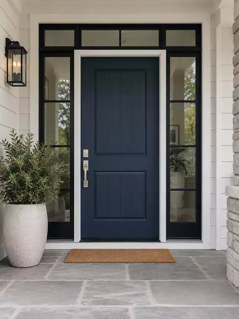
Reclaiming your entrance as the home’s primary focal point through intentional visual weight.
When you install new window frames, particularly high-contrast ones like black on white siding, you are fundamentally altering the visual weight of your home’s exterior. Visual weight is essentially the degree to which an element demands the eye’s attention; if your new frames are bold and dark, they may inadvertently “out-compete” your front door for dominance.
If your entrance feels like it has faded into the background since your renovation, you are likely dealing with a contrast imbalance. The door is no longer the star of the show because the frames have become too “loud.” To fix this, you need a reset of your exterior hierarchy.
The Reset Principle: Think of your facade like a stage. You can only have one primary focal point. If your frames are now the most prominent feature, your door must either retreat to match them or step up to command more attention.
To regain the balance, consider these two strategic paths for your door color:
- The Recede Strategy: If you prefer a modern, architectural, or minimalist look, match your door color to the frame finish. By painting the door the same black or charcoal as the window frames, you allow the entrance to blend into the facade, shifting the focus back to the overall geometry of the house.
- The Command Strategy: If you want the door to remain the primary focal point, it needs to shift to a deeper, more saturated tone. A light-colored door will often look weak or “washed out” against high-contrast frames; a rich, dark color will regain the necessary weight to hold its own against the new window finish.
Avoid the “Busy” Facade: A common mistake is trying to introduce a third, bright accent color when the frames and siding are already complex. If you have high-contrast frames, keep your door color grounded in deep, saturated tones to avoid a chaotic, fragmented look that fights for the viewer’s eye.
⭐ Best Entry Mats for Clean Floors
Heavy Duty Indoor Outdoor Welcome Mat
✨ Editor’s Pick
Absorbent Low Profile Indoor Entry Mat
Waterproof Non Slip Outdoor Welcome Mat
⚠️ Common Mistakes to Avoid:
- The “Visible Gap” Trap: Choosing a door color that is only slightly different from the frame, creating an accidental, muddy look.
- Ignoring Siding Undertones: Picking a high-contrast door color that clashes with the warmth or coolness of your home’s exterior cladding.
- Over-Scaling Contrast: Using a bold, neon, or bright pastel door that fights for attention against already high-contrast, modern window frames.
3. Black frame weight
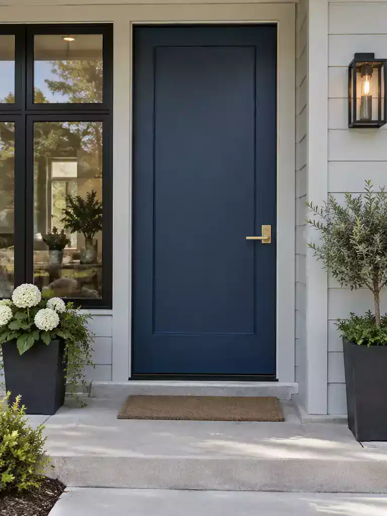
Balancing bold black frames with intentional color choices creates a sophisticated, architectural entrance.
Black window frames are a major design commitment because they significantly increase the perceived visual weight of your home’s exterior. When you switch to black, you are essentially adding a heavy, graphic element that demands a response from your front door.
If the frames are the loudest thing on your facade, your door needs to be handled with care to avoid looking like an accidental afterthought. You generally have three paths to balance this new visual intensity:
- Seamless Pairing: Using a black or near-black door creates a cohesive, modern look that lets the architecture speak for itself. This approach works best when you want the windows and door to read as a single, unified system.
- Softening with Wood: If the black frames feel too harsh, warm wood stains are your best tool for balance. The natural grain and honeyed or reddish tones of wood provide a much-needed organic counterpoint to the industrial feel of black metal.
- Saturated Statements: If you want color, choose deep, moody, and saturated hues. Deep navy, forest green, emerald, or rich, dark red hold their own against black frames without looking like a mistake.
Avoid the “Cheap” Trap
Steer clear of bright, neon, or pastel door colors when paired with black frames. These punchy, light, or artificial tones often look flat and unrefined against the high-contrast intensity of black, making the entire entrance feel disjointed rather than intentional.
Ultimately, the goal is to ensure your door doesn’t get “drowned out” by the dark windows. If you choose a deep, saturated color, ensure it has enough depth to maintain its presence. Treating your door as a deliberate focal point rather than just a swatch of paint is the secret to making black frames feel like a high-end design choice rather than a visual burden.
⭐ Handlesets That Elevate Any Front Door
Heavy Duty Matte Black Privacy Levers
Ten Pack Matte Black Interior Levers
✨ Editor’s Pick
Matte Black Interior Privacy Door Handles
✨ Finishing Touches for Black Frames
Black frames create a striking, modern silhouette, but the final details are what actually bridge the gap between a harsh industrial look and a welcoming, high-end entrance.
- Coordinating Hardware: Match your door handle and lockset to the frame’s finish to create a seamless, intentional look.
- Lighting Accents: Choose matte black or warm-toned brass fixtures that complement the window frame’s intensity without fighting it.
The entrance carries significant psychological weight because it serves as the primary transition between the public street and your private sanctuary. Focusing on the few elements that define this curb appeal helps you avoid the common pitfalls that often lead to costly, regretful paint choices.
Your home presents a confident exterior when you anchor the design on frame undertones and contrast, rather than trying to balance every single detail at once.
White frame brightness
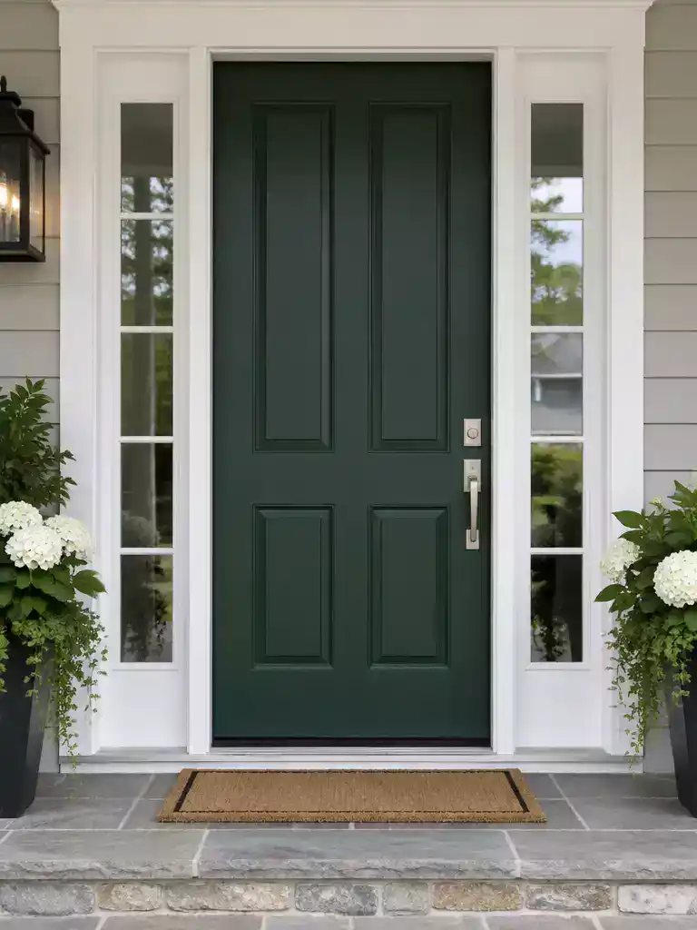
Bold, saturated door colors prevent your entrance from disappearing against bright white window frames.
White frames are a classic architectural choice, but they act like a spotlight on every other color nearby. Because white reflects so much light, it can make adjacent colors appear darker and more intense than they would against a neutral or dark frame.
If your door is a light or muted shade, white frames can inadvertently flatten its appearance, making the entrance look washed out or invisible from the street. To maintain a clear focal point, you need to lean into depth or high chroma.
The Depth Strategy: When you have bright white frames, your door needs to hold its own visual weight. Deep, rich tones like forest green, navy, charcoal, or classic black create a high-contrast look that commands attention.
If you prefer a more playful or energetic facade, you don’t have to stick to dark colors. However, you must ensure your chosen hue has high chroma – the vividness or purity of the color.
A soft pastel blue might look like a mistake next to bright white frames, but a vivid, saturated coral or a sunny yellow can look intentional and architectural. The goal is to avoid colors that feel “dusty” or washed out, as the white frames will only exaggerate those qualities.
Ultimately, the white frame acts as a frame for your front door. If the door color is too pale, the “frame” overwhelms the “picture.” Choose a color with enough weight to ensure your entry remains the hero of the facade.
⭐ Entry Mats We Love
✨ Editor’s Pick
Buffalo Plaid Checkered Outdoor Welcome Mat
Hand Painted Coconut Fiber Welcome Mat
Jumbo Size Waterproof Outdoor Entry Mat
💡 Why This Works
Because white frames naturally push colors away visually, adding depth to your door creates a “stopping point” for the eye. A saturated or dark tone prevents the entrance from feeling like a hole in the facade, instead turning it into a deliberate architectural anchor that balances the brightness of the surrounding window frames.
Visual Hierarchy: A high-contrast door prevents the white frames from dominating your home’s entire exterior appearance.
5. Bronze frame warmth
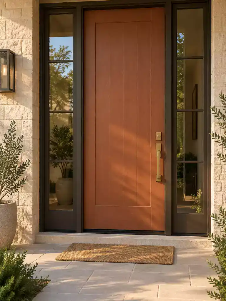
Aligning your door color with the warm, earthy undertones of bronze frames creates a sophisticated, unified entrance.
Because bronze is inherently a warm, dark brown-metal tone, it acts as a strong anchor for your exterior palette. When you introduce these frames, you are essentially committing to an earthy color story. The most successful results happen when you lean into this warmth rather than fighting it with cooler tones that create a discordant, muddy appearance.
The Warmth Rule: To maintain architectural harmony, choose colors that share the same temperature as your bronze frames. Think of your door as a natural extension of the metal finish rather than a separate, competing element.
When selecting your paint or wood stain, focus on the following color families to ensure your entrance remains cohesive:
- Earth Tones: Shades like olive green, deep terracotta, or muted ochre work exceptionally well with the richness of bronze.
- Neutrals: Creams, soft beiges, tan, and greige provide a classic, high-end look that lets the bronze frames define the window structure while the door remains inviting.
- Wood Stains: If you are opting for a stained finish, select options that lean toward the warm or red spectrum. Avoid grey-washed or ashy stains, which will clash with the brown undertones of the bronze.
Avoid the Temperature Clash: Steer clear of stark white, cool blue, or harsh blue-grey door colors. These cool tones create a visual conflict with the warm brown of the bronze, often making the metal frames look unintentionally muddy or dull by comparison.
If you aren’t sure where to start, begin by looking at the natural light hitting your entryway. If your porch is heavily shaded, a warm cream or lighter beige can brighten the space without introducing a color temperature that feels out of place against the bronze.
⭐ Hardware to Consider
Square Front Door Handle Deadbolt Set
✨ Editor’s Pick
Modern Matte Black Privacy Door Knobs
Sliding Barn Door Handle Pull Set
🏡 How This Works in a Real Home:
- Hardware coordination: Pair your bronze frames with oil-rubbed bronze or aged copper hardware to maintain a seamless, intentional look.
- Porch lighting: Choose warm-toned bulbs (2700K) to enhance the bronze finish, avoiding daylight or cool-white bulbs that wash out textures.
- Natural transitions: Use a wood-stained door finish to bridge the gap between metal frames and siding, creating a warmer, more approachable entrance.
6. Existing trim color
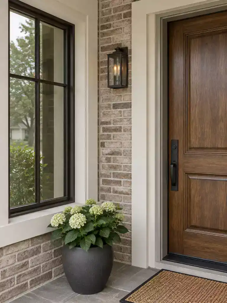
Aligning your trim and window frames creates a cohesive, professional look for your home.
When you install new window frames, you aren’t just changing the glass surroundings; you are introducing a new, permanent color block to your home’s exterior. Often, the trim surrounding your windows and doors acts as a continuous visual band that links your frames to the rest of the house.
If your trim color remains unchanged while your frames shift to a modern finish, the facade can quickly start to look segmented or “choppy.” To keep your curb appeal from feeling like a patchwork project, treat your trim as the bridge that connects the new frames to your existing door color.
The Bridge Strategy: If your new window frames are a bold choice like black, charcoal, or bronze, consider painting your trim to match the frames or choosing a neutral bridge color like cream or soft white.
This simple adjustment prevents the “framed-in” look and makes the transition between the windows and the door feel intentional rather than accidental.
If you have a mixed-material facade – such as brick paired with siding – the trim becomes even more influential. In these cases, avoid introducing a third, wildly different color for the trim, as this will compete with the window frames for visual dominance.
Instead, use these neutral “bridge” tones to unify the elements:
- Black or Charcoal: Best for modern or industrial frame styles to ground the house.
- Bronze: Ideal for softening the look if you have warmer body colors or natural stone.
- Cream or Warm White: Provides a classic, softened contrast that works well with almost any frame color.
By keeping the trim and frames within the same color family, you allow the front door to stand out as the primary focal point of the entrance. When the trim and frames are unified, the eye flows naturally across the facade, leading visitors directly to your door instead of getting caught in a visual tug-of-war between mismatched materials.
⭐ Reader Favorite Door Hardware
Black Flush Pocket Door Pull Handles
Brushed Nickel Passage Interior Door Levers
✨ Editor’s Pick
Exterior Door Lock Set With Deadbolt
🔢 The Right Sequence: Trim Before Door
Establishing your trim and frame palette first prevents the frustration of choosing a door color that feels disconnected from your home’s new architectural lines.
- Finalize frame finish: Lock in your window frame color to establish the primary architectural undertone.
- Bridge the trim: Paint or match trim to frames to create a continuous, unified visual band.
- Select door accent: Choose your door color last, using the established frames as your anchor for contrast.
7. Exterior material balance
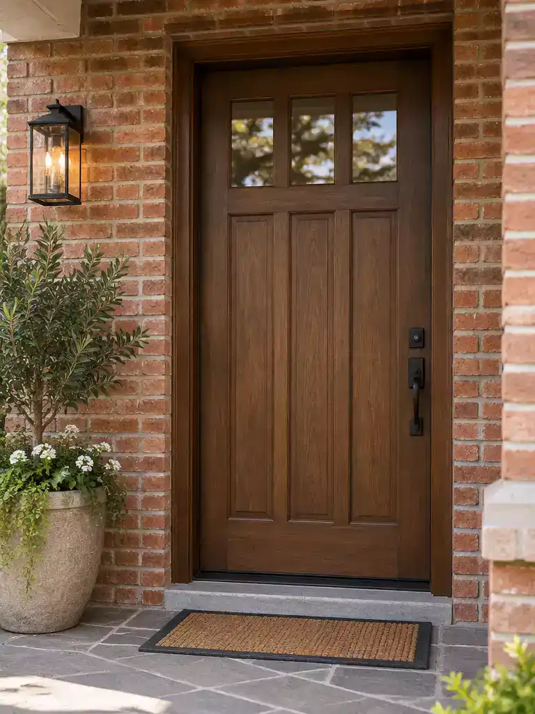
Aligning your door color with your home’s exterior material creates a cohesive, professional finish.
Your home’s exterior material acts as a massive canvas that dictates the “temperature” and texture of every other choice you make. When you introduce new window frames, they interact directly with this existing material, meaning your front door must bridge the gap between the window finish and the home’s building envelope.
Brick facades are inherently warm-toned, carrying deep reds, oranges, and earthy browns. If you choose a door color that is too cool – like a sharp, icy blue – it will fight against the natural warmth of the brick and create a jarring, discordant look. Instead, lean into warm, saturated tones like forest green, deep burgundy, or even a rich, muted terracotta to maintain a sense of harmony.
Pro Tip: If your home features variegated stone, keep your door color choice restrained. Because the stone already provides a complex pattern and texture, a high-gloss or bright-colored door often feels like it is competing for attention. Stick to matte or low-sheen finishes in neutral or deep, earthy tones to let the natural stone remain the star.
Siding offers the most flexibility, as it is often a neutral or solid-colored background that doesn’t carry the same “texture weight” as brick or stone. This is where you can be more experimental with modern, dark frame finishes and bold, deep door accents. Since siding lacks the natural, shifting colors of masonry, you have more freedom to create a high-contrast focal point that makes the entrance feel deliberate rather than accidental.
Regardless of your material, the goal is to avoid visual competition. If your home has a busy facade – such as multi-toned stone or intricate brickwork – your door color should act as a grounding element. If your home is a solid color, your door is the perfect place to inject energy and define the entrance as your home’s primary focal point.
⭐ Tried and Tested Door Hardware
✨ Editor’s Pick
Stainless Steel Round Recessed Door Lock
📋 Quick Reality Check: Surface Texture & Porosity
- Check absorption: Highly porous stone or brick will soak up paint differently, often requiring a specialized primer to ensure the finish remains uniform and doesn’t look patchy.
- Assess texture: Rough surfaces catch shadows and dust; choose a sheen that hides imperfections rather than highlighting every ridge and divot in your masonry.
- Verify compatibility: Ensure your chosen door finish doesn’t react poorly with the masonry sealants or mortar colors surrounding the frame, which can cause long-term discoloration or peeling.
8. Repeat or contrast
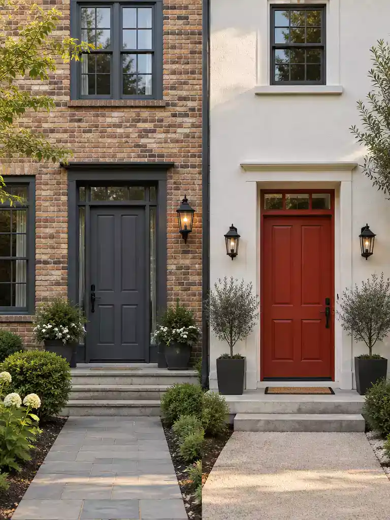
Control the visual energy of your home by choosing to repeat or contrast colors.
When you introduce new window frames, you are fundamentally changing the “noise level” of your home’s exterior. To decide whether your front door should match those frames or strike out on its own, you need to conduct a simple facade complexity test.
If your exterior is already doing a lot of heavy lifting, your best move is usually to keep things restrained. A facade with multi-toned brick, varying stone patterns, or complex architectural lines can quickly become overwhelming if you add a third or fourth competing color.
The Repeat Strategy:
When your home has a busy exterior, “repeating” the frame color on the front door creates a cohesive, intentional look. This pulls the eye toward the entrance without forcing it to compete with the rest of the house, effectively acting as a visual anchor that calms the overall design.
On the flip side, if your home features neutral siding, smooth stucco, or a uniform brick color, you have a blank canvas. In this scenario, your front door is the most effective tool you have to create a focal point and add genuine energy to the street view.
Contrast is your best friend when the rest of the house is quiet. By choosing a high-contrast door color, you signal to visitors exactly where the entrance is while injecting personality into a neutral palette.
Avoid the trap of thinking a door must always stand out. Sometimes, the most sophisticated exteriors are those that use restraint to let the architecture speak for itself.
⚖️ Quick Decision Guide:
- Choose this if: Your home has complex architecture like mixed stone or brick, where adding more colors creates visual clutter.
- Skip this if: You have a simple, monochromatic facade that desperately needs a pop of energy to feel inviting and finished.
- Pair it with: Coordinate your door hardware finish with the window frame material to bridge the gap between the two elements seamlessly.
9. Daylight testing
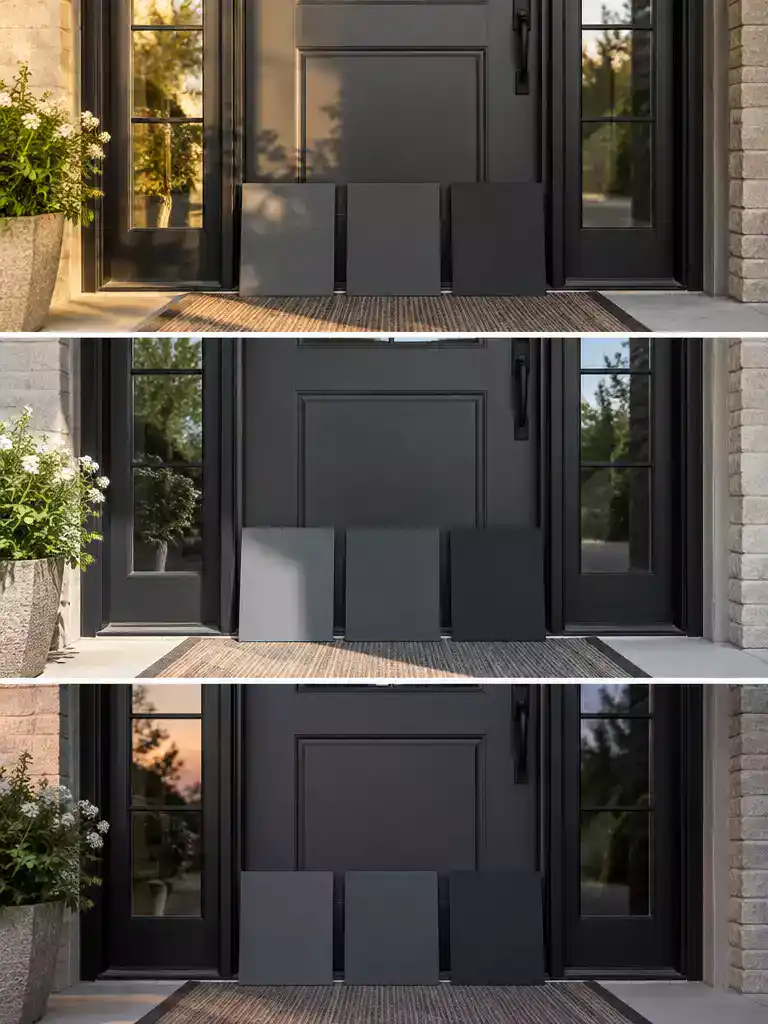
Testing samples in real-world light ensures your door color complements your frames every hour.
Never commit to a door color based on a tiny, mass-produced paint chip. Inconsistent light conditions can turn a color that looked perfect in the store into a muddy or clashing mess once it is applied to your front door.
The 12×12 rule is your most effective defense against expensive repainting regrets. By using large-format samples, you get a realistic sense of how the color interacts with the depth and undertone of your new frame finish.
The Testing Protocol
- Morning Light: Check how the color performs in cool, early-day light, which often emphasizes blues and greens.
- Midday Sun: Observe the color in direct, high-intensity light to see if it washes out or maintains its intended saturation.
- Evening Shade: Test the color at dusk to ensure it doesn’t disappear into the shadows or look completely different from your daytime choice.
- Frame Proximity: Always place your sample directly against the new frame finish to verify that the temperatures aren’t fighting each other.
If you are struggling to visualize the final result, move your sample around the entrance throughout the day. A door tucked under a deep porch overhang will react differently to light than one fully exposed to the sun.
Keep in mind that your goal is to find a color that feels intentional in every lighting scenario. If the color looks “off” during one part of the day, it is usually a sign that the undertone is clashing with the frames or the surrounding exterior materials.
Pro Tip: The Frame Interaction Check
The most common mistake is testing the door color against the siding rather than the window frames. Since the frames are your new architectural anchor, they must be the primary reference point in your lighting test.
💡 Why This Works
Testing your door color against the frames in varied light creates a bridge between your new architectural features and your personal style. Because human eyes perceive color as a reaction to its surroundings, seeing how the paint interacts with your specific frame finish prevents the “accidental” look that often ruins a renovation’s finish.
The Intentionality Factor: A color tested in real-world light always feels like a deliberate design choice rather than a guess.
With all nine factors now on the table, the path to a cohesive exterior becomes much clearer. You do not need to implement every strategy to achieve a polished result; focusing on the one or two adjustments that anchor your specific home will yield the most significant improvement.
The goal is to move from guesswork to a deliberate system, ensuring your entrance feels intentional rather than accidental. By prioritizing your frame undertone and testing colors in real-world light, you ensure your front door paint color serves as a genuine asset to your property. Simply identify your frame’s temperature and lean into the contrast that best suits your siding, and the rest of your curb appeal will naturally fall into place.
Related posts:
 Can You Change The Opening Door On French Doors?
 How to change inswing French doors to outswing?
 12 Wood Front Door Color Ideas for Timeless American Homes
 A Complete Guide to Choosing Your Front Door Paint Color
 Front Door Color Ideas That Suit Red Brick Not Fight It
 12 Autumn Wreaths for Front Door With Texture Color and Depth
 Unlocking the Secrets: the Truth About Load-Bearing Door Frames
 12 Door Security Upgrades for Weak Frames