Choosing front door colors for red brick is a high-stakes decision because the masonry dictates your entire exterior palette. This guide narrows the field to 11 curated ideas worth your attention, helping you avoid clashing undertones and secure a cohesive, professional look. Here are 11 colors that work with – not against – your home’s brick.
1. SOFT BLACK

Ground your home’s exterior with a sophisticated, timeless anchor that defines the entryway.
As an Amazon Associate I earn from qualifying purchases. Affiliate links may earn me a commission at no extra cost to you.
There is a persistent myth that black is too severe for the warmth of red brick. In reality, a soft black acts as a grounding anchor that mimics the natural shadow depth found in mortar joints and iron hardware.
When you choose a paint with a slightly softer, matte, or satin finish, you avoid the plastic look that stark, high-gloss blacks can sometimes create. This color choice pulls the disparate elements of your home together, especially if you have variegated brick with multiple color tones.
The Roof Color Check
Before you commit to a specific shade of black, look up at your roof. Your roof’s undertone changes how black interacts with the brick:
- Warm Brown Roofs: These require a softer, warmer black to prevent the door from looking like a floating abyss.
- Cool Gray or Slate Roofs: These environments can handle a crisper, more true-black without clashing.
The most important step is to avoid making your decision based on a tiny paint chip under indoor lighting. The sun changes everything; black paint can look drastically different at noon than it does during the golden hour.
Avoid the “Stark” Trap
Avoid using a “pure” or “jet” black meant for furniture or trim. These colors often contain blue or cool-toned tints that fight the organic, earthy warmth of red brick. Stick to blacks with neutral or warm undertones to keep the transition smooth.
If you are still feeling hesitant about the intensity of a full black door, the next step is to look at charcoal. It offers a slightly softer transition that maintains the same sense of architectural weight while feeling a bit more approachable against lighter, orange-toned masonry.
💡 Why This Works:
Soft black succeeds because it respects the brick’s inherent warmth rather than fighting it with the synthetic, icy blue tones found in standard jet blacks. By echoing the deep, charcoal-toned shadows of the mortar joints, this color creates a cohesive, sophisticated look that makes the entryway feel like an intentional architectural feature.
Visual takeaway: Aim for neutral or warm-tinted blacks to ensure your door complements, rather than competes with, the masonry.
2. CHARCOAL

Charcoal acts as the perfect bridge, anchoring your home without the starkness of black.
If you find pure black a bit too aggressive for your home’s architecture, charcoal is your best alternative. It serves as a sophisticated bridge between the deep shadows of your mortar lines and the vibrant, warm tones of the brick itself.
The real magic of charcoal lies in its ability to pull out the hidden undertones within your masonry. Whether your brick leans toward blue, brown, or even greenish flecks, a charcoal paint choice often acts as a neutralizer that makes these subtle variations pop rather than disappear.
Why It Works for Orange-Toned Brick
Homes with lighter, orange-leaning brick often suffer from a washed-out appearance if the front door is too light. Charcoal provides the necessary weight to ground the entryway, creating a refined contrast that prevents the orange tones from feeling overwhelming or “cheap.”
Keep in mind that charcoal behaves like a chameleon. It will look significantly different on a full-lite glass door compared to a solid, multi-paneled door because the amount of surface area reflecting light changes the perceived depth of the color.
The Large Sample Rule
Never rely on a tiny paint chip. Charcoal can shift from a sophisticated gray to a murky, flat tone depending on the ambient light. Always paint a large poster board and lean it against your door at different times of day to see how it interacts with the specific UV exposure of your entryway.
Before committing, evaluate the massing of your door. If your entrance includes sidelights or a transom, charcoal can create a very “heavy” look if the trim isn’t bright enough to provide a clean border. A crisp white trim is usually the safest partner for charcoal, as it frames the door and keeps the entry from feeling like a dark void within the brick facade.
📋 What to Check First
- Brick Undertones: Inspect your brick in direct sunlight to identify if it leans toward orange, deep brown, or burgundy before finalizing your charcoal shade.
- Hardware Contrast: Confirm that your existing door handle and knocker provide enough metallic definition to stand out against the darker charcoal paint surface.
- Trim Alignment: Verify that your window and door trim color isn’t too stark, as a high-contrast white can make the charcoal door feel isolated.
3. DEEP NAVY

Cool down your home’s exterior with a sophisticated, timeless navy blue entry.
If you feel your red brick is leaning too heavily into the “warm” category, deep navy is your most effective tool for balance. It acts as a cool counterpoint, instantly neutralizing the heat of terracotta, rust, or orange-toned masonry without making your home look like it is suffering from an identity crisis.
This color is a staple for Colonial and traditional-style homes because it feels grounded and historic rather than trendy. When you choose a deep navy, you aren’t just picking a blue; you are selecting a shade that provides enough depth to stand up to the weight of the brick while offering a cleaner, more refined look than a standard primary blue.
Pro-Tip: The Afternoon Test
Navy is notoriously shifty. Test your sample in the afternoon light; you will often find that a vibrant blue at noon settles into a deep, moody “midnight” hue as the sun dips, which is exactly the look that works best against red brick.
When selecting your specific shade, focus on the depth of the pigment. You want a color that stays dark even in direct sunlight.
- Hale Navy (Benjamin Moore): A classic, reliable choice that leans slightly gray, preventing that “toy-box” blue look.
- Naval (Sherwin-Williams): A true, deep navy that provides high contrast against red brick.
- Cyberspace (Sherwin-Williams): If you want to lean closer to charcoal while keeping those blue undertones, this is an excellent middle ground.
- Winding Waterway (Benjamin Moore): A slightly softer option if you are worried about the door looking too harsh against older, lighter brick.
Before you commit, check the undertones of your brick specifically. If your brick has distinct burgundy or purple notes, stick to a navy that has a hint of green or gray to avoid a clashing violet effect. If your brick is more on the orange or brown side, almost any deep navy will look intentional and polished.
4. FOREST GREEN

Create a refined, organic entrance that mirrors the natural beauty of your surrounding foliage.
Forest green is a masterclass in moody, refined design when paired with the inherent warmth of red brick. Because this color mimics the deep tones found in natural leaves and shrubs, it creates a seamless, organic look that makes your home feel grounded rather than forced.
The beauty of this choice lies in its ability to bridge the gap between the building material and the landscape. While other colors might contrast sharply, a deep forest green feels like a natural extension of your property’s greenery, allowing the brick’s texture to take center stage without competing for attention.
Pro Finish Tip
To ensure your door doesn’t get lost against the matte, porous texture of the masonry, opt for a high-gloss sheen. This finish reflects light, creating a sophisticated pop of color that adds depth and a high-end, polished feel to your entryway.
When selecting your shade, be wary of anything that leans toward “synthetic” or bright, lime-based greens. Those tones often clash with the earthy, iron-rich pigments of red brick and can quickly make an exterior look dated or flat.
Instead, look for deep, saturated greens that have a slightly darkened, botanical quality. These shades maintain their elegance regardless of the time of day, whereas brighter options can turn neon under direct afternoon sunlight.
Checklist: Evaluating Forest Green
- Test in both light conditions: View your sample during the brightest part of the day and again in the late afternoon shade to ensure it doesn’t shift toward an unintended teal.
- Check the hardware: Forest green pairs exceptionally well with brass or antique bronze hardware, which adds a layer of warmth that complements the brick.
- Avoid the “flat” trap: If your brick is particularly dark or variegated, a high-gloss or semi-gloss finish is essential to provide enough visual separation from the wall.
✨ Complete the Look
Since forest green is a bold, saturated choice, your hardware and porch accents must be chosen carefully to prevent the entryway from feeling too dark or enclosed.
- Hardware Finish: Use warm, unlacquered brass or antique bronze to break up the cool green tones and echo the brick’s natural warmth.
- Porch Decor: Add oversized terracotta pots or natural wood planters to bridge the gap between the deep green door and the earthy red masonry.
The long-term visual comfort of your home is defined by how well your entry coordinates with the permanent brickwork. You do not need to master every shade on the market to achieve a professional exterior result that feels cohesive and intentional.
Focusing on the undertones shared between your masonry and door paint is the single most effective way to guarantee a timeless, high-end appearance.
5. SAGE GREEN

Create a welcoming, organic entrance that softens the jagged edges of red brick.
If you want your entryway to feel approachable rather than bold, sage green is your best move. Unlike deeper, high-contrast colors that demand attention, this muted, earth-based tone acts as a natural bridge between your home’s architecture and the surrounding landscape.
It works particularly well on smaller entryways where a dark or saturated door might feel heavy or overwhelming. By choosing a shade with a gray or “muddy” undertone, you prevent the color from fighting the natural warmth of the brick, letting the two elements exist in a quiet, organic balance.
The Finish Matters: For sage green, stick to an eggshell finish. A high-gloss sheen can make lighter, muted colors look plastic or cheap, whereas eggshell mimics the soft, matte texture of stone and mortar, keeping the overall look sophisticated and high-end.
The biggest risk with this color is accidentally picking something too vivid. If your sample looks like a crayon or a bright spring leaf, it is too high-chroma for red brick.
Before you commit, check these three things to ensure you have the right “muddy” tone:
- The Daylight Test: Look at your sample at 10 AM, 2 PM, and 7 PM. A good sage should look just as grounded in the morning as it does in the afternoon.
- Trim Coordination: Ensure your door color doesn’t clash with your window casings. Sage green thrives when paired with warm creams or off-white trim rather than stark, icy whites.
- Hardware Check: This color pairs beautifully with antique brass or oil-rubbed bronze. Avoid chrome or polished nickel, as the cool metallic shine can make the green look washed out and sickly against the warm brick.
If you find that sage feels a little too delicate, you might be looking for something with a bit more weight. The next step up is olive, which captures that same earthy connection but brings a much stronger, more saturated warmth to the party.
6. OLIVE

Bring out the natural warmth of your brick with a sophisticated, earthy olive tone.
When you want to lean into the inherent warmth of your red brick rather than fighting it, olive is a standout choice. Unlike cooler greens that might feel disjointed, olive carries yellow undertones that mimic the natural, sun-drenched pigments found in terracotta and rustic red brick. It connects the door to the masonry in a way that feels intentional and organic, creating a look that is both grounded and refined.
Because olive is inherently warm, it acts as a bridge between the deep red of the brick and the natural landscape surrounding your home. It avoids the “clashing” risk common with brighter, synthetic greens. Instead, it provides a muted, sophisticated presence that feels right at home on both historic cottages and modern brick exteriors.
Hardware Pairing Tip: Skip the chrome or brushed nickel here. Olive thrives when paired with warm, bronze-toned hardware. The metallic warmth of antique bronze or oil-rubbed bronze picks up the yellow-green notes in the paint, creating a cohesive, high-end finish that feels like a natural extension of the entry.
When you are scouting for the right shade, look for deep, earthy options like Olive Grove (SW 7734). These saturated tones avoid the “crayola” look that can happen if you lean too far toward a lighter, brighter green. Always test your sample in full daylight to see how the yellow base interacts with the specific orange or brown flecks in your brick, as natural light will amplify those shared undertones.
Quick Checklist for Olive
- ✓ Select a deep, muddy base: If the paint swatch looks like a bright lime or emerald, keep looking.
- ✓ Match the hardware: Swap out existing cool-toned metal for bronze or brass.
- ✓ Daylight test: View the sample at noon when the yellow undertones will be most visible against the brick.
7. WARM CREAM

Refresh your exterior with a soft, inviting tone that brightens the entryway without clashing.
There is a persistent myth that a white front door is the only way to achieve a crisp, clean look. On a red brick home, however, a stark, bright white often creates a jarring contrast that looks more like plastic than a high-end architectural feature.
When you choose a warm cream – one with distinct yellow or beige undertones – you get that desired brightness while maintaining a natural harmony with the masonry. This color choice acts as a bridge, softening the transition between the hard, textured brick and the rest of your home’s trim.
The Chalkiness Test: If your sample looks like a flat, white wall or has a blueish tint, it is too cold. A proper warm cream should look buttery and substantial in the morning light, feeling intentional rather than like an unfinished primer coat.
The secret to pulling this off is ensuring the paint has enough pigment to stand up to the depth of the brick. If you go too light, the door can disappear or look washed out against the heavy, dark tones of the red clay.
Instead, look for shades that lean toward a soft parchment or a deep vanilla. These colors provide a classic, heritage feel that works exceptionally well on older townhouses or cottage-style brick homes where you want to emphasize a welcoming, historic aesthetic.
What to Watch For
- Avoid the “Plastic” Look: Steer clear of high-gloss, pure white paints which reflect too much light and highlight the artificiality of the finish.
- Test for Undertones: Always view your sample next to your window trim; if it looks yellow-green, it may be too vibrant, so stick to neutral beige-based creams.
- Hardware Pairing: Warm creams thrive with dark, aged hardware like oil-rubbed bronze or matte black, which anchors the lightness of the door.
Once you have narrowed down your cream options, commit to testing them at different times of the day. A shade that looks perfect at 10:00 AM may turn unexpectedly gray or “dirty” in the shade of a late afternoon porch, so watch how the color holds its warmth as the light shifts.
✨ Finishing Touches
Choosing the right cream is only half the battle; how you accessorize the door determines whether it feels like a cohesive design choice or a missed opportunity.
- Hardware Contrast: Opt for matte black or oil-rubbed bronze door sets to provide a sharp, necessary boundary between the soft cream paint and the warm brick.
- Lighting Finish: Select lantern-style sconces in an antique finish to mirror the historical, classic mood that a warm cream door naturally evokes on a brick facade.
8. GREIGE

A balanced, neutral anchor that bridges the gap between warm brick and cool mortar.
Greige is the ultimate neutral anchor for a red brick home. It functions as a bridge, pulling the cool, cement-based tones of your mortar joints together with the warm, fire-baked pigment of the brick itself.
Because it sits squarely in the middle of the color spectrum, it avoids the “clash” that happens when you try to force a stark white or a cold, icy gray against a warm-toned exterior. It makes the front door feel intentional and composed rather than like an afterthought.
Common Greige Picks:
- Sherwin-Williams Mindful Gray
- Benjamin Moore Drift of Mist
- Benjamin Moore Cumulus Cloud
- Benjamin Moore Stone Hearth
The Sunset Warning: Greige is highly reactive to light. In the soft, golden light of late afternoon, some greige tones can shift toward an unexpected pink. Always view your sample at noon, in the shade, and again at dusk before committing.
When selecting your specific shade, stay away from anything that leans too heavily into “icy” or “blue-gray” territory. Those undertones will fight the warmth of the brick every time the sun hits them.
Instead, look for a balanced earth-tone that feels slightly muddy. If the color chip looks like a clean, crisp gray on the shelf, it’s likely too cool for your brick; you want that hint of beige or brown to keep it grounded.
🏡 How This Works in a Real Home:
- Porch shadows: Test your greige sample under the deep shade of a covered porch, where it often appears darker than expected.
- Hardware contrast: Pair greige with matte black hardware to sharpen the entryway’s profile against the softness of the color.
- Natural finish: Use an eggshell or satin finish to keep the door looking soft and approachable rather than overly industrial.
9. SLATE BLUE

A sophisticated cool-toned accent that brings modern character to traditional red brick.
If you love the idea of a colored door but feel intimidated by the intensity of a true navy, slate blue is your best path forward. It provides a muted cool counterpoint to the warmth of red brick without the high-contrast drama that can sometimes feel too aggressive on a historic or traditional facade.
The secret to pulling this off successfully lies in the undertones. You are looking for a blue that leans heavily into grey, which helps it bridge the gap between the vivid red of your brick and the neutral tones of your mortar. If you pick a shade that is too “true” or “baby” blue, it will fight the brick and look like a crayon against the masonry.
Pro-Tip: The Green Check
When browsing paint chips, look for slate blues that have a touch of green or “dusty” grey in them. This little bit of earthiness ensures the color sits quietly against the brick rather than jumping off the wall as an accidental focal point.
Slate blue is inherently more forgiving than navy because it doesn’t shift as drastically from day to night. While navy can sometimes vanish into a “black hole” look once the sun drops, a well-chosen slate blue retains its character and distinct blue-grey identity throughout the day.
Before you commit to a full gallon, check how the blue-grey interacts with your specific brick’s undertones:
- Orange-toned brick: A slate blue with a high grey content will neutralize the orange, making the home look more balanced.
- Burgundy or deep red brick: You can afford a slightly deeper, more saturated slate blue here, as the brick has enough depth to hold its own against the color.
- Variegated brick: Stick to the most muted, greyed-out version of slate blue you can find to ensure the door doesn’t compete with the busy pattern of the multi-colored masonry.
Because slate blue is a cool-toned choice, it works exceptionally well with brushed nickel or matte black hardware. If you are trying to lean into a more traditional look, polished brass can work, but ensure the blue is deep enough to provide the necessary contrast; otherwise, the brass might look a bit lost against the lighter blue tones.
⚖️ Quick Decision Guide: Finding Your Perfect Slate
- Choose this if: You want a cool, modern edge that doesn’t overwhelm the brick’s natural, earthy warmth.
- Skip this if: Your brick is highly variegated or multicoloured, as the blue-grey can create visual clutter.
- Pair it with: Brushed nickel hardware to enhance the cool, sophisticated vibe of the blue-grey paint tones.
10. AGED BRONZE

Bring a historic, tactile warmth to your entryway that feels like a natural extension.
If you own a historic home or simply appreciate architecture that feels established and permanent, aged bronze is your most architecturally sound choice. Unlike standard paint colors that sit on the surface, this deep, weathered brown-charcoal tone mimics the oxidation process of real metal, making it feel less like a “painted door” and more like an integral material component of the facade.
It works so well because it shares the same earthy base as your red brick, effectively bridging the gap between the masonry and your hardware. It avoids the starkness of black while providing more weight and presence than a typical brown.
The Sheen Rule: Because aged bronze is meant to appear as a metallic material, you must choose a low-luster or satin finish. High-gloss finishes will make the paint look like plastic rather than weathered metal, undermining the sophisticated, grounded look you are trying to achieve.
Before you commit to a specific shade, consider the following checklist to ensure the tone fits your home’s unique masonry:
- Hardware Consistency: Because this color is a nod to metal, pair it with antique bronze or oil-rubbed bronze hardware to create a cohesive, intentional look.
- Brick Undertones: This choice is particularly effective for homes with darker or variegated brick, where a bright color would look out of place.
- Lighting Limitations: Always view your samples in the late afternoon. This color depth can change significantly as the sun hits the brick, and you want to ensure it doesn’t get lost in the shadows of an entry porch.
Think of aged bronze as the anchor for your home’s exterior palette. It doesn’t fight the brick for attention; instead, it creates a tactile, refined transition that makes the entire entrance feel like a thoughtful, permanent installation.
🧰 Questions to Ask Your Installer:
- Sheen and Finish: Can you provide a sample board in a satin finish to ensure the bronze doesn’t look like flat brown plastic?
- Hardware Coordination: Should we source oil-rubbed bronze hardware now to ensure the undertones of the door and metal match perfectly?
- Long-term Maintenance: What is the recommended cleaning frequency for this specific finish to prevent the metallic pigments from dulling over time?
11. BROWN-BLACK

A sophisticated choice that anchors your home with natural, earthy warmth.
If you want the definition of a black door without the stark, sometimes jarring contrast that true black can create against warm brick, brown-black is your answer. It functions as an analogous color, meaning it shares the same warmth and earthy roots as the red brick itself, allowing the door to feel like a natural extension of the house rather than a separate, bolted-on feature.
Because brown-black carries those deep, chocolatey undertones, it bridges the gap between the masonry and your hardware. It provides the crisp, professional edge you’re looking for, but it does so with a softer hand. This is a particularly strong choice for historic homes or traditional architectures where you want to maintain a sense of heritage and gravity.
The Durability Factor
Since dark colors absorb more heat, you must prioritize high-quality, exterior-grade paint specifically formulated for doors. UV exposure can cause dark pigments to fade or look “chalky” over time, so look for products with high color retention to keep that deep brown-black looking rich for years to come.
When you are finalizing your decision, check the value of your brick against your paint sample. If your brick is quite dark or heavily variegated with deep shadows, a true brown-black will look sophisticated and intentional. If your brick is lighter or more orange-toned, ensure the brown-black you choose leans deep enough to provide that necessary contrast; otherwise, the door might disappear into the facade.
Use this checklist to ensure your brown-black selection is the right fit:
- ✓ Verify the brown-black swatch against a sample of your brick in the late afternoon sun to see how the warm undertones react.
- ✓ Check your trim color; crisp white trim will make a brown-black door pop, while a creamy off-white will create a more subtle, historical look.
- ✓ Confirm your hardware finish; aged bronze or unlacquered brass pairs beautifully with brown-black, echoing the organic nature of the color.
🧰 Ask Before You Hire:
- Finish durability: Ask the professional to specify an exterior-grade, UV-resistant coating that prevents the dark brown-black pigment from chalking.
- Surface preparation: Confirm they will use a high-quality primer to ensure the dark, heavy paint adheres perfectly to the door material.
- Maintenance plan: Request advice on how often the door should be cleaned or touched up to protect the deep finish from sun-induced fading.
You now have eleven ways to approach your red brick exterior without losing the character of the masonry. Selecting the one or two that best suit your specific lighting conditions is what actually defines the result. You do not need to experiment with every option to find a professional look; the most effective strategy is to narrow your focus to the shades that naturally complement your home’s undertones.
The curb appeal you are after comes from a few deliberate decisions rather than a total exterior overhaul. If you want to refine the house even further, exploring styles that upgrade any home can help you finalize the look with confidence. Decide on your sample, test it thoroughly, and move forward.
Related posts
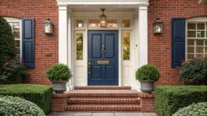 11 Best Front Door Colors for a Red Brick House
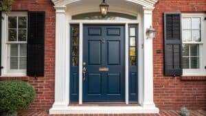 15 Front Door Colors Designers Pick for Brick & Black Shutter Homes
 12 Wood Front Door Color Ideas for Timeless American Homes
 A Complete Guide to Choosing Your Front Door Paint Color
 10 Rustic Multi Color Barn Door Ideas for Farmhouse Interiors
 11 Elegant French Door Color Ideas for Family Homes
 How to Paint French Doors: Prep, Primer and Glass
 What Color Door Knobs Should I Use? A Guide to Choosing the Perfect Doorknobs for Your Home