
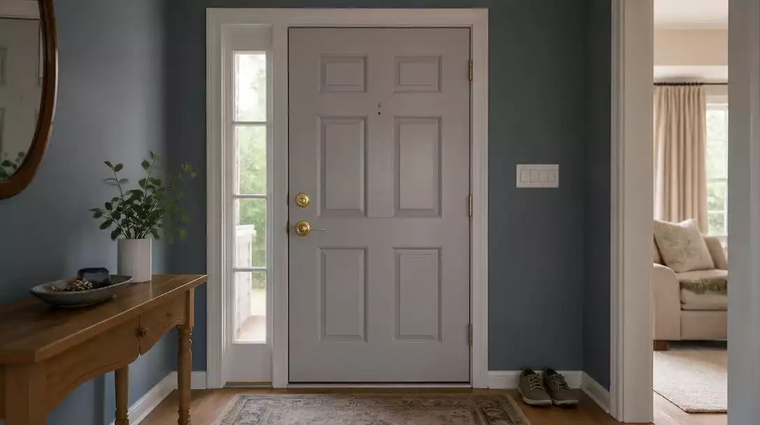
When you repaint an entryway, your front door often stops acting as a focal point and starts looking disconnected. This guide narrows the complexity down to 8 diagnostic ideas worth your attention to help you restore balance and ensure your home looks intentional. Let’s start with the wall undertones.
New wall undertone
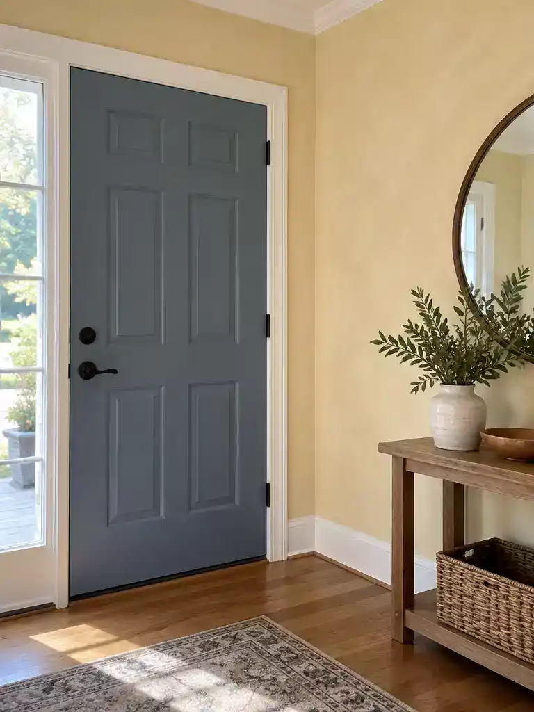
Getting your wall and door undertones in sync restores balance to your home’s entry.
As an Amazon Associate I earn from qualifying purchases. Affiliate links may earn me a commission at no extra cost to you.
When you repaint your entryway, you aren’t just changing a wall color – you are resetting the entire visual reference point for your front door. This phenomenon, known as simultaneous contrast, explains why a door that looked perfectly fine yesterday suddenly appears muddy, sickly, or disconnected today.
The door itself hasn’t changed, but the neighboring color has forced a new perception. Warm-toned walls – those with golden, peach, or red undertones – tend to make cool, blue-based door colors look jarring or even slightly sickly. Conversely, cool-toned walls with blue or green bases can make a warm-toned door appear unnaturally orange or vivid.
The White Paper Test
To identify the culprit, hold a piece of standard white printer paper directly against your new wall paint in daylight. Your eyes naturally adjust to the wall color, but the paper provides a neutral reference point that exposes the hidden undertones.
- If the wall looks yellowish or peachy compared to the white paper, your wall is warm.
- If the wall looks grayish, bluish, or greenish, your wall is cool.
If you find that your wall is firmly in the warm camp while your door leans cool, you have a classic undertone clash. Before you reach for a paintbrush to change the door, recognize that the issue is the shifted relationship between the two surfaces. You may find that simply adjusting the door to a shade with a compatible undertone – rather than just a lighter or darker version of the same color – is the key to making the space feel right again.
⭐ Best Exterior Doors for Your Entryway
✨ Editor’s Pick
Double Exterior Entry Doors with Glass
Pine Dutch Door Slab with Glass
Fiberglass Entry Door with Privacy Glass
💡 Designer Note: Why Your Door Feels “Off”
Designers often describe this as a broken “chromatic conversation.” When you change the wall, you alter the environmental light bounce. A door that looked balanced previously may suddenly feel like a visual orphan because it no longer shares a tonal language with its new surroundings, causing it to appear either flat or aggressively jarring.
2. Lost door contrast
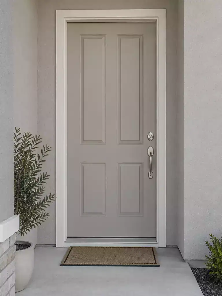
Achieving the right visual weight ensures your front door remains the home’s intentional focal point.
When you repaint your entryway, you often inadvertently shift the relationship between the walls and the door. If your door suddenly looks “muddy” or like it is trying to disappear into the wall without successfully doing so, you are likely dealing with a failure of visual contrast.
For a door to feel like a deliberate design choice rather than a mistake, you need a clear separation in Light Reflectance Value (LRV). The industry standard is the 30-Point LRV Rule, which suggests there should be at least a 30-point difference between the wall color and the door color to maintain visual interest.
The 30-Point LRV Rule
To calculate the contrast gap between your wall and door, use the Bowman-Sapolinski formula: C = 125(Y2 – Y1)/(Y1 + Y2 + 25). You can find the LRV for your specific paint colors on the back of your paint chips or directly on the manufacturer’s website. If your calculated gap is less than 30, your door will lack the necessary “pop” to stand out, often resulting in a flat or uninteresting look.
If you find that your wall and door are too close in value, you do not necessarily need to repaint the entire space. Sometimes, simply introducing a darker or lighter accent, such as a new door color that pushes the LRV gap beyond that 30-point threshold, can restore the necessary balance.
The Overcorrection Trap
Avoid the temptation to pick a new door color based solely on a small paint chip in a store. Because your wall color has fundamentally changed the light bounce in your entryway, a color that looked great on paper may still fail in your specific lighting conditions. Always test larger samples before committing to a full repaint.
⭐ Entryway Mats That Make a Statement
Striped Cotton Woven Outdoor Porch Rug
✨ Editor’s Pick
Heavy Duty Outdoor Welcome Door Mat
Blank Coir Door Mats for Crafting
3. Trim temperature shift
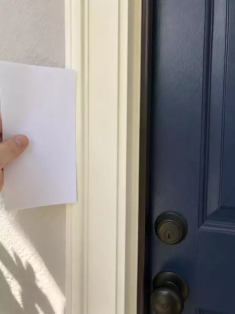
Aligning your trim and door temperatures restores the intended harmony of your entryway.
Your trim acts as the architectural frame for your door, and when you repaint the surrounding walls, that frame often gets ignored. If the old trim color was chosen to match a previous wall palette, it might now be fighting your door for visual dominance.
The biggest risk here is a temperature mismatch. If your trim is a “buttery” warm white and your door is a crisp, cool shade, the trim will inevitably look dirty or dingy by comparison. Conversely, if your trim is a sharp, icy blue-white and your door is a warm, earthy tone, the door can look like it is fading or losing its luster.
The White Paper Trim Test: To identify if your trim is the culprit, hold a piece of standard white printer paper directly against the door casing in natural daylight.
- If the trim looks yellow, beige, or peachy compared to the paper, your trim is warm.
- If the trim looks bluish, greenish, or gray compared to the paper, your trim is cool.
If you find that the trim is clashing with your door, you are essentially looking at a failed “buffer” transition. The trim is meant to bridge the gap between wall and door, but if it is the wrong temperature, it creates a visual fracture that makes the entire entryway feel disjointed.
Avoid the Overcorrection Trap: Do not rush to paint your trim based on a tiny paint chip. Trim covers a large surface area in an entryway; test your new trim color on a large foam core board first to see how it interacts with both the new wall color and the existing door before committing to the labor-intensive process of repainting the entire casing.
Remember, the door hasn’t actually changed, but the “neighboring” colors have forced a new perception. Often, simply adjusting the trim to a more neutral white – one that lacks strong yellow or blue undertones – can unify the space without needing to touch the door color at all.
⭐ Trim and Molding for Door Frames
Paintable Rounded Arch Door Trim Strip
Bendable Arch Frame Kit for Doorways
✨ Editor’s Pick
Self Adhesive Flexible Window Grid Inserts
⚖️ Quick Decision Guide: Trim vs. Door
- Choose a neutral white trim: If your door color is already locked in and you need a versatile, non-clashing frame.
- Skip “buttery” whites: If your door is a cool, icy blue or gray, as these warm tones will make the door look muddy.
- Pair with matching sheens: Use a satin or semi-gloss finish on both trim and door to ensure the light reflection remains consistent across the frame.
First impressions of a home are often defined by a few key visual relationships rather than the entire entryway. Identifying these specific connection points helps you avoid the common trap of making sweeping, expensive changes when only minor adjustments are actually necessary, as seen in these entry transformations.
Focusing on the specific balance between your door and wall undertones is the most effective way to restore visual harmony without repeating your entire painting process.
4. Changed light bounce
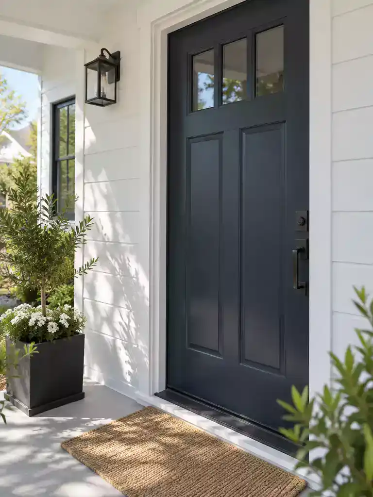
Understanding how your walls reflect light can save you from a mismatched door color.
Every paint color carries a Light Reflectance Value (LRV), a scale from 0 to 100 that dictates exactly how much light a surface reflects back into the room or porch. When you repaint your entryway walls, you are essentially changing the primary light source for your door. If your new wall color has a high LRV, it acts like a giant reflector, bouncing light back onto the door and potentially washing out a color that previously looked rich and intentional.
Conversely, if you shifted to a low-LRV wall color, you might find that your door now looks significantly darker or more intense than it did before. The wall is absorbing the light rather than bouncing it, which changes the perceived saturation of the door color. It is not that your door paint has changed – it is that the environment surrounding it is no longer feeding it the same light it had before.
The Tinting Effect: Keep in mind that light bounce is rarely neutral. If your new wall color is highly saturated – like a warm terracotta or a deep navy – it will cast a subtle color tint onto the door itself. A white or light-colored door is particularly susceptible to this, often picking up a pinkish or bluish hue from the wall that wasn’t there when the walls were a neutral off-white.
Before you decide the door color is the problem, observe how the light behaves at different times of the day. A wall that reflects gorgeous light at noon might create a muddy, shadowed look at 5 PM. If the door feels “off,” it is often because the new wall is shifting the color temperature of the light hitting the door, forcing a clash that didn’t exist with your previous setup.
⭐ Outdoor Lighting for Your Front Door
✨ Editor’s Pick
Motion Sensor Dusk to Dawn Sconce
Cross Frame Motion Sensor Porch Light
Modern Bronze Outdoor Wall Light Fixtures
💡 How Light Bounce Plays Out in Real Homes:
- Morning Exposure: East-facing entries reflect cool, blue-tinted light that can make warm door colors look muddy or muted.
- Afternoon Shift: West-facing walls often bounce warm, golden light, which can cause subtle colors to appear overly vibrant.
- Nighttime Testing: Always evaluate your door under porch lighting, as artificial bulbs often introduce yellow or green casts.
5. Entryway saturation
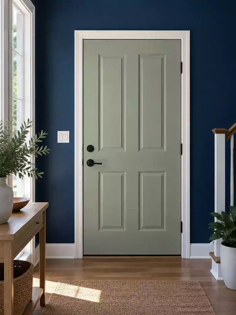
Achieve visual balance by mastering the interplay between your wall’s intensity and door color.
When you repaint an entryway, the contrast of saturation – the intensity of the color – often dictates whether the door feels like a deliberate design choice or a complete afterthought. If your new wall color is highly saturated and vibrant, a previously “safe” or muted door color can suddenly feel gray, lifeless, or dirty by comparison.
Conversely, if you have opted for a low-saturation, neutral, or grayish wall, a door that once looked sophisticated might now appear like a neon mistake. The door needs to distinguish itself from the wall either through value – how light or dark it is – or through its level of saturation.
The Grayscale Test
If you are struggling to see why the door feels “off,” take a photo of your entryway and use your phone’s camera filter to convert the image to black and white. If the door and the wall appear as the same shade of gray, they lack necessary contrast and will look like a flat, uninteresting block of color. You need to adjust the door’s value so it either pops forward or recedes appropriately.
Think of saturation as the “volume” of your color. If the wall is turned up to a ten, the door needs to be at a level that complements that intensity rather than fighting it.
- High-Saturation Walls: These demand a door with enough depth or brightness to hold its own; otherwise, the door will look washed out.
- Low-Saturation/Neutral Walls: These provide a canvas that allows even a moderately saturated door to stand out, but be careful of colors that are too “clean” or “bright” against a muddy or gray-toned wall.
If the door disappears into the wall in your grayscale photo, you have a value collision. To fix this without a full repaint of the wall, you might need to shift the door to a significantly darker or lighter version of its current hue to re-establish the visual boundary between the two surfaces.
⭐ Entryway Rugs That Elevate Your Space
Boho Moroccan Woven Entryway Area Rug
✨ Editor’s Pick
Absorbent Indoor Entryway Dirt Trapper Mat
Vintage Striped Grain Indoor Area Rug
🏡 How This Works in a Real Home:
- Test with textiles: Drape a vibrant throw blanket or heavy towel near the door to mimic a saturated wall’s influence on local lighting.
- Daily shadow shifts: Observe how the door’s intensity changes as the sun moves, since shadows often mute colors differently than direct light.
- Living with neutrals: If your entryway feels too “flat” after painting, introduce a natural wood or metallic element to bridge the gap between wall and door.
Door sheen mismatch
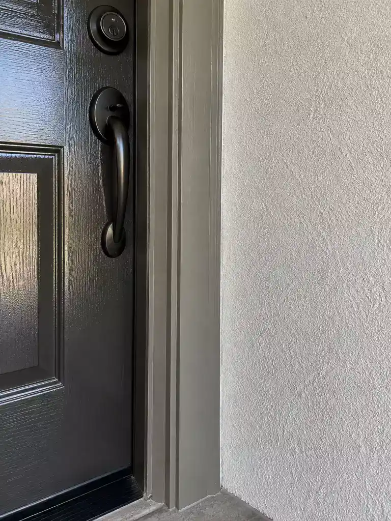
Achieving the right balance of reflection between your wall and door creates visual depth.
When your door feels disconnected from the room, look closely at how the light hits the surfaces. If your door looks like a flat, chalky board against the wall, or conversely, like a plastic insert that doesn’t belong, you are likely dealing with a sheen mismatch.
Paint reflectivity follows a strict hierarchy. Moving from the lowest to the highest reflection, we have: Flat/Matte, Eggshell, Satin, Semi-gloss, and Gloss. The standard approach for most entryways is to use a flat or eggshell finish on the walls, paired with a satin or semi-gloss finish on the door and trim.
If you find that the door has become “chalky” or unfinished, it is often because the wall color is now reflecting more light than the door itself. This inversion of the standard hierarchy causes the eye to perceive the door as a mistake or an afterthought.
Before you decide to repaint the door, check the sheen of your current wall paint. If you have moved to a higher-sheen wall paint, you may need to increase the door’s sheen to maintain that necessary architectural visual separation. Consistency in sheen across all trim pieces in the entryway will also help ground the door, making it feel like a intentional part of the home’s woodwork rather than an isolated element.
⭐ Paint and Hardware for Door Finishes
Stainless Steel Concealed French Door Bolts
Sage Green Metallic Aerosol Spray Paint
✨ Editor’s Pick
Automotive Sage Green Metallic Paint Kit
💡 Why This Works:
Adjusting your door’s sheen acts as a visual anchor that separates it from the surrounding wall. By ensuring the door reflects light differently than the adjacent surface, you create a deliberate architectural “pop” that prevents the entryway from looking like a flat, washed-out plane of color.
Visual separation: Matching sheen to trim creates a cohesive, professional-grade finish that frames the entryway perfectly.
7. Existing hardware balance
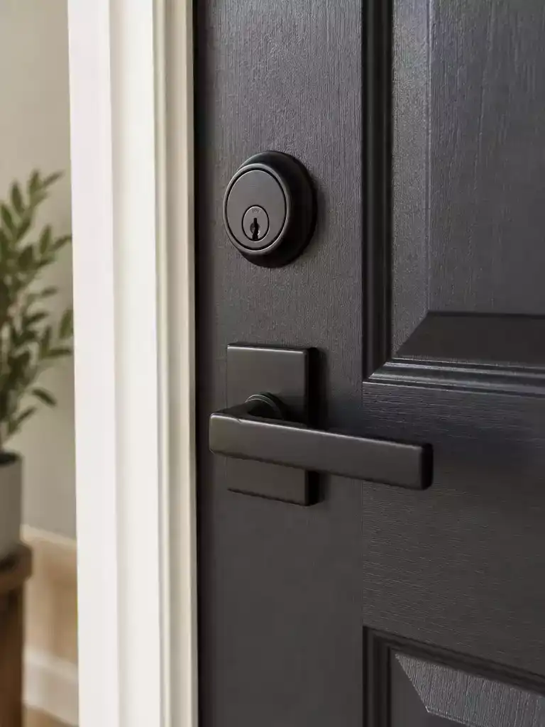
Ensure your hardware complements your new wall choice to maintain a cohesive, intentional look.
Your hardware is more than just a functional grip; it acts as a metallic accent that can either pull your new entryway color scheme together or leave it feeling disjointed. When you change the wall color, you fundamentally alter how the hardware interacts with its surroundings.
Dark finishes like matte black or oil-rubbed bronze naturally recede on dark-colored doors, creating a subtle, sophisticated profile. However, if you have placed those same dark finishes against a very light or high-contrast wall, they will suddenly pop, drawing the eye immediately to the lockset rather than the door itself.
The Hardware Disconnect Test: Ask yourself if the hardware finish feels like a deliberate design choice that belongs to the new wall palette, or if it feels like it is fighting for attention. If your hardware is the only metallic element in the entire entryway, it often ends up looking like an afterthought rather than a feature.
Bright metals like polished chrome or nickel behave differently, as they stand out against almost any background. If your new wall color is highly intense or deeply saturated, these shiny finishes might now feel like they are clashing with the environment.
Use this quick guide to evaluate if your current hardware is working with your new paint job:
- Dark Metals (Black/Bronze): Best on dark doors where you want a subtle look; check if they now look too aggressive against your new, lighter wall.
- Bright Metals (Chrome/Nickel): High-contrast and reflective; ensure they aren’t creating a visual “glare” that competes with the new wall’s undertones.
- Mixed Finishes: If you have mixed metals, verify that the new wall color hasn’t made one finish look “dirty” or out of place while the other remains crisp.
If the hardware feels disconnected, you don’t necessarily need to replace it. Sometimes, introducing a secondary metallic element – such as a new light fixture or a decorative mirror frame – can bridge the gap and tie the hardware back into the room’s overall design.
⭐ Handlesets That Balance Your Door Hardware
✨ Editor’s Pick
Matte Black Privacy Door Lever Set
Modern Privacy Keyless Interior Door Handles
Contemporary Keyed Alike Deadbolt Lock Set
✨ Finishing Touches
Small metallic details often serve as the final bridge between your new wall color and the hardware, preventing the door from feeling like an island.
- Coordinating Fixtures: Add a matching house number or wall-mounted mailbox to repeat the hardware finish across the entryway surface.
- Reflective Echoes: Incorporate a decorative mirror or metallic frame nearby to harmonize the existing hardware with the updated wall palette.
8. Retest the door color
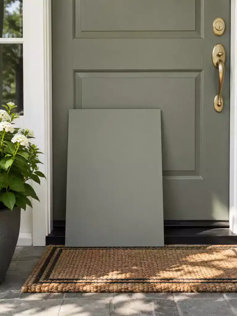
Move from guessing to designing by testing your color in real-world lighting conditions.
If you have worked through the previous diagnostic steps and the door still feels disconnected, it is time to stop guessing and start testing. The most reliable way to avoid another expensive mistake is to move your evaluation out of the paint chip aisle and into the actual light of your entryway.
You need a true-to-life sample to see how the color behaves against your new wall paint. Never paint directly on the door during this phase; instead, use a 12×12 inch sample at minimum, though an 18×24 inch board is much better for getting a real sense of the color’s impact.
The Testing Protocol
- Apply two full coats of paint to foam core or primed boards to ensure accurate color depth and sheen.
- View your samples from 39 inches away for a standard inspection, then step back 6–8 feet to see how the door reads as part of the entire entryway.
- Check the color at 8 AM, 12 PM, and 8 PM, and be sure to observe it under your home’s artificial night lighting as well.
This process is about identifying if the “wrongness” is truly in the door color or if it is a byproduct of the surrounding environment. If the sample looks correct during all these checks, the issue was likely your initial perception influenced by the wall’s undertones or light bounce. If it still looks “off” in every single test, you have your answer: it is time to select a new door color that works with the new system you have created.
Documenting these results prevents the emotional frustration of “guessing” what might look better. By using this testing log, you move from reacting to the problem to solving it with actual data.
⭐ Essential Door Upgrades to Consider
Square Door Knob Reinforcement Plate Kit
✨ Editor’s Pick
Paintable Acrylic Latex Door Frame Sealant
Heavy Duty Hidden Pivot Door Hinge
🔢 The Right Sequence to Save Rework
Rushing to paint the door directly often leads to repeat errors; follow this sequence to isolate the variable and confirm your color choice before committing.
- Prep the sample: Mount two coats of paint on 18×24 inch foam core boards for accurate depth.
- Test in situ: View samples at 39 inches and 8 feet away across three distinct daily light cycles.
- Verify the hardware: Re-attach existing handles to the samples to ensure the metal finish complements your final choice.
You now have the full set of diagnostic tools to bridge the gap between your new wall color and your existing entryway. Identifying the specific source of the disconnect is the most efficient way to resolve it, and you certainly don’t need to tackle every suggestion to regain a balanced look.
A couple of targeted adjustments will usually do the heavy lifting to restore the visual flow you originally intended. Before committing to a full repaint, download the front door paint guide to compare your current contrast levels against these professional standards. Once you isolate the culprit – whether it is an LRV mismatch or a simple temperature clash – you can move forward with a front door makeover that feels deliberate, cohesive, and perfectly scaled to your home.
Related posts:
 Why Does My Door Suddenly Not Close Properly?
 12 Front Door Entryway Ideas
 10 Front Door Entryway Ideas for a Stunning First Impression
 We Changed the Entryway Paint Instead of Repainting the Front Door
 15 Best Front Door & Curb Appeal Ideas That Buyers Notice First
 21 Front Door Ideas With Stylish Mats
 21 Pretty Pink Front Door Inspirations for Playful Charm
 14 Best Front Door Colors for Log Cabin