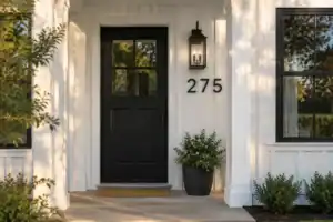
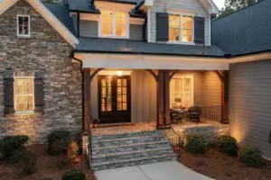
Choosing black or white interior doors for a house with light walls means deciding between visual continuity and brightness or deliberate contrast and architectural emphasis. With repainting costly and disruptive – general professional figures run about $150–$275 per door – this guide narrows the call to 7 practical comparisons. Use them to choose confidently, starting with the strongest case for white.
1. THE CASE FOR WHITE DOORS

White doors keep light-walled rooms feeling brighter, calmer, and visually connected.
As an Amazon Associate I earn from qualifying purchases. Affiliate links may earn me a commission at no extra cost to you.
If the priority is making light-walled rooms feel brighter, calmer, and less visually interrupted, white doors are the safer starting point. They are the continuity choice – not automatically the superior finish – and they work by letting the doorway recede instead of asking it to become the room’s main feature.
White reflects natural and artificial light, while a closely matched door and wall reduce the dark outline and visual weight around each opening. At the end of a hall, a white door can become part of the light wall plane, so your eye moves through the space without stopping at a strong color block.
That effect matters most in compact rooms and narrow passages, where every high-contrast rectangle can make the space feel more segmented. In a low-daylight room, white also preserves the light already available instead of adding a dark visual boundary.
Use the light-wall continuation test: stand at the room entrance and decide whether the doorway should disappear into the wall or interrupt it. White is the finish to save when brightness and a continuous sightline matter more than architectural emphasis.
White also leaves more room for future changes. If you repaint later or shift your décor, a neutral door is less likely to impose a specific direction, which can make a whole-house refresh easier to live with. Glazed white internal doors can support brightness further by allowing light to pass between adjoining rooms.
The tradeoff is visible upkeep. White can expose fingerprints, oily marks, stains, grime, and discoloration, especially around frequently touched areas. Less visual weight does not mean maintenance-free.
- Choose white first for compact rooms, narrow halls, or spaces with limited daylight.
- Choose it when broad future-buyer appeal and décor flexibility matter more than a strong statement.
- Expect fingerprints and grime to need attention near frequently used door areas.
Do not assume every white is interchangeable. Compare the door with the actual light wall because mismatched undertones can make one surface look dingy beside the other.
Before committing, test the exact finish on a 12×12-inch section of the door or on a foam-board sample, and view it in the room’s changing light. Once white has been established as the light-preserving background, the opposing choice asks for something different: a doorway that becomes the focal point.
⭐ Top White Interior Doors
✨ Editor’s Pick
White Three-Lite Bifold Interior Door
White Primed Two-Panel Slab Door
Paintable White Doorway Arch Kit
💡 Why the Undertone Test Matters:
A white that looks clean on a color card can appear noticeably warmer, cooler, or dingier beside your actual wall. Testing the real finish at full scale shows whether the door will quietly continue the wall or create an accidental mismatch once daylight and room lighting shift.
Best decision test: Judge the sample from the room entrance, not only close up, and compare it as the light changes.
2. THE CASE FOR BLACK DOORS

Create architectural definition and confident contrast without sacrificing the room’s sense of space.
Choose black when the doorway should be noticed. Against a light wall, the bright surface becomes a field behind the door, making the dark outline crisp, immediate, and intentional.
That contrast gives a plain passage more structure. Instead of fading into the background, the door becomes a deliberate architectural punctuation point, adding depth and visual weight without relying on extra decoration.
Black is a commitment to contrast, not a guaranteed upgrade. It works best when the room has enough natural light, adequate size, and visual breathing room to carry a darker doorway without feeling enclosed.
In a bright, spacious room, that dark rectangle can feel grounded and architectural. In a small, dim, or narrow room, black absorbs light and may make the space feel more bounded, so a finish that looks compelling in a sunlit main room can feel heavy at the end of a tight passage.
Sheen changes the maintenance experience. Matte or satin black generally reduces reflection and makes fingerprints less prominent than glossy black, while higher sheen can emphasize smudges, panel edges, brush marks, and uneven coverage.
Black also leaves less room for rushed preparation. Drips, bare spots, sanding flaws, brush marks, uneven coverage, and mismatched touch-ups can be easier to see, particularly when several doors are being repainted as a DIY project.
- Choose black for bright, adequately sized rooms where contrast matters more than visual continuity.
- Choose it when the existing interior direction already supports a deliberate modern, contemporary, custom, or high-design look.
- Favor matte or satin when reflection and oily marks are a concern.
- Skip an untested black finish in a dim room or on doors with difficult surfaces and obvious preparation flaws.
Check the undertone in the actual room before committing. Black can shift toward purple, green, or a muddy appearance under different lighting, so view a 12×12-inch sample on the door or on foam board rather than judging from a screen.
If many doors need repainting, or the surfaces require extensive preparation, professional help may be the more sensible choice. The next question is not which color sounds more distinctive, but how each finish behaves directly against the light wall.
💡 Designer Note: Treat Black as a Sightline Decision
A black door carries farther than the room it belongs to when several doorways line up in view. Before painting, stand at the main entrance to the hall and notice which doors share that sightline. If one dark doorway would compete with several pale openings, use black only where the architectural emphasis feels intentional.
The useful question is not which finish looks best in isolation, but what the actual room can carry: a dim, narrow passage may need continuity, while a bright, open room can support stronger contrast. A full-scale sample viewed from the doorway in changing light will tell you more than a screen image, and this broader look at room-to-room flow can help with connected sightlines.
You only need to settle the room’s light, visual weight, and resale priority before choosing a finish.
3. HOW EACH READS AGAINST LIGHT WALLS

See how sheen, panel depth, and undertone change the doorway’s visual weight.
Against a light wall, white either recedes into the surface or gains definition from its sheen and panel shadows; black creates an unmistakable outline. The choice changes how much attention the doorway demands before you even notice the room beyond it.
A closely matched white door and light wall can read as one pale visual field. That continuity reduces the interruption at the doorway and lets the eye move through the room without stopping at a strong color block, which is why white often feels more open and visually quiet.
White does not have to look flat or disappear completely. Satin or semi-gloss can add restrained reflection against a matte wall, while raised or recessed panels create presence through shadow rather than a contrasting color.
Black produces the opposite relationship: the light wall becomes a bright backdrop, and the door outline, edges, and panel profile become immediate focal points. A flat slab door can read minimal and monolithic, while a paneled door can feel more architectural because the dark finish emphasizes every recess, edge, and change in depth.
Color is only half the visual effect. Sheen, undertone, panel depth, and the size of the sample determine whether the door quietly merges with the wall or becomes its strongest boundary.
Undertones can undo an otherwise sound choice. A black sample may shift toward purple, green, or muddy-looking under different lighting, while two whites that seem identical on a screen can disagree visibly beside each other and make one surface appear dingy.
Test the actual wall and door together at full scale rather than relying on a digital image or a small color chip. A 12×12-inch section on the door, or a foam-board sample held beside it, reveals much more about the relationship; view it in morning, afternoon, and evening light, then switch on the artificial lighting.
The table below keeps the immediate wall-door relationship in view while flagging the practical factors that deserve a closer check later.
⭐ Frosted Glass Doors to Consider
White Single-Lite Frosted Glass Door
White Five-Panel Glass Pantry Door
✨ Editor’s Pick
White Five-Lite Frosted Glass Door
🏡 How This Works in a Real Home:
- Busy sightlines: In halls with several visible doorways, white prevents competing dark blocks from dominating the view.
- Room transitions: Let a black door mark one important threshold while quieter doorways recede into the background.
- Everyday balance: Use panel detail or restrained sheen when you want definition without making the doorway visually forceful.
Room Size and Natural Light

Test the actual room so brightness stays open and contrast never feels heavy.
The darker the room and narrower the passage, the more carefully black must be tested. A white door reflects natural and artificial light, so it is generally safer in compact rooms, narrow halls, and spaces with limited daylight.
Black needs more visual breathing room. In a larger, brighter room, its depth and definition are less likely to overwhelm the wall plane; in a dim space, the same door can make the room feel smaller or more closed in.
Room rule: If the space already feels dim, choose white unless a real-room test proves that black does not make it feel bounded. Strong daylight makes black less likely to feel heavy.
Do not judge the room by window count alone. Look at the actual daylight at different times, the artificial lighting after dark, the room dimensions, and the sightline from the entrance or from the far end of a corridor.
Connected doorways deserve extra attention. One dark door can add definition in a bright main room, but several dark doorways along one sightline carry more visual weight and can reduce the sense of openness across adjoining spaces.
Room-testing checklist
- Is the room compact or the hallway narrow?
- Does the space receive limited daylight?
- What does the sample look like in morning, afternoon, and evening light?
- Does artificial lighting change the undertone or perceived weight?
- Is the doorway at the end of a long sightline?
- Does the room need brightness more than contrast?
- Was a 12×12-inch sample tested on the actual door or a foam-board sample?
View the sample from normal standing distance, not only close up. Test it in morning, afternoon, and evening light, then switch on the artificial lighting; a finish that works in a sunlit main room may feel too heavy in an adjacent low-light room.
Professional painting generally costs about $150–$275 per door, so testing first can reduce the risk of paying to repaint several doors. That figure applies to painting doors generally, not to a black-specific or white-specific rate.
⭐ Doors That Brighten Smaller Rooms
✨ Editor’s Pick
Wide Five-Lite Frosted French Doors
Magnetic Screen Door for French Doors
Extra-Long Magnetic Double Door Screen
💡 Let the Home’s Brightest Room Set the Standard
A bright room can make black look balanced, but it should not automatically decide the finish for every doorway. If the main sightline connects to a darker hall or room, judge the door from that transition point too. The best choice supports the home’s weakest-light area, not just its most photogenic space.
5. MAINTENANCE AND VISIBLE MARKS

Choose the finish that makes everyday marks easier for you to live with.
Neither finish stays visually perfect; they simply reveal different kinds of marks. White generally hides ordinary dust better, but fingerprints, oily marks, stains, grime, and yellowing can gather attention around frequently touched areas.
Black reverses that pattern. Dust becomes easier to spot, and lighter scuffs, chips, scratches, sanding flaws, and repair differences can show clearly against the dark surface.
Choose by mark type, not by the promise of easy maintenance. White suits a home where visible dust is more irritating than occasional fingerprints; matte or satin black suits someone willing to dust in exchange for less emphasis on oily smudges.
Black may hide some smudges in certain conditions, especially on a lower-sheen surface, but angled light can still reveal fingerprints on both matte and glossy dark paint. Sheen often matters as much as color: high gloss reflects more light and can make streaks, smudges, brush marks, panel edges, and surface defects more conspicuous.
Satin or semi-gloss usually provides a more practical balance between cleanability and reduced reflection. Glossy black is the riskiest pairing if visible streaks and touch-ups already bother you, while white still needs close attention to undertone and discoloration.
- Use a soft microfiber cloth with a mild soap-and-water solution.
- Avoid harsh cleaners that can damage paint or leave streaks, particularly on black surfaces.
- Dry glossy paint with a clean microfiber cloth to reduce visible streaking.
- Use the same paint system and, if possible, the same sheen for touch-ups to reduce flashing.
Black touch-up paint can expose slight sheen differences, dust, or uneven coverage, so careful preparation matters more across several doors. For a chip that exposes bare substrate, clean and dry the area, sand lightly, prime where needed, and apply matching paint sparingly; deeper repairs may require repainting the affected section or the full door if blending fails.
White touch-ups are often easier to disguise, but mismatched whites and yellowing can make repairs visible too. Choose white if dust visibility is your bigger concern and occasional fingerprints are acceptable; choose matte or satin black if you prefer to minimize the emphasis on oily marks and accept more visible dusting.
⭐ Low-Maintenance Door Hardware
Matte Black Privacy Door Levers
✨ Editor’s Pick
Paintable White Door Caulk
Matte Black Passage Door Knobs
🔢 The Right Touch-Up Sequence:
Following the same order helps you judge the true defect and prevents a quick repair from creating a more visible patch.
- Inspect the mark in angled light before deciding whether cleaning or paint is actually needed.
- Clean the area gently, let it dry completely, then match the paint system and sheen.
- Apply matching paint sparingly; if flashing remains, repaint the affected section or full door.
6. RESALE AND BUYER APPEAL

Choose the finish that supports broad acceptance or a clearly established interior direction.
If resale is the deciding factor, neither color comes with a verified price premium. Research does not support a specific ROI percentage, buyer-value uplift, or guaranteed buyer preference for black or white interior doors.
White remains the safer default in a home with light walls because it is neutral, broadly compatible, and less likely to impose a specific design direction. It keeps the interior feeling clean and adaptable, which helps a future buyer see the home as a flexible starting point rather than a finished statement they must accept or repaint.
Black has a narrower but legitimate resale position. It can support a contemporary, modern, luxury, or custom interior when the rest of the home already communicates that direction through a consistent high-contrast visual language.
Coherence beats color. A black door can feel intentional when it belongs to an established interior direction, but disconnected when it is the only design-forward element in view.
That distinction matters across connected rooms. A repeated black finish can read as planned and architectural, while one isolated black door may look like a personal experiment that a buyer would need to undo.
Keep door quality separate from door color. For otherwise comparable doors, price differences come from the material, core type, finish quality, configuration, model, and dimensions – not simply whether the door is black or white.
Resale decision worksheet
- Resale safety: Does the finish appeal broadly or impose a strong look?
- Style coherence: Does it fit the home’s existing interior direction?
- Personal preference: Is the choice driven by desired brightness or desired contrast?
- Door quality: Are material, core, configuration, dimensions, and finish quality comparable?
- Evidence check: Am I assuming a premium that the research does not verify?
Choose white when the broadest buyer pool and the lowest risk of style mismatch matter most. Choose black when personal design intent matters more than universal neutrality and the interior already supports a deliberate contemporary or upscale look.
Before treating resale as a reason to spend more, answer three separate questions: Will buyers broadly accept this? Does it fit the home’s existing direction? Do I personally want the contrast?
⭐ Solid Doors Buyers Appreciate
Primed Four-Panel Bifold Door
Solid Wood K-Shape Barn Door
✨ Editor’s Pick
Half-Frosted Glass Interior Door
📈 The Long-Term Payoff
Treat the finish as a design and presentation decision, not an investment strategy. Neither color has a verified resale premium, so lasting value comes from choosing a coherent look and maintaining comparable material, construction, dimensions, and finish quality throughout the home.
Best return on effort: Choose the finish that looks intentional now without creating a style mismatch future buyers must correct.
7. FINAL VERDICT

Choose the finish that gives your rooms the right balance of brightness, definition, and everyday ease.
For light-colored walls, white is the safer default; black is the stronger choice only when contrast is the specific goal and the room can support it. White reflects natural and artificial light, blends more quietly with the wall, and carries less design risk across compact rooms, narrow halls, and connected sightlines.
Choose white when the priority is reflected light, perceived openness, visual continuity, flexible future decorating, or broad resale positioning. It is the finish to use when the door should recede rather than become the first element your eye notices.
Black earns its place when you want a focal point, architectural definition, and a deliberate modern, contemporary, or upscale direction. It works more convincingly in a bright, adequately sized room with visual breathing room; the same finish can feel heavy in a narrow or poorly lit area.
Choose white if brightness, visual continuity, flexible resale appeal, and lower design risk lead your list.
Choose black if contrast and architectural emphasis matter more, the room receives enough light, and you are willing to accept more visible preparation and touch-up risk.
Do not apply one finish blindly throughout the house. A black door may look compelling in a bright main room yet make a narrow hallway or low-daylight room feel bounded, so test the actual location from the entrance and along the main sightline.
Use visible marks as the practical tie-breaker. White tends to expose fingerprints, stains, and grime, while black tends to expose dust, light scuffs, chips, and some touch-up differences; choose the pattern you are more willing to manage.
Finish choice changes that tradeoff further. Matte or satin is generally more forgiving for black than high gloss, while white still needs close undertone matching with the actual wall so the two surfaces do not make each other look dingy.
Before committing:
- Test a 12×12-inch sample on the actual door or a foam-board sample.
- View it in morning, afternoon, and evening light.
- Switch on artificial lighting and check whether the undertone or visual weight changes.
- Compare the exact white with the wall, or check the black finish in the room before purchasing paint for multiple doors.
Painting several doors also carries real decision risk: professional painting is approximately $150–$275 per door, while a whole-house repaint can reach approximately $3,500–$8,000 for an average 2,000-square-foot home. Those are general painting figures, not evidence of a black-versus-white price premium.
Neither color has a verified door-specific resale premium, maintenance saving, lifespan advantage, or guaranteed cost benefit. Use the black-versus-white decision checklist or comparison worksheet before buying paint, then let the actual room – not a screen image or small color chip – make the final call.
⭐ Final Interior Door Favorites
✨ Editor’s Pick
Five-Lite Frosted Glass Door Slab
Compact Frosted Glass Door Slab
Matte Black Dummy Door Handles
💡 The Best Compromise for an Uncertain Home:
If the whole-house decision feels too risky, preserve white where several doorways share a sightline, then consider black only in a bright room where one door can act as a deliberate focal point. This keeps the home feeling open while giving contrast a clear, purposeful location.
With all seven considerations on the table, Black or White Interior Doors for a House With Light Walls? comes down to the result you want the room to deliver. White preserves reflected light, blends into pale walls, and keeps compact or low-daylight spaces feeling more open, while black adds depth and architectural definition where there is enough brightness and visual breathing room. Their upkeep differs too: white shows fingerprints and grime; black makes dust, light scuffs, and some touch-up flaws easier to spot. Sheen and preparation quality influence both.
You do not need to resolve every doorway or chase an unproven resale premium. Start with the one or two choices that carry the most visual weight, then test a 12×12-inch sample on the actual door or foam board in changing daylight and artificial light. Choose white when brightness, continuity, and broad appeal lead; choose black when contrast and architectural emphasis clearly justify the added visual commitment. That is enough to make a sound call.
Related posts
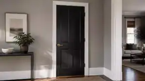 Gray Walls White Trim Black Doors: 12 Rooms That Get It Right
 Door Too Close to the Wall for Trim? How to Fix It
 Should Bedroom Doors Match the Walls or Trim
 Do Plantation Shutters Block Out Light? A Homeowner’s Guide to Elegant Light Control
 12 Best Front Door Colors for Light Gray House
 12 Frosted Glass Interior Doors That Add Light Without Losing Privacy
 10 Ways to Use French Doors as Room Dividers Without Losing Light
 11 Modern Glass Doors That Maximize Natural Light