
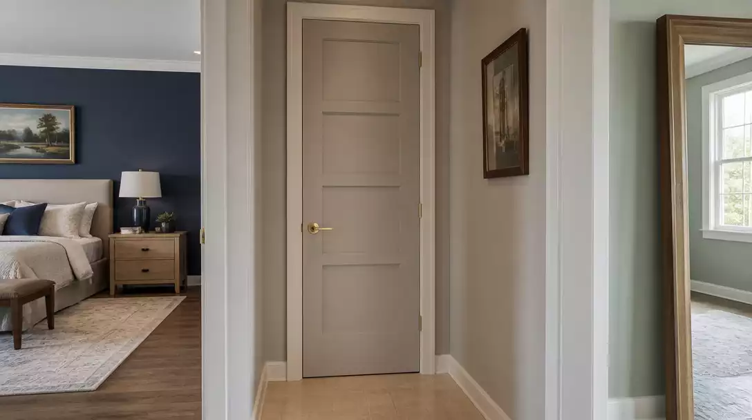
Choosing a door color when adjoining rooms have different palettes is a common design hurdle that can make a home feel disjointed if handled poorly. This guide narrows the process to 10 strategic steps to ensure a professional result. Let’s start with the most critical factor: undertones.
1. Shared Undertones
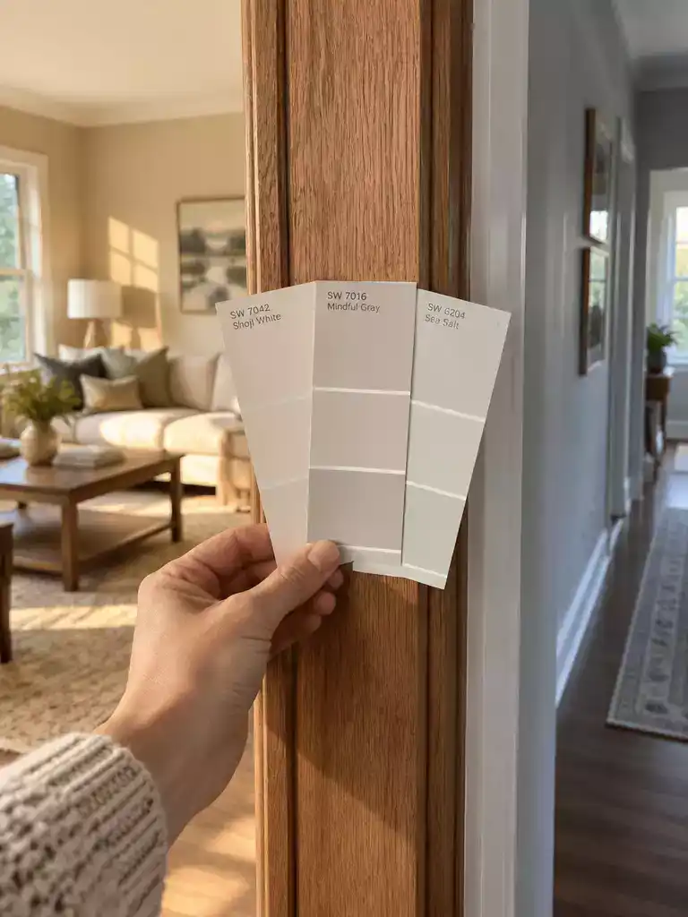
Aligning your door color with the hidden DNA of your rooms creates effortless flow.
As an Amazon Associate I earn from qualifying purchases. Affiliate links may earn me a commission at no extra cost to you.
Two rooms can feature completely different colors while still sharing the same “DNA” in their undertones. Before you pick a paint color, you need to identify whether your room palettes have a warm or cool bias. This is the difference between a home that feels intentionally curated and one that feels like a collection of mismatched accidents.
To determine the bias, hold your paint chips against a piece of true white or neutral gray paper. If your room color looks yellow, orange, or red compared to that white, it has a warm undertone. If it leans blue, green, or purple, it is cool-toned. Choosing a door color that ignores these biases is the fastest way to create visual discord.
Undertone Check
- Warm Bias: Look for yellow, orange, or red leanings.
- Cool Bias: Look for blue, green, or purple leanings.
- The Neutral Strategy: If one room is warm and the other cool, select a balanced neutral that doesn’t lean heavily in either direction.
Another common mistake is a saturation mismatch. This happens when the door color is significantly more vibrant or dull than the walls, making it look like a floating object rather than part of the architecture. You want the intensity of the door color to sit comfortably within the range of your two room colors.
If you find that your chosen door color looks “muddy” or dirty when held up to either wall, it is clashing with the undertones. Use a color fan deck to hold your candidate color against both room colors simultaneously. If it holds its own against both without turning gray or yellow, you have found a winner.
Pro Insight
If you are struggling to find a middle ground, look for a “balanced neutral.” These colors are specifically formulated to sit on the fence between warm and cool, making them the most reliable choice for bridging two distinct, competing palettes.
⭐ Top Entry Door Hardware to Consider
✨ Editor’s Pick
Matte Black Entry Door Knob Set
Composite Front Entry Door With Ironwork
Exterior Door Bottom Weather Seal Sweep
💡 Practical Tips for Undertone Harmony:
- Natural Light Check: Observe how local daylight shifts the color temperature throughout the day before finalizing any paint swatch.
- Texture Influence: Remember that matte finishes absorb light differently than gloss, which can subtly alter how undertones appear.
- Consistent Sheen: Use the same finish on both sides of the door to ensure that light reflection remains uniform.
2. Neutral Bridge Color
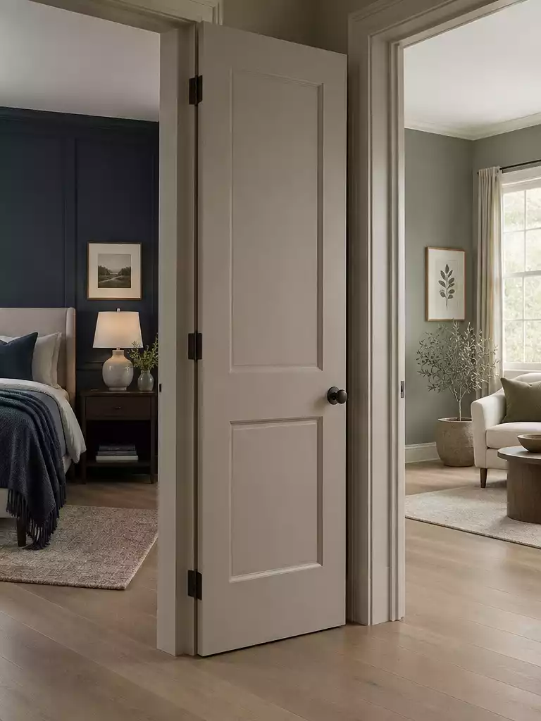
A perfectly chosen bridge color creates a visual handshake between two distinct room palettes.
When you are staring at two rooms that refuse to play nice together, a Bridge Color is your most reliable diplomatic tool. Instead of trying to force the door to match one room exclusively, you select a neutral shade that acts as a visual mediator, effectively shaking hands with both palettes simultaneously.
The secret to finding this bridge lies in the Light Reflectance Value (LRV), a scale from 0 (absolute black) to 100 (pure white). For a door that needs to connect two different worlds, you want to stay within the “sweet spot” of 55 to 82 LRV.
Why Mid-Value Neutrals Win: Mid-value neutrals, typically landing between 50 and 60 on the LRV scale, offer the most stability. They have enough body to hold their own against bold colors, but they aren’t so dark that they act as a jarring accent piece. If you choose something too dark, the door stops being a connector and becomes a focal point, which usually highlights the clash rather than solving it.
To see this in practice, look at established benchmarks like Revere Pewter (LRV ~55) or Alabaster (LRV 82). These aren’t just “off-white” colors; they are carefully balanced neutrals that sit comfortably between warm and cool extremes. When you hold a swatch of a mid-value greige or a soft warm white against your two target wall colors, the bridge color should look like a natural partner to both – not a competitor.
Mistake to Avoid: Avoid the temptation to use dark, low-LRV colors as a bridge. A dark charcoal or navy door between two light rooms will act as a “stop sign” for the eye, making the transition feel abrupt and choppy rather than cohesive.
⭐ Best Finishes for Your Wood Doors
Matte Finish Multi Tone Repair Paint
✨ Editor’s Pick
Fast Drying Matte Walnut Wood Stain
Natural Oil And Pigment Finishing Kit
Dominant Room
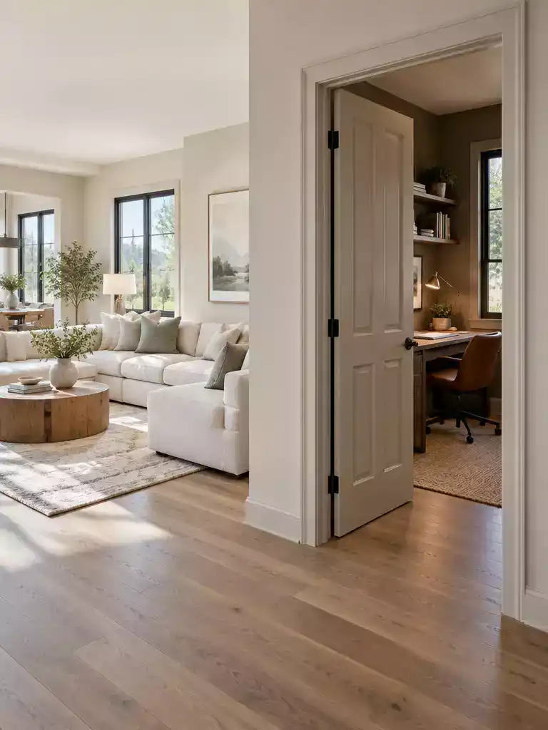
Anchoring your door color to the primary space creates a sense of intentional design flow.
When you find yourself staring at a door that connects two different worlds, the most common impulse is to try to appease both rooms equally. In reality, attempting a 50/50 color split often leaves the door feeling like an afterthought that doesn’t truly belong to either space.
Instead, identify the Dominant Room. This isn’t just about which room is larger; it’s about the “main experience” of your home.
How to identify your dominant room:
- Visual Weight: Which room has more expansive wall surfaces or higher ceilings?
- Primary Use: The living room or main hallway usually takes priority over a pantry, laundry room, or small home office.
- The Entry Tie-Breaker: If the rooms are equal in size, default to the space most visible from your home’s main entry point to maintain a cohesive first impression.
Once you’ve identified the dominant room, let its palette govern the door color. By aligning the door with the room that provides the main experience, you create a sense of scale and intentionality. The door effectively acts as an extension of the primary wall, which helps the space feel larger and more unified.
If you are worried about the secondary, smaller room feeling neglected, you don’t need to force the door to match it. Instead, bridge the gap with subtle interior accents.
Pro Tip: If the secondary room feels disconnected after you’ve painted the door to match the primary room, bring a small piece of the primary room’s color into the secondary space. A throw pillow, a piece of artwork, or a small decorative object can pull the rooms together without forcing the door to do all the heavy lifting.
Choosing the dominant room is about creating a hierarchy of visual importance. By letting the most significant space lead, you avoid the mistake of creating a “clashing threshold” and move toward a home that feels curated and purposeful.
⭐ Standout Doors for Your Home
Large Interior Cat Door For Pets
Sliding Spruce Wood Barn Door Slab
✨ Editor’s Pick
Double Exterior Entry Doors With Glass
🏡 Real-Home Application:
- Open Floor Plans: In homes without clear room boundaries, prioritize the color of the largest, most visible living space.
- High-Traffic Thresholds: Choose a durable finish for doors connecting mudrooms or kitchens to ensure the color holds up under constant use.
- Visual Continuity: Use the same door color for all rooms visible from a central hallway to prevent a disjointed, “choppy” appearance.
Balancing architectural harmony with the impact of your color choice often feels like a high-stakes puzzle, but most rooms find their rhythm through just a few intentional design decisions. When you coordinate your doors, you are building a cohesive narrative for your home rather than just painting a frame.
Focusing on the threshold as a transition rather than a standalone feature ensures your home feels intentional and expertly unified without requiring every single door to be a masterpiece.
4. Door Open Position
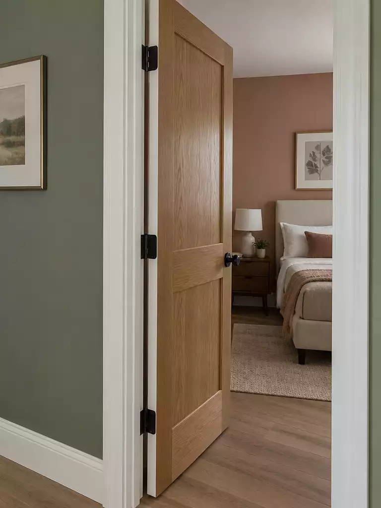
Mastering the hinge side ensures your door color feels intentional from every angle.
When you are dealing with two different room colors, the door swing becomes your most important technical guide. The standard rule is that the face of the door should match the room it swings into. This creates a visual harmony where the door appears as a natural extension of the wall when it is closed from the perspective of that room.
However, the real challenge arises the moment you open the door. When a door is left ajar, the edge becomes the primary color indicator for the room behind it. If you have been meticulous about your paint choices, a clashing edge can create a jarring visual gap that makes the entire transition feel like an afterthought.
The Edge Visibility Logic
If a door is rarely closed, treat the visible edge as the most important surface to coordinate with the room it faces. A clean, single-color edge is almost always superior to trying to split the paint colors on the thin side of the door, which often results in a messy, unprofessional finish.
To avoid a design mistake, follow this simple checklist for your door swing:
- Identify which room the door swings into; that side gets the primary wall color.
- Check the visibility of the hinge-side edge from the adjacent room when the door is partially open.
- Use a neutral color for the edge if you cannot decide which room it belongs to, as this acts as an effective buffer.
- Avoid painting the edge with a “split” color, as the transition line is rarely crisp and usually looks like a mistake.
If you find that your doors are almost always left open, the edge color matters more than the face color of the door itself. In these cases, opting for a neutral bridge color across the door and its edges can prevent the visual discord that happens when a deep-colored door is suddenly exposed against a light-colored room.
⭐ Essential Hardware for Every Door
✨ Editor’s Pick
Magnetic Stainless Steel Door Stop Set
Matte Black Sliding Pocket Door Lock
Bypass Sliding Barn Door Hardware Kit
💡 Practical Steps for Door Swing Clarity:
- Test the Sightline: Stand in the doorway and close the door halfway to see which room’s wall color feels most dominant against the door’s face.
- Check Hinge Placement: Confirm if the door swings into a tight corner, as this limits how much of the edge color is actually visible to the room.
- Prioritize Main Living Zones: When in doubt, let your high-traffic living area dictate the color rather than a secondary space like a pantry or closet.
5. Hallway Sightline
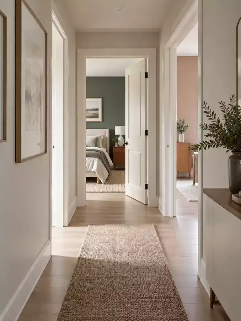
Transform your corridor into a cohesive link by letting your doors quietly connect adjacent spaces.
Your hallway acts as the primary vantage point for your entire home’s color story. When you stand in the center of a corridor, you are often looking at multiple doors and the glimpses of the rooms behind them simultaneously.
If you have several doors visible in one hallway, painting each one a different color to match its specific interior room can quickly turn your corridor into a chaotic, visual mess. This is where the receding technique becomes your best friend.
The Receding Strategy: Instead of making the door an accent, paint it the exact same color as your hallway trim or baseboards. This forces the door to “disappear” into the architecture, allowing the eye to travel down the hallway without being interrupted by a series of colored rectangles.
This approach is particularly effective in narrow corridors where space is at a premium. A dark or bold door color in a tight hallway can make the walls feel like they are closing in, creating a “choppy” visual rhythm that disrupts the flow of the home.
By keeping the door color light and consistent with the trim, you maintain a clean, airy feel that makes the transition between rooms feel intentional rather than accidental. If you feel like your hallway needs a bit more personality, focus on the wall art or a runner rug rather than the doors themselves.
Hallway Sightline Checklist
- ✓ Stand in the middle of your hallway and count how many doors are visible at once.
- ✓ Check if the trim color is consistent throughout the entire hallway.
- ✓ Determine if you want the doors to serve as focal points or architectural background.
- ✓ If the hallway is narrow, prioritize a light, trim-matching color to maintain openness.
If you find that your doors are of high-quality material or feature unique architectural details, you might be tempted to highlight them. However, if your goal is a calm, cohesive home, the most professional-looking choice is almost always to let the hallway trim dictate the door color, effectively creating a unified frame for the entire space.
⭐ Great Doors for Your Home
Exterior Prehung Dutch Entry Door Slab
✨ Editor’s Pick
Sliding Spruce Wood Interior Barn Door
Black Fiberglass Entry Door Slab Panel
💡 Why This Works
By aligning the door color with the hallway trim rather than the individual rooms, you effectively treat the corridor as a cohesive gallery space. This visual simplification prevents the “choppy” aesthetic caused by competing door colors and allows the unique character of your rooms to shine without the doors constantly fighting for attention.
Design Benefit: This strategy creates a calm, intentional flow that makes your entire home feel larger and more connected.
Trim Color
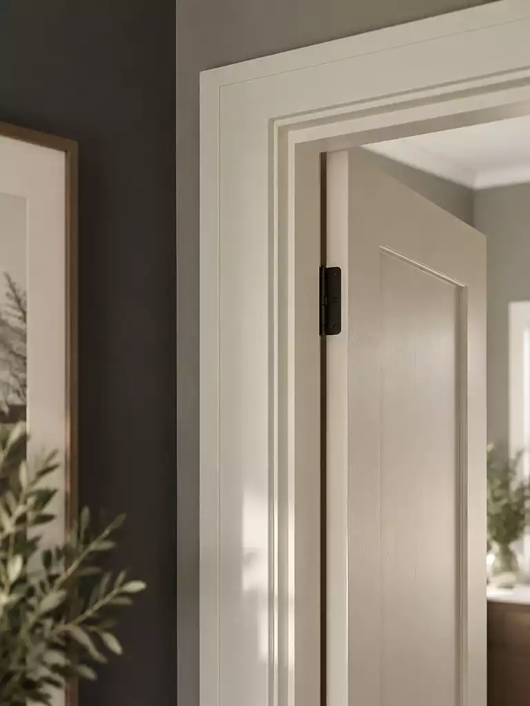
Use your trim as a strategic frame to anchor the door and unify two different room colors.
The trim around your door serves as the final border, essentially acting as the frame for your color choice. When you are working with two different room colors, how you treat this frame can either highlight the contrast or soften it significantly.
The integrated look is often the safest path when you want a quiet, professional finish. By painting the trim the same color as the door, you create a cohesive unit that stands apart from the walls on either side. This approach minimizes the visual “choppiness” that happens when a door is surrounded by a stark white frame that doesn’t quite match the undertones of the adjacent rooms.
Graphic vs. Integrated Styles: If you want the door to feel like a deliberate design feature, use a high-contrast trim color to “frame” it. If you want the door to disappear or feel like a natural part of the hallway architecture, paint the trim and door the same color to create an integrated, recessed appearance.
One of the most common mistakes is defaulting to “pure white” for trim without checking the surrounding paint. If your living room is a warm, creamy yellow and your hallway is a cool, crisp blue, a standard bright white trim can clash with both, making the entire threshold look disjointed.
Instead, use the trim as a buffer zone. If your door color is bold, a neutral trim can act as a transition that keeps the bold color from overwhelming the neutral wall. Before committing to a trim color, always test it against the door color in both natural morning light and evening artificial light.
Warning: Avoid using stark, cool-toned white trim if your room palettes lean heavily toward warm, earthy undertones. This creates a harsh visual tension that makes the transition feel accidental rather than intentional.
If you are struggling to find a trim color that works for both sides, look for a “clean” neutral with a neutral LRV that doesn’t lean too heavily into yellow or blue. This provides a stable, consistent border that allows the door color to sit comfortably between the two distinct room palettes.
⭐ Entryway Mats We Love
Absorbent Muddy Dirt Resist Entry Mat
Non Slip Washable Indoor Entryway Rug
✨ Editor’s Pick
Striped Cotton Woven Porch Door Mat
✨ Finishing Touches: The Sheen Factor
Beyond color, the paint finish on your trim and door dictates how that frame interacts with light and daily wear.
- Durable Sheen: Use a semi-gloss or satin finish for trim to ensure it resists scuffs and cleans easily.
- Visual Depth: Pair a matte door with a soft-sheen trim to create subtle textural contrast that feels sophisticated.
7. Flooring Continuity
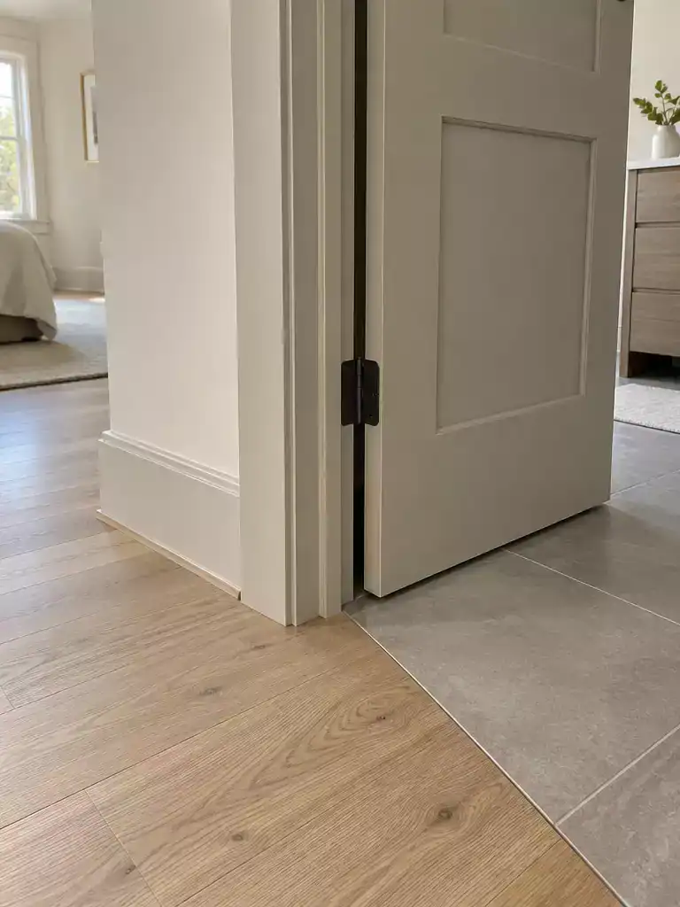
Use a neutral door to anchor the transition between two different floor materials.
When your flooring changes at a doorway – perhaps from hardwood in the living room to tile in the kitchen – the floor itself becomes a significant visual anchor. If you choose a bold or highly saturated door color, you risk creating a chaotic focal point that clashes with both floor types simultaneously.
Think of your door as a neutral buffer. By selecting a shade that doesn’t compete with the undertones of your flooring, you allow the transition between rooms to feel intentional rather than accidental.
The Flooring Coordination Cue: If the flooring on either side of the door uses vastly different temperatures – such as a warm rustic oak next to a cool, blue-toned slate – avoid door colors that lean heavily into either warm or cool spectrums. A balanced neutral greige or a soft, warm white often works best to bridge that temperature gap without emphasizing the clash.
If you are struggling to find common ground, use this checklist to assess your floor-to-door junction before you commit to a paint color:
- ✓ Identify the undertone: Does your wood flooring have yellow, orange, or gray undertones? Does the tile lean blue, green, or stark white?
- ✓ Check the contrast: If both floors are dark, a high-contrast white door will draw the eye directly to the messy transition line.
- ✓ Simplify: When in doubt, a door color that matches your trim or baseboards is the safest way to maintain a clean, quiet aesthetic at the floor junction.
If you find that your floors and door are still fighting for attention, the door color is likely too dark or too vibrant. In spaces where flooring materials change abruptly, the goal is to make the door feel like part of the wall architecture rather than an additional “floor-level” accent.
Common Pitfall: Avoid choosing a door color that perfectly matches one floor but ignores the other. This often makes the room with the mismatched floor feel like an afterthought.
⭐ Personalized Mats Worth Buying
✨ Editor’s Pick
Checkered Fall Decor Outdoor Entry Rug
Blank Artificial Coir Crafting Door Mats
Waterproof Non Slip Outdoor Entry Mat
💡 Why This Works:
Using a neutral door color when flooring materials shift creates a visual “pause” that prevents the eye from snagging on the transition. By softening the contrast at the threshold, you allow the two distinct rooms to exist in the same home without the floor junction becoming an awkward, high-contrast focal point.
Visual benefit: A neutral door effectively camouflages the floor-to-floor seam, keeping your home’s transition points feeling intentional and quiet.
8. Light on Each Side
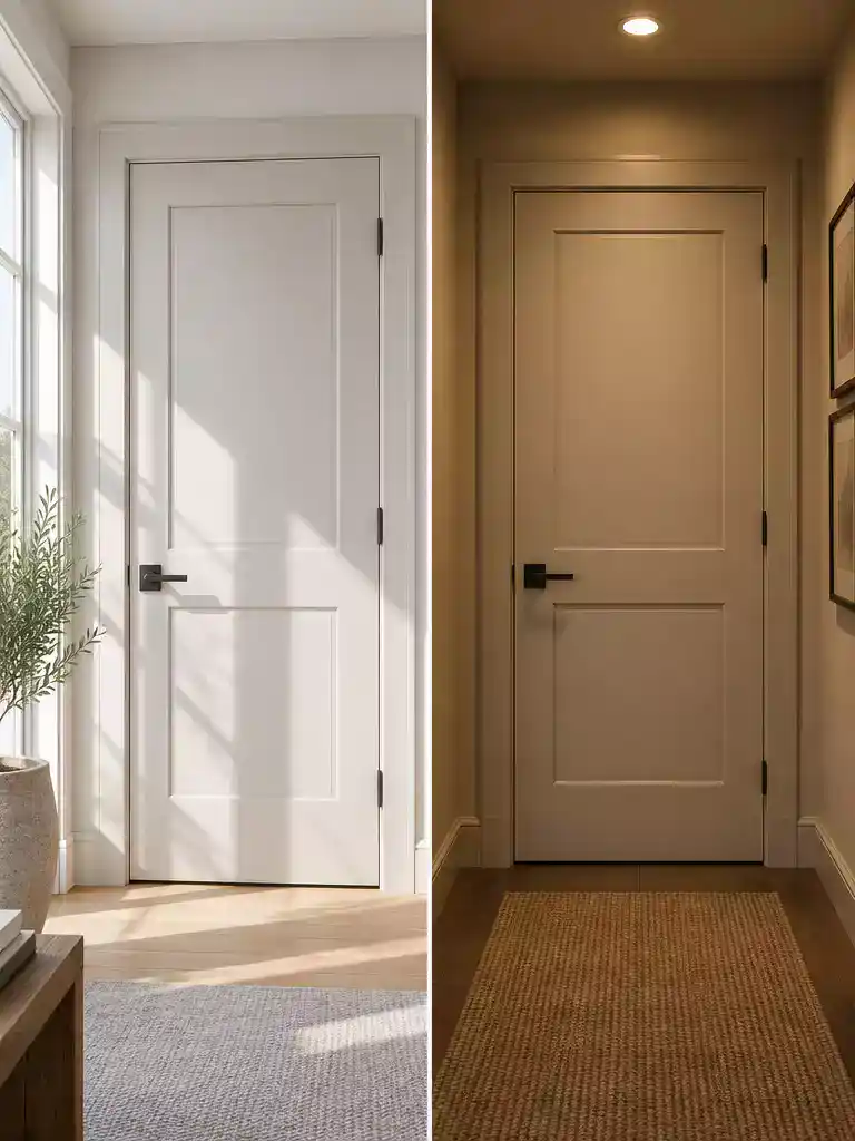
Mastering the light shift ensures your door color stays true regardless of the time of day.
Most homeowners make the mistake of choosing a door color based solely on how it looks under the harsh, fluorescent glow of a paint store. In reality, the light on either side of your door is rarely identical, and this light shift is exactly what causes a color to look perfect in the living room but muddy or washed out in the hallway.
Natural daylight is inherently cool, often pulling blue or green tones out of your paint, while artificial lighting – especially traditional bulbs – tends to be warm and yellow. If your door connects a bright, sun-filled room to a dim, windowless hallway, that single paint color will behave like two different shades depending on which side you are standing on.
The 24-Hour Light Test
To avoid a costly repaint, you must observe your color choice at three distinct times: early morning natural light, midday sun, and evening artificial light. Keep your sample boards in the actual doorway for a full day to see how the color transitions as your home’s lighting shifts.
When you are dealing with these dramatic light differences, the intensity of your chosen color matters significantly. Darker, more saturated doors tend to hold their true color better in bright, light-filled rooms, whereas lighter, high-LRV colors are your best friend for brightening up dim, cramped hallways.
If you find that your chosen color looks completely wrong in one of these conditions, it is a sign that the undertones are too sensitive to the light shift. Instead of forcing it, pivot toward a more balanced neutral that lacks a strong blue or yellow bias, as these are much more forgiving when moving between natural and artificial light sources.
Mistake to Avoid: The “Store-Light” Trap
Never finalize a paint color under store lighting. The artificial environment of a paint shop is designed for efficiency, not accurate color rendering; always bring your samples home and view them in the specific doorway where they will live.
⭐ Great Doors for Your Home
✨ Editor’s Pick
Reversible Black Fiberglass Entry Door Slab
⚖️ Quick Decision Guide: Light Conditions
- Choose this if: Your door connects a windowless hallway to a sun-drenched room; opt for a balanced, mid-tone neutral.
- Skip this if: You are eyeing a high-saturation color that shifts dramatically under warm artificial lighting versus cool daylight.
- Pair it with: A soft, matte finish to minimize glare and keep the color consistent across varying levels of light exposure.
9. Door Edge Treatment
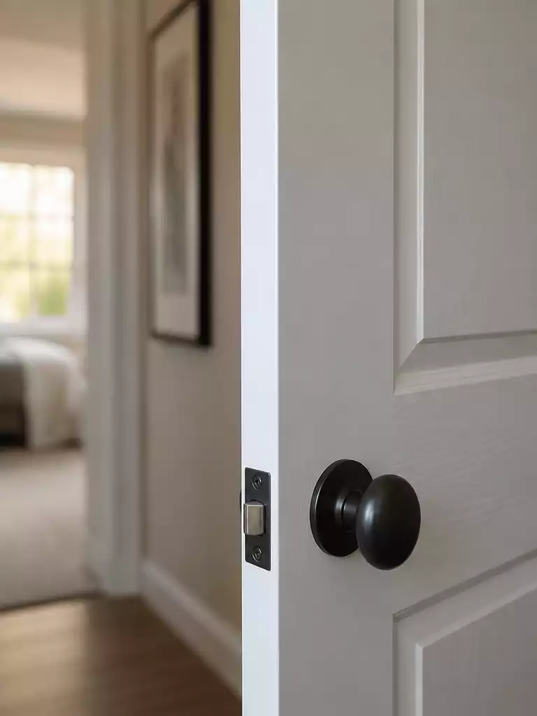
A clean, consistent edge finish ensures your door looks intentional from every angle.
When you are dealing with two different room colors, the edge of the door often feels like an afterthought. It is the sliver of space that links two distinct palettes, and how you handle it determines whether your door feels like a cohesive design choice or an accidental clash.
The most reliable convention is to match the edge to the room the door swings into. This creates a visual logic that feels natural as you move through your home; when the door is closed, you only see the face that belongs to the room you are currently occupying. The edge effectively becomes an extension of the room it faces when open.
Professional Tip: If you are struggling to decide, choose the door face that is most visible when the door is in its “at rest” position. For most homes, this is the side facing the hallway or the primary living space, as that is where you will spend the most time viewing the door closed.
You might be tempted to try a “split-edge” technique, where the edge is painted half-and-half to match each room. While this sounds like a clever compromise, it is almost universally discouraged by professionals. It creates a messy, uneven transition that looks like a mistake rather than a design feature.
Instead, focus on achieving a clean, single-color finish on the entire thickness of the door. This simplicity provides a crisp line that keeps the transition between rooms feeling sharp. If you find yourself in a situation where the swing direction makes the edge visible from both sides simultaneously, stick to a neutral color that complements both palettes to minimize the visual impact of the edge itself.
Painting the edge of the door two different colors often results in a jagged, poorly defined line that looks unprofessional. Always carry one color all the way across the edge to ensure a sharp, intentional finish.
⭐ Best Door Seals to Consider
Vinyl Replacement Insert For Door Thresholds
Vinyl Replacement Insert For Aluminum Thresholds
✨ Editor’s Pick
Adjustable Double Bubble Exterior Door Sweep
⚠️ Where This Can Go Wrong:
- The Split-Edge Trap: Trying to paint the edge half-and-half creates a jagged, messy transition that looks like a technical error.
- Ignoring Sightlines: Failing to check the door’s edge from the hallway vantage point can result in an awkward, visible color clash.
- Poor Paint Lines: Using low-quality tape or skipping a clean seal on the edge causes bleeding, making your professional finish look amateur.
10. Two-Sided Sampling
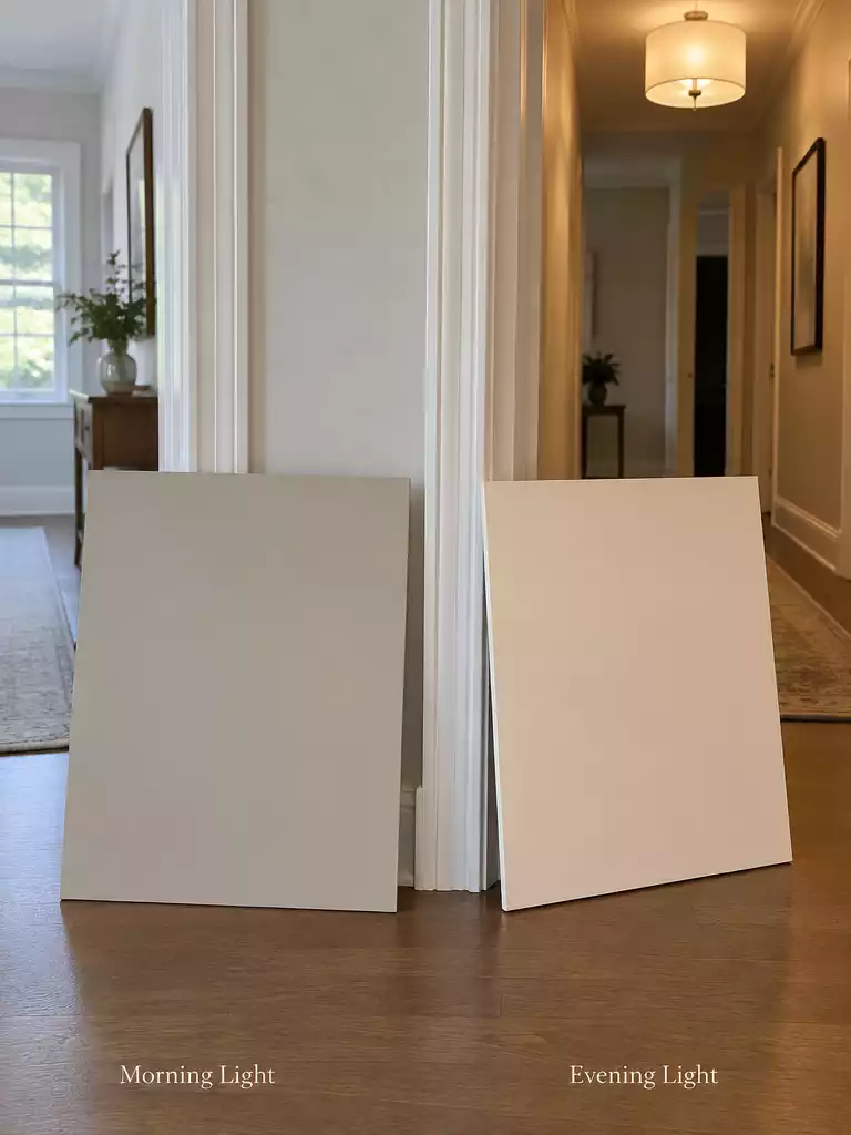
Testing in real-world light prevents costly repainting and ensures your color choice bridges the gap.
Relying on tiny paint chips is the fastest way to invite expensive regret. Because light behaves differently on each side of a threshold, you need a strategy that accounts for the specific conditions of both rooms simultaneously.
To get it right, use large sample boards rather than sticking small chips directly on the door. Paint both sides of your sample board with the candidate color, then position it exactly where the door sits in the frame.
The 24-Hour Observation Rule: Keep your sample boards in place for a full day. You need to see how the color interacts with the cool morning light, the harsh midday sun, and the warm, artificial glow of your evening lighting before you commit to a full gallon.
If the color looks muddy or “off” in even one of your tested light settings, it is not the right choice for that transition. A truly successful bridge color should remain stable and balanced regardless of the shift in light from one side to the other.
Sampling Checklist
- ✓ Use large boards (at least 12×12 inches) instead of small paper chips.
- ✓ Paint both sides of the board to see how light reflects on each surface.
- ✓ Test during morning, midday, and evening cycles.
- ✓ Verify the color against both room palettes simultaneously.
If you find that your chosen color fails this test, don’t force it. It is significantly cheaper to buy a few extra sample pots now than it is to repaint a door that looks like a mistake every time you walk through it.
⭐ Top Products for Your Entryway
✨ Editor’s Pick
Aluminum Flat Profile Door Threshold
🧰 Questions to Ask Your Pro
- Sample verification: “Can we test the final door color in the specific light conditions of each adjacent room?”
- Finish compatibility: “How will the chosen paint sheen hold up against the different traffic levels in these two spaces?”
- Transition logic: “Should we use a custom blend or a neutral bridge color to ensure the threshold feels intentional?”
With all ten strategies now in front of you, the path to a cohesive transition between rooms becomes much clearer. Focusing on the one or two factors that most impact your home’s flow is far more effective than attempting every adjustment at once.
If you are ready to refine your home’s palette, prioritizing a neutral bridge color or confirming your undertones will do the heavy lifting for you. Making these deliberate choices ensures your home looks intentional and finished, rather than just painted. For those still refining their style, exploring additional color guidance can help you feel completely confident before picking up the brush.
Related posts:
 What Color Door Knobs Should I Use? A Guide to Choosing the Perfect Doorknobs for Your Home
 A Complete Guide to Choosing Your Front Door Paint Color
 Gray Walls White Trim Black Doors: 12 Rooms That Get It Right
 Pocket Doors for Laundry Rooms With Tight Floor Plans
 Door Painting Secrets Revealed: Expert Tips for Choosing the Perfect Paint for Your Doors
 Securing Safety: Choosing the Right Screw Sizes for Fire Door Hinges
 The Ultimate Guide to Choosing the Right Size Sliding Door Fly Screen
 What to Know Before Choosing a Safety Door