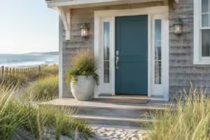
House numbers are the one part of the front of your house that has a job beyond looking good. Delivery drivers, guests and, most of all, an ambulance or fire truck at night need to find your door fast. Plenty of house numbers that look lovely on Pinterest fail that test: thin, brass, tucked behind a plant or too small to read from the curb. Here is how to choose house numbers people can actually read from the street, and still make them look good.
The short answer
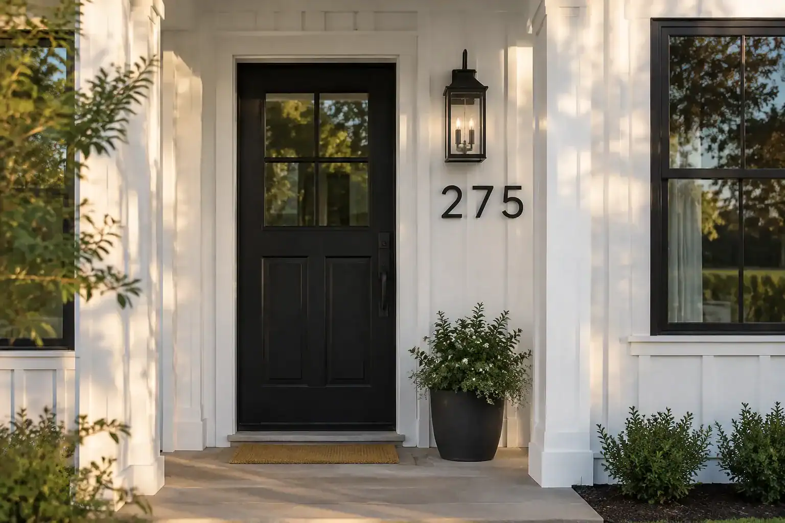
Use plain numerals at least 4 inches tall with strokes at least 1/2 inch wide, in a color that contrasts strongly with the wall behind them. Mount them where they face the street named in your address, keep plants and porch posts out of the way, and make sure they are lit or reflective at night. If the house is set far back or hidden, add numbers at the street on a post or the mailbox.
4 in
minimum height in the model residential code
1/2 in
minimum stroke width, so the digits don’t fade with distance
1 in
minimum height for numbers on a curbside mailbox under USPS standards
Sources: the International Residential Code address rule as adopted locally, fire department guidance, InterNACHI, and the USPS Domestic Mail Manual.
01 / Size
How big should house numbers be?
House numbers should be at least 4 inches tall, with a stroke at least 1/2 inch wide. That is the address rule in the International Residential Code (section R319) and the fire code, and it is what many towns adopt word for word. A typical local rule asks for numbers plainly legible and visible from the street, contrasting with their background, at least 4 inches high with a 1/2-inch stroke (Elmira Heights rule).
Four inches is the minimum, not the target. Towns that regulate size generally require 3 to 6 inches, and some also set the stroke width. Check your local building or fire department, because local rules can be stricter than the model code.
Our take · James Davis
On a house close to the sidewalk, 4 to 5 inches looks right. If the front door is a long way back from the street, I’d go to 6 inches or more. Numbers almost always look bigger on the wall than in the box, so tape a paper template up and check it from the curb before you drill.
02 / Contrast and style
What color and style of house numbers is easiest to read?
The easiest numbers to read are bold, plain digits in a color that contrasts strongly with the wall. White on black or black on white reads best, and brass or bronze numbers are best avoided because they are hard to see at night (Briarcliff Manor Fire Department).
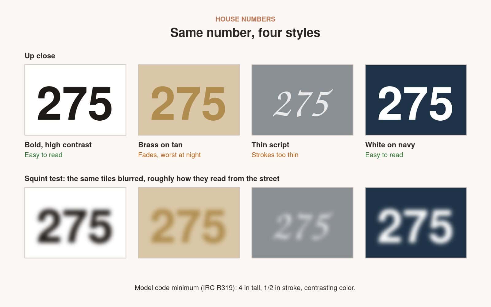
- Dark numbers on light walls Black or charcoal on white, cream or light gray siding.
- Light numbers on dark walls White or light metal on navy, charcoal, black or dark brick.
- Brick and stone Busy textures swallow numbers. Mount them on a plain plaque in a contrasting color.
- Brass and bronze Beautiful up close, but low contrast on many walls and poor at night. Use them on a dark backing plate if you love the look.
- Script and spelled-out numbers Fine as decoration, but pair them with plain digits somewhere visible from the street.
Font matters as much as color. Choose a simple typeface with open shapes, where a 6, 8 and 9 can’t be mistaken for each other at a glance. Thin modern fonts look elegant on a mood board and disappear from the street.
03 / Placement
Where should house numbers go?
Put them where someone driving along the street named in your address will see them first. Numbers should face the street named in the address and not be blocked by trees, shrubs or other permanent objects. Next to the front door is the classic spot, as long as the door itself can be seen from the street.
- On the side of the house that faces your address street, not the side street
- Clear of porch posts, columns, shutters and open storm doors
- Clear of shrubs and trees in every season, not just the day you install them
- Close to a light, so they are lit at night
- At a height people naturally look at, roughly eye level or just above the door frame
If the house sits far back from the road, behind trees or up a long driveway, the house numbers on the wall won’t be enough. The Briarcliff Manor fire chief’s advice is to put the number near the street on a post or fence, or on the mailbox, so it can be seen from the road.
Our take · James Davis
InterNACHI makes a point people miss: numbers you install in winter can be hidden by leaves by summer. Before you drill, stand where the shrubs will be fully grown and check the line of sight from the street.
04 / At night
How do you make house numbers visible at night?
Light them or choose reflective numbers. Reflective numbers are usually easier to see at night than non-reflective ones, and some towns require numbers to be either illuminated or reflective. The fire department guidance makes the same point from the other side: crews struggle to find numbers from the street, and it is hardest at night.
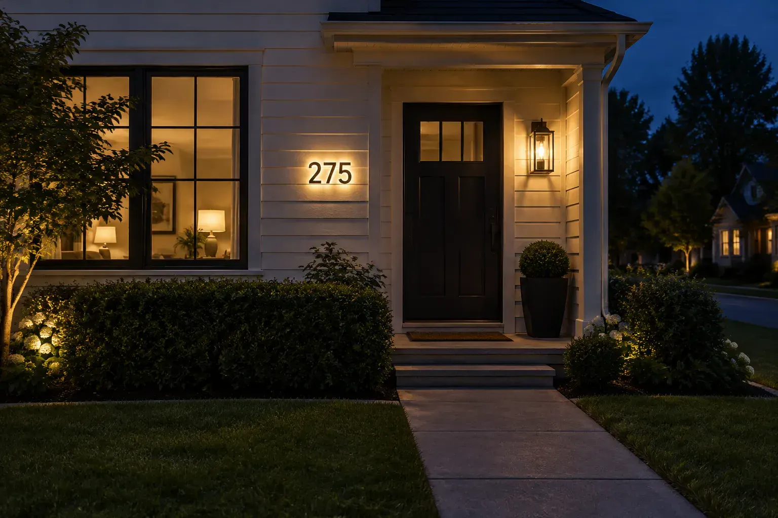
The simplest fix is to mount the numbers where the porch light already falls on them. Backlit “halo” numbers and solar-lit address plaques are other options. If you are changing the porch lights anyway, our guide on how to choose front door lights covers size, placement and warm bulbs that light the numbers without glare.
05 / The mailbox
Do house numbers need to be on the mailbox too?
On a curbside mailbox, yes. Every curbside mailbox must show the house number, in a contrasting color, in neat numerals at least 1 inch high, on the side the carrier approaches from (USPS mailbox standards). If the mailbox is on a different street from the house, the street name must be on it too.
A mailbox number does double duty: it helps the mail carrier, and on a house set far back it is often the number emergency crews will see first. Make it bigger than the minimum if you can.
Our take · James Davis
Do a drive-by test once the numbers are up. Drive past at normal speed, once in daylight and once after dark. If you can’t read the number without slowing down, neither can an ambulance driver. It takes five minutes and tells you more than any rule.
06 / Style
How do you make house numbers look good with the door?
Readable doesn’t have to mean ugly. Match the numbers’ finish to the door hardware and lights, choose a typeface that suits the house, and size them so they look intentional rather than an afterthought. On a symmetrical colonial or a classic entry, numbers centered above the door or on a plaque beside it look tidy; see how it is done in our colonial house front door ideas. For a modern house, large single-line numbers next to the door work well, as in many of our classy front door ideas.
For a bigger refresh, numbers are one of the cheapest ways to sharpen the whole entry. Our front door curb appeal ideas show how they fit with the door color, hardware and planters, and our guide to choosing front door hardware helps you pick finishes that go together.
House numbers FAQ
What size should house numbers be?
At least 4 inches tall with a stroke at least 1/2 inch wide, which is the minimum in the model residential and fire codes. Go to 5 or 6 inches or more if the house is set back from the street, and check your local rules.
Are brass house numbers a bad idea?
They can be hard to read. Fire department guidance says brass and bronze numbers should be avoided because they are hard to see at night. If you love the look, mount them on a dark plaque and light them well.
Should house numbers be vertical or horizontal?
Either works if the numbers are large, bold and high-contrast. Horizontal is the more common choice; vertical suits narrow posts and tall, thin spaces beside a door.
Where should house numbers go if the house is far from the road?
Put them near the street as well, on a post, a fence or the mailbox, so they can be seen from the road. Numbers only on a distant wall are easy to miss.
Do house numbers need to be lit?
Some towns require numbers to be illuminated or reflective. Even where they don’t, lighting or reflective numbers make your address far easier to find at night.
The takeaway
Choose plain digits at least 4 inches tall with a 1/2-inch stroke, in a color that contrasts with the wall. Put them where they face your address street and stay clear of plants, light them or choose reflective numbers, and add numbers at the street if the house is set back. Then do a drive-by test, by day and by night.
Related posts
 Flat Closet Doors Reworked to Read Like Paneled Cabinetry
 How to Choose Outdoor Lights for Your Front Door
 How to Choose a Front Door Thats Secure Solid and Timeless
 Storm and Screen Doors: How to Choose and What They Cost
 Best Blinds for French Doors: How to Choose and Mount Them
 Why Choose French Doors
 12 Best Front Door Colors for a Blue House
 14 Barn House Front Door Ideas