
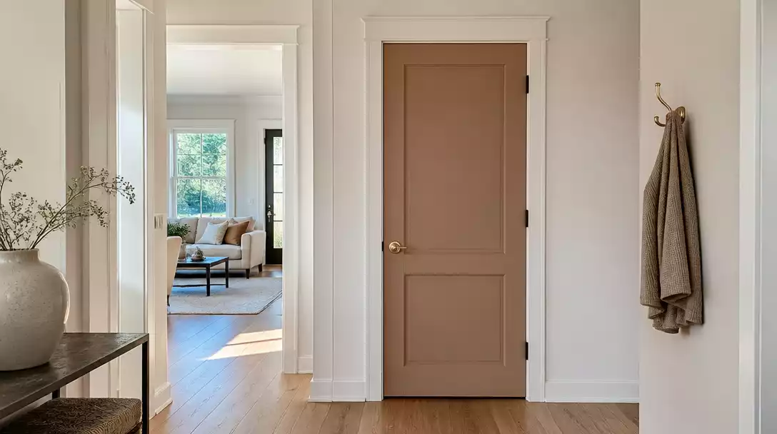
Many hallways feel unfinished because all-white schemes lack architectural definition. This guide rounds up 10 door color ideas worth saving that provide the right contrast against your trim. Use these curated palettes to create a polished transition that fits your home perfectly.
Pale Greige
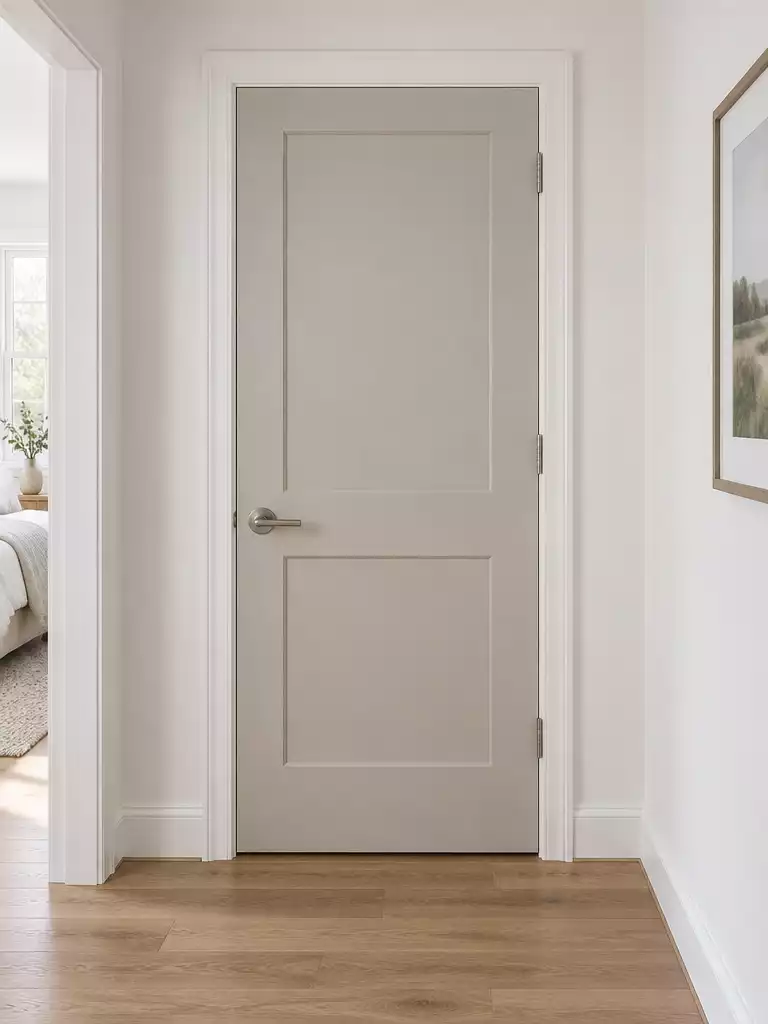
Create a polished, modern transition that adds depth to your hallway without high-contrast drama.
As an Amazon Associate I earn from qualifying purchases. Affiliate links may earn me a commission at no extra cost to you.
Think of pale greige as the ultimate bridge color. It sits perfectly between the warmth of beige and the neutrality of gray, making it a safe yet intentional choice for narrow transitional spaces.
Because this color stays close to the lightness of white, it relies on your home’s natural light to shine. It works best in hallways with moderate brightness where soft shadows can naturally define the door’s edge against your trim.
The Bright Hallway Check
If your hallway is flooded with intense, direct sunlight, steer clear of this shade. In extremely bright conditions, the door may wash out and disappear entirely into the white trim, losing that architectural definition you are trying to build.
When used in the right light, this color creates a modern-traditional look that feels curated rather than forced. It is the perfect solution for homeowners who want their doors to look intentional without the sharp, heavy contrast of darker paint colors.
⭐ Top Pale Greige Entrance Mats
✨ Editor’s Pick
Waterproof Natural Rubber Indoor Entrance Mat
Non Slip Washable Beige Entryway Mat
Brown Dirt Trapper Indoor Entryway Rug
Why This Works: The Nuance of Greige
Pale greige succeeds because it leverages the “definition test”—it is just saturated enough to distinguish itself from white trim through soft shadow play. By avoiding the starkness of a true gray or the yellowness of a dated beige, it creates a tailored, modern-traditional aesthetic that feels inherently sophisticated and calm in any hallway.
Dusty Blue
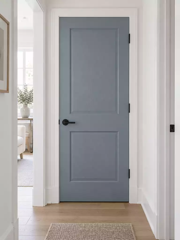
Create an airy, architectural focal point that sharpens your hallway’s narrow dimensions instantly.
Dusty blue functions as a high-impact choice for hallways that struggle with natural light. Because the white trim acts as a stark, clean frame, this color gains a level of architectural snap that lighter neutrals simply cannot provide.
This color is a true chameleon that reacts to your specific lighting conditions. During the daylight hours, it feels crisp and refreshing, but as evening approaches, the tone shifts toward a moody, sophisticated gray-green.
Selection Tip: To avoid a juvenile “nursery” look, specifically select highly desaturated, muted tones. If the blue looks too vibrant on the paint chip, it will inevitably feel overwhelming once applied to the vertical plane of the door.
This shade is ideal for homeowners who want to cool down a hallway that feels too warm or clinical. If your space is windowless, it helps create a sense of depth rather than making the hallway feel like a cramped tunnel.
⭐ Dusty Blue Accents We Love
✨ Editor’s Pick
Light Dusty Blue Striped Outdoor Porch Throw Pillow Covers 18×18 Set of 2
📋 Before You Try This
- Sample placement: Test your blue swatches directly against the door frame, not the wall, to see how the white trim affects the color’s perceived temperature.
- Sheen selection: Choose a satin or semi-gloss finish to ensure the door surface remains durable and reflects enough light to highlight the blue’s depth.
- Lighting check: Observe your blue sample at both high noon and under evening artificial light to confirm the color doesn’t shift into an unwanted swampy green.
Achieving a cohesive home rarely demands that every single detail is perfect. By focusing on how your paint sheen interacts with your chosen door color, you ensure a polished transition that holds up under various lighting conditions throughout the day.
Selecting one or two high-impact doors to refine correctly will carry the entire aesthetic of your hallway more effectively than attempting an overhaul of every surface.
Soft Sage

Create a quiet, restorative transition by pulling natural, organic tones into your hallway layout.
Soft sage acts as an organic bridge in hallways featuring wood floors or stone tile. It provides a distinct separation from white trim without the heavy visual weight often associated with darker, moodier shades.
Pro-Tip: Because sage is highly sensitive to light temperature, test your sample at both noon and dusk. Warm light bulbs will push this color toward an olive tone, while cooler bulbs can leave it looking flat.
This color is an ideal pick for those who want to avoid the sterility of a plain white door while keeping the hallway feeling airy. It works best in homes where you want the architecture to feel grounded and connected to natural design elements.
Avoid this choice if your hallway relies heavily on very cool, blue-toned LED lighting, as it can strip the color of its warmth. If your space lacks natural light, ensure you have well-placed sconces to reveal the undertones that keep the sage from appearing gray or muddied.
⭐ Soft Sage Green Decor Picks
Artificial Cedar Branches for Greenery
Artificial Fall Eucalyptus Leaves Stems
✨ Editor’s Pick
Sage Green Abstract Half Round Mat
The Detail That Pulls It Together
To make soft sage feel intentional rather than accidental, pair it with hardware that leans into its organic roots. Brushed brass or unlacquered copper handles provide a warm, earthy contrast that complements the green undertones, while matte black hardware can feel too industrial for this restorative palette. Focus on satin sheens to ensure the light reflects softly across the door’s surface, enhancing the sense of calm.
Mushroom
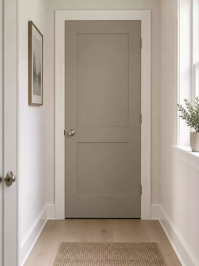
Ground your hallway with a sophisticated, earthy tone that adds depth and architectural interest.
Mushroom is a complex, grown-up neutral that blends taupe, gray, and beige into a single, cohesive shade. It offers a much more refined edge against white trim than standard greige, providing enough depth to make your doorways feel like intentional design features.
Because of its grounded profile, this color is an excellent choice for narrow hallways where you need to create a sense of weight without resorting to dark, moody pigments. It excels at adding shadow definition to the door plane, which helps break up long, monotonous corridors.
Light Requirement Alert: This color thrives when it has enough light to reveal its hidden undertones.
If you are painting a windowless hallway, make sure you have at least one dedicated light source like a wall sconce or a bright overhead fixture. Without proper illumination, the color can appear flat and lose its complex, warm character.
If you want to test if this shade works for your specific home, grab a 12×12 sample board and place it directly against your white trim. Observe how the color shifts from morning to evening, as the gray-beige balance will react differently depending on your hallway’s specific light bulbs.
⭐ Mushroom Tones for Your Entry
✨ Editor’s Pick
Brown Beige Checkered Indoor Outdoor Rug
Black and Tan Striped Porch Rug
Striped Cotton Woven Small Area Rug
🏡 How This Works in a Real Home:
- Visual flow: Use mushroom on doors to ground the space, especially if your hallway connects to neutral-toned living areas lacking distinct color.
- Daily upkeep: Matte finishes show scuffs faster in high-traffic hallways; opt for a satin sheen to balance a soft look with necessary durability.
- Lived-in feel: Pair with brushed gold or matte black hardware to pull out the subtle taupe undertones, ensuring the door feels intentional rather than staged.
Muted Clay
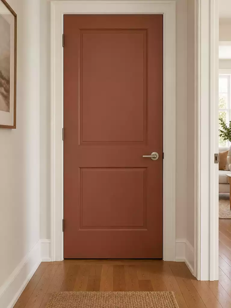
Create a warm, artisanal entrance that turns a standard hallway into a deliberate design statement.
Muted clay is an artisanal choice that brings immediate character to a space that often feels like an afterthought. It provides a distinct, warm contrast that makes standard white trim appear exceptionally clean and bright by comparison.
Design Note: This color serves as a bold design note rather than a neutral background. It works best in hallways that connect directly to shared living areas where you want to signal a transition into a warmer, more inviting environment.
Before committing to this shade, consider the scale of your hallway. In very tight or windowless corridors, the intensity of the clay can feel slightly enclosed.
If you love the look but fear too much saturation, test a sample at different times of the day. You want to ensure the color remains sophisticated rather than shifting into a bright, distracting hue.
⭐ Muted Clay Mats to Consider
Waterproof Non Slip Outdoor Entrance Mat
✨ Editor’s Pick
Funny Welcome Mat for Front Porch
Heavy Duty Sturdy Outdoor Entrance Mat
🏡 Real-Home Application: Making Muted Clay Work
- Hardware coordination: Pair with matte black or aged brass handles to ground the clay’s earthy, artisanal warmth.
- Daily functionality: Use a satin or semi-gloss finish to handle high-traffic smudges while keeping the pigment rich.
- Natural integration: Ensure the clay tone complements existing flooring; it excels near wood tones or natural stone tiles.
Deep Taupe
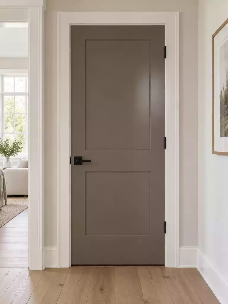
Create an architectural, high-end feel in your hallway with this balanced, grounded neutral.
Deep taupe acts as an architectural anchor in your hallway, providing a substantial presence that makes the door feel like a solid, high-quality feature. Because it sits perfectly balanced between brown and gray, it avoids the “trendy” trap and offers a level of sophistication that lighter neutrals often lack.
The white trim acts as a precise frame here, preventing the color from bleeding into the walls and ensuring the door plane remains clearly defined. This creates a clean, intentional contrast that feels custom-built rather than just painted over.
Is this for you? This color thrives in hallways with good ambient light where the depth of the tone can really shine.
Avoid using this shade in cramped, windowless corridors where there is little to no natural light. In those tight environments, the visual weight of deep taupe can make the space feel heavy or enclosed instead of curated.
⭐ Deep Taupe Rugs We Love
Black and White Buffalo Plaid Rug
Black and White Checkered Porch Rug
✨ Editor’s Pick
Large Buffalo Plaid Farmhouse Area Rug
Designer Note: Maximizing the Luxe Effect
To make deep taupe feel intentional rather than accidental, prioritize a satin or semi-gloss finish. A higher sheen helps the door catch light, which prevents the darker pigment from absorbing all the hallway’s brightness. Pair this with hardware in an aged brass or matte black finish to reinforce that sophisticated, architectural profile.
Smoky Lavender
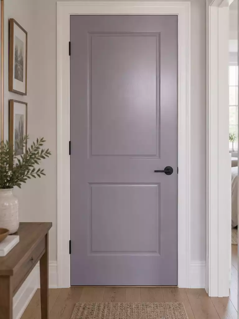
Create a memorable, atmospheric transition with a soft, muted violet that feels grounded and controlled.
Smoky lavender is a bold choice for homeowners who want to move beyond neutral tones without resorting to high-energy colors. Because it is highly sensitive to light, the white trim serves as a vital structural frame that keeps the color from bleeding into the walls or appearing messy.
Pro Tip: This shade behaves like a chameleon depending on your home’s lighting temperature.
- In warm lighting, the color shifts toward a soft mauve or taupe.
- In cool lighting, it leans into a steely, restrained gray-violet.
This color is best suited for homes where you can control the ambient light to maintain a consistent look throughout the day. If your hallway lacks natural light and relies entirely on artificial bulbs, test a sample board first to ensure the color doesn’t skew too dark or muddy.
Those with consistent, predictable lighting schemes should embrace this color as a primary design feature. If your hallway is a high-traffic area with wildly shifting light levels, you may want to opt for a more neutral tone to avoid unpredictable shifts in the door’s appearance.
⭐ Smoky Lavender Mats to Buy
✨ Editor’s Pick
Hand Painted Coconut Fiber Welcome Mat
Seasonal Thanksgiving Pumpkin Kitchen Floor Mat
Blank Coir Doormats for DIY Crafting
🧰 Questions for Your Painter or Pro:
- Undertone consistency: Can you provide a drawdown of this specific lavender to test against my hallway lighting conditions?
- Finish durability: Will a satin or semi-gloss sheen keep the color true without showing too many brush strokes?
- Trim integration: Should we use the same white trim paint throughout the hall to ensure the lavender boundary remains crisp?
Warm Charcoal
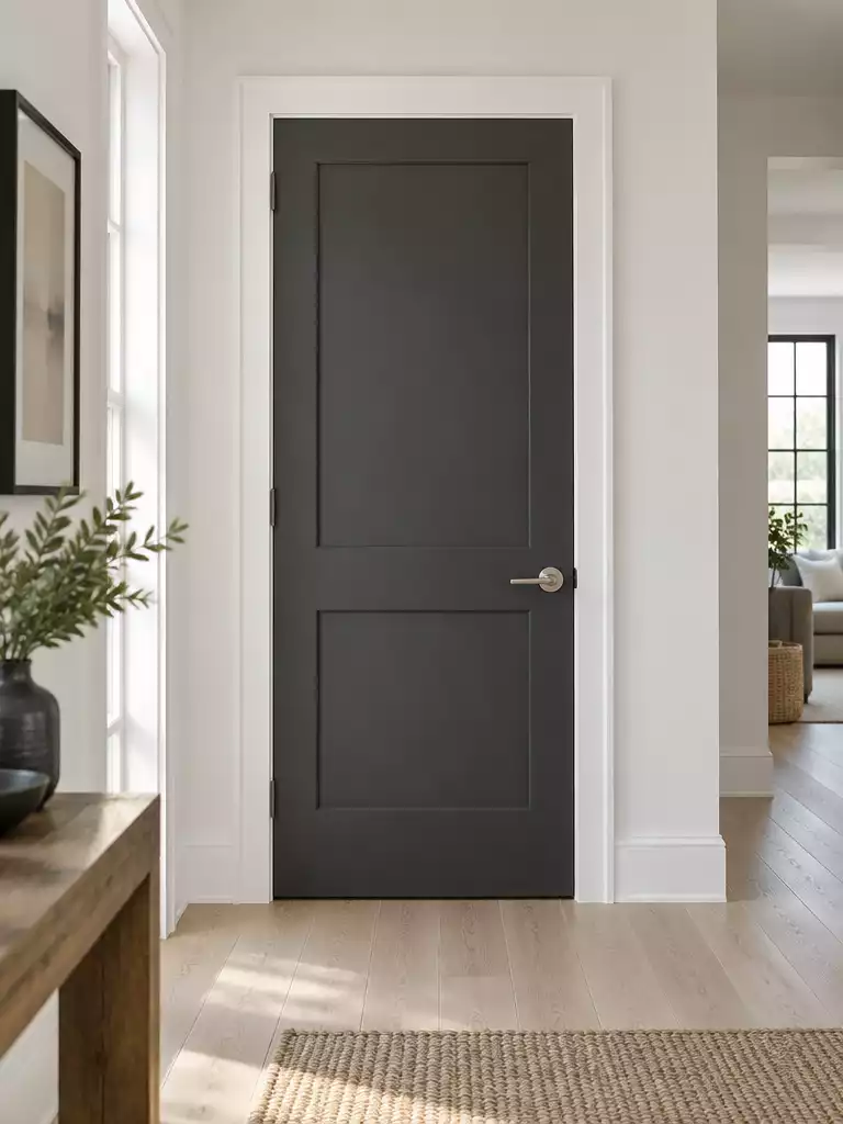
Define your hallway with a sharp, structural edge that makes white trim pop.
If you want a sharp, contemporary alternative to black, warm charcoal is your go-to. It provides the highest contrast on this list, which inevitably makes your adjacent white trim appear brighter and crisper by comparison.
This color acts as a structural element, effectively framing the door plane so it feels like a heavy, intentional feature rather than an afterthought. It is best suited for bright, wide hallways where the space can handle a bold, dark anchor without feeling cramped.
Proceed with caution: Because this hue tends to absorb more light than lighter neutrals, it can easily intensify an enclosed, tunnel-like feeling in narrow or windowless hallways.
If you choose to use it in a tighter space, ensure you have plenty of overhead lighting or wall sconces to keep the area from feeling like a dark corner. Use a satin or semi-gloss finish to give the charcoal pigment enough sheen to reflect light and prevent the door from looking like a flat, light-sucking void.
⭐ Warm Charcoal Mats Worth Buying
Striped Outdoor Rug for Layered Mats
✨ Editor’s Pick
Indoor Welcome Mat for Entryway Floors
Buffalo Plaid Cotton Outdoor Entry Rug
⚖️ Quick Decision Guide
- Choose this if: You want a high-contrast, modern architectural feature that makes your white trim look exceptionally clean.
- Skip this if: Your hallway lacks natural windows or effective artificial lighting, as dark charcoal can feel overly heavy.
- Pair it with: Brushed nickel or matte black hardware to maintain a sharp, cohesive, and intentional contemporary aesthetic.
Soft blush beige
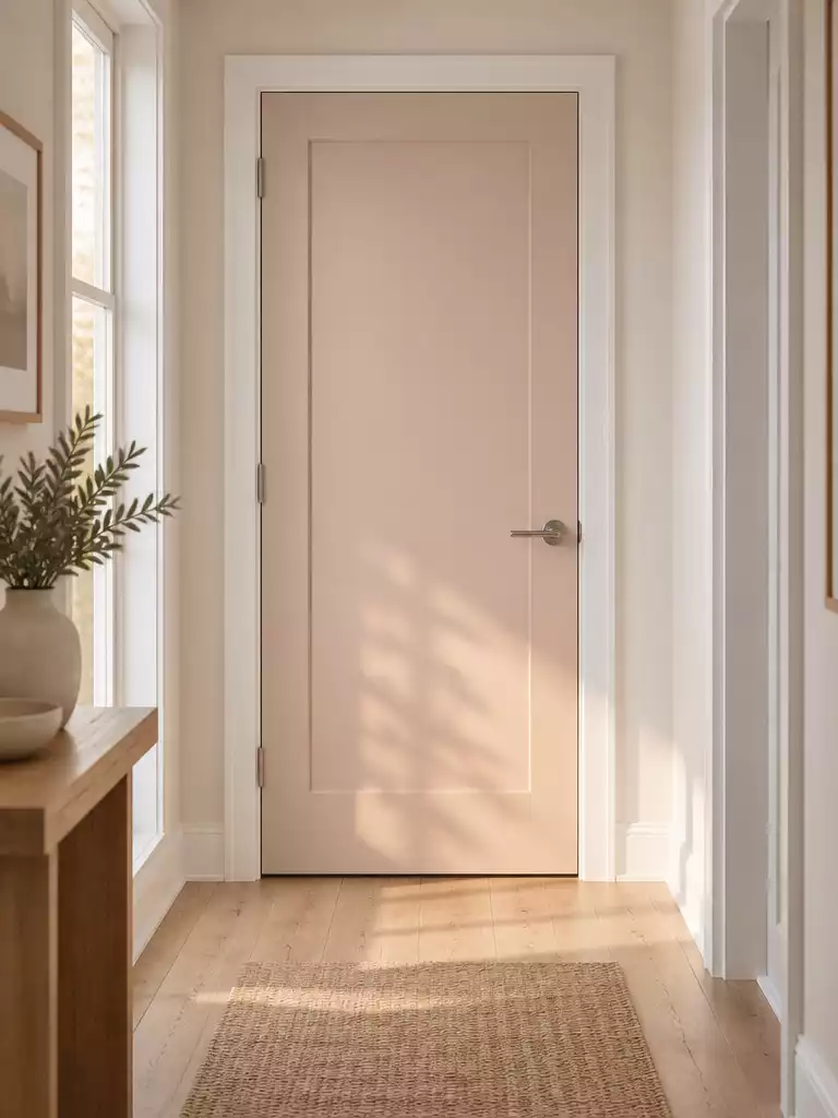
Create a gentle, welcoming transition that warms up clinical hallways without overwhelming the space.
Soft blush beige acts as a warmth-forward neutral that feels significantly lighter and more approachable than traditional tans or mushroom tones. It avoids the heavy, grounded weight of darker colors, making it an ideal choice for narrow corridors that feel cold or under-lit.
The Undertone Warning: Because of its delicate balance, this color is highly sensitive to your lighting. It can quickly shift toward a distinct peach or dusty rose depending on whether your bulbs are warm or cool.
This shade is best suited for homeowners looking to soften the transition between rooms without resorting to stark white or cold grays. If your hallway feels like a sterile, clinical space, this color introduces a subtle, feminine touch that feels intentional and curated.
Use this table to determine if your hallway environment aligns with this color choice:
⭐ Soft Blush Beige Entry Mats
✨ Editor’s Pick
Jumbo Size Waterproof Front Door Mat
💡 Why This Works:
By introducing a soft blush beige, you leverage the psychological warmth of red undertones without the intensity of a true color. In narrow hallways, this hue reflects light in a flattering, diffuse way, effectively breaking up the monotony of white trim while maintaining a clean, airy, and expansive atmosphere.
Visual Benefit: It provides essential depth and color interest that prevents the hallway from feeling like a clinical, uninviting passageway.
Blue-Gray
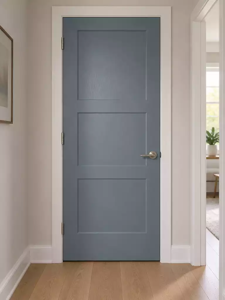
Create immediate architectural definition in your hallway with this balanced, cool-toned classic.
Blue-gray functions as a reliable bridge between coastal influence and contemporary structure. It provides enough saturation to stand out against white trim without feeling like a primary color experiment.
In narrow corridors, this shade helps the wall surface feel cleaner and more dimensional. The white trim acts as a sharp boundary, forcing the eye to acknowledge the door as a distinct design element rather than a flat piece of the wall.
Pro Tip: If your hallway feels overly clinical or cold, test a blue-gray paint with a hint of green undertone.
This adjustment keeps the refreshing quality of the blue while introducing just enough warmth to make the space feel grounded and welcoming.
This color is ideal for those who want visual interest without the hallway appearing “loud” or overwhelming. If you prefer high-contrast drama, consider a darker charcoal instead, as blue-gray is designed for subtle definition rather than stark opposition.
⭐ Blue Gray Rugs We Love
✨ Editor’s Pick
Striped Porch Rug for Fall Decor
Brown Beige Checkered Diamond Entry Rug
Six Tier Over The Door Organizer
⚖️ Quick Decision Guide:
- Choose this if: You want a versatile, timeless transition that feels polished without clashing with warm or cool floors.
- Skip this if: Your hallway is already very dark or windowless, as the blue undertones may read as muddy gray.
- Pair it with: Brushed nickel or matte black hardware to lean into either a classic coastal or modern industrial aesthetic.
Having reviewed these ten paint directions, you have a clear path toward bridging those transitions between your white trim and door planes. Select the one or two shades that align best with your home’s existing light and floor tones rather than trying to fit them all. The most successful hallways rely on consistency, not variety.
Focus your effort on a single high-traffic door to test how your chosen depth behaves from morning to evening. Once you see the impact of a professional finish on one door, you will know exactly how to transform interior doors throughout the rest of your space. Decide on the color that anchors your hallway, and the architectural definition will follow.
Related posts:
 14 Best French Door Ideas for Brightening Dark Hallways
 15 Interior Door Styles That Update Hallways Without Remodeling
 10 Black Front Door Trim Ideas
 15 Front Door Colors Designers Pick for Brick & Black Shutter Homes
 12 Neutral Front Door Colors That Boost Home Value
 12 Best Front Door Colors for a Blue House
 14 Best Front Door Colors for Log Cabin
 16 Benjamin Moore Front Door Colors With Exact Shade Names