A front door color does two things at once: it tells your neighbours who you are, and it tells you you’re home. Get it right and the whole house lifts. Get it wrong and you’ll wince every time you pull into the driveway.
Benjamin Moore has thousands of colours in its system, which is both a gift and a problem. Narrowing down to one shade for a 3×7-foot rectangle shouldn’t take six weekends and four sample pots — but it usually does. This list covers sixteen specific shades, each with the exact Benjamin Moore name and code, the house styles they pair with, and the lighting conditions where they’ll actually look the way you’re hoping.
One thing before we start: front doors take a beating from sun, rain, and temperature swings. Use a high-quality exterior formula in semi-gloss or high-gloss. Benjamin Moore’s Aura Exterior and Regal Select Exterior both hold up well on front doors, and their ADVANCE line in high gloss also levels beautifully on door panels. Two coats minimum, three on dark colours.
Benjamin Moore 210 · LRV 34 · Deep brownish ochre with faint mossy undertone

The name suggests a timid pastel, but Leap of Faith is closer to aged mustard with a warm, slightly greenish depth. On a front door it reads as a rich golden yellow — the kind that photographs well on white clapboard and holds its own next to dark shutters. It earned a cult following on Pinterest and design blogs around 2023–2024 as homeowners looked for yellow front doors that didn’t veer into “children’s birthday party” territory.
It pairs particularly well with Colonial and Cape Cod homes in white, cream, or pale gray. Avoid it on south-facing doors in hot climates — heavy afternoon sun can push the mossy undertone forward and make it look more olive than gold. A satin or semi-gloss finish keeps the warmth from going flat.
Why Marblehead Gold (HC-11) Feels Richer Than Standard Mustard
Benjamin Moore HC-11 · Historical Collection · Deep straw with muted amber undertones

Marblehead Gold sits in Benjamin Moore’s Historical Collection — 191 colours launched for the 1976 bicentennial and inspired by American landmarks. On a front door, it reads as warm straw with a brownish amber base, nothing like the bright, flat mustards that feel dated within a year. The amber undertones keep it grounded, even in bright light.
This shade works on brick Colonials, stone-fronted Tudors, and cream-painted farmhouses. It’s especially good against dark bronze or oil-rubbed hardware because the warm tones already live in the same family. If you’re torn between a gold and a brown front door, HC-11 lands precisely in between.
Palladian Blue (HC-144) for a Soft Coastal Front Door
Benjamin Moore HC-144 · Historical Collection · LRV 60 · Soft airy blue-green

Palladian Blue is one of those colours that doesn’t fully commit to blue or green, and that’s what makes it work on a front door. It has enough gray mixed in that it never looks juvenile or overly “beachy.” In natural light the blue leads; under porch lights at night the green-gray comes forward. This chameleon quality means it shifts through the day without ever looking wrong.
It’s a natural fit on coastal cottages, Nantucket shingle-style homes, and white farmhouses. Pair it with bright white trim — warm whites like cream or ivory next to Palladian Blue can make the trim look slightly yellow. Chantilly Lace or Simply White keep the contrast clean. Because of its higher LRV (around 60), this is one of the lighter colours on this list, so it won’t create the same dramatic punch as a navy or teal.
Hale Navy (HC-154) — The Front Door Classic That Outlasts Every Trend
Benjamin Moore HC-154 · Historical Collection · Deep navy with gray undertones

Hale Navy has been a front-door mainstay for over a decade and it still doesn’t feel tired. It’s a true navy with enough gray to stop it from reading like a primary blue. On a glossy front door, particularly with polished brass or unlacquered brass hardware, it gives off a timeless, slightly nautical confidence without any theme-park energy.
It works on almost everything: white clapboard, gray shingle, red brick, even light stone. The one place it struggles is next to very dark siding — on a charcoal house, Hale Navy can disappear entirely. This shade needs contrast to sing. Three coats are standard for full coverage; navy pigments are notoriously thin in the first pass.
Water’s Edge (1635) Brings Just Enough Blue Without Going Bold
Benjamin Moore 1635 · Classic Collection · Medium-toned blue with gray undertones

If you want a blue front door but keep second-guessing whether it’s “too much,” Water’s Edge is the answer. It’s a medium-toned blue with enough gray to read as restrained rather than vibrant. On screen it can look almost like a blue-gray, but on an actual door with hardware and sidelights, the blue asserts itself clearly — just quietly.
This shade is particularly well-suited to transitional homes, gray-sided Craftsman bungalows, and contemporary ranch-style houses. It plays nicely with both brushed nickel and matte black hardware. Avoid pairing it with blue-gray siding — the two will compete and flatten each other. White, warm gray, or natural wood siding all give Water’s Edge room to come forward.
How Stratton Blue (HC-142) Splits the Difference Between Blue and Gray
Benjamin Moore HC-142 · Historical Collection · LRV ~38 · Muted blue-green with gray undertones

Stratton Blue is technically a blue-green, but on a door it reads differently than most teals or turquoises. The gray in it tones everything down so the colour sits somewhere between a faded denim and sage, depending on your light exposure. North-facing doors pull more blue. West-facing doors in late afternoon push the green forward. Neither version looks bad — it just shifts personality.
It’s from the Historical Collection, which means it was designed to work on period architecture, and it does — particularly on Colonial revivals and Georgian homes. But it’s equally at home on a modern farmhouse with black window frames. Because it sits at a mid-range LRV (around 38), it doesn’t wash out in bright sun or disappear at dusk the way some pale blues do.
Boothbay Gray (HC-165) on a Front Door — Quiet but Never Boring
Benjamin Moore HC-165 · Historical Collection · Blue-gray with subtle green undertones

Boothbay Gray is for the homeowner who wants colour on their front door but doesn’t want anyone to comment on it. It’s a blue-gray with a whisper of green that registers as “thoughtfully chosen” rather than “look at me.” In cool northern light the blue comes out; in warm afternoon light, the green grounds it. It’s named after the harbour town in Maine, and it carries that same understated New England composure.
It works beautifully on shingle-style homes, white Colonial houses, and stone-fronted cottages. The shade is dark enough to feel intentional but light enough that it won’t absorb heat the way a navy or black would — a real consideration if your door gets direct afternoon sun. Pair it with brushed brass or pewter hardware for the most cohesive look.
Wrought Iron (2124-10) — Benjamin Moore’s Answer to “Almost Black”
Benjamin Moore 2124-10 · Classic Collection · Rich dark neutral, near-black with charcoal-navy undertones

Pure black front doors can look stark and slightly industrial, which is exactly right for some homes and completely wrong for others. Wrought Iron sits just short of black with undertones of charcoal, navy, and brown. In person it reads as a dark, warm neutral — more forgiving than Jet Black but every bit as dramatic. It’s become one of Benjamin Moore’s most popular dark colours for front doors, shutters, and exteriors for this reason.
It’s at home on modern farmhouses with white siding, brick Tudors with arched entries, and mid-century ranches where a flat black would feel too heavy. Because it absorbs a lot of light, it will show imperfections in the door surface — dents, patches, and uneven texture all become more visible. Sand thoroughly between coats, and use a high-gloss finish if you want the reflective depth, or satin if you want to hide minor surface flaws.
Aegean Teal (2136-40) for When You Want Color With Confidence
Benjamin Moore 2136-40 · 2021 Color of the Year · Blue-green with gray undertones

Aegean Teal was Benjamin Moore’s 2021 Color of the Year, and it earned the title. It’s a grayed-down blue-green — think the deep water off a Greek island on an overcast day. On a front door, it has enough saturation to clearly read as “colour” from the street, but the gray in it keeps it from feeling loud or trendy. It strikes a balance that very few teals manage.
It pairs particularly well with warm white exteriors, natural cedar shingle, and light gray siding. On brick homes, especially those with warm red or brown tones, Aegean Teal creates a complementary contrast that makes the brick look richer. Hardware in matte black or polished brass both work — black gives it a modern edge, brass warms the whole composition up. This is a confident colour choice that won’t date within five years.
Heritage Red (HC-181) and the Traditional Brick House Pairing
Benjamin Moore HC-181 · Historical Collection · LRV ~7 · Deep classic red with crimson-ruby depth

A red front door is one of those choices people either love or agonize over. Heritage Red makes the decision easier because it avoids the two common traps — it’s not fire-engine bright, and it’s not so dark it reads as maroon in shade. It’s a true, saturated red with enough depth to feel serious, part of the Historical Collection and modelled on the reds found on early American architecture.
The classic pairing is a white house with black shutters and a Heritage Red door, but it also works on buff-coloured brick, stone facades, and dark gray siding. Where it gets tricky: red brick. Red door on red brick can work if the tones are deliberately different — Heritage Red’s cool, slightly bluish base actually contrasts well with warm orange-toned bricks. But if your brick is already crimson-leaning, the two will blur together. Always sample on the actual door and step back to the curb before committing.
Georgian Brick (HC-50) — A Warm Neutral That Reads Like Painted Clay
Benjamin Moore HC-50 · Historical Collection · LRV ~15 · Rustic blend of red and orange

Georgian Brick is not a red and not a brown — it’s the sun-baked terracotta in between. On a front door it reads like an old clay pot from Provence: warm, earthy, and slightly weathered in feeling even when freshly painted. It’s one of those colours that makes a house look like it’s been there longer and more gracefully than it has.
It’s a natural match for stucco Mediterranean homes, but it also works surprisingly well on white clapboard Colonials and cream-painted Craftsman bungalows. The orange undertone means it warms up the entire entry, so it pairs best with cooler-toned trim and siding. Against pale blue-gray siding, it creates a combination that feels like a Tuscan village. Polished brass hardware is the obvious companion, but matte black works if you want to pull the look more modern.
Normandy (2129-40) on a Front Door Feels Like the French Countryside
Benjamin Moore 2129-40 · Color Preview Collection · Deep blue-gray with quiet sophistication

Normandy is what you’d get if Hale Navy and Boothbay Gray had a conversation and met halfway. It’s a medium-depth blue with substantial gray undertones — not light enough to feel casual, not dark enough to disappear. On a front door with a glossy finish, it catches light in a way that shifts between slate blue and French blue depending on the angle. The name earns itself.
This shade is particularly well-suited to French Country and European-influenced homes, but it also works on traditional American foursquares and renovated Victorians. It’s one of the few blue-family door colours that pairs comfortably with warm-toned siding — creams, tans, and warm grays all work because the gray in Normandy bridges the temperature gap. If you love the idea of a blue door but find Hale Navy too dark and Palladian Blue too light, this is the space you’re looking for.
Breath of Fresh Air (806) for Light, Airy Curb Appeal
Benjamin Moore 806 · Classic Collection · Light, soothing blue

This is a pale, powdery blue that belongs to the category of “barely there” colours — ones that register as colour from across the street but feel almost white up close. On a front door, Breath of Fresh Air creates a soft, approachable entry that’s unexpected without being polarising. It’s the door equivalent of a white linen shirt: clean, unforced, quietly deliberate.
It works best on homes that are already very light — white, off-white, or pale gray — where a darker door colour would feel too heavy for the architecture. Think small cottages, beach bungalows, and light-filled modern farmhouses. The trade-off is that pale blue doors can show dirt, handprints, and weathering more readily than darker shades. Plan on cleaning it periodically or choosing a semi-gloss finish that wipes down easily.
Woodlawn Blue (HC-147) and the Robin’s Egg Front Door Look
Benjamin Moore HC-147 · Historical Collection · LRV ~61 · Tranquil blue-green

Woodlawn Blue is often compared to Palladian Blue, and they do live in the same family — but Woodlawn leans a touch greener and a touch more saturated. On a front door it reads as a robin’s egg blue that’s been softened with a drop of sage. Depending on your light, it can appear more blue or more green, and both versions work well. It’s one shade darker than Palladian Blue on the same colour strip.
This shade is a strong fit for white-painted Colonials, shingle-sided cottages, and traditional farmhouses. It’s been used consistently in historically-inspired renovations because of its Historical Collection pedigree. The LRV of about 61 means it reflects a good amount of light, so it won’t darken a covered porch entry. Pair it with white or warm cream trim and polished nickel or brushed brass hardware.
Essex Green (HC-188) and Kelly Green (2037-30) — Going Full Traditional
Benjamin Moore HC-188 & 2037-30 · Historical Collection & Classic Collection · Deep traditional greens

A dark green front door on a brick house with white trim is one of the most enduring combinations in residential architecture. Benjamin Moore’s two best options in this category are Essex Green (HC-188), which is so dark it reads almost black with olive-green undertones, and Kelly Green (2037-30), which is a brighter, more saturated true green. Essex is the moody, understated choice; Kelly Green is the one that announces itself from the street.
Both pair naturally with Georgian, Colonial, and Federal-style homes. Essex Green needs bright sunlight to reveal its green character — under a deep porch overhang or on a north-facing door, it can read as near-black. If you want the green to be unmistakable, Kelly Green is the bolder pick — it’s a vivid, traditional green that reads clearly even in shade. Both colours pair well with brass hardware (period-appropriate) or black iron (more modern). These greens demand proper surface prep — any chalking, peeling, or old latex showing through will ruin the depth.
Roycroft Bronze Green (SW 2846) for a Moody, Earthy Entrance
Sherwin-Williams SW 2846 · LRV ~9 · Bronze-green with olive undertones

Roycroft Bronze Green is actually a Sherwin-Williams colour, not Benjamin Moore — but it shows up in so many front door inspiration boards alongside BM colours that it’s earned its place in this conversation. It’s a dark, brownish green with olive and bronze undertones that reads completely differently from the traditional greens above. Where Essex Green says “Colonial Williamsburg,” Roycroft Bronze Green says “Arts & Crafts bungalow” or “moody modern cabin.”
This shade is a chameleon: in warm light it looks more brown-bronze; in cool light the green comes forward. It works on Craftsman homes, mid-century moderns, and any house with exposed wood, stone, or earthy materials. It’s dark (LRV around 9), so like Wrought Iron, it will show surface imperfections. Benjamin Moore’s closest equivalent in the same territory would be Dakota Woods Green (2139-20) or Cabbage Patch (2141-20), but neither has quite the same bronze-brown warmth that makes this Sherwin-Williams shade so distinctive on a front door.
Before you buy a gallon
Every colour on this list will look different on your door than it does on your screen. Order a physical sample pot and paint a test swatch directly on the door — not on a piece of cardboard held next to it. Check it in morning light, midday sun, and under your porch light at night. If the door faces a direction that gets mostly shade, the colour will consistently read darker and cooler than the swatch card. Give the sample 24 hours to fully cure before you judge it; wet paint always looks different from dry paint, especially with darker colours.
A front door is one of the smallest surfaces on your house and one of the most visible. It’s also one of the cheapest things to repaint if you change your mind — a quart of good paint and a few hours on a Saturday afternoon. So if you’ve been staring at the same faded beige door for three years, pick a shade from this list, buy the sample, and test it this weekend. The worst outcome is you spend six dollars on a sample pot you don’t use. The best outcome is you pull into your driveway and actually like what you see.
Image Disclaimer: The inspirational images featured in this article were created using artificial intelligence technology. While they showcase design possibilities, actual implementations may vary. Please consult with a professional for specific design and installation guidance.
Related posts
 15 Front Door Colors That Make Buyers Fall in Love
 15 Front Door Colors Designers Pick for Brick & Black Shutter Homes
 12 Neutral Front Door Colors That Boost Home Value
 15 Coastal Front Door Colors Beach Towns Love Most
 12 Best Front Door Colors for a Blue House
 15 Best Front Door Colors for a Green House
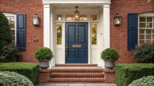 11 Best Front Door Colors for a Red Brick House
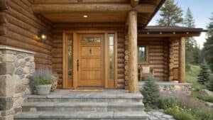 14 Best Front Door Colors for Log Cabin