
Your front door speaks before you do. While most sellers obsess over staging their living rooms and updating kitchens, they’re missing the single element that creates the most powerful first impression, that split second when potential buyers pull up to your curb and either feel their hearts skip or their interest fade. The right door colour doesn’t just welcome visitors; it whispers promises about the home that lies beyond.
Here’s something that might surprise you: the most popular door colours aren’t always the ones that sell homes. After three decades of watching buyers’ faces light up (or fall flat) at front entrances, I’ve discovered which hues actually trigger that magical “this could be home” feeling. Some of these winning shades might challenge everything you thought you knew about curb appeal.
1. Classic Navy: The Trust Builder

This isn’t your grandfather’s boring blue navy doors, radiating quiet confidence that buyers instinctively trust. You’ll notice how this deep shade makes brass hardware gleam like jewellery while creating enough contrast to make white trim pop without screaming for attention. Navy works its magic by feeling both traditional and fresh, giving buyers permission to imagine their own stories unfolding behind that welcoming threshold.
2. Cherry Red: The Memory Maker

Forget what you’ve heard about red being too bold. The right cherry tone, deeper than fire engine, warmer than burgundy, actually helps buyers remember your home among dozens of beige-door listings. You want that slight blue undertone that keeps the colour from looking angry in the afternoon sun. I once had a client whose cherry red door became the neighbourhood landmark: “the house with the happy door,” kids called it.
3. Deep Teal: The Sophistication Signal

Your home’s personality shines through teal like no other colour can manage. This jewel tone tells buyers you’re not afraid of good taste, especially when paired with oil-rubbed bronze hardware that brings out those hidden green notes. Watch how teal doors make cream siding look expensive rather than boring, and notice how even sceptical buyers pause a little longer at your threshold.
4. Warm Charcoal: The Modern Classic

Here’s where most people mess up: they choose flat grey, thinking it’s safe, when warm charcoal with subtle brown undertones actually sells the dream. You’ll see how this colour makes your entrance feel substantial without the maintenance worries of true black. Charcoal doors with satin finishes reflect just enough light to show dimension, turning what could be a boring choice into sophisticated restraint.
5. Sunny Yellow: The Happiness Dealer

Not buttercream, not neon, you need that perfect golden yellow that makes people smile before they realise they’re doing it. This colour works overtime on tree-lined streets where dappled shade could make other doors disappear. Yellow doors tell buyers this home has personality without being quirky, warmth without trying too hard. Just keep it clean; fingerprints show up faster than you’d think.
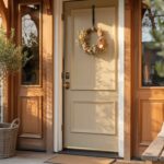
6. Crisp White: The Fresh Start

A pristine white door promises buyers a clean slate for their new beginning, but here’s the catch: it better be pristine. You’ll want high-gloss paint that wipes clean easily because every smudge tells buyers you might be neglecting other maintenance, too. White doors make small porches feel larger and cluttered entries look organised, working like visual magic on buyers’ perceptions.
7. Olive Green: The Nature Connector

This muted green bridges the gap between your landscaping and your home’s bones, creating flow that buyers feel rather than analyse. You’ll love how olive plays well with both warm brick and cool stone, never competing for attention. Smart sellers choose this shade when their gardens are their best feature; it’s like extending your curb appeal right to your threshold.
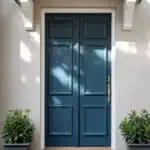
8. Slate Blue: The Quiet Luxury

Buyers associate slate blue with quality even when they can’t explain why. This colour has gravitas without stuffiness, especially in that perfect blue-grey zone that shifts with changing light. You’re giving potential buyers permission to see themselves as sophisticated homeowners, the kind who choose timeless over trendy. Test this colour at dawn and dusk, that’s when its magic really shows.
9. Rich Burgundy: The Heritage Statement

Deep burgundy doors tell stories of Sunday dinners and holiday gatherings before anyone steps inside. You need enough brown in the mix to keep it from looking like cheap wine, aiming for that leather-bound book richness instead. This colour can backfire in dark entryways, though, make sure you’ve got good porch lighting to keep that welcoming glow alive after sunset.
10. Mint Green: The Conversation Starter

Here’s my controversial take: mint green outsells sage green every time, despite what design blogs claim. This unexpected choice makes buyers curious about what other delightful surprises await inside. You’re walking a tightrope between charming and childish, so pair it with sophisticated hardware and mature landscaping to keep the overall effect grown-up yet playful.
11. True Black: The Power Move

Black doors command respect, but they’re like wearing a tuxedo; everything else better be up to standard. You’ll notice how black makes colourful flowers pop and highlights architectural details that might otherwise go unnoticed. Yes, they absorb heat in summer, but buyers see confidence, not climate concerns. Just install that storm door if you’re in Phoenix.
12. Terracotta: The Warmth Wrapper

This earthy option wraps your home in warmth that buyers can almost feel physically. You want that perfect clay pot shade, not too orange, not too brown, that makes people think of Tuscan villas and sunset dinners. Terracotta doors pair beautifully with stucco or adobe-style homes, but can also add unexpected warmth to contemporary designs when done right.
13. Deep Plum: The Bold Individualist

Plum doors separate move-in-ready homes from the merely adequate. This unexpected choice tells buyers you’re confident in your home’s value, not trying to play it safe for a quick sale. You’ll see how plum makes white flowers pop and gives grey siding some much-needed personality. The trick? Keep everything else relatively neutral so your door becomes the star, not the oddball.
14. Coral: The Optimist’s Choice

Coral walks that perfect line between energetic and elegant when you nail the undertone, too pink looks juvenile, too orange feels dated. This colour makes buyers feel optimistic about their future in your home, especially effective in neighbourhoods full of predictable neutrals. You’re essentially installing a permanent “welcome” sign that speaks in colour rather than words.
15. Light Grey: The Subtle Sophisticate

Don’t let anyone tell you light grey is dull. The right shade with green or blue undertones becomes a chameleon that complements any buyer’s style. You’ll appreciate how this colour makes bold landscaping shine while never competing with your home’s architecture. Light grey doors work hardest in contemporary homes where less really does mean more.
Making Your Door Do the Selling
After watching thousands of buyers make split-second judgments at front doors, I can tell you this: colour psychology is real, and it’s powerful. The shades you just explored don’t just make your home look good; they make buyers feel good about imagining their futures beginning at your threshold. Your door colour is essentially your home’s handshake, and you want that first contact to promise warmth, stability, and pride of ownership.
Ready to give your home the entrance it deserves? Stop letting that tired, faded door undersell your property’s potential. Whether you’re planning to list next month or next year, remember that the best time to create curb appeal is before you need it. Your future buyers are out there right now, dreaming of their perfect home. Make sure your door is dressed to make their dreams come true.
FAQs on Front Door Colours & Curb Appeal
1. What are the safest front door colours for resale value?
The safest front door colours for resale are timeless neutrals that have broad appeal. Classic black, warm charcoal grey, and deep navy blue are top choices. These shades convey sophistication, pair well with most exterior materials like brick and siding, and allow potential buyers to envision the home as their own easily.
2. How do you match a front door colour to a brick house?
For a classic red brick house, choose colours that create a rich contrast without clashing. Deep navy blue, forest green, and true black are excellent choices that ground the entrance. For homes with brown or tan brick, consider warmer tones like deep burgundy, olive green, or a creamy off-white to complement the earthy exterior.
3. What is the best paint finish for a front door?
A satin or semi-gloss finish is the best all-around choice for a front door. This finish offers the ideal balance of durability and practicality, as it resists scuffs and can be wiped clean easily. While a high-gloss finish provides a dramatic, lacquered look, it highlights every imperfection. A matte finish offers a modern feel, but is the most difficult to keep clean.
4. Does a black front door actually increase home value?
Yes, a black front door can measurably increase a home’s perceived value. Real estate data frequently shows that homes with black or charcoal front doors sell for a higher price than expected. The colour conveys a sense of elegance, security, and timeless style, making a powerful and valuable first impression on buyers.
5. What front door colours should you generally avoid when selling?
For resale purposes, it’s best to avoid colours that are overly personal, jarring, or can appear dated. Avoid excessively bright neons, electric purples, or specific shades like lime green, as they can detract from the home’s architecture. While bold colours can be effective, those that are too taste-specific risk alienating a large number of potential buyers.
Image Disclaimer: The inspirational images featured in this article were created using artificial intelligence technology. While they showcase design possibilities, actual implementations may vary. Please consult with a professional for specific design and installation guidance.
Related posts:
 11 Pinterest-Worthy Door Design Inspirations You’ll Love
 21 Stunning French Door Styles Designers Love
 11 Front Door Ideas for Your First Home Sweet Home
 10 Cream Front Doors That Pair Perfectly With Natural Wood Tones
 21 Best Front Door Colours to Instantly Boost Curb Appeal
 15 Trending Front Door Paint Colours We’re Loving This Year
 Front Doors